Hi!
It's Wednesday, which is not only hump-day but also Colour Creations Day. I know which one sounds nicer! This week we are looking at Pacific Point, a nice, vibrant blue from the Brights colour family.
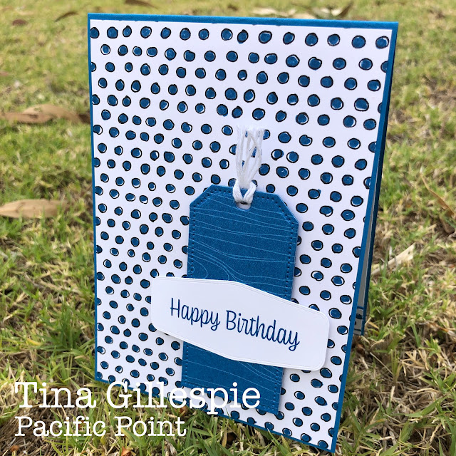
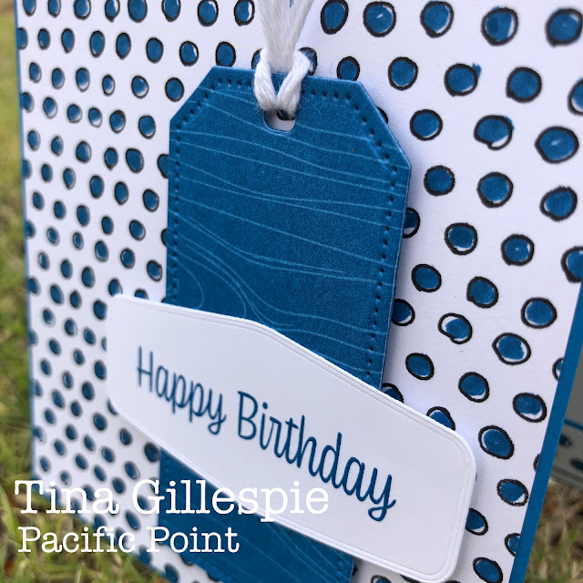
I decided to make a masculine card using Pacific Point this week. Nice and simple, no fuss, flowers or frills! The woodgrain DSP is from the Brights DSP pack, but I think it's from a retired pack.
I was watching the Fourth Ashes Test while I was making this card, so I decided to colour each of the polka dots in the Pattern Party DSP using my Pacific Point Stampin' Write Marker. You can see that I wasn't precise in my colouring, but that's the look I was going for.
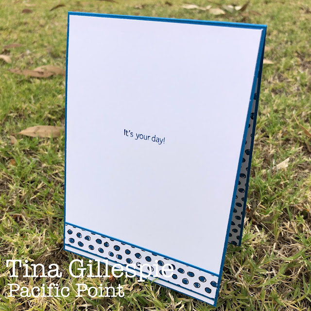
Another little strip of the DSP was used to finish off the inside.
Thanks for stopping by, but please do continue your way around our Blog Hop tonight. The next stop is the wonderful Kate Morgan. I wonder what she's done with this bright blue?
As always, the equally wonderful Catherine Proctor keeps us all organised, so if you have a problem with a broken link, just pop on over to her blog. You'll find a list of all participants there.
Bye for now,
Tina


What a fantastic masculine card, Tina. That DSP looks so good coloured in with the marker – a great crafting idea for in front of the cricket/tennis!
ReplyDeleteAha, I was thinking, I don't remember there being a Pacific Point dotty design in our DSPs! You are so creative to colour each dot in the way you have, it's just genius! I love the tailored tag die too.
ReplyDeleteThat is such a great idea to colour the dots in. What a great card. I am loving the tag!
ReplyDeleteLove the crisp look and simplicity of this card Tina. Great mindfulness activity colouring all those dots!
ReplyDeleteSuch patience, to colour all those little circles, Tina! I love the shape of the die cut you used for your sentiment label. Nice showcasing of Pacific Point. :)
ReplyDeleteSuch a lovely crisp card Tina and that DSP looks fabulous with the coloured dots.
ReplyDeleteI love this clean and apparently simple masculine card. I say apparently as your addition of colouring to the DSP and embossing to the label accent looks simple but adds an amazing effect. xxx
ReplyDeleteA great simple, no fuss masculine card Tina. The hand coloured dots look fantastic and really add to the style of design. I think I’d be seeing dots for days if I attempted this - lol!
ReplyDelete