Hi!
Tonight the Art With Heart team are sharing creative products using supplies from the upcoming 2019 - 2020 Annual Catalogue. If you would like a copy of the brand new Annual Catalogue, contact any of the girls on the blog hop and we will get in touch with you.
New catalogue time is always an exciting time for devotees of Stampin' Up!, and this year's catalogue is no exception. I found it very difficult to narrow down what I was going to play with, and in the end went for one of the very first products I got my hands on - Mosaic Mood SDSP.
I used two different sheets from the pack to create my background. It's a fairly classic layout - top third on one pattern, bottom tow thirds in another, with a solid strip between them to break them up. In this case I've used some Mint Macaron ribbon. I love the patterns in this paper, and can't wait to play some more with them.
The humming bird was fussy cut from a third sheet of DSP. What you can't see in the photo is what makes this pack a Specialty pack. The catalogue calls it 'shiny accents', but it's like an actual mosaic. The design is raised and very textural. So pretty - just like running your fingers over real tiles.
I stamped the inside with the humming bird from the retiring stamp set, Humming Along. It's a great tie in with the DSP, so if you love the paper, I'd grab the stamp set before it's too late!
Now it’s time to hop on over to our next participant, the very talented, Ros Davidson.
If you find a broken link or have come to this blog hop from a different entry point, you can view the participants below:
Christina Barnes
Rachel Woollard
Tina Gillespie
Ros Davidson
Vicki Boucher
Rebecca Jacovou
Claire Daly
Catherine Proctor
Rachel Palmieri
Kimberly Hern
Kate Morgan
Bye for now,
Tina
Showing posts with label Bunch Of Blossoms. Show all posts
Thursday, 23 May 2019
Monday, 5 November 2018
An Expedition Gift
Hi!
I wrote this post a couple of weeks ago, but by the time it publishes, I will have been in Salt Lake City for a couple of days with my friend and travel mate, Judy May. If all went to plan, we would have spend the weekend checking out the city and listening to the Mormon Tabernacle Choir with fellow travellers Kathryn Mangelsdorf and Rachel Palmieri. We are off to tour Stampin' Up! Head Office today. How exciting, to see where it all happens!
Today's post is about the card and little gift I made and had made for Judy. She did an amazing job planning and organising our trip, for which I was very grateful.
I used paper from the Animal Expedition DSP, as it's so cute, and I thought a perfect choice for the card. I really love the birdie paper! The sentiment, from Treehouse Adventures, is also the perfect choice for the card - I fee like we really are off on an adventure.
I stamped and then coloured the Kangaroo with my Blends. I used the Soft Suede, Smoky Slate and Petal Pink combos. Can you see the silver around the edges? I ran out of Silver Foil paper, so I sponged the edge of the card with Versamark ink and then added Silver Embossing Powder before heat embossing. Too easy!
I also had a bone folder engraved to commemorate the trip. My friend, Alisha and her hubby did the engraving for me. I was so pleased with how it turned out!
To make the case for the bone folder I took a strip of Berry Burst cardstock that was a little wider and nearly twice as long as the folder. I rounded the corners and then scored lines for the fold at the bottom and the flap at the front. I then took a piece of Animal Expedition DSP and wrapped it around the cardstock, adhering it to the cardstock at the back. You need to do this with the bone folder inside the cardstock, otherwise it may end up too tight a fit. I then tied a length of Berry Burst ribbon around the whole thing.
How sweet is this sentiment and tag? The stamp is from the Bunch Of Blossoms stamp set, and the tag is from the Window Box Thinlits set. I punched a small heart from Silver Glimmer Paper using the Cookie Cutter Builder Punch.
I hope Judy enjoys using her bone folder while remembering our trip for many years to come.
Of course, I had to get one for myself too!
Bye for now,
Tina
I wrote this post a couple of weeks ago, but by the time it publishes, I will have been in Salt Lake City for a couple of days with my friend and travel mate, Judy May. If all went to plan, we would have spend the weekend checking out the city and listening to the Mormon Tabernacle Choir with fellow travellers Kathryn Mangelsdorf and Rachel Palmieri. We are off to tour Stampin' Up! Head Office today. How exciting, to see where it all happens!
Today's post is about the card and little gift I made and had made for Judy. She did an amazing job planning and organising our trip, for which I was very grateful.
I used paper from the Animal Expedition DSP, as it's so cute, and I thought a perfect choice for the card. I really love the birdie paper! The sentiment, from Treehouse Adventures, is also the perfect choice for the card - I fee like we really are off on an adventure.
I stamped and then coloured the Kangaroo with my Blends. I used the Soft Suede, Smoky Slate and Petal Pink combos. Can you see the silver around the edges? I ran out of Silver Foil paper, so I sponged the edge of the card with Versamark ink and then added Silver Embossing Powder before heat embossing. Too easy!
I also had a bone folder engraved to commemorate the trip. My friend, Alisha and her hubby did the engraving for me. I was so pleased with how it turned out!
To make the case for the bone folder I took a strip of Berry Burst cardstock that was a little wider and nearly twice as long as the folder. I rounded the corners and then scored lines for the fold at the bottom and the flap at the front. I then took a piece of Animal Expedition DSP and wrapped it around the cardstock, adhering it to the cardstock at the back. You need to do this with the bone folder inside the cardstock, otherwise it may end up too tight a fit. I then tied a length of Berry Burst ribbon around the whole thing.
How sweet is this sentiment and tag? The stamp is from the Bunch Of Blossoms stamp set, and the tag is from the Window Box Thinlits set. I punched a small heart from Silver Glimmer Paper using the Cookie Cutter Builder Punch.
I hope Judy enjoys using her bone folder while remembering our trip for many years to come.
Of course, I had to get one for myself too!
Bye for now,
Tina
Monday, 3 September 2018
Best Birds in Nature's Poem
Hi!
Today's card is one I made for a class way back in July. I wanted to do a bit of watercolouring with my class ladies, and also to show off parts of the Share What You Love Embellishment Kit. In the end, I only used one of the labels, but it's the thought that counts!
You can see on the card that I used the larger label, but I cut it in half so that I could make twice as many cards with it. I love finding ways to stretch my crafting dollar further! The DSP is from the Nature's Poem pack. I love the subtle pattern that looks a little like some woven fabric. It's one of my favourites from the pack.
The bird was coloured to match the colours of the paper and cardstock - Grapefruit Grove and Rich Razzleberry. Bits of it look very yellow in the photo, but that's just the tones in the Grapefruit Grove as compared to Rich Razzleberry. Soft Suede and Shaded Spruce were used on the branch and leaves.
I had a flower left over from the front of the card, so I popped it on the inside beside the sentiment. It was just the perfect space for it!
Bye for now,
Tina
Today's card is one I made for a class way back in July. I wanted to do a bit of watercolouring with my class ladies, and also to show off parts of the Share What You Love Embellishment Kit. In the end, I only used one of the labels, but it's the thought that counts!
You can see on the card that I used the larger label, but I cut it in half so that I could make twice as many cards with it. I love finding ways to stretch my crafting dollar further! The DSP is from the Nature's Poem pack. I love the subtle pattern that looks a little like some woven fabric. It's one of my favourites from the pack.
The bird was coloured to match the colours of the paper and cardstock - Grapefruit Grove and Rich Razzleberry. Bits of it look very yellow in the photo, but that's just the tones in the Grapefruit Grove as compared to Rich Razzleberry. Soft Suede and Shaded Spruce were used on the branch and leaves.
I had a flower left over from the front of the card, so I popped it on the inside beside the sentiment. It was just the perfect space for it!
Bye for now,
Tina
Tuesday, 31 July 2018
Clover In The Tropics
Hi!
Welcome to the new Colour Creations Blog Share.
This week it's Call Me Clover's turn. The lush green made me think of the Tropical Chic suite.
I started by using my sponge brayers to create the ombre panel. I used Call Me Clover, Lemon Lime Twist and Pineapple Punch on Shimmery White paper.
I used the dies to cut the leaves in both Basic Black and Call Me Clover, and then layered them in pairs. Isn't it a dramatic look?
On the inside I used the larger die to create a window and the smaller die to add the Call Me Clover accent.
Short and sweet for me tonight! You can find everyone's links at Catherine's blog.
Bye for now,
Tina
Welcome to the new Colour Creations Blog Share.
This week it's Call Me Clover's turn. The lush green made me think of the Tropical Chic suite.
I started by using my sponge brayers to create the ombre panel. I used Call Me Clover, Lemon Lime Twist and Pineapple Punch on Shimmery White paper.
I used the dies to cut the leaves in both Basic Black and Call Me Clover, and then layered them in pairs. Isn't it a dramatic look?
On the inside I used the larger die to create a window and the smaller die to add the Call Me Clover accent.
Short and sweet for me tonight! You can find everyone's links at Catherine's blog.
Bye for now,
Tina
Tuesday, 26 June 2018
Smooshed Berry
Hi!
Hooray for a Colour Creations Blog Share with one of my favourite colours!
This week we are featuring Berry Burst. It's such a luscious, rich pink - very aptly named! I needed to make a card for one of my nieces, so I decided to make it a little special.
Have you tried the smooshing technique? That's how I created my background. I used an Aqua Painter to spread some water over my 'F' clear block (that's the background stamp sized one), and then picked up some Berry Burst ink and mixed it around in the water. I kept going until I was happy with the pink colour, and then I took my cardstock and smooshed it onto the block. I love the variations in colour you get, and the little runs where some water has pooled.
Once it dried, I roughly sponged some more Berry Burst through the diamond mask in the Pattern Party set. I then finished with some Pear Pizzazz Shimmer ribbon, Black sequin trim, and some Basic Black Faceted Gems. With all that colour, I left the daisy crisp Whisper White on top. I layered three of the punched daisies to give a very full look, probably more of a gerbera.
To finish the inside, I sponged with the mask again and then dragged my wet Aqua Painter over the sponged area to spread the colour.
As usual, you can find the links to the other blogs over at Catherine's blog. Berry Burst is a popular colour, so there's bound to be plenty of inspiration to be found!
Bye for now,
Tina
Hooray for a Colour Creations Blog Share with one of my favourite colours!
This week we are featuring Berry Burst. It's such a luscious, rich pink - very aptly named! I needed to make a card for one of my nieces, so I decided to make it a little special.
Have you tried the smooshing technique? That's how I created my background. I used an Aqua Painter to spread some water over my 'F' clear block (that's the background stamp sized one), and then picked up some Berry Burst ink and mixed it around in the water. I kept going until I was happy with the pink colour, and then I took my cardstock and smooshed it onto the block. I love the variations in colour you get, and the little runs where some water has pooled.
Once it dried, I roughly sponged some more Berry Burst through the diamond mask in the Pattern Party set. I then finished with some Pear Pizzazz Shimmer ribbon, Black sequin trim, and some Basic Black Faceted Gems. With all that colour, I left the daisy crisp Whisper White on top. I layered three of the punched daisies to give a very full look, probably more of a gerbera.
To finish the inside, I sponged with the mask again and then dragged my wet Aqua Painter over the sponged area to spread the colour.
As usual, you can find the links to the other blogs over at Catherine's blog. Berry Burst is a popular colour, so there's bound to be plenty of inspiration to be found!
Bye for now,
Tina
Thursday, 24 May 2018
AWH Blog Hop: In Colours
Hi!
Tonight the Art With Heart team are sharing creative projects featuring an “In Colour” theme. Check out the new 2018 - 2020 In Colours and let's not forget the current 2017 - 2019 In Colours, or the outgoing 2016 - 2018 set. If you would like a copy of the 2018-2019 Annual Catalogue, contact any of the girls on the blog hop and we will get in touch with you.
I decided to do a bit of a colour sampler with the three sets of In Colours and to achieve this, I ended up making 4 cards for tonight's hop. I started by grouping the In Colours by colour rather than by year group.
The first card showcases the oranges/corals. From bottom to top the colours are Flirty Flamingo, Grapefruit Grove and then Peekaboo Peach. I was inspired to make this card after I saw this card by Kristin Kortonick. I used her idea, but ended up slanting the spread of squares more to the right than she did.
I kept the inside fairly simple, as I was really over cutting tiny squares by the time I got to the inside!
Next, I moved onto the pinks. As I said, I was over cutting squares, so I decided to do something a little different, but still similar, on this card.
The colours on this card are, from the bottom, Fresh Fig, Berry Burst, Sweet Sugarplum and Powder Pink. I simply cut strips of cardstock that were 1/2" thick and adhered them to the card base in varying lengths. The first and last strip are just over half the width of the rest - I needed to do this so that I cold have three strips of each colour.
I had some off cuts after finishing the front, so I kept them to using on the inside. Waste not, want not! The card was inspired by a demonstrator called Karen Cate. She shared a card that used thin strips of card as a way of using up her scraps. Unfortunately she doesn't have a blog, so I can't link to her card.
Next was the greens! There were five colours in this group (the biggest), so I decided to stamp the colours instead of using cardstock. From bottom to top they are Tranquil Tide, Call Me Clover, Emerald Envy, Lemon Lime Twist and Pineapple Punch. I decided to sneak the Pineapple Punch into this card, as Lemon Lime Twist provides a lovely 'bridge' between green and yellow.
I reminded myself the hard way while making this card that it's always best to stamp from lightest colour to darkest. Even when you think your stamp may be clean, maybe it's not quite clean! Oops.
Last comes the blues. I cheated a little on this card, as there are only two blues in the three groups of In Colours. To make up for it I added an extra two from the list of retiring colours. So from bottom to top I used Blueberry Bushel, Dapper Denim, Marina Mist and Soft Sky.
So there you have it, I managed to fit all but one of the 15 In Colours on my cards. Can you think which one I missed? For the life of me, I could not make it 'fit' into any of the colour groups I used on my cards.
Now it’s time to hop on over to our next participant, the very talented, Rebecca.
Bye for now,
Tina
Tonight the Art With Heart team are sharing creative projects featuring an “In Colour” theme. Check out the new 2018 - 2020 In Colours and let's not forget the current 2017 - 2019 In Colours, or the outgoing 2016 - 2018 set. If you would like a copy of the 2018-2019 Annual Catalogue, contact any of the girls on the blog hop and we will get in touch with you.
I decided to do a bit of a colour sampler with the three sets of In Colours and to achieve this, I ended up making 4 cards for tonight's hop. I started by grouping the In Colours by colour rather than by year group.
The first card showcases the oranges/corals. From bottom to top the colours are Flirty Flamingo, Grapefruit Grove and then Peekaboo Peach. I was inspired to make this card after I saw this card by Kristin Kortonick. I used her idea, but ended up slanting the spread of squares more to the right than she did.
I kept the inside fairly simple, as I was really over cutting tiny squares by the time I got to the inside!
Next, I moved onto the pinks. As I said, I was over cutting squares, so I decided to do something a little different, but still similar, on this card.
The colours on this card are, from the bottom, Fresh Fig, Berry Burst, Sweet Sugarplum and Powder Pink. I simply cut strips of cardstock that were 1/2" thick and adhered them to the card base in varying lengths. The first and last strip are just over half the width of the rest - I needed to do this so that I cold have three strips of each colour.
I had some off cuts after finishing the front, so I kept them to using on the inside. Waste not, want not! The card was inspired by a demonstrator called Karen Cate. She shared a card that used thin strips of card as a way of using up her scraps. Unfortunately she doesn't have a blog, so I can't link to her card.
Next was the greens! There were five colours in this group (the biggest), so I decided to stamp the colours instead of using cardstock. From bottom to top they are Tranquil Tide, Call Me Clover, Emerald Envy, Lemon Lime Twist and Pineapple Punch. I decided to sneak the Pineapple Punch into this card, as Lemon Lime Twist provides a lovely 'bridge' between green and yellow.
I reminded myself the hard way while making this card that it's always best to stamp from lightest colour to darkest. Even when you think your stamp may be clean, maybe it's not quite clean! Oops.
Last comes the blues. I cheated a little on this card, as there are only two blues in the three groups of In Colours. To make up for it I added an extra two from the list of retiring colours. So from bottom to top I used Blueberry Bushel, Dapper Denim, Marina Mist and Soft Sky.
So there you have it, I managed to fit all but one of the 15 In Colours on my cards. Can you think which one I missed? For the life of me, I could not make it 'fit' into any of the colour groups I used on my cards.
Now it’s time to hop on over to our next participant, the very talented, Rebecca.
If you find a broken link or have come to this blog hop from a different entry point, you can view the participants below:
Tina
Wednesday, 9 May 2018
Goodbye Lovely Inside and Out
Hi!
I have two cards for you today, because essentially they are the same card with just a few tweaks. They both used the Lovely Inside and Out bundle, which is retiring and only available while stocks last.
This first card was a direct CASE of this card by Alison Okamitsu. I loved it so much that the only thing I changed was to use cardstock behind the opening rather than ribbon. I kept the cardstock the same colours and widths as the ribbon.
It's such a cute card, it really didn't need any changes!
I was on my own for the inside though, as Alison doesn't show the insides on her blog. I used a stamp from the also retiring Thoughts and Prayers for the sentiment, masking off the bits I didn't want.
Not long after I CASEd the card, I was planning on attending a stamping day with a group of other demonstrators. I wanted to make a little card to give to each of the ladies attending, so I decided to CASE my CASE of Alison's card.
You can clearly see the similarities and differences. I kept the layout the same, but changed the size of the card to be a 4 1/4" square.
I also decided to use DSP behind the opening, rather than ribbon or strips of cardstock. It's such a different look!
Aww, how nice is this sentiment? Perfect for a bunch of like-minded Stampin' Up! demonstrators! It's from the Bunch Of Blossoms set, which is carrying over.
Bye for now,
Tina
I have two cards for you today, because essentially they are the same card with just a few tweaks. They both used the Lovely Inside and Out bundle, which is retiring and only available while stocks last.
This first card was a direct CASE of this card by Alison Okamitsu. I loved it so much that the only thing I changed was to use cardstock behind the opening rather than ribbon. I kept the cardstock the same colours and widths as the ribbon.
It's such a cute card, it really didn't need any changes!
I was on my own for the inside though, as Alison doesn't show the insides on her blog. I used a stamp from the also retiring Thoughts and Prayers for the sentiment, masking off the bits I didn't want.
Not long after I CASEd the card, I was planning on attending a stamping day with a group of other demonstrators. I wanted to make a little card to give to each of the ladies attending, so I decided to CASE my CASE of Alison's card.
You can clearly see the similarities and differences. I kept the layout the same, but changed the size of the card to be a 4 1/4" square.
I also decided to use DSP behind the opening, rather than ribbon or strips of cardstock. It's such a different look!
Aww, how nice is this sentiment? Perfect for a bunch of like-minded Stampin' Up! demonstrators! It's from the Bunch Of Blossoms set, which is carrying over.
Bye for now,
Tina
Monday, 5 February 2018
CTC #164: Occasions Catalogue Kits
Hi!
EDIT: I was so excited to be a Crew Pick for this card!
I'm pretty happy to be 4 for 4 with the CASEing The Catty Challenges this year. They are announced each Sunday evening, and I've been mostly able to get straight into the challenge and get a card made pretty quickly. This week the challenge is the kit cards from pages 14-17 of the Occasions Catalogue. I don't have either kit, so I had to improvise. My card is a CASE of one of the trio at the bottom of page 17.
The card in the catalogue is square, but I decided to make a full sized card. I used exactly the same colours and ribbon, but I had to use different stamps. I remembered that the Soft Sayings kit had a similar flower stamp, and so I decided to use it.
I stamped the swoosh from Work Of Art, the flower and the leaves from Soft Sayings, and then I spritzed the cardstock lightly with some water. Once it dried I stamped the sentiment from Bunch Of Blossoms. I finished it off with the Berry Burst ribbon and some retired Pearls for the centre of the flower. The dotty stamp from Dragonfly Dreams provides a nice background for the main panel.
I used a few of the same stamps on the inside to finish off the card. It's always so much nicer to have a finished inside, don't you think?
Bye for now,
Tina
EDIT: I was so excited to be a Crew Pick for this card!
I'm pretty happy to be 4 for 4 with the CASEing The Catty Challenges this year. They are announced each Sunday evening, and I've been mostly able to get straight into the challenge and get a card made pretty quickly. This week the challenge is the kit cards from pages 14-17 of the Occasions Catalogue. I don't have either kit, so I had to improvise. My card is a CASE of one of the trio at the bottom of page 17.
The card in the catalogue is square, but I decided to make a full sized card. I used exactly the same colours and ribbon, but I had to use different stamps. I remembered that the Soft Sayings kit had a similar flower stamp, and so I decided to use it.
I stamped the swoosh from Work Of Art, the flower and the leaves from Soft Sayings, and then I spritzed the cardstock lightly with some water. Once it dried I stamped the sentiment from Bunch Of Blossoms. I finished it off with the Berry Burst ribbon and some retired Pearls for the centre of the flower. The dotty stamp from Dragonfly Dreams provides a nice background for the main panel.
I used a few of the same stamps on the inside to finish off the card. It's always so much nicer to have a finished inside, don't you think?
Bye for now,
Tina
Monday, 16 October 2017
A Beautiful Bouquet CASE
Hi!
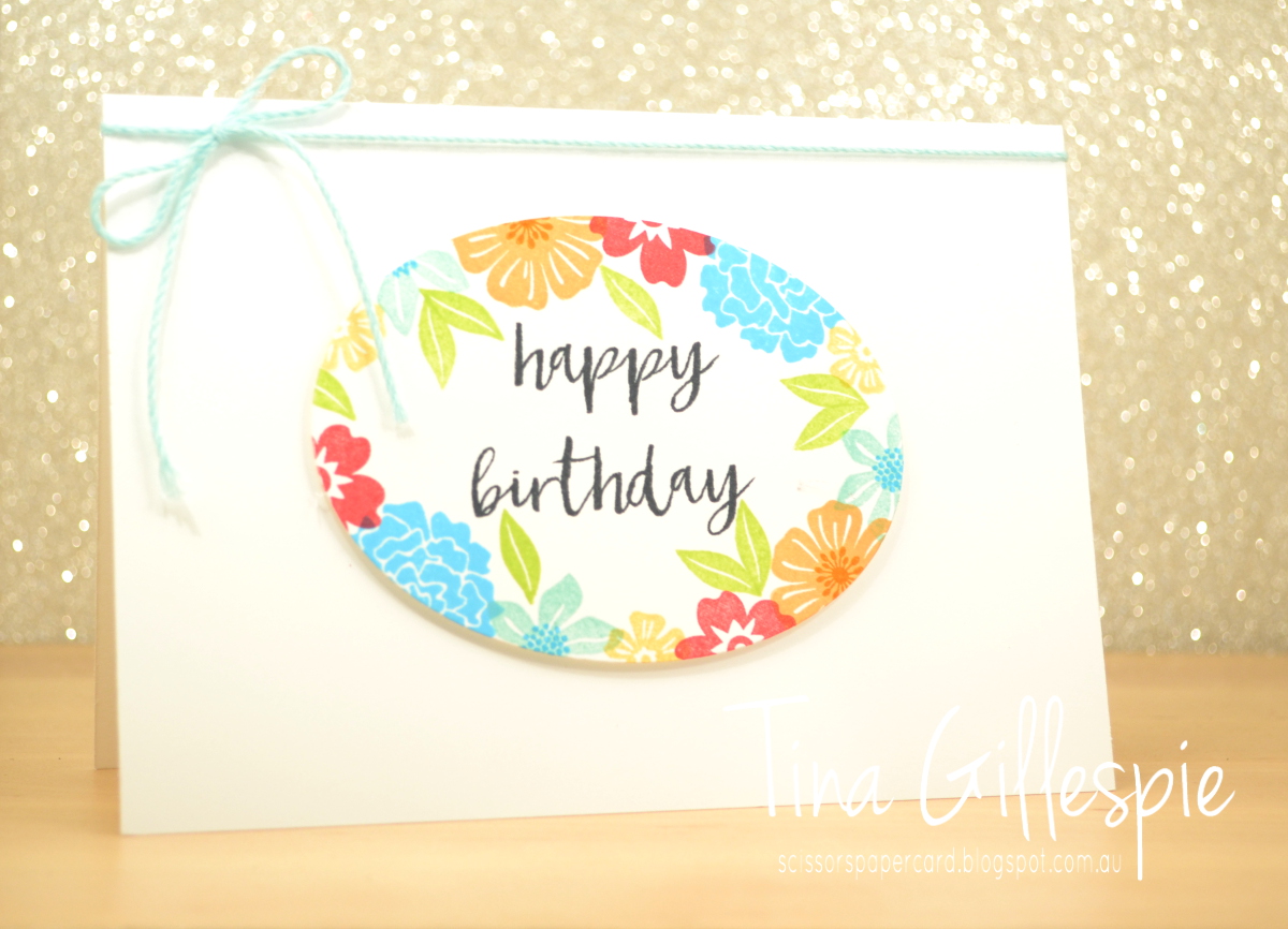
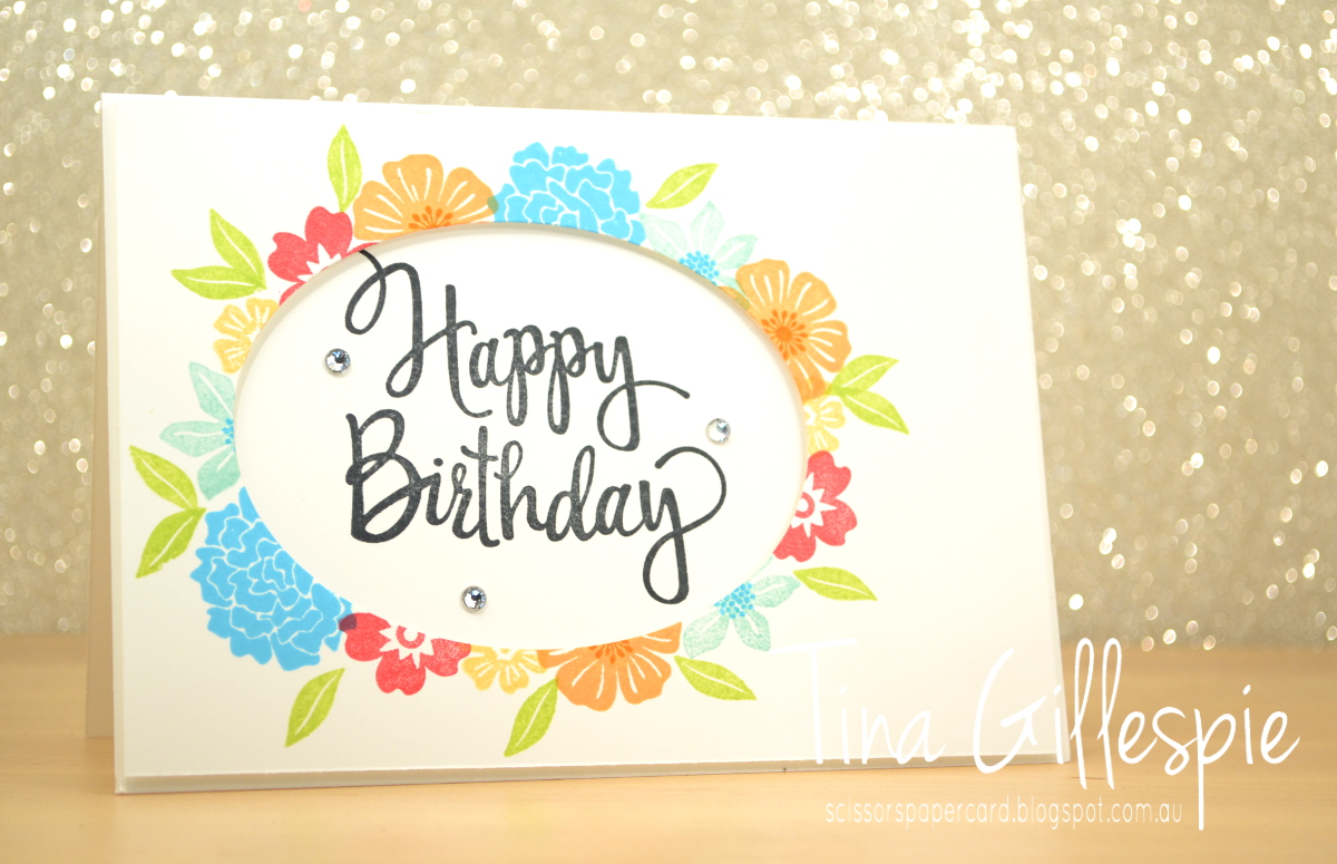
Today I have for you a fun set of cards that I CASEd from Leonie Schroder. I saw them on a demo Facebook group and thought they looked so fresh and fabulous - I just had to CASE them right away! Leonie CASEd the cards from Jennifer McGuire, who called it the Four From One technique.
Basically, you cut one card front and die cut a shape into it. Jennifer and Leonie used hearts, but I went for an oval.
You then need to cut four card bases. I cut them from Thick Whisper White, and cut two in landscape orientation, and two in portrait orientation.
You then adhere the two pieces from the card front to two of the card bases using temporary adhesive. In my case, this was the oval and the card front with the oval hole. Next, you stamp around the shape, making sure that half the stamp is on either side of the edge of the shape.
Once you've finished stamping, you carefully peel apart the layers. You should be left with two card bases that have been stamped, and tow pieces of card front that have also been stamped. On two pieces the stamping is on the outside of the oval, and on the other two, it's on the inside. All that's left to do is stamp the sentiments and assemble the two also cards. Oh, and embellish, if required.
I can't forget to stamp the insides either!
Here are the four cards together. If you look closely, you can see that the top and bottom card fronts were stamped together, and the two side cards were stamped together. It really is a super fun technique to try!
Bye for now,
Tina
Today I have for you a fun set of cards that I CASEd from Leonie Schroder. I saw them on a demo Facebook group and thought they looked so fresh and fabulous - I just had to CASE them right away! Leonie CASEd the cards from Jennifer McGuire, who called it the Four From One technique.
Basically, you cut one card front and die cut a shape into it. Jennifer and Leonie used hearts, but I went for an oval.
You then need to cut four card bases. I cut them from Thick Whisper White, and cut two in landscape orientation, and two in portrait orientation.
You then adhere the two pieces from the card front to two of the card bases using temporary adhesive. In my case, this was the oval and the card front with the oval hole. Next, you stamp around the shape, making sure that half the stamp is on either side of the edge of the shape.
Once you've finished stamping, you carefully peel apart the layers. You should be left with two card bases that have been stamped, and tow pieces of card front that have also been stamped. On two pieces the stamping is on the outside of the oval, and on the other two, it's on the inside. All that's left to do is stamp the sentiments and assemble the two also cards. Oh, and embellish, if required.
I can't forget to stamp the insides either!
Here are the four cards together. If you look closely, you can see that the top and bottom card fronts were stamped together, and the two side cards were stamped together. It really is a super fun technique to try!
Bye for now,
Tina
Thursday, 21 September 2017
AWH Blog Hop: Fancy Folds
Hi!
Welcome to another Art with Heart Team blog hop where we are focusing on fancy folds. You will find loads of creative inspiration tonight, showcasing different folding techniques and projects. Don't be afraid of trying some Fancy Fold cards; they may look intimidating, but in fact, they are not that difficult to create.
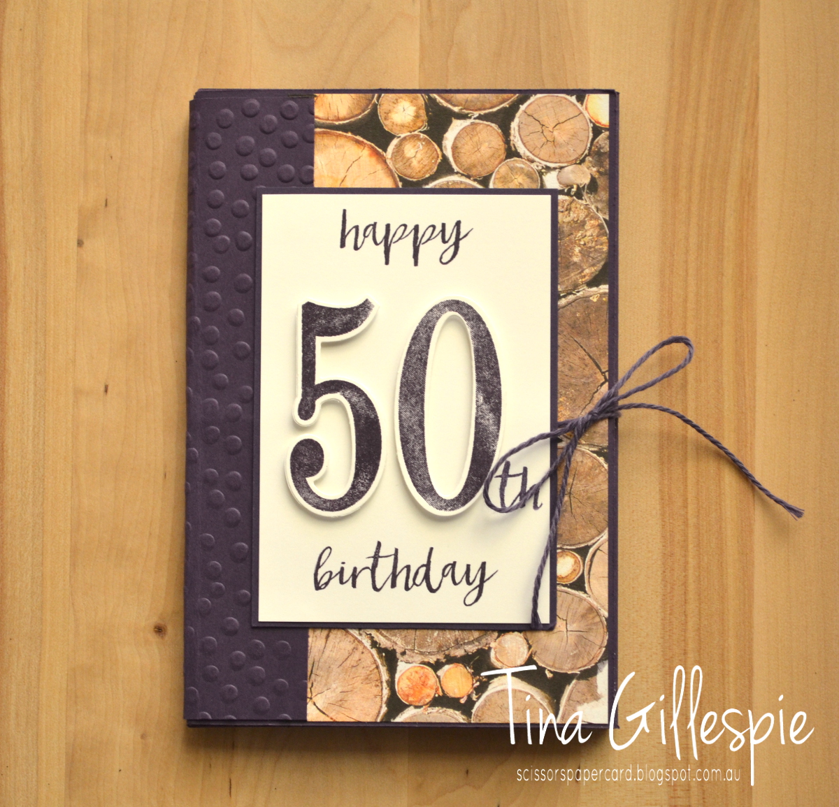
I was recently asked to make a birthday card for a woman turning 50, but it had to be big enough for around 30 people to sign. My first thought was to make a super-sized card, but I thought about how annoying that would be to store, so I decided to make something that was the size of a regular card, and add some extra pages for the guests to write on.
I'm not sure of the name of the fold, but you pretty much take a sheet of cardstock that is double the height of the finished card and 3-4 times the width. In this case I used a sheet of 12x12 cardstock in Elegant Eggplant. I should mention at this point that my brief included using purple and no flowers - the recipient is a really outdoorsy kind of person who enjoys camping, etc.
I scored the 12x12 at 4 and 8 inches, and then turned it 90 degrees and cut at 6 inches from the edge and stopping at the second score line from the edge. I also cut two extra pieces of cardstock that were 6x4, with an additional flap on one 6 inch side. Here's a diagram that shows what I did. Dashed lines are scored, solid are cutting lines, and all measurements are in inches.
I adhered the to extra flaps to the edges of b and c. I then adhered A to a, B to b and C to c using Tear And Tape Adhesive. This creates a little book with 8 pages. You could leave the top of each page open, so that you could have extra tags in the pockets too.
I decorated the front and back cover with Wood Textures DSP and used another piece of cardstock to act as a spine, hiding all of the folds. I added a length of twine to the cover before adding the spine, so that the card can be tied shut.
Each of the pages was decorated with a little more of the DSP, and I also added a few stamps from the Tabs For Everything set to give it a bit more colour. I heard that the card was a hit, so I was very pleased!
Well, that's it for me, so now you're hopping off to visit Kate Morgan's blog. She always has something fabulous that is bound to inspire.
I was recently asked to make a birthday card for a woman turning 50, but it had to be big enough for around 30 people to sign. My first thought was to make a super-sized card, but I thought about how annoying that would be to store, so I decided to make something that was the size of a regular card, and add some extra pages for the guests to write on.
I'm not sure of the name of the fold, but you pretty much take a sheet of cardstock that is double the height of the finished card and 3-4 times the width. In this case I used a sheet of 12x12 cardstock in Elegant Eggplant. I should mention at this point that my brief included using purple and no flowers - the recipient is a really outdoorsy kind of person who enjoys camping, etc.
I scored the 12x12 at 4 and 8 inches, and then turned it 90 degrees and cut at 6 inches from the edge and stopping at the second score line from the edge. I also cut two extra pieces of cardstock that were 6x4, with an additional flap on one 6 inch side. Here's a diagram that shows what I did. Dashed lines are scored, solid are cutting lines, and all measurements are in inches.
I adhered the to extra flaps to the edges of b and c. I then adhered A to a, B to b and C to c using Tear And Tape Adhesive. This creates a little book with 8 pages. You could leave the top of each page open, so that you could have extra tags in the pockets too.
I decorated the front and back cover with Wood Textures DSP and used another piece of cardstock to act as a spine, hiding all of the folds. I added a length of twine to the cover before adding the spine, so that the card can be tied shut.
Each of the pages was decorated with a little more of the DSP, and I also added a few stamps from the Tabs For Everything set to give it a bit more colour. I heard that the card was a hit, so I was very pleased!
Well, that's it for me, so now you're hopping off to visit Kate Morgan's blog. She always has something fabulous that is bound to inspire.
If you find a broken link or have come to this blog hop from a different entry point, you can view the participants below:
Bye for now,
Tina
Subscribe to:
Posts (Atom)