Hi!
Tuesday night means it's time for the Art With Heart Colour Creations Blog Share. I've lost count of the number we are up to, but we are well past half way, and I'm impressed that I've managed to join in every week so far. Hopefully I haven't jinxed myself by saying that!
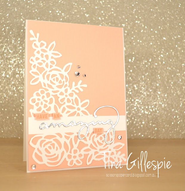
It's Petal Pink this week, which isn't a colour I particularly like. It's a little on the coral/peach side of the pinks and I prefer a pinker pink, if you know what I mean! It is a useful pink though, great for Caucasian skin tones, among other things. Anyway, on to the card! I used the partial die cutting technique to create the band across the middle of the Springtime Impressions Thinlit for the sentiment. I love how it creates one seamless piece for the front of the card.
To get the band, I lightly drew two lines across the Whisper White cardstock to mark where I wanted the band. I then ran my sandwich through the Big Shot, with one end of the top plate lined up with one of the lines. The older style plates with the straight edges work best for this technique. I then repeated for the other line. I then used my trimmer and snips to cut along the two lines, but just to remove the excess cardstock, I didn't cut through the die cut design. Does that make sense? If not, google it - Jennifer McGuire has a great video tutorial.
I finished the inside with a few of the coordinating flowers from the die set, adding a sequin to each centre to add a bit of glitz. This card will go to Ada's dance teacher, who is getting married in April. She likes her glitz!
Time to pop on over to Catherine's blog, where you can find the links to the rest of this week's Colour Creations cards.
Bye for now,
Tina
Showing posts with label Thoughtful Banners. Show all posts
Showing posts with label Thoughtful Banners. Show all posts
Tuesday, 19 February 2019
Thursday, 13 December 2018
JAI # 348: Just Add Colour
Hi!
Welcome to Friday!
This week Nikki has set the new Just Add Ink challenge. Check out the colours she's chosen:
Hmmm, what will you add to Lovely Lipstick and Granny Apple Green? I chose Pacific Point to keep the colours (sort of) primary.
I've had such a full on week that I had about half an hour to make my card, photograph it and edit it ready to go on my blog. I *had* to make something quick and simple, but I wanted a big impact. I think I achieved it! I stared by die cutting the 'amazing' from Lovely Lipstick cardstock, gluing it down and then stamping 'you are' in Pacific Point.
I'd originally cut some stars with a retired star punch that came in a trio with a heart and a flower. Remember that one? It was too big though, so after a quick scrounge in my retired products basket I found the Sprinkles Confetti punch and used the star from that. Much better! You may not see in the photo, but I added some Wink Of Stella to the word and stars for a tiny touch of glimmer.
I finished off the inside with a couple of Wink Of Stella'd stars after I'd stamped the thank you. It's from the Thoughtful Banners set, as was the 'you are' on the front.
So, which colour will you choose to pair with our two colour this week? I'll be very interested to see! You can add your blog to the list over at Just Add Ink, where you can also see what colours the Design Team chose to use.
Bye for now,
Tina
Tuesday, 4 December 2018
Swiping Mango
Hi!
Wowee, these weeks are wizzing by so fast! Here it is, Tuesday again, and time for the new Colour Creations Blog Share.
We are up to the M's this week - more specifically Mango Melody. What perfect timing, just as summer and the mango season begins! Yum, I love a good, juicy mango!
Today's card features a technique that was showcased at OnStage in Orlando. It's not a new technique, but sometimes it's fun to revisit old favourites. The technique is ink pad swiping, where you turn an ink pad upside down and swipe it over your cardstock. The base of tonight's card was actually my second attempt, as the cardstock slipped the first time and I ended up with seriously wobbly lines! Not a bad look, just not the look I was after. Anyway, it's a fun technique that looks different every time you do it.
I then took one of the large pieces of the Delightfully Detailed Laser Cut DSP and snipped a few flowers from it. I chose three of the five pointed flowers so that I could layer them. The largest one was coloured Mango Melody with a sponge brayer, and I left the medium one white. The flower centre is a clear epoxy droplet that I coloured with my Dark Mango Melody Blend.
I ended up using the smallest flower on the inside of my card. I'd intended it to go on the front, but it got a bit lost among the other two. Instead, it's now the star of the inside!
As ever, the rest of the links to this week's cards are over on Catherine's blog. I always enjoy seeing what everyone else has done with each colour. Don't you?
Bye for now,
Tina
Thursday, 28 June 2018
AWH Blog Hop: CASEing The Catalogue
Hi!
Welcome to June's Art With Heart Blog Hop!
This month, Ros has asked us to CASE a card from the new Annual Catalogue. Do you ever CASE? It's a great way to kick start your creativity when you feel like you've lost your mojo. I also sometimes CASE when I have a new stamp set and I'm a bit stumped on how to use it.
So what is a CASE? It can mean Copy And Share Everything, or Copy And Selectively Edit. Doesn't matter which you pick - it just means you've made a card that was directly inspired by another. Of course, you should always give credit to the original! I've chosen the card at the bottom left of the picture on page 157 to CASE today, and I've made two versions.
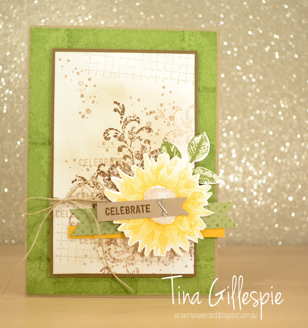
If you have your Annual Catalogue handy and have flicked to page 157, you can see that my first card is a pretty direct CASE of the card I chose. I've used all of the same stamp sets, inks and colours - there isn't a lot that I've changed.
In this picture, you can see my two changes - I've used staples instead of stitching (I was feeling a bit too lazy to get out my sewing machine!), and I've used a stamped Pear Pizzazz flag instead of Pear Pizzazz DSP. That was simply because I don't have any current Pear Pizzazz DSP. Otherwise, the card is as close of a CASE as I could make it.
I had to imagine what the inside would look like, as it's rare that the insides are shown in the Catalogue. I just went with similar stamping to the background on the front.
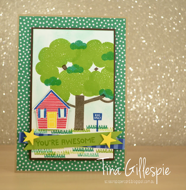
Next, I decided to CASE the same card, but to make it completely different. I started by selecting a different stamp set. I recently got Treehouse Adventure, so I pulled it out for a play. My first effort went in the bin, but I was much happier with the second!
Like the first card, I've used a Crumb Cake card base. I've kept the green background, but this time I've used some Call Me Clover DSP. As I was making a kid's card, I elected to go with bright colours. Once again, my main panel is matted in a dark brown, but this time I've used Early Espresso rather than Soft Suede. The tree and grass replaces the grungy stamping on the first card, but I've used different shades of the one colour (green/brown) on each card, stamping off at times both.
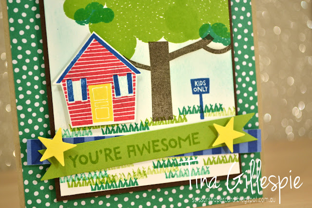
You can easily see on this card, I've flipped some of the elements. The treehouse replaces the sunflower, but now it's on the opposite side of the card. I had no intention to do so, but in stamping the grass I managed to get an ink smudge in a bad spot, so the house had to hide it. I've not used twine on this card, and the banner elements are different, but still in a similar position.
I couldn't resist adding the house in again on the inside!
So there you have it - two cards that CASE the one card, but both are very different!
That's it from me, now you're hopping back to the start, as I'm last on the list. Top of this list this month is the fabulous Catherine Proctor.
If you find a broken link or have come to this blog hop from a different entry point, you can view the participants below:
Bye for now,
Tina
Monday, 25 June 2018
Polished Stone in Pink
Hi!
I mentioned a couple of weeks ago that I'd been playing around with the Polished Stone technique for my June classes. Today I have the first card I made using the technique.
I used Melon Mambo and Basic Black as the main colours on my card. I wanted to keep the colours dramatic but simple so that the focus would be on the Polished Stone panel.
Speaking of which, how lovely does that Polished Stone panel look? I used Melon Mambo, Pumpkin Pie and Daffodil Delight reinkers on Glossy Cardstock to achieve the effect. It's important to choose colours that are beside each other on the Colour Wheel, or you risk ending up with brown blobs instead of lovely colours. I went with a little more PP and DD, as I knew MM would dominate the combination.
I used the dotty stamp from Dragonfly Dreams on the inside, trying to recreate the Polished Stone in a small way.
Have you tried the technique yet? It's a fun one, so well worth trying!
Bye for now,
Tina
Monday, 16 April 2018
CTC #174
Hi!
One of the things I love most about the school holidays is the lack of places to be! The kids and I like keeping the holidays fairly low key to allow the batteries to recharge. All this means that I usually get a lot more time to stamp during the day, allowing me to take part in some challenges.
Today I'm joining in with the CASEing The Catty Challenge. This week they are challenging us to recreate a card from either the Memories & More or Hostess sections of either the Annual or Occasions catalogues. After a quick flick through both catalogues, the card that most caught my eye was the Feathery Friends card on page 220 of the Annual. I don't have the Feathery Friends stamp set, so I decided to substitute with another of the Hostess sets, Tranquil Tulips.
The DSP background is from the Petal Garden DSP stack. This is one of my favourite designs from the pack, which pretty much means I've hoarded it until that end of catalogue must use it up panic sets in. LOL!
The tulips are stamped in Sweet Sugarplum. I wish you could see the card yourself, because it's much nicer than it looks on screen. My photo editing program and I just couldn't get the colour any truer.
I stamped the tulips again on the inside. It's really hard to see, but I also sponged around them in Pool Party ink, just like I did on the front panel. It's a lovely sky effect, and finishes off the card nicely.
Bye for now,
Tina
Monday, 14 August 2017
Vintage Leaves With Copper Trim
Hi!
I'm really not much of a metallics person, but when I first saw the new Copper Trim, I just had to have it! I loved the versatility - it can be used as is, or it can be stretched out to give a netting look.
For this card, I paired two very different DSPs: Wood Textures and Be Merry. I could have just used the Garden Green strip from Be Merry and left the right side of the card plain, but I liked the extra little something that using one of the more subtle Wood Textures papers gave.
Here's a bit of a closer look at that gorgeous trim! For this card, I threaded the trim onto my thumb to make it into a tube, and then cut along the tube to open it up flat. I stretched it out until I was happy with how it looked, and then adhered it using tape under where the leaf was going. It's important to use a fair length of the trim - as you pull it in one direction, it shrinks in the other direction! I did this in a class, and we ended up having to use a couple of pieces of the trim under the flower, as I'd cut their pieces too short.
Nice and simple on the inside. I think this is a great masculine card. Not too fussy, but the texture of the Copper Trim adds a lot of interest to the card. What do you think?
Bye for now,
Tina
Wednesday, 9 August 2017
AWH HOC Week 11
Hi!
I hope you're not tired of the Christmas inspiration just yet - there's still a lot of weeks to go before Christmas, but it will be upon us before we know it!
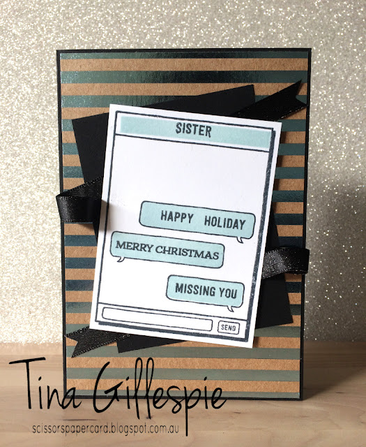
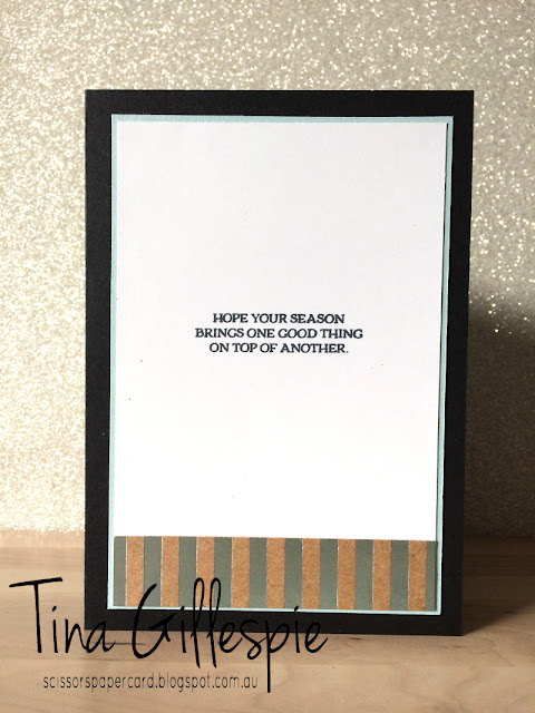
I got a little silly with this week's card. I'm waiting not so patiently for my Holiday Catalogue preorder to arrive, and I've used my other Christmas themed sets a lot, so I decided to try something different this week.
What do you think? A bit silly, but still a Christmas card! I usually only get to spend every second Christmas with my side of the family, so often the day starts with texts back and forth until later in the day when we can speak to each other.
Did you notice the new Basic Black shimmer ribbon in the background? It is soooo lovely!
Apologies for the not-so-great photos of my card this week - I've been doing a lot of purging and rearranging at home, and I still haven't found a permanent home for my photo booth. That job is top of the list for next week!
As usual, you can see the list of who has made a card this week over at Claire's blog. There's usually around 10 of us, so lots of Christmas inspiration. Just wait 'til next week, when we all have our preorders to play with!
Bye for now,
Tina
Monday, 17 July 2017
A Foxy Coffee CASE
Hi!
Today's card is a CASE of a card made by Jen of World Of Jen Craft. I found the card when I was searching for cards made using the new Coffee Break DSP. I'm not a coffee drinker, so the suite didn't appeal to me until I saw the paper. I immediately fell in love with the colours and patterns in the DSP. It's a fantastic pack for male cards.
Jen's card uses the new This Little Piggy stamp set, which I don't own, so I substituted for A Little Foxy. I was aiming for a card that could be used for a new baby, or a birthday card for a young boy.
I quite like the fox in Pear Pizzazz - it makes me think of a stuffed toy that a young child might have.
Have you seen or purchased the Coffee Break DSP yet? It's a great addition to your stash of paper!
Bye for now,
Tina
Thursday, 1 June 2017
JAI #362: Just Add Colour
Hi!
It's been a super busy blogging week for me, but today's post is the last for the week. Of course, being Friday, it's my Just Add Ink card.
I needed to make a card for a baby boy who is being Christened this month, and so I decided that I would use these colours to make a card suitable for that. The little sailboat is a great image for a boy's card.
I stamped the boat on Shimmery White cardstock that I'd cut using the Stitched Shapes die. I then carefully watercoloured the ocean using Bermuda Bay (which is not showing very true to colour), and the sky with Pool Party.
I don't have any Christening sentiment stamps, so I left the inside blank apart from another little sail boat.
What comes to your mind when you see these colours together? Why don't you get stamping and link up to us over at Just Add Ink? I'd love to see where you go with the colours.
Bye for now,
Tina
It's been a super busy blogging week for me, but today's post is the last for the week. Of course, being Friday, it's my Just Add Ink card.
This week Nikki has given us this gorgeous colour combination. I've always liked Pool Party and Bermuda Bay together, but the addition of Peekaboo Peach adds a freshness to the combo.
I needed to make a card for a baby boy who is being Christened this month, and so I decided that I would use these colours to make a card suitable for that. The little sailboat is a great image for a boy's card.
I stamped the boat on Shimmery White cardstock that I'd cut using the Stitched Shapes die. I then carefully watercoloured the ocean using Bermuda Bay (which is not showing very true to colour), and the sky with Pool Party.
I don't have any Christening sentiment stamps, so I left the inside blank apart from another little sail boat.
What comes to your mind when you see these colours together? Why don't you get stamping and link up to us over at Just Add Ink? I'd love to see where you go with the colours.
Bye for now,
Tina
Wednesday, 3 May 2017
Timeless Babywipe Technique
Hi!
Continuing in the theme of, 'Yay! It's carrying over!', is today's card featuring Timeless Textures. It's one of my favourite sets for adding a touch of grunge or vintage to a card.
This card was made as a class sample. We played with the babywipe technique, where you drip reinkers onto a folded wipe and then use the wipe as an inkpad. You can see that the flourish stamp has multiple colours. It's such a cool effect!
Can you see a tiny piece of DSP behind the vellum sentiment banner? It's from the colour family DSP stacks, and sadly these are retiring and not being replaced.
I really love this card - it's so soft and pretty!
Bye for now,
Tina
Tuesday, 14 June 2016
Sugarplum Swirls
Hi!
MMMMM, Sugarplum Swirls - sounds like a fabulous new lolly (candy), doesn't it? Unfortunately it's not, but it is a fabulous new In Colour. Such a gorgeous, dusky purply-pink.
For this card I paired it with Pear Pizzazz and Very Vanilla. It's a really soft, vintage inspired combo. What do you think?

I stamped the little splatters underneath the swirl for a little extra interest on the card. The tiny flowers are really sweet, and sit nicely on the swirl.
The splatters feature again on the inside, but this time stamped off first so that they didn't overwhelm the sentiment.
Have you tried out the new In Colours yet? Which is your favourite? I think I'm still deciding!
Bye for now,
Tina
MMMMM, Sugarplum Swirls - sounds like a fabulous new lolly (candy), doesn't it? Unfortunately it's not, but it is a fabulous new In Colour. Such a gorgeous, dusky purply-pink.
For this card I paired it with Pear Pizzazz and Very Vanilla. It's a really soft, vintage inspired combo. What do you think?

I stamped the little splatters underneath the swirl for a little extra interest on the card. The tiny flowers are really sweet, and sit nicely on the swirl.
The splatters feature again on the inside, but this time stamped off first so that they didn't overwhelm the sentiment.
Have you tried out the new In Colours yet? Which is your favourite? I think I'm still deciding!
Bye for now,
Tina
Subscribe to:
Posts (Atom)


