Hi!
Welcome to Sunday night and the new CASEing The Catty Sunday Challenge Blog Hop! You may have arrived here from Rebecca's blog, or you may be starting here. Either way, just keep on hopping until you get back to where you started. This week the CTC Crew are using their favourite retiring punch. There's a few to choose from!
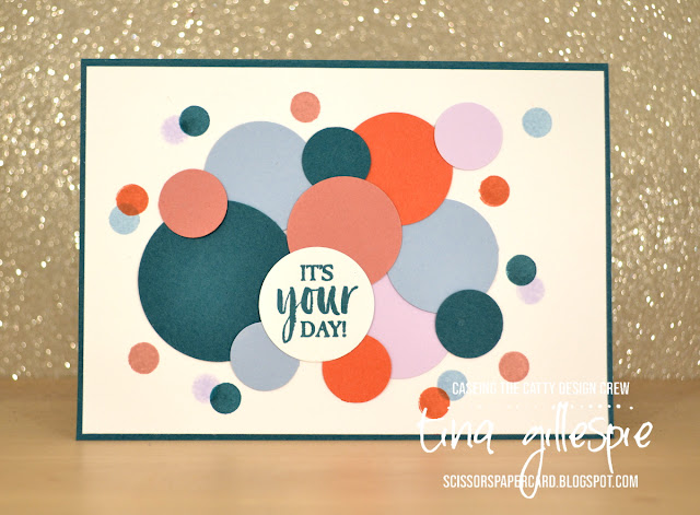
Some of my most used punches are my circle punches, and a whopping four (!) are retiring at the end of the current Annual Catalogue. I've used the largest three on my card: 1 3/4", 1 1/4" and 3/4" punches.
I started by punching out a heap of different sized circles from the new In Colour cardstock. I only did one in the new Pretty Peacock cardstock in the largest circle, to keep it as a subtle focal point. I originally intended to do the sentiment on a strip, but I couldn't make that work, so I ended up going with another circle.
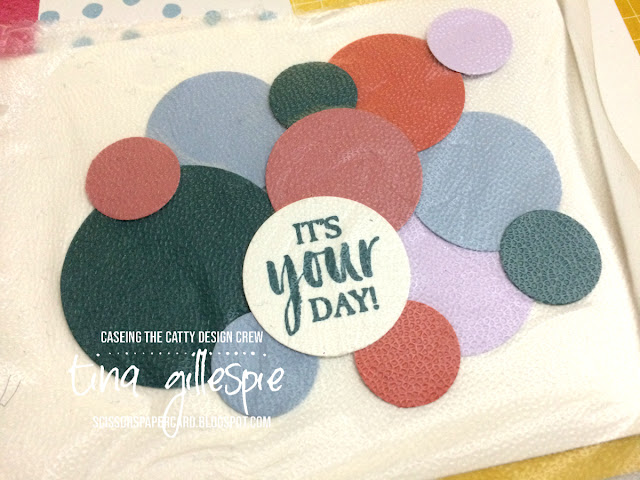
After I'd laid out all the circles, I had a little moment of panic about gluing them all down. Do you ever have that - once you lift them to glue, you can never get them quite the same way again? Luckily I had a brain wave - Press & Seal to the rescue! I cut a small piece and laid it over the top of my circles. I could then flip the whole piece over, add adhesive to the back and then flip it again to adhere it to my card front. Problem solved!
Of course, this really only works if you want your card to be flat. Or maybe you could only put a tiny bit of tape on the back of the piece you want to pop up, so that you could lift them easily? I will have to experiment!
I finished off the front by stamping some circles around the outside of the punched circles to add to the confetti feel. I used a little round stamp from Jar Of Love. I snuck in another new stamp set for the sentiment - it's from A Good Man.
I had a few punched circles left from the front, so along with some extra stamping, they went down the side of the inside. Done! I think the whole card took under an hour - perfect for those cards you need in a hurry!
You can enter our challenge each week by posing your card over on our Facebook group.
Before you go, don't forget to finish the hop. The Crew have done a great job with their punches, so you wouldn't want to miss anyone! Next up is the lovely Elizabeth.
Bye for now,
Tina
Showing posts with label Jar Of Love. Show all posts
Showing posts with label Jar Of Love. Show all posts
Sunday, 19 May 2019
Tuesday, 2 April 2019
Gettin' Real, Red.
Hi!
It's time for a new Colour Creations Blog Share. We are up to the R's this week - starting with Real Red. I'm a bit of a red fan, so I enjoyed pulling out some Real Red things and getting inky this week. Not that I don't enjoy getting inky anytime, it's just, as I'm sure you'll agree, some colours are way easier than others to get inspired by!
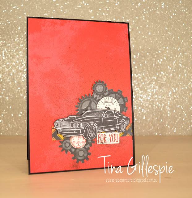
My first stop is usually to check what DSP has the feature colour, and this week I chose the Classic Garage DSP. I don't have any of the other coordinating products, but it's easy enough to make a great card if you don't mind a bit of fussy cutting.
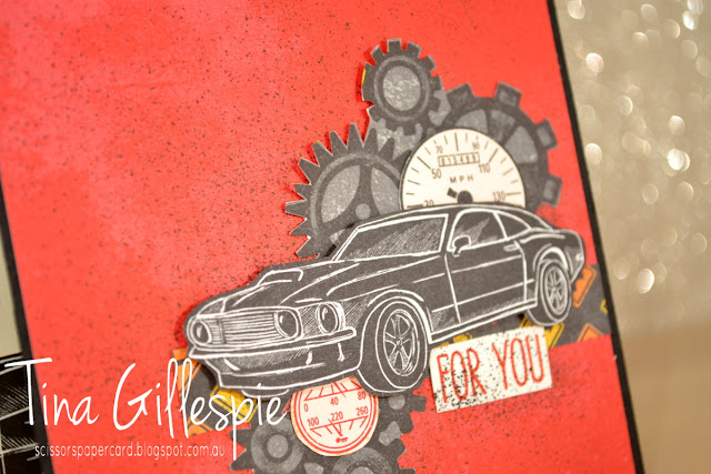
I started by dusting off my long retired Stampin' Spritzer and using it to splatter some Basic Black ink over the Real Red DSP. I then layered some fussy cut cogs, dials and car over the top. I also added a strip of the road sign pattern as an anchor for all the other 'bits'. The 'For You' is from Jar Of Love on Very Vanilla cardstock, but it looked too clean compared to the rest, so it got the spritzer treatment too!
While I had the spritzer out, I also added some splatters to the inside. Another strip of the Real Red DSP and I was nearly done. The car was fussy cut from the DSP, but I used a car that was along the edge of the paper. I didn't want the whole car, so why waste a whole one when I could use a partial car?
Why not pop on over to Catherine's blog, where you can find the links to the rest of this week's Colour Creations cards featuring Real Red?
Bye for now,
Tina
Sunday, 31 March 2019
CTC #222: Sale-A-Bration
Hi!
Time for the new CASEing The Catty Sunday Challenge Blog Hop. You may have come to my blog from my friend Judy May, or you may be starting here. Doesn't matter - just keep hopping until you get back to where you started.
This week we are CASEing the Sale-A-Bration Catalogue for the last time. Sniff! SAB ends today, so I hope you got lots of lovely freebies from the promotion. I sure did!
This week my inspiration came from the front cover of the catalogue - to be more specific, the background photo on the first release catalogue. I love the unfocussed shot of balloons, and after looking at the card bases in the Incredible Like You kit, I realised that one of the bases had a similar look. It's the card that you'd usually put the citrus laser cut paper over.
Instead of popping the laser cut paper over the top, I cropped a piece of vellum with my Rectangle Stitched Framelits and adhered that over the top. It softened the colourful circles and made them look more like the cover.
The layering on the front was made using the bits from the kit that would normally go with this card. As I have done on other cards recently, I also used a wooden butterfly, but I went over the top of it with my Silver Sharpie. It was then glued over the top of the silver edged circle label that came with the kit. The bottom piece was cropped from some Grapefruit Grove Cardstock with my Everyday Label punch, to which I added a strip of Silver foil top and bottom.
While I had the Silver Foil handy, I cropped some small butterflies using my Butterfly Duet Punch. I love the way they look fluttering around the inside sentiment.
That's it fr me for this week. Don't forget to join our Facebook group so that you can participate in the challenges each week. We'd love to have you!
For now though, don't forget to finish the Blog Hop. Next is the lovely Sandra Collett.
Bye for now,
Tina
Tuesday, 14 August 2018
A Beautiful Day For Cherry Cobbler
Hi!
Are you excited for a new week of Colour Creations? This week's it's an old favourite - Cherry Cobbler.
I always try to do something a little different on my Colour Creations cards. It could be a new technique or stamping style, or just a new way to use my stash. I actually used two techniques for the first time on today's card.
The first technique is called Ghosting - and it's why I had to photograph my card at a weird angle! I cut some Glossy White cardstock for the card background and then stamped the large flower all over using Versamark ink. I then used a sponge brayer to go over the top with Cherry Cobbler ink. The versa mark resists the ink, leaving a soft outline. It's just like Emboss Resist without the heat embossing.
The second technique is called Pointilism, and it's how I coloured my focal flower. I used my Blends markers on Whisper White Cardstock, after stamping with Memento. Here's a little breakdown of how to do it
I worked one petal at a time. First, I coloured all over with my Light Calypso Coral Blend.
Next, I took my Light Cherry Cobbler Blend and used the pen nib end to gently add some dots onto the petal. I kept them fairly spaced and more towards the outer edge of the petal.
Lastly, I used my Dark Cherry Cobbler Blend to add more dots over the top. These were a little closer together, especially towards the bottom of the petal where I wanted the shading effect to be darker. I used the same technique on the leaf using the Dark Pineapple Punch and both Old Olive Blends.
I mimicked the front of the card on the inside, but in reverse.
Are you inspired to try Pointilism with your Blends? I think I need to practice a little more to perfect my technique, but I certainly had a lot of fun with it.
You can see what the other ladies participating have done with Cherry Cobbler by following their links on Catherine's blog. Don't forget that you can right click on each link to give you the option of opening the link in a new tab or window.
Bye for now,
Tina
Monday, 6 August 2018
A Fishy CASE
Hi!
I recently got around to purchasing the new set of Embossing Mats, and have been having some fun with them. As is often the case, I found a card to CASE for my first try with them. You can find the card I CASEd here at Kathy Maurer's blog. It was such a fun card that I couldn't resist CASEing it!
I kept the card pretty much the same - only a few minor changes. I switched the colour of the card base, simply because I didn't have enough of the colour Kathy used. I also used some retired epoxy dots to use for the air bubbles rather than rhinestones.
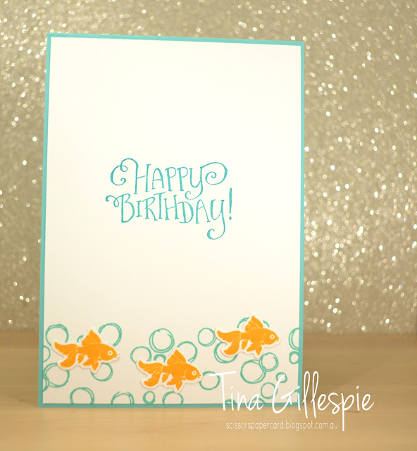
Can you see better in this picture - the long swirly die from Swirly Scribbles was used to emboss the cardstock base and represent waves? Perfect for the little fishies to swim in!
Kathy didn't show the inside of her card, so I was on my own here. I couldn't resist adding more fish and using the bubbles from my favourite background stamp underneath.
Bye for now,
Tina
Monday, 16 July 2018
CTC #187
Hi!
It's been a while since I've played along at CASEing The Catty, but I found time last night to make a card that suits this week's challenge. The DT are CASEing cards from the Kids and Babies section of the Annual Catalogue, which covers pages 80-91. I chose the card at the top left of page 91.
I kept the same basic layout of the card, but I changed the colours, stamps and purpose of the card. I don't really have many baby sets, and I've made a few baby cards lately, so it was time for a change! It was nice to stamp with two old favourite sets - Jar Of Love and Beautiful Bouquet. They combine rather nicely, don't you think?
The DSP I used is from the 2018-2020 In Colour DSP Stack. It's a cute little 6 inch stack that's the perfect size for card fronts. I used Lovely Lipstick - a colour I haven't used much of at all yet. I can't quite decide if it's a red or a pink! I love the addition of the Stitched Shapes square under the main panel. One of those subtle little details that can make a big difference to a card.
Isn't that sentiment lovely? I can just imagine the smile it will bring to the face of the recipient!
Bye for now,
Tina
Thursday, 8 March 2018
JAI #399: Just Add Water
Hi!
Welcome back to the new Just Add Ink challenge. This week Chloe has set the task, and it's to Just Add Water. I love how broadly that could be interpreted!
I hadn't done any colouring for a while, so I decided to pull out my Watercolour Pencils, Wink Of Stella and the Just Add Colour DSP. The underwater design on one of the sheets was perfect for this challenge!
It was heaps of fun using the different colour pencils to blend and create some more realistic pictures. The seaweed at the bottom right uses Old Olive and Daffodil Delight, and the seahorses used a mix of Calypso Coral, Pumpkin Pie, Daffodil Delight and Basic Grey.
I love using my Wink Of Stella pen to smooth out the colours. It's a great way to blend the pencil lines that also adds a gorgeous shimmer to the card. Hard to photograph, but trust me, it's shimmery! I love how the Basic Black card base makes the colours pop.
I was a bit tired of colouring by the time I got to the inside, so I cheated a little and used the fish stamps from Jar Of Love to finish the card. Do you cheat a little like this sometimes?
Why not pop on over to the Just Add Ink blog, where you can see the cards the rest of the Design Team have created? You can also link up your card for the challenge. How will you add water to your card?
Bye for now,
Tina
Thursday, 2 November 2017
JAI #384: Just Add Inspiration
Hi!
Is is really Friday already? Where did this week go?
It most certainly is Friday, which means it's Just Add Ink challenge day! This week we have an Inspiration Challenge, suggested by the lovely Jan.
Come on peeps - put aside the Christmas stuff, and get that Daisy punch out again!
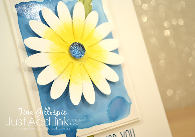
I really love the Inspiration photo, but had absolutely no idea what I was going to do for it. After pondering for a few days, I happened across a 'reject' on my craft desk. It was the watercolored panel underneath the daisy. It was a test piece for an ATC swap I'd done recently, but it hadn't quite turned out the way I'd hoped. Luckily for me, instead of chucking it as I'd usually do, I put it aside.
The panel is Dapper Denim ink on Glossy cardstock. It warped a little with the water, so I mounted it on some Thick Whisper White card to help straighten it out. I really love the imperfect, blotchy look of the panel. The silver Faceted Gem was coloured with a Copic marker in the closest colour to Dapper Denim that I had. I think I used B97.
I was really stumped with how to do the inside. I couldn't really replicate the glossy panel on the front, so in the end I went for super simple, to match the CAS look of the front of the card. I like how it turned out.
The Design Team have created a fabulous set of cards this week. Everyone has such a different take on the same picture, which is fabulous! You can see everyone's cards over on the Just Add Ink blog, where you can also link your card.
Bye for now,
Tina
Labels:
Birthday,
Challenge,
Daisy Delight,
Design Team,
Jar Of Love,
Just Add Ink,
Sunshine Sayings
Monday, 23 October 2017
Daisy Delight Bridge Card
Hi!
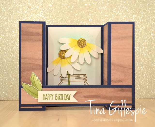
Have you jumped on the Bridge Fold card bandwagon yet? I have, and I had a lovely time making this card.
Aren't those half daisies so cute?! You just punch one daisy in Whisper White, use a sponge dauber to add a bit of Daffodil Delight ink to the centre, snip through the middle of the daisy, and glue the two halves back together so that the petals overlap. Finally, you stamp, crop and adhere a flower centre to the middle of the daisy.
I stamped a little jar with water on the back section of the front, and then sponged a little Soft Sky ink behind where the daisies sit. It really helps the white daisies to pop off the page.
There's not a whole lot of room on the back of the card for a sentiment, so I kept my stamping simple.
The best part about Bridge Fold cards is that they fold flat and still stay the correct size for an envelope. The recipient just needs to unfold the card for display. Too easy!
Bye for now,
Tina
Thursday, 19 October 2017
JAI #382: Just Add Colour
Hi!
I hope you've had a lovely week. We've had a few hot days here in Adelaide, and I've loved it! Bring on summer!
During the week, I also created a card for this week's Just Add Ink challenge. It's a colour combo this week, suggested by Patrice.
Isn't it lovely - the yummy neutrals with the pop of Fresh Fig.
There's lots of different bits and pieces on this card. Do you create like that, or do you stick to one stamp set? I do a bit of both. In this case I've stamped with the flourish from Timeless Textures, the flowers from Oh So Eclectic and the sentiment from Jar Of Love. Chuck in some vellum, Black Thread, silver sequins, some Pick A Pattern Washi tape and leaf dies from Eclectic Layers, and you have a card!
I coloured the flowers with my Fresh Fig ink pad and a Blender Pen. I wanted a heavy concentration of colour at the base of the flower, fading to a super pale shade near the tips of the petals.
I used a lot of the same elements on the inside, but I opted to leave out the black elements, as they dominated too much in the smaller space I was decorating.
This was such a fun colour combination. You can see what the rest of the team have created over at Just Add Ink. You can also link up your card there when you're ready.
Bye for now,
Tina
Subscribe to:
Posts (Atom)


