Hi!
It's the end of another busy week, but that means it's time for both the weekend and the new Just Add Ink challenge. Yay! This week Rachael has given us a sweet, soft colour combo to work with.
I don't know about you, but those colours scream 'baby card' to me. Ok, well maybe whisper so that we don't wake the baby! LOL!
I took the opportunity to use a new stamp set, called Witty-cisms. I was lucky enough to receive this stamp set in the bundle of goodies I got to present at OnStage recently. It's a cute little set with lots of funny images and sentiments. The text and image are actually one stamp, so I used a lot of masking to stamp the pram three times in Smokey Slate, and then just the text for the fourth square.
I stamped the images on Shimmery White cardstock so that I could watercolour the prams. The Shimmery paper copes with water much better than regular Whisper White card. The little hearts were cropped using the little heart die from the Well Written dies.
The congratulations sentiment is also from a new stamp set, called Peaceful Moments. The hearts I used on the inside are also a stamp, from the new Music From The Heart stamp set, which was also in my goodie bundle from OnStage. I just over a month they will be available for purchase.
Time for me to finish up, but you can head on over to the Just Add Ink blog, where you can see the rest of this week's Design team cards. You can also enter your card into our challenge by linking up your blog post.
Bye for now,
Tina
Showing posts with label Layering Squares Framelits. Show all posts
Showing posts with label Layering Squares Framelits. Show all posts
Thursday, 28 November 2019
Thursday, 21 June 2018
JAI #414: Just Add A Window
Hi!
Whoops! I'm running a bit late with my Just Add Ink post today! This week Nikki has challenged us to add a window or a frame to our cards.
I wasn't sure which one I wanted to do, so I just added both!
I recently received the new Tropical Thinlits and the coordinating Tropical Escape DSP. Quite conveniently for this challenge, the thinlit set has a window die that I was very eager to use. I cut the window into my Granny Apple Green front panel, and then used some Blushing Bride with my Layering Squares Thinlits to cut a narrow frame to go around it. The colours really pop with the Shaded Spruce card base peeking out. I tried Whisper White, but it didn't pop in quite the same way.
I didn't buy the Tropical Chic stamp set to match the dies and DSP, and I'm sort of regretting that now! Instead I used the flamingo from Fabulous Flamingo, stamped in Early Espresso, Berry Burst (stamped off) and Blushing Bride.
The hibiscus flowers on the front and inside were fussy cut from the DSP. I had hoped that they could be cut by the die, but they are a bit smaller. Looks like that stamp set will be on my next order - you'd think I'd know this by now, always get the bundle!
The Design Team have had a fun time with Nikki's challenge. You can see their cards over at the Just Add Ink blog, where you can also link up your card. See you there!
Bye for now,
Tina
Saturday, 26 May 2018
Butterfly Basics No Longer
Hi!
I'm squeezing in an extra blog post this week so that I can show you some more cards that use very soon to be retired products. As is usual lately, I have two cards for you today. This pair both use the retiring Butterfly Basics stamp set. There were a lot of shocked people when they realised all of the current butterfly stamps and dies were being retired, me included. After a little thought though, I was OK with it, as it means new stuff, and the new butterfly die is gorgeous! Time for a change!
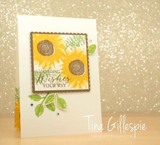
On to today's cards! The first card is a CASE of this card by Jenny Hall. I had a request from one of my class ladies to do it in a class, and I was happy to comply. There's not much I changed, apart from locating my main panel a bit higher on the card, and using the sentiment from Butterfly Basics instead of from Painted Harvest.
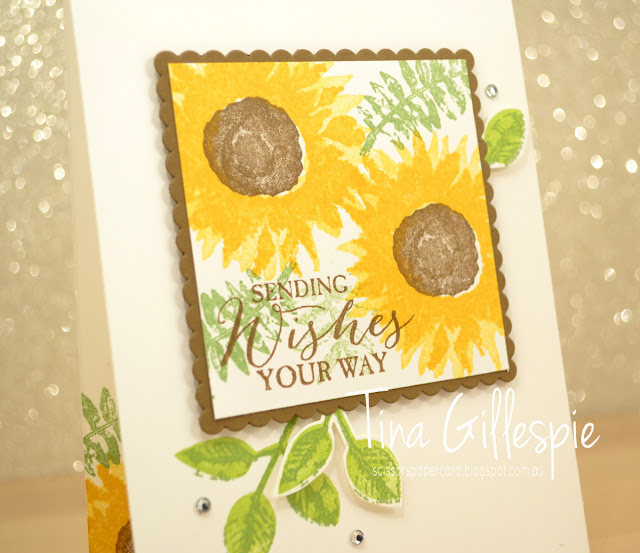
Sadly, the Painted Harvest set I used was faulty, so the detail isn't visible in the sunflower petals. Thankfully Stampin' Up! replaced the set with a brand new copy that wasn't faulty.
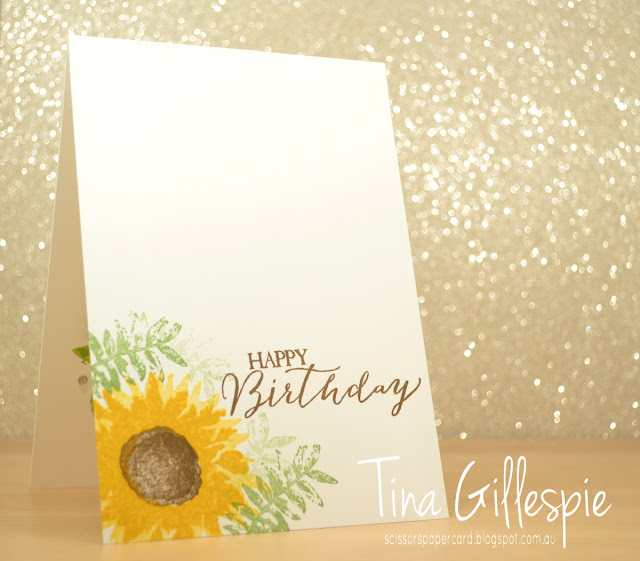
I also did a different inside to Jenny's card - it was a great excuse to stamp the sunflower again!
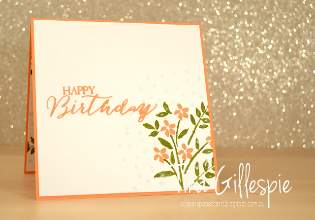
This second card was also a class card, designed to show my ladies how to do the wreath technique on the Stamparatus. We used the leaves and flowers from the also retiring Number Of Years stamp set. Can you see a new colour on the card? Grapefruit Grove is an early favourite from the batch of new In Colours.
It's a little easier to see in this photo that I used Soft Sky (retiring) to stamp some scattered dots in the gaps between the leaves. It's a subtle effect, but helps to reduce the stark look of the blank space.
I really love the mix of fonts in the Butterfly Basics sentiments, especially the script font. It's so deliciously like old fashioned hand writing.
Bye for now,
Tina
Thursday, 24 May 2018
JAI #410: Just Add Inspiration
Hi!
Welcome back to a new Just Add Ink challenge. This week Jo has found an Inspiration photo for us to work with.
I must admit that I really struggled with this one. It's such an explosion of colour! In the end, I decided to use all of the colours, but in much smaller doses. That got the creativity flowing!
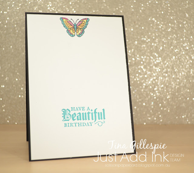
I chose a square piece of the new Graceful Glass Designer Vellum and coloured it with my Blends markers. I went with a square to match with the squares in the side table. I chose pink, yellow, orange and aqua markers to go with the pom pom garland on the wall.
The vellum piece is actually a window in the card. I took this photo with a battery operated tea light inside the card to show you how the light shines through. It's so pretty in real life - very hard to capture in a photograph.
I used the coordinating Painted Glass stamp set to finish off the inside. I deliberately didn't stamp where the window sat so that when the card was closed it has a white backing. It makes the stained glass effect so much nicer.
The Design Team have had a fun time with this Inspiration Challenge. You can see their gorgeous cards over at the Just Add Ink blog, where you can link up your card.
Bye for now,
Tina
Friday, 24 March 2017
JAI #352: Just Add Colour
Hi!
I cut the largest Stitched Shapes Square Framelit from the base once I'd brayered it. I added a few layers underneath it to hide the cut. I love the colours together with a splash of Whisper White - they look so crisp!
I recently purchased the Foxy Friends bundle and finally got a chance to play with it on this baby card. I look forward to playing some more in the future - I think it's going to be great for baby/toddler cards.
I had lots of fun making my card for this week's Just Add Ink challenge. I hop you do too! You can link your card over at the blog.
Bye for now,
Tina
Here we are again, with another new challenge for Just Add Ink. This week Nikki has given us this gorgeous colour combination to work with. I fell in love with it straight away.
You may have worked out that I'm a bit in love with the Sponge Brayers. I couldn't resist getting one out again for this card. Tempting Turquoise looks fabulous as an ombre background, don't you think?
I cut the largest Stitched Shapes Square Framelit from the base once I'd brayered it. I added a few layers underneath it to hide the cut. I love the colours together with a splash of Whisper White - they look so crisp!
I recently purchased the Foxy Friends bundle and finally got a chance to play with it on this baby card. I look forward to playing some more in the future - I think it's going to be great for baby/toddler cards.
I had lots of fun making my card for this week's Just Add Ink challenge. I hop you do too! You can link your card over at the blog.
Bye for now,
Tina
Subscribe to:
Posts (Atom)


