Hi!
Thanks for joining me for another week of the Colour Creations Blog Hops. Are you enjoying our alphabetical tour through the Stampin' Up! colours? I sure am! This week's colour is Blushing Bride. It's a pale pink, and it's one I don't particularly like. I prefer a more pure pink - this pink is a little dusky for my tastes.
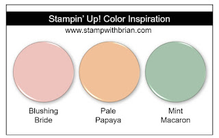
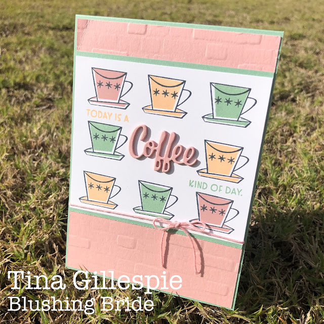
I found this cute colour combo by Brian King. The colours really scream retro to me - kind of 50's kitchen colour scheme - so what else could I use but the Nothing's Better Than bundle?
I stamped all the coffee cups in Memento Tuxedo Black, and then filled them in using the filler stamp and the three combo colours. The Brick & Mortar 3DEF was used to emboss the Blushing Bride background.
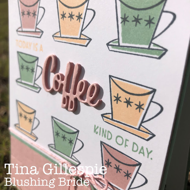
The word 'coffee' was cropped from Blushing Bride cardstock four times, and then each piece was glued and stacked to provide a dimensional element to my card. If you can't be bothered doing this, you could easily used the Foam Sheets instead, but I liked the look of the solid pink layers.
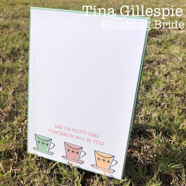
Another row of coffee cups finishes off the inside quite nicely.
It's time to hop on over to see the next Blushing Bride creation over on my lovely friend, Kate Morgan's blog. There's lots more inspiration to be found!
Bye for now,
Tina


Beautiful rows of cups Tina. Did you have trick for lining them up so neatly?
ReplyDeleteLOL, it's entirely eyeballed! I do use the grid paper to centre the cups in the middle of the top and bottom rows, but otherwise it's all just by eye!
DeleteOh I just adore your retro cups of coffee, Tina! And that layered sentiment is superb. I had only 4 hours sleep last night so I had a big belly laugh when I saw your card as it was definitely a coffee kind of day for me today – though not quite 11 cups worth, haha!
ReplyDeleteA delightful card Tina. I quite often feel like it is a coffee kind of day so totally relate to it. Love your brick embossing in the background and the layered dimension of the word coffee. I love the stamp set and the way you have used it - must get it out and give it some love as well xxx
ReplyDeleteSuch a cute colour combo, and perfect for use with those stamps, Tina! I love the stacked "coffee" part of the sentiment, and the overall composition of your card. So pretty.
ReplyDeleteGreat card Tina, I love the dimension on coffee, very effective
ReplyDeleteSuch an unexpectedly lovely colour combo Tina and as you said quite retro. Great job on lining up those cups so well.
ReplyDeleteGorgeous coffee cups and love the colours Tina! And so perfectly lined up too. The layered coffee die cuts are fabulous.
ReplyDeleteOMG this is gorgeous!!! Perfect colour combo for this set! I thought about using this set too - but you have far outdone what I had in mind!
ReplyDeleteNow hang on, how did you get those cups to line up perfectly? I was sure you were going to say you used the Stamparatus... I love the rows of 3 with the layered 'coffee' sentiment in the centre, such a stunning retro card and I love it!
ReplyDeleteAs always Tina a beautiful card. I love the way you have the cup in three rows. Makes me want to drink Coffee.
ReplyDeleteTina your retro card is rad!!! I have this bundle. In fact, I think a bought it after seeing a card of yours last year. I have hardly used it but you have motivated me (again) to get it out and play with it.
ReplyDelete