Hi!
Hello, and welcome to the final Colour Creations Blog Hop for the 2022-23 Catalogue. Never fear - we will start again next week with the brand new In Colours. This week, however, we are finishing with Soft Suede, a colour that we are farewelling permanently from the colour line up.
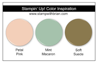
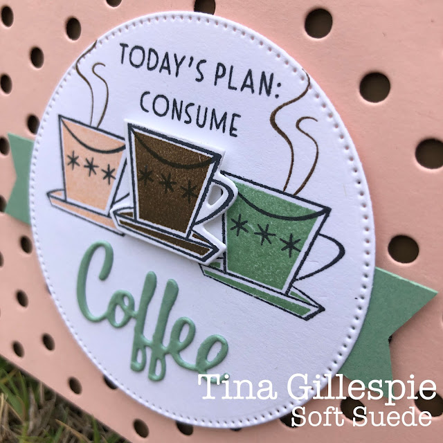
I turned to Brian King one last time for a colour combo, that added Petal Pink and Mint Macaron (sob!! It's retiring too!) to Soft Suede. It's a very retro combo, so I pulled out the retiring Nothing's Better Than stamp set, with the coordinating Love You More Than Dies. Sadly, they are both retiring, too.
I also thought that my Dots & Spots Die would work well with the retro vibe of the card. It allows little pops of Soft Suede to peek through from the card base.
I stamped each of the coffee cups in the colours from the combo, popping up the central, Soft Suede Cup. I'm really not a fan of Soft Suede, and I found it really difficult to find a nice way to make it the main colour.
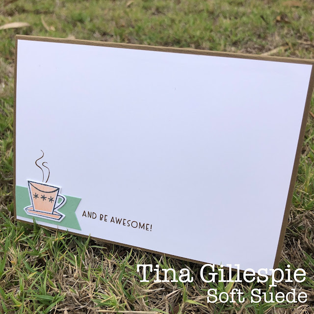
I love the inside that I created for my card. The coffee cup over the banner is so much fun!
I'll likely take a couple of weeks off from the Colour Creations Hop, for a variety of reasons, but mostly because I've forgotten to order any of the new colour stuff from Stampin' Up!. Oops! I'll get to it soon! In the meantime though, there's plenty more Soft Suede inspiration to be found on this blog hop, so jump on over to the lovely Caroline Manwaring's blog to see what she's done with it.
As always, even while busily setting up the next round of Colour Creations Blog Hops, Cathy Proctor is our wonderful Host. Pop on over to her blog if you run into any issues with links. She's have a list of all of tonight's participants on her blog for you to get back on track.
Bye for now,
Tina


Tina, I love the retro feel of your card - it is stunning! I'm so sad this bundle is retiring too because I've loved everything you've made with it, especially this wonderful card.
ReplyDeleteFantastic retro card Tina, great use of these colours with Soft Suede.
ReplyDeleteI love your Nothing is Better Than card Tina. You have chosen a great colour combination and used them brilliantly with the coffee cups. Your decoration inside the card is delightful too. xxx
ReplyDeleteLove this retro look Tina! Great colour combo and great choice of the Dots & Spots die. I'd love to have a coffee in a retro vibe coffee shop - I imagine the decor to look something like your card.
ReplyDeleteTina, you do Retro so well and this is another beauty. I love that use of the Dots & Spots die and the Mint Macaron banner works great, especially on the inside of your card. I'm going to miss this stamp set too.
ReplyDeleteI love the colour combo Tina, and the retro look of your card.
ReplyDelete