
Hi!

It's time for our regular Wednesday evening Colour Creations Blog Hop, with the feature colour this week being Early Espresso. It is, as the name suggests, a very rich, dark brown colour that falls into the Neutrals colour family.
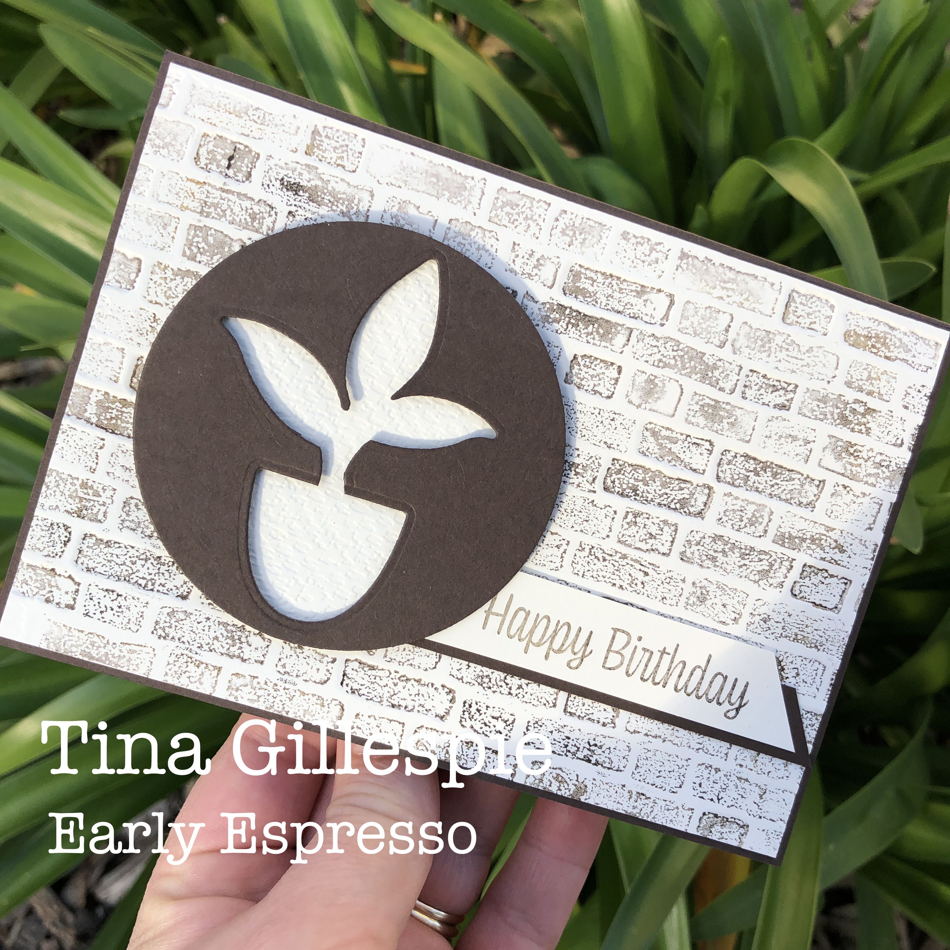
I started my card with the background. I inked up one side of my Brick & Mortar 3DEF with Early Espresso ink and then ran it throughly Big Shot with a piece of Vern Vanilla cardstock. I was very pleased with the mottled effect of the bricks.

The focal panel was created using my Perfect Plants dies. I cropped a circle first, with the Layering Circles Dies, and then ran the circle through my Big Shot again with the leaves die, and then a third time with the pot die. Another circle was cropped from Very Vanilla card, and then embossed with my Tasteful Textile 3DEF. I quite like the use of the negative die cut.

As I'm not one to waste anything, I used the cropped leaves and pot on the inside of my card. The sentiments I've used are both from the Sweet As A Peach stamp set.
That's all from me tonight, but the Hop does continue! Just keep going until you get back to where you started. Next in line is Caroline Manwaring, who makes the most beautiful cards each week for Colour Creations. I'm sure you won't want to miss her card this week!

If you find a broken link at any point along the way, please take note of where you're up to and then jump to Catherine Proctor's blog. She has a complete list of participants on her blog to help you get back on track.
Bye for now,
Tina
The brick background looks awesome, Tina. Clever, and economical, use of those plant dies!
ReplyDeleteVery stylish card Tina, great way to showcase Early Espresso
ReplyDeleteTina your brick wall background looks so realistic - just fantastic! Using the negative die image is very clever and the whole card comes together perfectly.
ReplyDeleteI never ceased to be amazed at your talent in focussing on the nominated colour with only black and or white/vanilla and create such delightful cards. This card is no exception. Your background embossed brick work is so effective and I love the way your focal point is actually the “negative” die cut-out. So effective. Brilliant to use the potted plant inside your card. Xxx
ReplyDeleteThe inked embossed background adds such a lovely texture to your negative die cut focus image on the front of your card, Tina. Then to use the die cut pieces on the inside is a lovely touch. Great card.
ReplyDeleteOh I do love how you have created the brickwork background. Very effective. You really do monochromatic so well
ReplyDeleteFabulous background, and it almost seems that you may be going through your minimalist phase, to great effect too.
ReplyDeleteI love how you coloured the brick texture for the card.
ReplyDeleteOoh, this is lovely Tina. Sweet and simple.
ReplyDelete