Hi!
Welcome to another Just Add Ink challenge. This week Nikki has found a fabulous Inspiration Photo to guide our creativity.
Oooh, I'd love to get a bunch of flowers like that! So pretty! The flattish brown flowers (I am soooo not a gardener, and have no idea what type they are!) reminded me of the seed pods in Country Home, so that's the stamp set I reached for to make this card.
I totally used the 'wrong' colours for the rest of the flowers, but that didn't worry me, after all, an Inspiration Photo is just a starting point!
I used DSP from the Woven Threads DSP pack, as this linen look paper reminded me of the backdrop on the Inspiration Photo. The paper is gorgeous - it looks so textural!
I stamped the flowers again on the inside, using Sahara Sand ink. The sentiment is from Seaside Notions, as is the one of th front of the card. I so love the mix of fonts in that set!
Time for me to dash, but you can hop on over to the Just Add Ink blog to see the rest of this week's Design team cards. Don't forget to add your card to the challenge gallery before the deadline.
Bye for now,
Tina
Thursday, 31 October 2019
Wednesday, 30 October 2019
AWH HOC Week 11
Hi!
Hello, and welcome to the Art With Heart team's heart Of Christmas Blog Share. I'm hosting again this week, while Claire has some family committments to keep her busy. It's Week 11 this week, and we are inching ever closer to the big day!
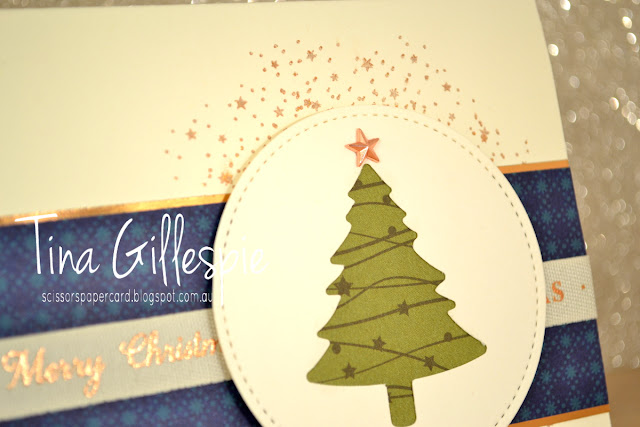
This week I have a simple card that I made as a class sample. It uses quite a few different products from the Holiday Catalogue, so maybe simple isn't the right word! I started by cropping a Sitiched Circle in Very Vanilla, and then used my Pine Tree punch to punch an opening in the circle. I backed it with some DSP from the Night Before Christmas DSP pack. I love how it looks like lights on the tree. I topped the tree with a copper Star Designer Element.
The DSP on the base is also from the Night Before Christmas pack. I adhered a strip of Copper Foil to each long edge, and then I wrapped a length of the Christmas Very Vanilla/Copper Classic Weave Ribbon around it before I adhered it all to the base. Oooh, I nearly forgot that I stamped the tiny stars from So Many Stars on the base card using Celestial Copper Delicata Ink before adding the rest.
The inside is nice and simple, with more stars across the bottom and a sentiment from So Many Stars. It leaves a lot of room for writing a Christmas message to the recipient.
Time now to pop on over to see the rest of this week's Heart Of Christmas cards. Click on each name to take you to their blog.
Sharon Davern
Caroline Manwaring
Rachel Woollard
Claire Daly
Diane Furniss
Kate Morgan
Andrea Sargent
Catherine Proctor
Christina Barnes
Vicki Boucher
Michelle Taylor
Bye for now,
Tina
Sunday, 27 October 2019
CTC #252: CASE A Layout
Hi!
Gee, these weeks are flying past! Once again, it is Sunday night, which makes it time for the new CASEing The Catty Sunday Challenge Blog Hop. The blog before mine was Sandra's,and mine is officially last on the list, but we are all linked in a circle, so just keep hopping until you get back to where you started.
This week we are CASEing a layout from page 52 of the Holiday Catalogue. It's tricky this week, as there aren't any cards to directly CASE - you have to think a little more!
My eye was caught this week by the box at the top of the image above. I liked how the leaves peeked out from under the layers above. I took basically the same design, I just made it bigger for a card front.
While I do own the Ornate Frames dies, they weren't quite the right size of shape for my card. I used a Stitched Label instead, and added a Pine Tree punched shape to the front. Instead of leaves peeking out, I cut strips of the Shaded Spruce and Gold ribbon instead.
The Gold Foil label is a great base for the Shaded Spruce tree, cropped from some retired Regals DSP. The wooden star I topped the tree with was from my stash. I pushed it onto my Cherry Cobbler ink pad to colour it before glueing it to the foil.
I used another strip of the Cherry Cobbler DSP from the front on the inside with another of the punched trees. I really love that punch for Christmas cards! The sentiment is from the Hostess set, Greatest Part Of Christmas. It's such a pretty font and sentiment.
That's all from me this week, don't forget our Facebook group, where you can join in the challenges each week, not blog or fancy editing necessary!
If you haven't finished the hop though, please do jump back to the offical start, which is the lovely Peta's blog.
Bye for now,
Tina
Thursday, 24 October 2019
JAI #480: Just Add A Technique
Hi!
It's Friday, which means it's time for the new Just Add Ink challenge. Yay! This week Jan has set the challenge, which is to add a technique.
Sometimes I'm very glad that Kim does our schedule months ahead, so that I have time to think about what I'd like to do. There are so many fun techniques out there, that it can be difficult to narrow it down to just one. In the end I decided to use my Stamparatus to do some mirror stamping.
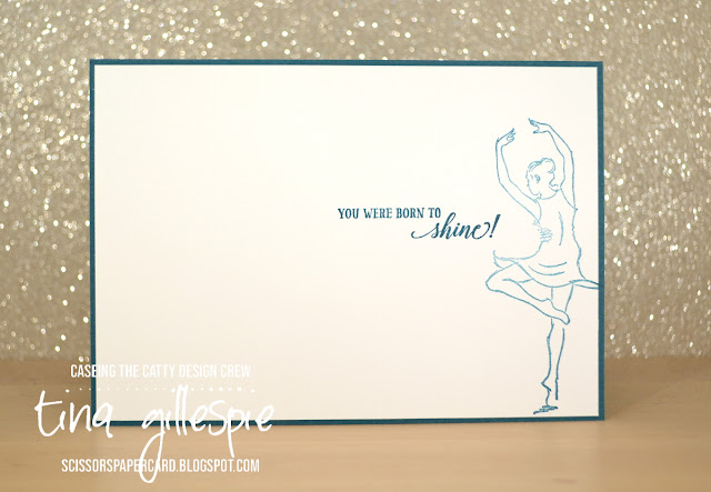
Born To Shine was still fresh in my mind, as I made a card with it last week. I decided that the dancer was the prefect stamp to use for the technique. There are lots of tutorials on the internet, but here's a *very* basic outline: to get the mirror image, you position the stamp on your Stamparatus and then stamp the image onto a silicone sheet or window sheet. Place your cardstock face down over the silicone sheet and press down with the stamp on the Stamparatus. You will end up with an image on both sides of the card, that is normal. Your then remove the silicone sheet, flip the cardstock, and stamp again (after reinking the stamp, of course!)
You may be able to see that the right dancer isn't quite as crisp as the left - she's the mirror dancer. It's a very minor difference though. The dancers were both coloured with my Watercolour Pencils in Night Of Navy, Flirty Flamingo and Cajun Craze, using my Wink Of Stella brush to blend the colours.
I stamped the dancer again on the inside, using Night Of Navy that I'd stamped off once. I used this star DSP with copper highlights, from the Brightly Gleaming SDSP pack, as I think it's great for dance cards, despite being Christmas DSP. What do you think?
That's it from me for this week, but your turn is just starting! Check out the Just Add Ink blog for the rest of the techniques that the Design Team have used, and then get stamping! Upload your card into our gallery before Wednesday evening, when the challenge closes. See you there!
Bye for now,
Tina
AWH October Blog Hop: Embossing Folders
Hi!
It's been a while since I've played with A Good Man, so I decided to pair it with one of my Embossing Folders for tonight's hop. If you know me, you know that I can't resist a technique for these hops, so I decided I'd use an oldie but a goodie. It's a simple technique, but the new 3D Embossing Folders caught me out! You may have noticed that the central part of my card is *not* embossed, and be wondering how I did that. Well, let me show you!
I simply took a piece of chipboard (it's a backing sheet from a pack of foil or glimmer paper) and cut it to be slightly larger than card front sized. I then used one of my oval dies to trace an oval shape in the centre and used very heavy duty scissors to cut out the oval. I then put my card in the folder as usual, and place the chipboard over the top, centering the oval. It took a little bit of playing to work out the correct sandwich for my machine, which was the bit that took the longest on this whole card! Every machine will be different, but I basically removed one plate from the sandwich. If you try this, just make sure that you don't damage your machine by trying to force the sandwich through. I had better luck with the newer style 3D folders, rather than the thicker, older style.
I emphasised the oval more by taking my Seaside Spray sponge dauber and applying some ink to the edges in a larger oval shape. I then stamped the relaxed guy and coloured his hat, shirt and shorts and the ground underneath with my Light Seaside Spray Blends marker. The Flax Ribbon helped the sentiment pop just a little from the rest.
The inside was finished quite simply, just the same image, stamped off first, and then the sentiment. Done!
Welcome to another Art With Heart Blog Hop. This month we are featuring Stampin' Up's! versatile range of Embossing Folders. There are new Embossing Folders available in every Stampin' Up! catalogue and they are an inexpensive way of adding WOW! to your projects. Currently there are 24 different Embossing Folders in the range. Tonight we plan on showing you lots of ideas on how to use these folders.
It's been a while since I've played with A Good Man, so I decided to pair it with one of my Embossing Folders for tonight's hop. If you know me, you know that I can't resist a technique for these hops, so I decided I'd use an oldie but a goodie. It's a simple technique, but the new 3D Embossing Folders caught me out! You may have noticed that the central part of my card is *not* embossed, and be wondering how I did that. Well, let me show you!
I simply took a piece of chipboard (it's a backing sheet from a pack of foil or glimmer paper) and cut it to be slightly larger than card front sized. I then used one of my oval dies to trace an oval shape in the centre and used very heavy duty scissors to cut out the oval. I then put my card in the folder as usual, and place the chipboard over the top, centering the oval. It took a little bit of playing to work out the correct sandwich for my machine, which was the bit that took the longest on this whole card! Every machine will be different, but I basically removed one plate from the sandwich. If you try this, just make sure that you don't damage your machine by trying to force the sandwich through. I had better luck with the newer style 3D folders, rather than the thicker, older style.
I emphasised the oval more by taking my Seaside Spray sponge dauber and applying some ink to the edges in a larger oval shape. I then stamped the relaxed guy and coloured his hat, shirt and shorts and the ground underneath with my Light Seaside Spray Blends marker. The Flax Ribbon helped the sentiment pop just a little from the rest.
The inside was finished quite simply, just the same image, stamped off first, and then the sentiment. Done!
For best results when using the Stampin' Up!'s 3D Embossing Folders; use the 3D Embossing Folder Plate; it adds a little more oomph to your die sandwich to make those 3D designs pop.
That's it for me for tonight, now it's time to hop on over to Claire's Blog to continue your way around the hop.
If you find a broken link or have come to this blog hop from a different entry point, you can view all the participants below:
Bye for now,
Tina
Wednesday, 23 October 2019
AWH HOC Week 10
Hi!
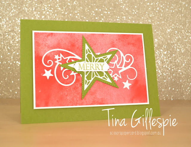
Welcome to another week of the Art With Heart's Heart Of Christmas Blog Share. We are up to Week 10 - double digits! I was a bit time poor this week, so I chose to CASE this card by Brian King. His card isn't a Christmas card, but it was super easy to change it to be suitable for Christmas.
I loved his card so much that I didn't actually make many changes. The sentiment, obviously, as his wasn't Christmassy. I also added some of the stars that are part of the swirly die to the front of the card. No point in wasting them!
It is *super* hard to see, as they are white on white, but I added the other three stars to the inside, around the sentiment from Merry Christmas To All.
I made this card to use as a class sample, as I thought my ladies would like it. A few of them prefer a more traditional colour scheme, so I also made a sample in red and green. On both cards, the DSP is from the See A Silhouette pack - the variation in colour is so pretty on the background, don't you think?
This card was essentially the same as the first card, just a few minor changes. The stars on the front are in slightly different positions, and the Merry sentiment was double punched to make the sentiment shorter.
Which do you prefer?
Once you've decided, pop on over to Claire's Blog where you can find the rest of this week's links.
Bye for now,
Tina
Sunday, 20 October 2019
CTC #251: Brightly Gleaming
Hi!
Hello, and welcome to the CASEing The Catty Sunday Challenge Blog Hop. Are you starting here, or have you come from Lauren's blog? It doesn't really matter, as we are all linked in a circle.
This week we are looking at the gorgeous Brightly Gleaming Suite, but particularly the Brightly Gleaming SDSP. It's stunning DSP, which features fabulous copper highlights with the rich colours of the paper.
As part of the challenge, we not only have to CASE the SDSP, but also a layout from page 30, which is the page pictured above. I had about 3 minutes to make my card, as my daughter had dance competitions over the weekend. I ended up going with the card at the top right of the page.
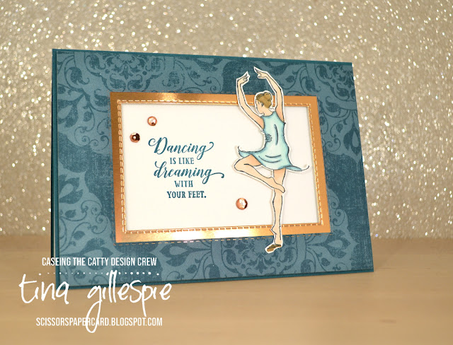
Instead of using the Brightly Gleaming DSP, I chose a more subtle paper from the Woven Threads pack. It's still Pretty Peacock, but it ins't a Christmas pattern. I wanted to make a card for my daughter to let her know how proud we were of her dancing in the competition.
I coloured the dancer using my Blends. I selected Light Pool Party and Light Pretty Peacock for her dress, Ivory for her skin, and the Soft Suede pair for her hair and the shadow under her feet. Ada danced in a similar coloured costume, so that worked nicely for my card! Although her costume had *way* more sequins than my card!
As a different feature, I decided to inset the rectangles in the design rather than layer them on top. I used my Rectangle Stitched dies to crop the opening in the DSP and then to crop a frame in the Copper Foil paper. The whole piece was then popped up over the card base.
To finish the inside I stamped the same dancer, but this time I stamped her off so that the Pretty Peacock was a lighter shade. Ada is forever twirling around the house like this, so it really reminds me of her!
In case you were wondering, her troupe received Highly Commended awards for their Jazz, Tap and Contemporary routines.
That's it for me, but just the start for you! The challenge runs for the next week, and you can upload your card in our Facebook group. Which of the cards will you choose to CASE using the Brightly Gleaming Suite as inspiration?
I'm the last stop on the Blog Hop this week, but if you didn't start at the beginning, you should continue hopping to see the gorgeous cards the DT have created this week. just keep going until you get back to where you started. Siobhan was the starting point this week.
Bye for now,
Tina
Thursday, 17 October 2019
JAI #479: Just Add Colour
Hi!
Hooray, it's Friday, so it's time for the newJust Add Ink challenge. This week Jackie has given us an unusual colour combination to work with.
I say unusual, because I wouldn't usually pair those shades of blue and green. I'm happy to say though, that they work together nicely!
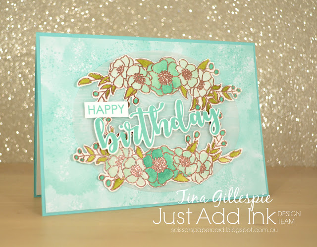
I decided to focus mostly on Coastal Cabana, with just a few Pear Pizzazz and Whisper White highlights. I started by heat embossing the sprays from Bloom and Grow using Copper Embossing Powder. I bent the stamp a little before I stamped so that it would fit around the oval better. It's very hard to see, but there is a vellum oval, dry embossed with the Pinewood Planks folder under the flowers and sentiment! The flowers were then watercoloured. I started with the middle flower, and worked my way out, diluting the ink more for each flower.
The sentiment is from Uniquely Creative, and it's called Sweet Sentiments Builder. I love that some of the words in the set have matching dies - it makes my life a little easier! I layered everything onto a base of Coastal Cabana DSP from the Follow Your Art pack. I wanted something with a bit of variation in the colour, not just a flat piece of blue.
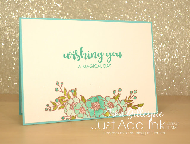
The inside was stamped and coloured the same way as the front. I often use Shimmery White cardstock when I am watercolouring, as it's more cost effective than watercolour paper and it handles the water very well.
That's it for me - why not pop on over to the Just Add Ink blog, where you can see the rest of the Design Team cards and link up your own for the challenge. I think you'll like this colour combo!
Bye for now,
Tina
Wednesday, 16 October 2019
AWH HOC Week 9
Hi!
Welcome once again tot he Art With Heart team's Heart Of Christmas Blog Share. We are rapidly approaching the time to start sending out Christmas cards, ad I am grateful that I have quite the stash already, thanks to the Heart Of Christmas.
I had a lot going on this week, so quick and easy was the order of the day! The stunning Brightly Gleaming SDSP makes quick, easy and fabulous cards so easily! I used the hostess set, Greatest Part Of Christmas. I love a big sentiment that does most of the work for you.
I wanted a bit of extra somethin' somethin' on my card, so I die cut the starry swirl from Stitched Stars from Copper Foil. I chopped it in half and adhered it to my card front so that it stretched from corner to corner. A layered Copper and Navy star finished the front of the card.
The starry swirl die has five star shapes included in the design. They are great for using on the inside of cards to add extra detail. They are perfect for clustering around the inside sentiment, don't you think? I'd rather use them than have them floating around forever on my craft desk, that's for sure!
Time now to pop on over to Claire's Blog, where you'll find the rest of this week's Heart Of Christmas cards.
Bye for now,
Tina
Bye for now,
Tina
Sunday, 13 October 2019
CTC #250: CASE A Layout
Hi!
Welcome to the CASEing The Catty Sunday Challenge Blog Hop! Have you arrived here from Rebecca's blog, or are you just starting here? Either way is totally OK, just keep on hopping until you get back to where you started.
This week Rebecca has selected a page from the Holiday Catalogue for us to CASE a layout. You can choose any of the cards and make another based on the design of the card. Which one catches your eye?
The feathery Pretty Peacock card at the bottom right of the page caught my eye. I nearly pulled out my Friends Of A Feather Paper Pumpkin kit, but then I remembered that there was some DSP in the Bird Ballad DSP that had a similar look as the DSP on the catalogue card, with a white design on a coloured background.
So in the end I did use a Paper Pumpkin kit, but it was the Hug From Shelli kit. I stamped the sprig of flowers around my Pretty Peacock card base in matching ink, and then a few in Memento to pop under the label. These I coloured with my Watercolour Pencils and Wink Of Stella.
The label was also from the PP kit, and it was stamped with the Happy Birthday from Magnolia Blooms. I layered some of the twine from the PP kit under the label as a nod to the original card.
I had a few extra coloured sprigs, so they went on the inside. Such an abundance of flowers, I love it!
That's it from me, so it's nearly time to hop on over to the next blog. Don't forget to check out our Facebook group, where you can see everyone's cards for the weekly challenges and add your own. You don't need a blog or fancy equipment, just snap a nice picture of your card and add it to the group. Too easy!
Don't forget to complete the hop first though! Next you're off to see what the wonderful Shannon has created.
Bye for now,
Tina
Subscribe to:
Posts (Atom)


