Hi!
Welcome to another week of the Art With Heart's Heart Of Christmas Blog Share. We are up to Week 10 - double digits! I was a bit time poor this week, so I chose to CASE this card by Brian King. His card isn't a Christmas card, but it was super easy to change it to be suitable for Christmas.
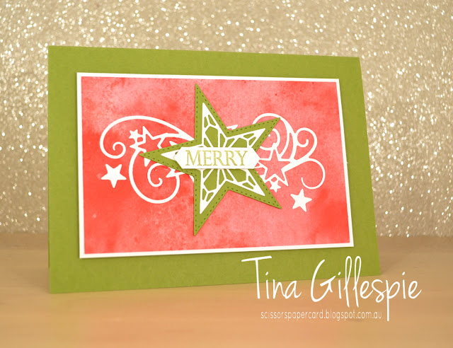
I loved his card so much that I didn't actually make many changes. The sentiment, obviously, as his wasn't Christmassy. I also added some of the stars that are part of the swirly die to the front of the card. No point in wasting them!
It is *super* hard to see, as they are white on white, but I added the other three stars to the inside, around the sentiment from Merry Christmas To All.
I made this card to use as a class sample, as I thought my ladies would like it. A few of them prefer a more traditional colour scheme, so I also made a sample in red and green. On both cards, the DSP is from the See A Silhouette pack - the variation in colour is so pretty on the background, don't you think?
This card was essentially the same as the first card, just a few minor changes. The stars on the front are in slightly different positions, and the Merry sentiment was double punched to make the sentiment shorter.
Which do you prefer?
Once you've decided, pop on over to Claire's Blog where you can find the rest of this week's links.
Bye for now,
Tina


Great cards Tina. I actually thought that background paper was an ink technique. Looks great. Thanks for playing along in week 10 of Heart of Christmas.
ReplyDeleteLove your cards Tina. Simply gorgeous 💖
ReplyDeleteLove the clean lines of your cards,Tina. The background DSP works really well with the stars.
ReplyDeleteGreat cards Tina, those swirls add the perfect touch of fancy to your cards.
ReplyDeleteGreat cards, Tina! Very clever to use the DSP to add interest - it looks like you've inked it yourself!
ReplyDeleteHow great are these cards Tina and the DSP is just fantastic for them as well.
ReplyDeleteLovely cards Tina, I like the green one, but that's because green is my favourite colour.
ReplyDeleteI love the modern, contemporary look to the cards Tina with your colour choices. I agree with Judy's comment that the background works really well with the stars.
ReplyDeleteBeautiful cards Tina. I love your ‘play on’ traditional Christmas colours.
ReplyDelete