Hi!
Sob! it's Sunday, which means the school holidays are over, but ti also means it's time for this week's CASEing The Catty Sunday Challenge Blog Hop. Yay! You may have arrived here from Siobhan's blog, or just starting here. It really doesn't matter, just keep hopping 'til you get back to where you started.
This week we are CASEing layouts from the Occasions Catalogue. What does this mean? Simply take a card you like and make a new one based on the placement of all of the elements on the card. Easy!
I decided to CASE the front of the catalogue, treating it like a big card.
I started by using my Stamparatus to create the wreath of flowers on the base. It was a little tricky, as I stamped the Bike Ride image six times (because there are 6 cards on the cover!), but I got it first go! I only used the Stamparatus to stamp the outline, and then the flowers and leaves were stamped by hand.
The punched flowers were created using the Bitty Blooms Punch pack, but I also threw in a few leaves stamped with a leaf from Happy Birthday Gorgeous. After I'd assembled the card I added a scattering of copper sequins to represent the butterflies on the cover.
It wasn't until I was editing these photos that I realised how vintage the colour scheme is. I used Grapefruit Grove, Pear Pizzazz and Soft Suede. I think nearly every kitchen had crockery or bakeware in these colours in the 70's!
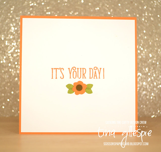
I couldn't resist adding another little flower on the inside!
Hopefully I'll see you over in our Facebook group, where you can add your CASEd Layout card to the challenge.
Before you go, though, don't forget to complete the hop! Next up is the lovely Julia.


Too cute in the retro colours. Everything old is new again! Bike Ride has provided some of my favourite wreaths and yours is particularly pretty. Love your inspiration!
ReplyDeleteI remember the pottery dinnerware that was so like this! What a lovely memory. Love the stamped circle! Gorgeous card.
ReplyDeleteGorgeous card, and a great idea to Case the front cover. I love the way you created the wreath using the Stamparatus - so clever.
ReplyDeleteSuch a cool CASE, Tina. A great idea! I'm super impressed with the precise stamping. And you're right, the colours remind me of vintage crockery, too!
ReplyDeleteWhat a clever idea to case the layout of the cover. It looks great!
ReplyDeleteWow Tina this is such a clever CASE. I love the retro colours and the copper sequins work perfectly.
ReplyDeleteOh, what a great layout to case!! I love your wreath!!
ReplyDelete