Welcome to June's Art With Heart Blog Hop!
This month, Ros has asked us to CASE a card from the new Annual Catalogue. Do you ever CASE? It's a great way to kick start your creativity when you feel like you've lost your mojo. I also sometimes CASE when I have a new stamp set and I'm a bit stumped on how to use it.
So what is a CASE? It can mean Copy And Share Everything, or Copy And Selectively Edit. Doesn't matter which you pick - it just means you've made a card that was directly inspired by another. Of course, you should always give credit to the original! I've chosen the card at the bottom left of the picture on page 157 to CASE today, and I've made two versions.
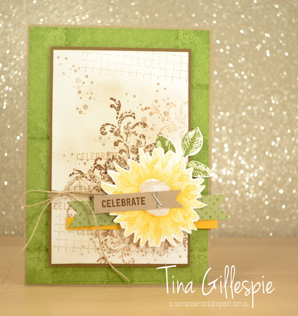
If you have your Annual Catalogue handy and have flicked to page 157, you can see that my first card is a pretty direct CASE of the card I chose. I've used all of the same stamp sets, inks and colours - there isn't a lot that I've changed.
In this picture, you can see my two changes - I've used staples instead of stitching (I was feeling a bit too lazy to get out my sewing machine!), and I've used a stamped Pear Pizzazz flag instead of Pear Pizzazz DSP. That was simply because I don't have any current Pear Pizzazz DSP. Otherwise, the card is as close of a CASE as I could make it.
I had to imagine what the inside would look like, as it's rare that the insides are shown in the Catalogue. I just went with similar stamping to the background on the front.
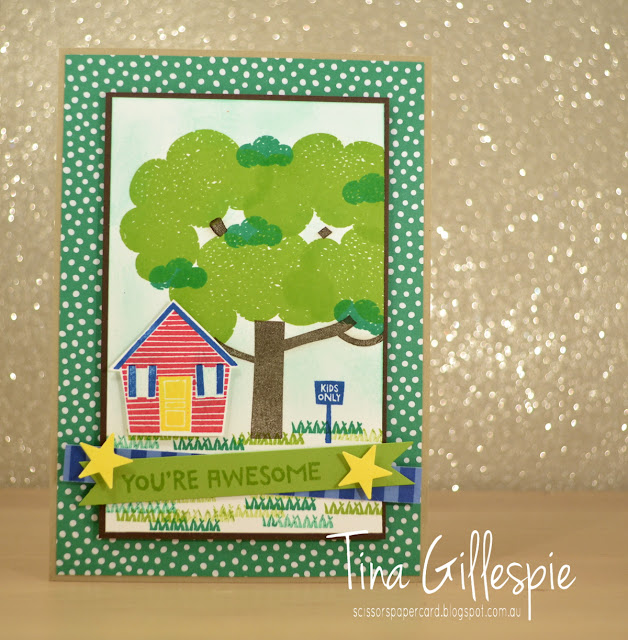
Next, I decided to CASE the same card, but to make it completely different. I started by selecting a different stamp set. I recently got Treehouse Adventure, so I pulled it out for a play. My first effort went in the bin, but I was much happier with the second!
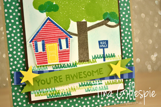
Like the first card, I've used a Crumb Cake card base. I've kept the green background, but this time I've used some Call Me Clover DSP. As I was making a kid's card, I elected to go with bright colours. Once again, my main panel is matted in a dark brown, but this time I've used Early Espresso rather than Soft Suede. The tree and grass replaces the grungy stamping on the first card, but I've used different shades of the one colour (green/brown) on each card, stamping off at times both.
You can easily see on this card, I've flipped some of the elements. The treehouse replaces the sunflower, but now it's on the opposite side of the card. I had no intention to do so, but in stamping the grass I managed to get an ink smudge in a bad spot, so the house had to hide it. I've not used twine on this card, and the banner elements are different, but still in a similar position.
I couldn't resist adding the house in again on the inside!
So there you have it - two cards that CASE the one card, but both are very different!
That's it from me, now you're hopping back to the start, as I'm last on the list. Top of this list this month is the fabulous Catherine Proctor.
If you find a broken link or have come to this blog hop from a different entry point, you can view the participants below:
Bye for now,
Tina


I pinned both your cards Tina. The sunflower is gorgeous and I haven't really given it much of a look in the catalogue yet. As for Treehouse, that is such a cute card you've made.
ReplyDeleteGreat idea casing the one card in two different ways. Thanks for taking part in the CASE the catalogue blog hop.
ReplyDeleteWow, now that is a great showcase of Casing the catalogue with two very different cards and I love them both!
ReplyDeleteOh wow! Casing the card in two ways and they are completely different too! They are both fantastic.
ReplyDeleteThese are both great cards Tina! You've really made me take a second look at the treehouse stamp set.
ReplyDeleteLove these, and love how you did two different ways
ReplyDeleteLove your cards Tina! I really like the rustic look of the staples on the sentiment attached to the sunflower card - great idea! And WOW, I LOVE your second card. It's so bright and fun, my favourite if pushed to choose.
ReplyDeleteYou definitely did justice to the CASEing of the first card, it's amazing! - I swear even the bows are the same!! Love the second one too. It's very well-made and changed my idea about that stamp set ha ha!
ReplyDeleteHow cute is that tree-house stamp set! Thanks for sharing such a cute sample!
ReplyDelete