Hi!
Woot woot for Friday - it's been a long week this week! It's so close to the weekend, and I can't wait. In the meantime, let's get stuck into the new Just Add Ink challenge. This week Jan has designed this awesome sketch to work with.
I'm usually very literal with sketches - why reinvent the wheel if someone else has done the hard work? This time, though, I took a few liberties.
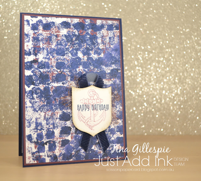
This card was made a few weeks ago, so it has a bit of a mix of old and new products. The new are now available, with the new Annual Catalogue going live today. Yay! The DSP I have used is from the new Tranquil Textures DSP pack. It's designed to coordinate with the Tranquil Textures suite, which is a very ocean themed suite. I'm not mad on the ocean stuff, but I love the grungy, textured paper in the pack. It's an awesome way to get the look without having to make any mess!
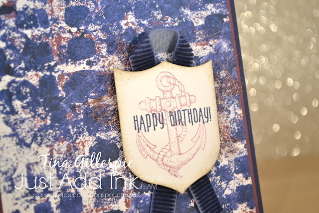
Instead of the heart shaped element, I used some Copper Trim. I cut a length around 12cm, threaded it onto my thumb and then cut along the tube to open it up flat. I then teased it out to make a flat net, which was adhered under the sentiment panel. I probably should have cut a longer piece so that it stuck out a little more, but it's very hard to tell how big the piece will end up when its still in ribbon form.
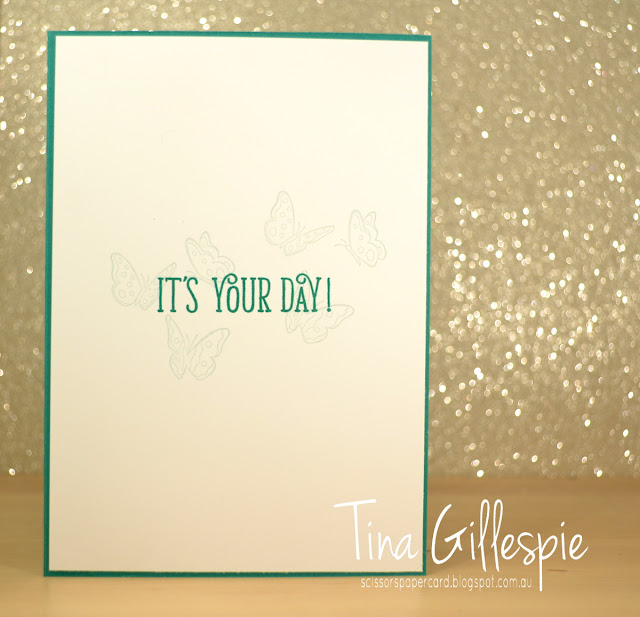
The anchors are from the now retired Guy Greetings, stamped in Fresh Fig to match the colours in the DSP. I stamped off the one on the front, but the one on the inside is full strength. The sentiments are from Picture Perfect Birthday.
The Design Team have done an awesome job with Jan's sketch this week. Pop on over to the Just Add Ink blog to check it all out and to link up your card. See you there!'
Bye for now,
Tina
Thursday, 31 May 2018
Wednesday, 30 May 2018
Some Last Goodbyes
Hi!
One last double post with cards made with retiring products!
My first card today is a CASE of this card by Karina Chin. There are a few differences - I used a different colour card base and top panel, and I left off the scalloped circle layer. I also placed my sentiment in a different spot. I also used a greater range of colours from the Naturally Eclectic DSP to colour my butterflies.
I love how the butterflies looks if they are in motion - they really give life to the card. Fussy cutting and popping some of them up on Dimensionals really adds to the look.
Can you see that I stamped them again on the inside, in Soft Sky ink so that they are a lovely, subtle background for the sentiment?
My second card is also a CASE, this time it's one of the cards in this post by Kate Morgan. I changed the proportions of the Petal Garden DSP pieces a little, used a different ribbon and made my sentiment panel a little fancier. Oh, and I used a different base card colour.
The flower is from the Better Together stamp set. Would you believe it's the only rose stamp I own? I coloured it with my Calypso Coral and Old Olive Blends. Did you know that the Doilies are retiring? They are being replaced by a gorgeous pearlised doily, which is so pretty!
I used a couple of off cuts to finish off the inside. The DSP comes in a 6x6 inch stack, so I seem to end up with lots of little strips of DSP. The best way to use them is on the inside!
Bye for now,
Tina
Monday, 28 May 2018
Saying Goodbye to Wisteria Wonder
Hi!
Wisteria Wonder is one of the colours that has been cut from the range of Stampin' Up! colours starting next month. It's been a purple I've liked using, as it's a lovely, soft colour. Having said this, I'm pretty excited about the new purples, as are the purple lovers that have been begging for a 'true' purple for many years!
The first card today is a CASE of a tag in the soon to be finished Annual Catalogue. You can see it on page 76, smack bang in the centre of the page. It's the tag on the Foil frenzy gift box.
I kept the tag essentially the same. I had to use an oval as the base as I didn't own the Lots Of Labels Framelits set at the time that I made this card. I also used the flowers and leaves from Happy Birthday Gorgeous. They frame the Happy Birthday diecut so well!
Hmm, thinking back, I don't use the flowers in this set anywhere as much as I should!
My second card pairs Wisteria Wonder with the Delightful Daisy DSP and the Cat punch. I haven't used the punch much, but it has carried over to the new Annual Catalogue, so I've got another yer at least to remedy that!
Teeny Tiny Sentiments is another retiring set that I didn't use much, but it was very handy to have on hand. It contains a HUGE range of sentiments that cover nearly every occasion you could think of, and because they are so small you can fit them anywhere on a card.
I gave this card to my Mother-In-Law for Mother's Day. She loves cats, so it was very fitting for her.
Bye for now,
Tina
Saturday, 26 May 2018
Butterfly Basics No Longer
Hi!
I'm squeezing in an extra blog post this week so that I can show you some more cards that use very soon to be retired products. As is usual lately, I have two cards for you today. This pair both use the retiring Butterfly Basics stamp set. There were a lot of shocked people when they realised all of the current butterfly stamps and dies were being retired, me included. After a little thought though, I was OK with it, as it means new stuff, and the new butterfly die is gorgeous! Time for a change!
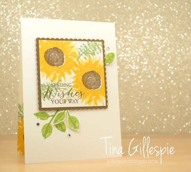
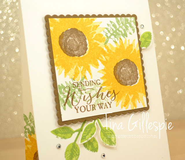
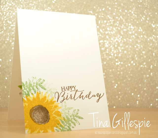
On to today's cards! The first card is a CASE of this card by Jenny Hall. I had a request from one of my class ladies to do it in a class, and I was happy to comply. There's not much I changed, apart from locating my main panel a bit higher on the card, and using the sentiment from Butterfly Basics instead of from Painted Harvest.
Sadly, the Painted Harvest set I used was faulty, so the detail isn't visible in the sunflower petals. Thankfully Stampin' Up! replaced the set with a brand new copy that wasn't faulty.
I also did a different inside to Jenny's card - it was a great excuse to stamp the sunflower again!
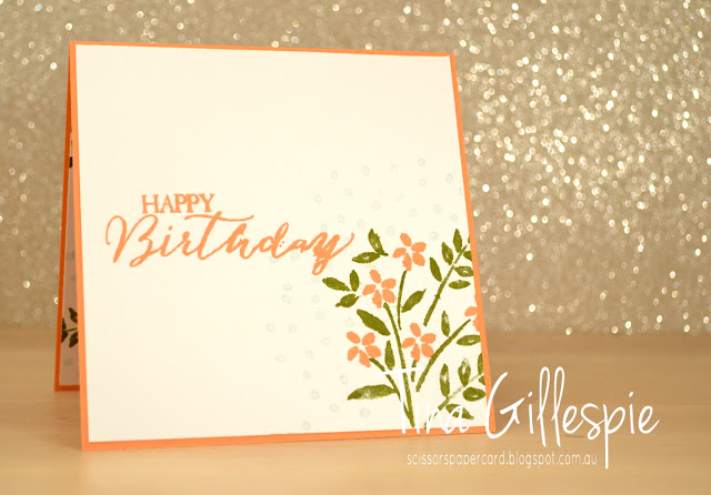
This second card was also a class card, designed to show my ladies how to do the wreath technique on the Stamparatus. We used the leaves and flowers from the also retiring Number Of Years stamp set. Can you see a new colour on the card? Grapefruit Grove is an early favourite from the batch of new In Colours.
It's a little easier to see in this photo that I used Soft Sky (retiring) to stamp some scattered dots in the gaps between the leaves. It's a subtle effect, but helps to reduce the stark look of the blank space.
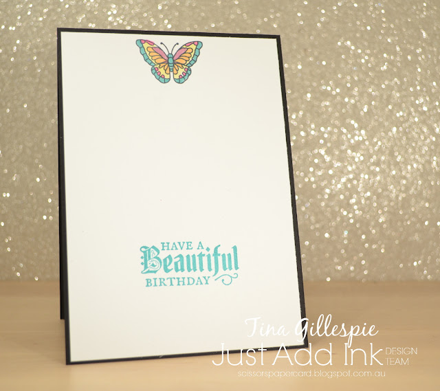
I really love the mix of fonts in the Butterfly Basics sentiments, especially the script font. It's so deliciously like old fashioned hand writing.
Bye for now,
Tina
Thursday, 24 May 2018
JAI #410: Just Add Inspiration
Hi!
Welcome back to a new Just Add Ink challenge. This week Jo has found an Inspiration photo for us to work with.
I must admit that I really struggled with this one. It's such an explosion of colour! In the end, I decided to use all of the colours, but in much smaller doses. That got the creativity flowing!
I chose a square piece of the new Graceful Glass Designer Vellum and coloured it with my Blends markers. I went with a square to match with the squares in the side table. I chose pink, yellow, orange and aqua markers to go with the pom pom garland on the wall.
The vellum piece is actually a window in the card. I took this photo with a battery operated tea light inside the card to show you how the light shines through. It's so pretty in real life - very hard to capture in a photograph.
I used the coordinating Painted Glass stamp set to finish off the inside. I deliberately didn't stamp where the window sat so that when the card was closed it has a white backing. It makes the stained glass effect so much nicer.
The Design Team have had a fun time with this Inspiration Challenge. You can see their gorgeous cards over at the Just Add Ink blog, where you can link up your card.
Bye for now,
Tina
AWH Blog Hop: In Colours
Hi!
Tonight the Art With Heart team are sharing creative projects featuring an “In Colour” theme. Check out the new 2018 - 2020 In Colours and let's not forget the current 2017 - 2019 In Colours, or the outgoing 2016 - 2018 set. If you would like a copy of the 2018-2019 Annual Catalogue, contact any of the girls on the blog hop and we will get in touch with you.
I decided to do a bit of a colour sampler with the three sets of In Colours and to achieve this, I ended up making 4 cards for tonight's hop. I started by grouping the In Colours by colour rather than by year group.
The first card showcases the oranges/corals. From bottom to top the colours are Flirty Flamingo, Grapefruit Grove and then Peekaboo Peach. I was inspired to make this card after I saw this card by Kristin Kortonick. I used her idea, but ended up slanting the spread of squares more to the right than she did.
I kept the inside fairly simple, as I was really over cutting tiny squares by the time I got to the inside!
Next, I moved onto the pinks. As I said, I was over cutting squares, so I decided to do something a little different, but still similar, on this card.
The colours on this card are, from the bottom, Fresh Fig, Berry Burst, Sweet Sugarplum and Powder Pink. I simply cut strips of cardstock that were 1/2" thick and adhered them to the card base in varying lengths. The first and last strip are just over half the width of the rest - I needed to do this so that I cold have three strips of each colour.
I had some off cuts after finishing the front, so I kept them to using on the inside. Waste not, want not! The card was inspired by a demonstrator called Karen Cate. She shared a card that used thin strips of card as a way of using up her scraps. Unfortunately she doesn't have a blog, so I can't link to her card.
Next was the greens! There were five colours in this group (the biggest), so I decided to stamp the colours instead of using cardstock. From bottom to top they are Tranquil Tide, Call Me Clover, Emerald Envy, Lemon Lime Twist and Pineapple Punch. I decided to sneak the Pineapple Punch into this card, as Lemon Lime Twist provides a lovely 'bridge' between green and yellow.
I reminded myself the hard way while making this card that it's always best to stamp from lightest colour to darkest. Even when you think your stamp may be clean, maybe it's not quite clean! Oops.
Last comes the blues. I cheated a little on this card, as there are only two blues in the three groups of In Colours. To make up for it I added an extra two from the list of retiring colours. So from bottom to top I used Blueberry Bushel, Dapper Denim, Marina Mist and Soft Sky.
So there you have it, I managed to fit all but one of the 15 In Colours on my cards. Can you think which one I missed? For the life of me, I could not make it 'fit' into any of the colour groups I used on my cards.
Now it’s time to hop on over to our next participant, the very talented, Rebecca.
Bye for now,
Tina
Tonight the Art With Heart team are sharing creative projects featuring an “In Colour” theme. Check out the new 2018 - 2020 In Colours and let's not forget the current 2017 - 2019 In Colours, or the outgoing 2016 - 2018 set. If you would like a copy of the 2018-2019 Annual Catalogue, contact any of the girls on the blog hop and we will get in touch with you.
I decided to do a bit of a colour sampler with the three sets of In Colours and to achieve this, I ended up making 4 cards for tonight's hop. I started by grouping the In Colours by colour rather than by year group.
The first card showcases the oranges/corals. From bottom to top the colours are Flirty Flamingo, Grapefruit Grove and then Peekaboo Peach. I was inspired to make this card after I saw this card by Kristin Kortonick. I used her idea, but ended up slanting the spread of squares more to the right than she did.
I kept the inside fairly simple, as I was really over cutting tiny squares by the time I got to the inside!
Next, I moved onto the pinks. As I said, I was over cutting squares, so I decided to do something a little different, but still similar, on this card.
The colours on this card are, from the bottom, Fresh Fig, Berry Burst, Sweet Sugarplum and Powder Pink. I simply cut strips of cardstock that were 1/2" thick and adhered them to the card base in varying lengths. The first and last strip are just over half the width of the rest - I needed to do this so that I cold have three strips of each colour.
I had some off cuts after finishing the front, so I kept them to using on the inside. Waste not, want not! The card was inspired by a demonstrator called Karen Cate. She shared a card that used thin strips of card as a way of using up her scraps. Unfortunately she doesn't have a blog, so I can't link to her card.
Next was the greens! There were five colours in this group (the biggest), so I decided to stamp the colours instead of using cardstock. From bottom to top they are Tranquil Tide, Call Me Clover, Emerald Envy, Lemon Lime Twist and Pineapple Punch. I decided to sneak the Pineapple Punch into this card, as Lemon Lime Twist provides a lovely 'bridge' between green and yellow.
I reminded myself the hard way while making this card that it's always best to stamp from lightest colour to darkest. Even when you think your stamp may be clean, maybe it's not quite clean! Oops.
Last comes the blues. I cheated a little on this card, as there are only two blues in the three groups of In Colours. To make up for it I added an extra two from the list of retiring colours. So from bottom to top I used Blueberry Bushel, Dapper Denim, Marina Mist and Soft Sky.
So there you have it, I managed to fit all but one of the 15 In Colours on my cards. Can you think which one I missed? For the life of me, I could not make it 'fit' into any of the colour groups I used on my cards.
Now it’s time to hop on over to our next participant, the very talented, Rebecca.
If you find a broken link or have come to this blog hop from a different entry point, you can view the participants below:
Tina
Wednesday, 23 May 2018
Goodbye, Tranquil Tulips
Hi!
I have another pair of cards for you today, both made using the Tranquil Tulips Hostess stamp set. I think that it's been one of my biggest sellers this year! It's such a gorgeous set, and it's so easy use.
This first card was my own design, and was made for a class during 2017. It's taken me a while to blog it! Looking at it now, I think just about everything I used on it is retiring! The DSP (Naturally Eclectic), sentiment (Milestone Moments), ribbon (Night Of Navy Crinkled Seam Binding) and dies (Lots of Labels Framelits) are all going alongside Tranquil Tulips. I can't recall what colour I stamped the tulips, but the stems and leaves are in Emerald Envy, and that's going too!
I particularly loved the Crinkled Seam binding, mostly because it's so soft and easy to use. If you tied a bow you weren't happy with it was easy to start again - what's a little more crinkle in an already crinkled ribbon?
I just loved how easy it was to make cards look great with the set. The trio of stems gave the perfect placement for the flowers, making them look awesome every time.
My second card was a more recent class card that was a CASE of this card by Wendy Aungst. Wendy's card was for Easter, but I liked it as a Sympathy card. I used the retiring Thoughts And Prayers for the sentiments. I thought that was a stamp set that would never retire!
I didn't change much else from Wendy's card. I used a different sheet of DSP from the retiring Delightful Daisy pack, and also a different ribbon. I used the Whisper White Organza from the Occasions Catalogue. It's another fabulous ribbon that I will miss! I may need to stock up before it retires.
Bye for now,
Tina
Monday, 21 May 2018
A Belated Farewell to Springtime Foils
Hi!
Today I have tow very different cards for you that feature the gorgeous Springtime Foils SDSP from the recent Sale-A-Bration promotion. I took a little longer than everyone else falling in love with these papers, so I didn't really use them much until they'd already retired.
This first card I made as a class sample to demonstrate the technique that was all the rage earlier this year. I can't recall what it was called, but you basically cut a slot in the front of the card so that the butterfly (which was adhered to the inside of the card) could pop through the slot. I teamed the Foils DSO with Berry Burst and some plain Gold Foil. Such a luxe combo!
After the class, I remade this card and gave it to my mum for her recent milestone birthday. I wish I'd taken a photo before I mailed it! I added a half circle under the 'celebrate' punchie and added the appropriate numbers. I won't reveal her age, but she looks young for it!
Here's a look at the side of the card so you can see how the butterfly pops through the card.
And the inside. I love how the butterfly does most of the work for both the inside and outside of the card!
My second card also uses the Springtime Foils SDSP. Funnily enough, I used the same sheet of paper but got a very different look!
My sister was invited to a wedding and asked me to make a card for her that wasn't 'girly'. She sent me through a pic of the invite, which was black with metallic leaves on it. Straight away I thought of this DSP. I coloured it black by rubbing my Memento ink pad over the paper and then buffing it with some paper towel to remove the ink from the foil part of the design. I repeated this process about 4 times until I was happy with the black. It looked too grey to start with! Just a tip - you can't use a permanent ink like Archival Black for this technique, as it won't buff off of the foil.
I matted the piece on Gold Foil to add some extra luxe to the card. I used Vellum to go under the sentiment so that I didn't lose too much of the gorgeous black foil pattern underneath.
Isn't this sentiment great for a wedding card? I combined two stamps from Beautiful Bouquet and added some tiny gold hearts to help tie in the front of the card. They were punched from the Cookie Cutter punch.
So there you go, two different cards using the gorgeous Springtime Foils DSP. Even though it's retired, I hope I've given you some new inspiration for using it.
Bye for now,
Tina
Subscribe to:
Comments (Atom)


