Hi!
Thanks for joining me for a new week of Just Add Ink. This week Di has given us a soft, beautiful palette to work with.
Aren't they pretty? They immediately spoke 'baby card' to me, but with no babies on my horizon, and a distinct lack of time this week, I went super quick and simple, and made what could be a masculine card.
I copied the idea of the stripes from another demo, who had used her Stampin' Blends to colour the white stripes on her Golden Honey DSP. She used a rather bold colour combo, but I think this one works well too. I used my Dark Petal Pink and Soft Sea Foam marker, with my Light Smokey Slate. It was very quick and easy to colour each stripe.
Because I was aiming for a masculine look, I kept the sentiment simple. I loved this big greeting from Bloom and Grow. The non-fussy font filled the Stitched So Sweetly die cut perfectly. To give it a little more oomph, I cut a Stitched Rectangle in Soft Sea Foam and snipped it to just show in the corners of the main shape. A subtle effect, but I quite like it!
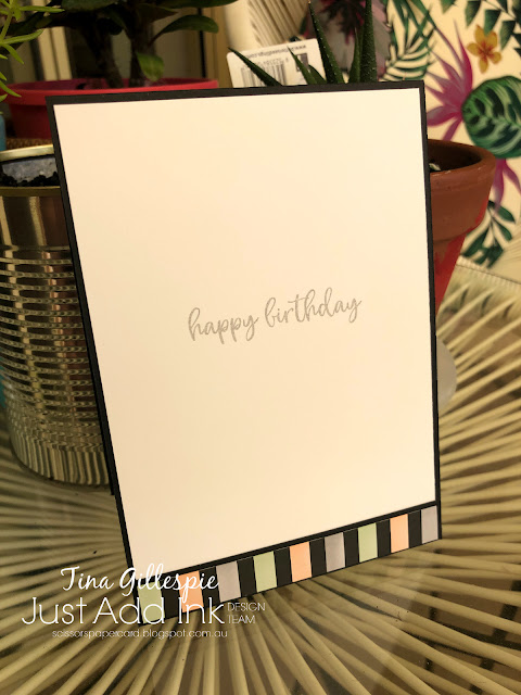
The inside is just another scrap of the Golden Honey DSP coloured to match the front. The sentiment comes from Music From The Heart.
The Design Team have created some gorgeous cards this week using these colours, so please do pop on over to the Just Add Ink blog to see their work. You can also link up your card made using the colours. Where do they take you?
Bye for now,
Tina
Thursday, 27 February 2020
AWH February Blog Hop: Masculine Cards
Hi!
I've been wanting to try some no-line colouring with my Stampin' Blends, and this Showcase seemed like a great opportunity to do so. A Good Man was the best stamp set to colour, so that's the set I reached for. Tonight's post is a little photo heavy, but I wanted to show you the main steps.
I started by using my Stamparatus to stamp the image in Blushing Bride, stamped off twice before I stamped on my Thick Whisper White cardstock. I forgot to take a photo until I'd coloured the skin ares with Ivory and the hair and shoes with Soft Suede.
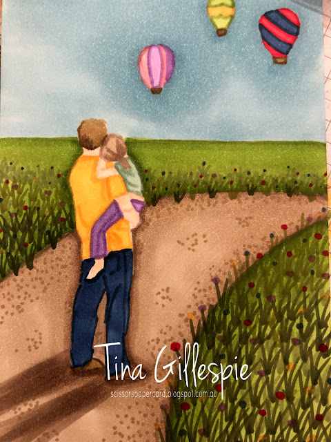
Here they are all finished! I used Night Of Navy for the jeans, Highland Heather for the pants, Mango Melody for his shirt, and Mint Macaron for her's. Her hair was Crumb Cake. Each area was outlined with the dark Blend and then coloured/blended with the light Blend. I also went over the shading lines in the stamped image with the dark Blend. It helped to have the stamp beside me to refer back to.
The next step was to think about the background and to draw some light pencil lines. I decided I wanted them to be on a path through a field of wild flowers. So sorry for the dodgy photos - they were taken on my phone at night, so not the best photography conditions!
I coloured the path using my Crumb Cake combo. I drew over the pencil line with the dark blend, and then used the light blend, colouring in a circular motion, to pull the colour into the rest of the path shape. I then used the dark blend to create the shadow. The grass was coloured using my Granny Apple Green Blends in a similar manner - dark along the edge, and then circular motion with the light to colour the rest.
The man and girl needed something to be gazing at, so I used some balloons from Above The Clouds. I think they work well. They were coloured using Poppy Parade, Night Of Navy, Granny Apple Green, Mango Melody, Flirty Flamingo, Highland Heather and Soft Suede. The sky was coloured din Balmy Blue in the same was as the path and grass.
At this stage, I got a bit of stage fright, and left the card until late the next day. I knew the next step was critical, and I was so frightened that I'd mess it up and ruin the whole card.
It was the wildflowers that I was scared of messing up, but once I got the courage to do it, I was thrilled with the outcome. I started at the bottom of the grass area and, using a flicking motion with the bullet nib of my dark Mossy Meadow Blend, I drew a heap of lines, designed to look like clumps go longer grass. As I got further up the card, I switched to my dark Old Olive Blend, and then my light Mossy Meadow, and finally the light Old Olive. I faded them out to the top of the grass section on the right, but mid way on the left section. I wanted them to blur out, like they would on a real landscape.
To create the flowers, I just added dots of colour using my dark Night Of Navy, Highland Heather, Mango Melody and Poppy Parade Blends. I made the dots larger at the bottom of the card, and they get smaller as they move towards the top of the card. You can also see that I added some pebbles on the path using the bullet tip of my dark Crumb Cake Blend.
Here's the finished card, finally! I hope it was worth the wait! I didn't want to cover too much of the front, so I just used a short sentiment and the Classic Label punch. I love the way the variation in the sky looks a little like a storm is coming in.
To create the inside, I just stamped the main image again, but in Mossy Meadow. It was still on the Stamparatus, so it lines up with the same image on the front! I decided to stamp the more generic 'it's your day' on the inside, so that I can use this for either a birthday or even Father's Day.
Thanks for sticking with me to the end, now you're off to see what the wonderful Vicki Boucher has created.
Bye for now,
Tina
Welcome to another Creative Showcase with the Art With Heart Team. This month we are featuring Masculine themed projects. We have many masculine themed products in the Stampin’ Up! range including Stamp Sets and coordinating Dies, Designer Series Papers, Embellishments and Embossing Folders. The Art With Heart Team have a wonderful selection of projects to inspire you to create Masculine Masterpieces.
I've been wanting to try some no-line colouring with my Stampin' Blends, and this Showcase seemed like a great opportunity to do so. A Good Man was the best stamp set to colour, so that's the set I reached for. Tonight's post is a little photo heavy, but I wanted to show you the main steps.
I started by using my Stamparatus to stamp the image in Blushing Bride, stamped off twice before I stamped on my Thick Whisper White cardstock. I forgot to take a photo until I'd coloured the skin ares with Ivory and the hair and shoes with Soft Suede.
Here they are all finished! I used Night Of Navy for the jeans, Highland Heather for the pants, Mango Melody for his shirt, and Mint Macaron for her's. Her hair was Crumb Cake. Each area was outlined with the dark Blend and then coloured/blended with the light Blend. I also went over the shading lines in the stamped image with the dark Blend. It helped to have the stamp beside me to refer back to.
The next step was to think about the background and to draw some light pencil lines. I decided I wanted them to be on a path through a field of wild flowers. So sorry for the dodgy photos - they were taken on my phone at night, so not the best photography conditions!
I coloured the path using my Crumb Cake combo. I drew over the pencil line with the dark blend, and then used the light blend, colouring in a circular motion, to pull the colour into the rest of the path shape. I then used the dark blend to create the shadow. The grass was coloured using my Granny Apple Green Blends in a similar manner - dark along the edge, and then circular motion with the light to colour the rest.
The man and girl needed something to be gazing at, so I used some balloons from Above The Clouds. I think they work well. They were coloured using Poppy Parade, Night Of Navy, Granny Apple Green, Mango Melody, Flirty Flamingo, Highland Heather and Soft Suede. The sky was coloured din Balmy Blue in the same was as the path and grass.
At this stage, I got a bit of stage fright, and left the card until late the next day. I knew the next step was critical, and I was so frightened that I'd mess it up and ruin the whole card.
It was the wildflowers that I was scared of messing up, but once I got the courage to do it, I was thrilled with the outcome. I started at the bottom of the grass area and, using a flicking motion with the bullet nib of my dark Mossy Meadow Blend, I drew a heap of lines, designed to look like clumps go longer grass. As I got further up the card, I switched to my dark Old Olive Blend, and then my light Mossy Meadow, and finally the light Old Olive. I faded them out to the top of the grass section on the right, but mid way on the left section. I wanted them to blur out, like they would on a real landscape.
To create the flowers, I just added dots of colour using my dark Night Of Navy, Highland Heather, Mango Melody and Poppy Parade Blends. I made the dots larger at the bottom of the card, and they get smaller as they move towards the top of the card. You can also see that I added some pebbles on the path using the bullet tip of my dark Crumb Cake Blend.
Here's the finished card, finally! I hope it was worth the wait! I didn't want to cover too much of the front, so I just used a short sentiment and the Classic Label punch. I love the way the variation in the sky looks a little like a storm is coming in.
To create the inside, I just stamped the main image again, but in Mossy Meadow. It was still on the Stamparatus, so it lines up with the same image on the front! I decided to stamp the more generic 'it's your day' on the inside, so that I can use this for either a birthday or even Father's Day.
Thanks for sticking with me to the end, now you're off to see what the wonderful Vicki Boucher has created.
Bye for now,
Tina
If you have a broken link or have come to this blog hop midway, you can view all the participants below:
Labels:
A Good Man,
Above The Clouds,
Art With Heart,
Blog Hop,
Stampin' Blends,
Technique
Sunday, 23 February 2020
CTC #263 Week 2: CASE The Kerchief Colours
Hi!
Thanks for joining us on Week 2 of our CASE of the Kerchief Card Kit Colours blog hop. You may be arriving here from Rebecca's blog, or you may be starting here. Just keep going until you get back to where you started. Have you checked out the kit? It's got the sweetest floral design printed on the card bases!
Last week I made a card that used the Coastal Cabana card, and my natural inclination for this week was to use the Poppy Parade card. However, I had a lovely day stamping with Kathryn Mangelsdorf and Rachel Palmieri recently, and I was able to stamp some images from Kathryn's Above The Clouds stamp set. I thought it would be a great way to get lots of the colours onto one card!
I started with a Balmy Blue base that I used my Shimmery Embossing Paste and the cloud mask to create a sky. To make the clouds look fluffy, I slapped the flat side of my fat palette knife over the smooth paste. I learned this technique when making lemon meringue pie, as it makes lovely peaks in the meringue. Don't you love it when skills from one area translate to other areas of your life? LOL!
The hot air balloons were coloured using Poppy Parade, Night Of Navy, Balmy Blue, Pear Pizzazz, Soft Suede and Mossy Meadow. I was colouring them while watching a movie with my daughter, who was home sick from school. She told me that the top balloon looked like a strawberry, so I had to add the bunting to make it less strawberry-like!
I used my cloud mask with some Balmy Blue ink to create the scattering of clouds across the bottom. Although, now that I think about it, I probably should have put them at the top of the card. Oh well, maybe I'll just pretend that the balloon is floating above the clouds!
That's all from me for tonight. Our challenge is run through our Facebook group. You can see all of the Crew cards posted during the week, and you can also post your card to enter our challenge. You don't need a blog or fancy equipment, just snap a photo and add it with a description. Easy!
Before you go, please do continue on with the hop. Next up is my wonderful friend, Judy, who always has something spectacular to see!
Bye for now,
Tina
Thursday, 20 February 2020
JAI #493: Just Choose Two
Hi!
Welcome back to a new Just Add Ink challenge! This week Patrice has challenged us to Just Add Two to our creations. Which two? Any of these two:
Now, for some reason I became a little fixated on having felt on my card. I'm not quite sure why - maybe because, of the three, it's the one that I was least likely to have. Nothing like making it hard for myself! LOL! I was sure I had a felt Christmas ornament that SU retired a long time ago *somewhere* in my craft room. I never found it, but I did find some cheap sheets of felt in the kid's craft stash.
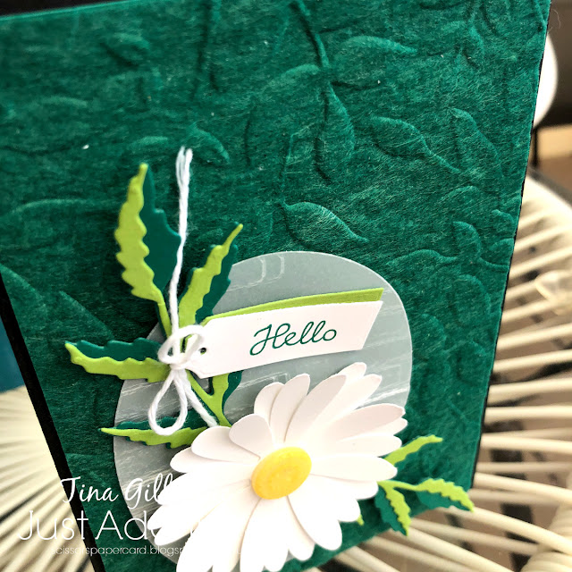
I trimmed some green felt and attached it to a piece of Shaded Spruce cardstock with TomBow glue. Before it dried, I ran it through my Big Shot with the Layered Leaves 3D Embossing Folder. I was quite impressed with how well it held the embossed design!
To finish the card, I layered a piece of vellum embossed with the Brick & Mortar 3D Embossing folder with some of the Poppy Moments leaves and a Large Daisy. The second of my Two items is a button, the centre of the daisy. I used a Medium Classy Designer Button, which retired a while ago, and coloured it with my dark Pineapple Punch Stampin' Blend to change the colour from vanilla to yellow.
The inside was finished off with a So Saffron daisy and a sentiment from Varied Vases.
So which two will you choose? You can check out what the Design Team chose over at the Just Add Ink blog, where you can also link up your Just Choose Two card.
Bye for now,
Tina
Sunday, 16 February 2020
CTC #263 Week 1: CASE The Kerchief Colours
Hi!
Hello, and welcome once again to the CASEing The Catty Sunday Challenge Blog Hop. I'm the first stop on this week's blog hop, so you may have come here from our Facebook group, or you may have come from Judy's blog. Either way, just keep hopping until you get back to where you started!
This fortnight we are CASEing the colours of the Kerchief Card Kit. There are a heap of colours (Balmy Blue, Coastal Cabana, Early Espresso, Gold, Mossy Meadow, Night of Navy, Petal Pink, Pear Pizzazz, Poppy Parade, White), so there are lots and lots of options. I recently received the card kit, and so I pulled it out to inspire some creativity. I naturally lean towards blues, so this week's cards focus on that side of the palette. I thought it would be pretty to punch some butterflies from the floral part of the card, and that naturally led to making a paid of Floating Frame cards.
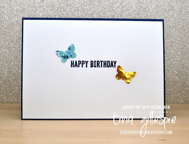
Have you tried your hand at Floating Frame cards yet? They were all the rage about a year ago, and I haven't made one for a while. I punched as many butterflies as I could from the front of the pre-stamped card. I was so right about the butterflies looking pretty in the floral print!
This first card features most of the butterflies. The Press 'n' Seal pulled off a bit of the top layer as I peeled it away, but I decide to just go with the distressed look to some of the butterflies. I cut a Stitched Circle and layered it under a Subtle embossed layer for my sentiment. The gaps in the front were filled with gold sequins.
A couple of spare butterflies were used to finish off the inside.
The second card uses the butterflies cut from the centre of the first card. A larger gold Stitched Circle layers underneath, and the background is embossed sing the Subtle 3D Embossing Folder. A Sentiment from Label Me Bold finished off the front of the card.
I had run out of Kerchief butterflies, so I used a gold one to complete the inside, LOL!
You have two weeks to get your card made and entered into our challenge. It's super easy - just photograph your card and post it to our Facebook group. Done!
Now it's time for you to hop on over to Michelle's blog. Au revoir 😉
Bye for now,
Tina
Thursday, 13 February 2020
JAI #492: Just Add A Sketch
Hi!
Hello, and welcome to the new Just Add Ink challenge! This week we have a sketch for you, designed by the lovely Jackie.
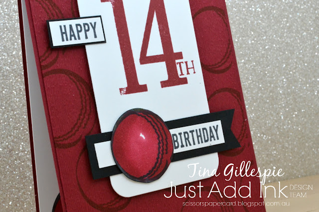
I used a long-retired SU stamp set, called Play Ball, as the main feature of the card. In case you couldn't guess, he's a keen cricket player, so the cricket ball was the perfect image for his card. There are so many different colour cricket balls, but in the end I settled on the deep red of a Test Match ball.
I stamped the ball all over the Cherry Cobbler cardstock in matching ink, and then ran the whole piece through my Big Shot with the Subtle Embossing Folder. I also stamped the ball in Memento ink so that I could colour it with my Cherry Cobbler Blends. I left one tiny spot of light to help give the impression of a round ball.
I repeated the ball on the inside, also coloured with my Cherry Cobbler Blends. I hope my nephew likes it!
The Design Team have had lots of fun with this sketch. You can see their cards over on the Just Add Ink blog, where you can also link up your card for this sketch challenge. See you there!
Bye for now,
Tina
Hello, and welcome to the new Just Add Ink challenge! This week we have a sketch for you, designed by the lovely Jackie.
There's so much that could be done with this sketch, don't you think? I have a nephew that turned 14 this month, and the sketch worked perfectly for the card I wanted to make for him.
I used a long-retired SU stamp set, called Play Ball, as the main feature of the card. In case you couldn't guess, he's a keen cricket player, so the cricket ball was the perfect image for his card. There are so many different colour cricket balls, but in the end I settled on the deep red of a Test Match ball.
I stamped the ball all over the Cherry Cobbler cardstock in matching ink, and then ran the whole piece through my Big Shot with the Subtle Embossing Folder. I also stamped the ball in Memento ink so that I could colour it with my Cherry Cobbler Blends. I left one tiny spot of light to help give the impression of a round ball.
I repeated the ball on the inside, also coloured with my Cherry Cobbler Blends. I hope my nephew likes it!
The Design Team have had lots of fun with this sketch. You can see their cards over on the Just Add Ink blog, where you can also link up your card for this sketch challenge. See you there!
Bye for now,
Tina
Sunday, 9 February 2020
CTC #262 Week 2: CASE The Koala Sketch
Hi!
Thanks for joining me from Julia's blog, or are you starting here? Either way, please do continue on with the CASEing The Catty Sunday Challenge Blog Hop until you've visited all of our blogs. You'll find the link to the next blog at the end of my post.
For this round, we are challenging you to CASE the layout of this cute Birthday Bonanza card. Here's the sketch we are using as the basis of our cards.
The technique uses a clear block, and inkpad and a spritzer. I gently pressed the clear block into my Coastal Cabana ink pad, misted it lightly with the spritzer, and then 'stamped' it onto my cardstock. I started with the middle rectangle, and then repeated the process to stamp the two outside rectangles. The stamping part can get a little messy, which adds to the look. To make it a bit more messy, I used my Aqua Painter to flick some more Coastal Cabana ink over the card front.
Once it was dry, I stamped the poppy outlines over the rectangles, making sure I went out of the lines. I then used my Bermuda Bay Stampin' Write Marker to add a rough outline to each rectangle, skipping over the poppies. A strip of Golden Honey SDSP, a few sequins, a sentiment from Label Me Bold, and another poppy/leaf cluster finished off the front of the card. After I finished I realised it's a very Port Power looking card! I don't follow the football, so it was very unintentional.
I used the larger poppy outline again for the inside. This time I used the coordinating filler stamp, stamped off, to colour the flower.
Our challenge is run through our Facebook Group, so you can pop on over there to upload your card. Tis is the second week of this challenge, so you only have a week left to get your card made and uploaded to the group.
For now though, please hop on over to see what Peta and Marvi have been getting up to!
Bye for now,
Tina
Thanks for joining me from Julia's blog, or are you starting here? Either way, please do continue on with the CASEing The Catty Sunday Challenge Blog Hop until you've visited all of our blogs. You'll find the link to the next blog at the end of my post.
For this round, we are challenging you to CASE the layout of this cute Birthday Bonanza card. Here's the sketch we are using as the basis of our cards.
I decided to use a technique, called stamped block background, to create the rectangle elements on my card.
The technique uses a clear block, and inkpad and a spritzer. I gently pressed the clear block into my Coastal Cabana ink pad, misted it lightly with the spritzer, and then 'stamped' it onto my cardstock. I started with the middle rectangle, and then repeated the process to stamp the two outside rectangles. The stamping part can get a little messy, which adds to the look. To make it a bit more messy, I used my Aqua Painter to flick some more Coastal Cabana ink over the card front.
Once it was dry, I stamped the poppy outlines over the rectangles, making sure I went out of the lines. I then used my Bermuda Bay Stampin' Write Marker to add a rough outline to each rectangle, skipping over the poppies. A strip of Golden Honey SDSP, a few sequins, a sentiment from Label Me Bold, and another poppy/leaf cluster finished off the front of the card. After I finished I realised it's a very Port Power looking card! I don't follow the football, so it was very unintentional.
I used the larger poppy outline again for the inside. This time I used the coordinating filler stamp, stamped off, to colour the flower.
Our challenge is run through our Facebook Group, so you can pop on over there to upload your card. Tis is the second week of this challenge, so you only have a week left to get your card made and uploaded to the group.
For now though, please hop on over to see what Peta and Marvi have been getting up to!
Bye for now,
Tina
Thursday, 6 February 2020
JAI #491: Just Add Inspiration
Hi!
Thanks for joining me for the new Just Add Ink challenge. This week Nikki has given us a tropical Inspiration Photo to work with.
Doesn't that look so pretty? If it weren't for the sand, I could quite happily relax on those cushions for hours.
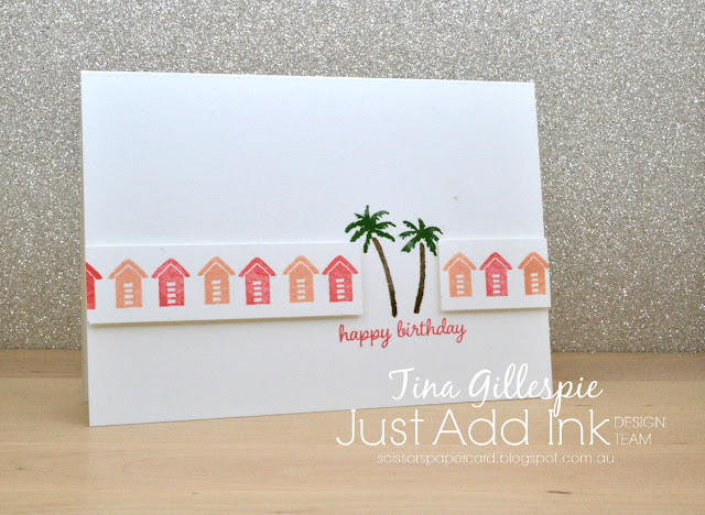
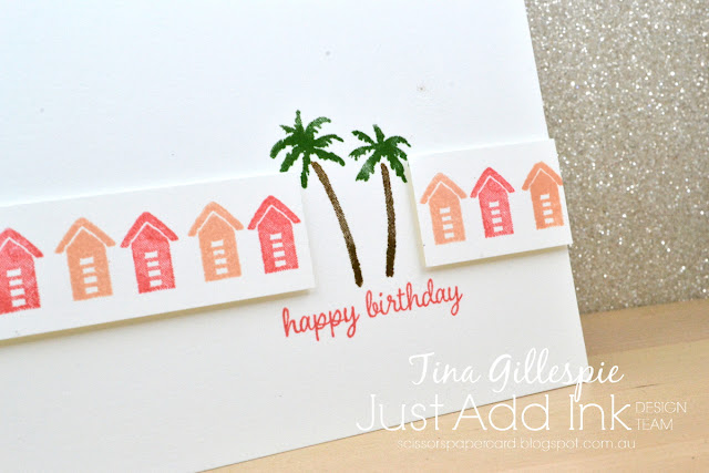
I decided to go for a clean, fresh look, so I kept my card fairly simple. I used my Stamparatus to stamp the beach hut from Waterfront on a strip of Whisper White. I stamped the Flirty Flamingo huts first, and then repositioned my cardstock so that I could stamp the Petal Pink huts in the gap.
The palm trees were stamped directly to the card base in Soft Suede and Garden Green. The strip of beach huts was then trimmed to fit around the trees and popped up using Dimensionals. The sentiment is from Timeless Tulips.
I stamped a smaller version of the front for the inside. I added the sand, as the hut and trees looked a little strange floating in the air!
What inspiration do you take from this week's photo challenge? You can see what the rest of the Design Team did with it over at the Just Add Ink blog, where you can also enter the challenge. I can't wait to see what you make!
Bye for now,
Tina
Subscribe to:
Comments (Atom)


