Pages

Tuesday, 30 August 2011

A Wedding Card

Hi!

Rob and I recently attended the wedding of one of my university friends.  It was fantastic to catch up with her as she's been living in England pretty much since we graduated.  She's a very bright and bubbly person, so I wanted the card I made her to reflect her personality.


I used a lot of new products on this card, which will be available for purchase when the new Idea Book and Catalogue goes live on the 1st September.  I used the new In Colour Island Indigo, which is the gorgeous deep blue on the card.  I also used the new Lace Ribbon Border Punch.  I didn't use it as a border though, I cut up the little medallions to use as flowers.  Some I kept whole, others I cut up again to use the smaller central flower.  I also used some of the offcuts that look like teeny tiny little flowers.  Some pearls for the centre and it's done.

Oh, I'd better not forget that I CASED the card from here.

Ink: Island Indigo
Stamp: It's Your Day
Cardstock: Island Indigo, Daffodil Delight, Whisper White
Other: Lace Ribbon Border Punch, Big Shot, Top Note Die, Paper Snips, Basic Jewel Pearls, Daffodil Delight Satin Ribbon

Catch you later,

Tina

Sunday, 28 August 2011

New Baby Card

Hi!

Today I have a card for you that uses a product that is being reconfigured: watercolour paper.  Stampin' Up! are discontinuing the smaller sized sheets and changing the pack to larger sized sheets.  The card I made was a commission from a friend.  She wanted me to use the All In The Family stamp set to represent the family on the front of the card.  The family consisted of mum, dad, 2 sisters, a cat and 2 dogs and the new baby girl.  Hmmmm.  I didn't fancy trying to stamp all that on the front of a card and make it look good.  After all, most people keep the cards as a keepsake.  So I put the thinking cap on and decided I'd make it look a bit like the Brady Bunch - you know the grid where they are all smiling and waving to each other from their own box?


I stamped each family member in Stazon ink on some watercolour paper and then coloured them with my ink pads and blender pen.  The sentiment panel is stamped on plain cardstock.  The base colours are Pear Pizzazz and Blushing Bride.  I can't remember the other colours I used on the people.

I have since been told that the recipient loves the card so much she is framing it for the baby's nursery.

Catch you later,

Tina

Friday, 26 August 2011

Layout 66: ouch!

Hi!

Today I have a layout for you using some retiring products.  You don't have very long left at all to get your hands on these before they are gone forever.

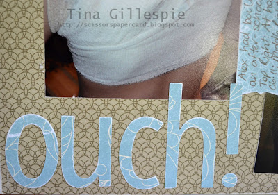
The layout is a pretty simple one that shows my son Alex. Well, it shows his back!  He was doing a cooking class at school and ran past the stove just as some older girls were moving a pot of boiling water.  Poor Alex copped the water right down his back.  Some quick thinking teachers got him into a shower which helped a lot.  He still got some blistering, but overall he's a very lucky boy.


He was allergic to the first dressing, which is why there are photos of a few different dressings.  Do you feeling like a mean mummy when you take photos like this?  I do a bit, but then I think that it's still a memory and as just as much right to be preserved as the good ones.

Anyway, the retiring product in this layout is the DSP - Elegant Soiree.  It was a fabulous DSP that was equally as suitable for male projects as female.  I also used my sanding blocks on the layout.  They are sort of retiring.  The old ones are going and new ones will replace them.  The new ones have an assortment of grades so that you'll be able to achieve different effects with each side.


On this layout I sanded the photo edges (a new favourite technique of mine!).  I also sanded the DSP to soften the tones a little.  This was especially good for the Baja Breeze pieces as they were a bit too bright for the layout.  I sanded them twice - once before I die cut/punched them and again after.  I did it before so that the little pieces were less likely to rip after I cut/punched them.  I gave them a light sand afterwards to give them a white edge, which you can hopefully see in the photo above.  Just a tip though - the paper is thinner after sanding and therefore is a bit fragile.  When you stick your letters down they are more likely to tear if you try to lift them, so make sure you place them correctly the first time!

Ink: Soft Suede Stampin' Write Marker
DSP: Elegant Soiree (retiring)
Other: Sanding Blocks (being reconfigured), Big Shot, Simple Letters Alphabet Dies, Decorative Label Punch

Catch you later,

Tina

Wednesday, 24 August 2011

Basic Phrases Butterfly

Hi!

Ada recently went to a classmate's birthday party recently, so of course I needed to make a card to go with the gift.  Now this is NOT a card you can whip up in the 5 minutes before you leave for the party (hands up who's done that before? lol).  It's a CASE of a card designed by Sherri Freese.  She has a blog here, but this card is not on it.  I saw it on a demonstrator's only site - another perk of becoming a Stampin' Up! Demonstrator!


See what I mean about NOT being a 5 minute job???  That gasps and ooohs of the girls when the card was removed from the envelope were totally worth it though!  Here's a closer look at the butterfly:


And off to the side is the sentiment - all stamped with stamps from the Basic Phrases stamp set which is retiring at the end of August.

Stamps: Basic Phrases (retiring)
Ink: Perfect Plum
Cardstock: Whisper White, Daffodil Delight, Perfect Plum, Marina Mist, Pretty In Pink
Other: Big Shot, Beautiful Butterflies Bigz Die, Heart To Heart Punch, Two Step Bird Punch, Paper Snips, Basic Jewel Rhinestones, Dimensionals, Silver Cord (non SU)

Catch you later,

Tina

Monday, 22 August 2011

Fox and Friends Cheerful Card

Hi!

Have you bought all you wanted from the retired list?  I certainly hope so!  Today's card only has a small piece of retiring product.  Can you see what it is?


Hmmm, some of those panels look a little crooked - they aren't in real life!  So did you see the retiring product?  It's not the Fox and Friends stamp set (yay!).  It's the sentiment, which is from the Great Friend stamp set.  Isn't this a great little card to pop in with a little boy's birthday present?   Or change the colours to Melon Mambo and Rich Razzleberry and you could use the same card for a little girl.  Too cute!

Stamps: Fox and Friends, Great Friend (retiring)
Ink: Pacific Point
Cardstock: Whisper White, Pacific Point, Real Red
Other: Scallop Square Punch, Square Punch, Dimensionals

Catch you later,

Tina

Saturday, 20 August 2011

Sew Sweet Birthday

Hi!

Today's card uses a stamp set that has already retired out of the Autumn Winter Mini catalogue and a DSP pack that you only have until the end of the month to purchase, that is if stocks last that long!  The card was for my upline and good friend Sue's birthday last month.


I LOVED the Sew Suite stamp set and was pretty devastated when it didn't make the new catalogue.  However, there is SOOOOO much fabulous new stuff in the catalogue that I soon forgot my disappointment.  For this card I wanted a vintage look, so I used the Love Letter DSP and spritzed the main panel with Basic Black ink.  The sentiment was enclosed in a bookplate from the Hodgepodge Hardware set - also retiring at the end of the month!

Stamps: Sew Suite (retired), Clearly For You
Ink: Basic Black
DSP/Cardstock: Love Letter DSP (retiring), Very Vanilla
Other: Paper Snips, Dimensionals, Colour Spritzer, Hodgepodge Hardware (retiring)

Catch you later,

Tina

Thursday, 18 August 2011

A CASE of a CASE

Hi!

Today's card features a few retiring products.  Is is based on a card I CASED a few months ago from Judy May.  You can see Judy's original card here, and my first CASE here.  I love this card for the males in our lives.  The colour scheme and textures are just great.


So on the outside the retiring products are the Large Star punch and the Celebrations DSP.  The star punch has already sold out, but you can still get your hands on the Celebrations DSP if you're quick!  The Brushed Silver cardstock is being reconfigured.  Currently you can only purchase it in the Brushed Metallics pack, but come September 1st you'll be able to purchase it in a pack of it's own.


On the inside I have used the Classic Stars Jumbo wheel which is also retiring at the end of the month.  Get in quick!

Stamps: Classic Stars Jumbo Wheel (retiring), A Word For You
Ink: Pacific Point, Real Red
DSP/Cardstock: Celebrations DSP, Brushed Silver, Pacific Point, Real Red, Whisper White
Other: Big Shot, Timeless Type Alphabet Die, Perfect Polka Dots Textured Impressions Embossing Folder, Large Star Punch (retiring), Silver Brads

Catch you later,

Tina

Tuesday, 16 August 2011

Another Sweet and Sour Birthday Card

Hi!

Today's card is a different version of the card I posted on Sunday.  The previous card was for a little girl's birthday, but this one was for a woman's card.  I like that I can use essentially the same design and DSP but make cards for two different ages.


It's a little difficult to see in this photo, but the plain layers of the cake and the flames on the candles all have glitter applied to them for a touch of bling.  I used my two way glue pens and just sprinkled some Dazzling Diamonds over the top.

Stamps: A Slice of Life (retired Hostess Set)
Ink: Rose Red
DSP/Cardstock: Sweet and Sour Specialty DSP (retiring at the end of August), Very Vanilla, Rose Red
Other: Two Way Glue Pen, Dazzling Diamonds, Dimensionals, 1/4" Pumpkin Pie Grosgrain Ribbon

Catch you later,

Tina

Sunday, 14 August 2011

Sweet and Sour Birthday Card

Hi!

The Sweet and Sour Specialty DSP was one of my absolute favourites this year.  I love the colours and the textures in the glossy designs were just gorgeous.  Today's card uses the paper.  I love it for little girl cards, especially the bubbly, polka dot design.  If you want some of this gorgeous paper get in quick as it's on the retirement list and only available until stocks run out or August 31st.


This was a pretty simple design which came together really quickly.  I also have a slightly different version of this card, which I'll show you in a couple of days.

Ink: Rose Red
Stamps: A Word For You
DSP/Cardstock: Sweet and Sour Speciality DSP, Crumb Cake, Rose Red, Pumpkin Pie, Very Vanilla
Other: Pumpkin Pie Flower Brads, Twine, Circle Punches, Modern Label Punch, Dimensionals

Catch you later,

Tina

Friday, 12 August 2011

All A Flutter Fluttering Away

Hi!

Today I have another card featuring a stamp that is retiring at the end of the month.  I'm a little sad because it is a favourite of mine, but I am also very excited because it means that there a a whole bunch of new products debuting in the new Idea Book and Catalogue.  If you want to get your hands on this fabulous stamp it is a bargain at just $12.95, but get in quick as it is only available while stocks last!


I CASED this card from Beate Johns, a very talented cardmaker.  She used flowers on hers, but I wanted to use butterflies.  I liked the effect of not using the complete butterfly image on each square panel.

Stamps: All A Flutter, Great Friend (both of which are retiring at the end of the month!)
Ink: Basic Black, Pear Pizzazz, Rose Red, Daffodil Delight, Marina Mist
DSP/Cardstock: In Colour Hostess DSP (also retiring), Very Vanilla, Basic Black
Other: Corner Rounder Punch, Blender Pen, Basic Rhinestone Jewels, Dimensionals, Paper Piercer

Catch you later,

Tina

Wednesday, 10 August 2011

Layout 65: fly

Hi!

Today I have another layout for you.  The photo I used was one I took at Cleland Wildlife Park, but I didn't scrap it as a part of that series as it didn't quite 'fit' with that album.  I love, love, love the photo though, so I was keen to scrap it.


The photo inspired the whole theme of the layout.  The wind in her hair and the outstretched arms look like she is ready to take flight.  It got me thinking about her leaving the nest when she is older and what she may become as an adult.  I am so excited for the possibilities for her, but first we must go through childhood.  I can't be wishing her life away for her!


The flowers were created using the smallest Boho Blossoms punch flower.  After I punched them I scrunched them up and then split the layers to give them a suede type texture.  I then used pearls for the centres.  The journalling strips were spritzed with my Pumpkin Pie and Rose Red Markers.  I wanted to tone down the Very Vanilla paper so they didn't stand out so much.


One of the many perks of being a Stampin' Up! Demonstrator is the discount we get on all the products we buy.  This year as an added bonus we got an extra discount for our birthday. My birthday is this month so I got to spend mine to purchase the Simple Letters Die for the Big Shot.  I used it for the first time on this layout.  I love the bigger font!  The smaller Timeless Type die would not have worked as well on this page as it is too little small and would have got lost.

The paper I used on this layout is only available until the end of the month and then it will be gone forever!  Check out the retiring list on the side of my blog to see what else will be retiring at the end of the month.  But get in quickly, as they are selling out fast.  I will be featuring retiring products on my blog for the rest of the month.

Ink: Pumpkin Pie and Rose Red Ink Pads and Stampin' Write Markers
DSP/Cardstock: Sweet and Sour Speciality DSP, Rose Red, Pumpkin Pie, Very Vanilla
Other: Big Shot, Simple Letters Dies, Beautiful Wings Embosslit, Colour Spritzer, Sponge Daubers, Boho Blossoms Punch, Glue Dots, Basic Pearl Jewels

Catch you later,

Tina
Monday, 8 August 2011

A Double Sneak Peek!

Hi!

Today a project of mine is being featured over on the Stamp A Memory blog.  Here's the first sneak peek:


A little look at the project itself.  And did you see the second sneak peek?  The flower image is from the Button Buddies set, new to the upcoming Idea Book and Catalogue.  If you'd like to see the rest of the project, pop on over to Stamp A Memory.  Be sure to leave a comment - I'd love to know what you think of it!

Catch you later,

Tina

Wednesday, 3 August 2011

Cleland Wildlife Park Layout 23

Hi!

Well, here it is - my final Cleland layout.  I saved my favourite photo for last and kept the page nice and simple so the focus is on the photo.


Of course a family photo would be my favourite!  I also used my favourite paper from the Woodland Walk DSP.  The bubbly paper is so cute!  I layered it on some textured Crumb Cake cardstock, which is just gorgeous.  I love the smooth cardstock, but the textured is just divine - it has the look of raw linen and adds a lovely touch to the layout.

Ink: Chocolate Chip Stampin' Write Marker
DSP/Cardstock: Woodland Walk DSP, Crumb Cake Textured 12x12, Chocolate Chip
Other: Twine, Urban West Rub Ons (retired), Anchored Rub Ons (retired)

Woodland Walk DSP will be gone forever at the end of the month, as will all the other DSP packs and a whole lot of stamp sets and accessories.  Click on the Stampin' Up! logo in my sidebar to see the Retiring List of products, but get in quick as they are all while stocks last.  My newsletter went out last night via email with some more details about the Retiring Products and my new Idea Book and Catalogue Launch Party.  If you'd like to receive my monthly newsletter, you can sign up for it on my sidebar also.

Catch you later,

Tina

Tuesday, 2 August 2011

Cleland Wildlife Park Layout 22

Hi!

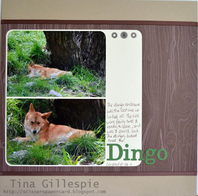
Today I have for you my second to last layout about our day at Cleland Wildlife Park.  It features a dingo from the park. Lucky I had my long lens, because the dingo was tucked up near the back of the enclosure.  It took us a bit of time to find her hidden in the grass.


I've saved my favourite photo of the 500 odd I took for tomorrow's layout. I hope you can pop by to see it!

Ink: Chocolate Chip Stampin' Write Marker
DSP/Cardstock: Woodland Walk DSP, Crumb Cake, Very Vanilla, Garden Green
Other: Big Shot, Timeless Type Alphabet Die, Corner Rounder Punch, 1/4" Chocolate Chip Grosgrain Ribbon (retired), Urban West Rub Ons (retired)

Catch you later,

Tina

Monday, 1 August 2011

Stamp A Memory August Challenge: Celebrations

Hi!

Today's layout is my design team submission for the latest Stamp A Memory challenge.  Stamp A Memory is celebrating it's second birthday, so the challenge for you is to scrap a layout about a celebration.  My layout is not based on a typical celebration - it was about me finding a new pair of red shoes.  I had worn red shoes to my wedding reception nearly 10 years ago.  They lasted another year or so until they fell apart.  I hadn't been able to find a new pair that were 'right' until earlier this year.  So of course, I was celebrating!


The title for my layout is "My sisters call me... Dorothy".  I added the text to the photo using Photoshop CS5.  The photo itself was taken on a recent sunny day.  I went outside, lay on my back with my legs in the air and took some photos.  I hope my neighbours weren't peeking over the fence that day!


I used white Stazon ink to stamp the flourish from Creative Elements several times in the top corner to act as a backdrop for the flowers and butterflies.  The butterflies were also stamped in white Stazon on a window sheet, then cut out with my trusty paper snips.  The flower was brayered with Pacific Point Ink.  I also stamped the flourish above the photo on the right hand side of the layout where the other two butterflies rest.  You can see a close up of that section on the Stamp A Memory blog.

Stamps: All A Flutter, Creative Elements (from the upcoming Idea Book and Catalogue)
Ink: White Stazon, Riding Hood Red Stampin' Write Marker, Pacific Point
Cardstock: Riding Hood Red 12x12 Textured, Whisper White, Riding Hood Red, Window Sheet
Other: Whisper White and Night Of Navy Satin Ribbon, Scallop Edge Punch, 1/16" Circle Punch, 1/2" Circle Punch, Paper Snips, Basic Jewel Rhinestones, Clear Round Rhinestone Brad, Paper Daisies, Brayer, Glue Dots
Digital: Photoshop CS5

Can't wait to see the celebrations you scrap for the challenge at Stamp A Memory!

Catch you later,

Tina
Dorothy