Pages

Friday, 29 January 2016

JAI #296: Just Add Nature

Hi!

Oh boy, it's hard to believe that it's the last day of school holidays! The last seven weeks have just flown by! My oldest is starting High School this year, so there will be lots of new challenges for us all.  Still, it's an exciting time, and Alex is excited, so I am too.


Speaking of exciting, it's time for the new Just Add Ink challenge! This week Di has challenged us to Just Add Nature to our cards. I've gone for the largest butterfly in the Butterflies Thinlits collection. This was the third card my ladies made last week in class.


I paired the butterfly with the stamp set that rocketed to the top of my 'Must Have' list when I saw the new Occasions Catalogue - Timeless Textures. There's also a little peek of the splatters from Gorgeous Grunge on the card too.


Most of the background stamping has been stamped off first, as I wanted the main focus of the card to be the butterfly. The colours I used were Crumb Cake (edge stamp and splatters), Always Artichoke (grid stamp), Early Espresso (coffee rings) and Rose Red (flourish), all on a Very Vanilla base.  This would have to be one of my favourite colour combinations for girly, grungy cards.


The stamping on the inside is nearly the same as the outside, the exception being I left off the Gorgeous Grunge splatters so that there would be more clean space for writing a message.

What nature themed gorgeousness can you come up with for our challenge?  I'd love to see your work lined over at Just Add Ink.

Bye for now,

Tina

Wednesday, 27 January 2016

The Sky Is The Limit When You're Going Places

Hi!

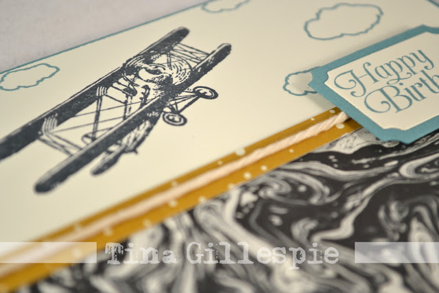
Today I have the second card for you from last week's card class. This time I have used another Sale-A-Bration stamp set, called Sky Is The Limit. What a fabulous set for male cards! If you love this set, make sure you get in quick - this is one of the three Limited Time Only sets that will only be available until the 15th February, when they will be replaced by another group of SAB products.

Anyway, on to the card! The card is actually a CASE of this card, made by Debra Simonis.


I CASEd Debra's card fairly closely, the only real changes are the colour of the base card, the addition of twine and the change in colour of the sentiment and the matt under the sentiment.


I really love the marbled DSP from the Going Places DSP stack. So much easier (and less messy) than making your own! The Very Vanilla Twine is simply the Metallic Baker's Twine with the metallic thread removed.


Debra didn't show the inside of her card, so I just winged it for mine.  I originally stamped the clouds over the top of the sentiment, but they looked really silly to me, so I just went for the corners in the end!

Bye for now,

Tina

Monday, 25 January 2016

Just For You in Wildflower Fields

Hi!

Last week I told you about my crafting day where I managed to get three cards done for last Friday's class. I didn't want to show you the cards before the class because I like to surprise my ladies with them.  Well, the class has been and gone, so now I can show you.

Today's card uses two Sale-A-Bration products - the Botanicals For You stamp set and the Wildflower Fields DSP.  While they are not designed to be coordinating, they still work beautifully together.


I think Botanicals For You is one of my favourite SAB products this year. I really love the big bold 'Just For You' stamp. You can either use it on it's own, or use the smaller floral stamps in the set to jazz it up.


My Blackberry Bliss Inkpad is still very juicy, so my image came out a little 'bubbly'. I decided to go over the top with my clear Wink Of Stella Glitter Brush. It helped to even out the colour a bit, and had the added bonus of making the sentiment glittery. It's very hard to photograph though! Just a hint - the Wink Of Stella brush will pick up some of the colour, so make sure you give it a quick wipe off before you use it over another colour.


I rarely throw a DSP offcut away, unless it is really tiny.  In this case, it was a great way to finish off the inside of the card.

Bye for now,

Tina

Friday, 22 January 2016

JAI #295: Just Add A Sketch

Hi!


Here we are at the Friday end of the week again, ready for the weekend and another Just Add Ink challenge. This week we have a sketch challenge for you, designed by ME!


Funnily enough, I struggled a little with this sketch! It looks so easy, doesn't it? The hard part is all that white space. In the end though, I was really happy with the card I created.


So soft and pretty, if I do say so myself! I stamped the image from You've Got This in Momento ink and coloured it with my (retired) Blendabilites, then cut it in quarters. I matted it with a very thin matt of Old Olive, just to help it pop from the background. I finally popped each square up using Dimensionals.


It's really difficult to see, but I also stamped the big background stamp from You've Got This in Pink Pirouette behind the squares. It helps to ground them a little, and because I stamped the sentiment over the image it helps link the sentiment to the flower.


OK, now it's really, really hard to see, but I also stamped the background stamp on the inside.  This time I stamped it off first so that it is very pale. I wanted the effect, but I didn't want to feel like I have to 'write around' the image, if you get what I mean.

I've had a sneak peek of the Design Team's cards this week, and they are all amazing!  I really love what they've done with this sketch, and I'm sure you'll do something fabulous with it too.  Why don't you pop on over to the Just Add Ink blog to take a look?

Bye for now,

Tina

Wednesday, 20 January 2016

A Beautiful Butterfly CASE

Hi!

I think it's something I say a lot, but I'm going to say it again - I love school holidays! The kids played quite happily together this afternoon so I was able to get a decent chunk of time at my craft desk. I managed to get a few cards made, but as they are for a class on Friday, you will just have to wait to see them.  Instead I will show you a card I made for a class late last year.


Isn't that butterfly gorgeous? It was so easy to do.  Simply cut one of each of the Butterfly dies and snip them in half, making sure that the body stays intact and on the right wing if you want it to face the same way as mine. Keep it on the left wing if you'd like your butterfly to face the other way. The solid butterfly was then sponged with Daffodil Delight, Pumpkin Pie and Garden Green ink. Adhere the outline butterfly pieces to the matching solid butterfly pieces and then adhere the two halves together as desired.  Done!


You could sponge in any colours you wanted - it really doesn't matter!


Here is the card I CASEd for mine.  I can't link to a blog as I took the photo at the last Convention on the Gold Coast.


If you know who made this gorgeous card, please let me know as I'd love to credit them.

Bye for now,

Tina

Monday, 18 January 2016

A Nice Cuppa

Hi!

I was able to get a bit of unexpected crafting time in yesterday while hubby made dinner, and today's card is the result.  I wanted to have a play with the new Have a Cuppa suite of products.  I'm a big tea drinker, so this suite really appealed to me.


I don't make a lot of single layer cards - probably because they nearly always seem unfinished to me. I do like this card though. It took a lot of playing around to get it to look right, but I'm fairly satisfied with the final product. The colours (Melon Mambo, Wisteria Wonder and Bermuda Bay) were taken from the coordinating Have A Cuppa DSP. You can see a bit of it peeking out from under the teapot.


The teapot was originally just the pot and lid, but it looked a little plain.  I die cut some scallop trim and adhered it to the pot using my Fine-Tip Glue Pen.  It still wasn't quite enough, so I grabbed my Clear Wink Of Stella Glitter Brush and added highlights to the scallops and lid.  Much better!


Isn't that curl of steam so cute? Love it!

Bye for now,

Tina

Friday, 15 January 2016

JAI #294: Just Add Something New Blog Hop

Hi!

http://just-add-ink.blogspot.com.au/2016/01/just-add-inkadd-something-new-blog-hop.html

At Just Add Ink we always like to start the year off with a blog hop to showcase the first challenge of the year.

This year Rochelle has suggested we all "Just Add Something New". Now I know that won't be hard for the Stampin Up! demonstrators out there as the new Occasions catalogue and Sale-a-bration promotions have started! If you don't have anything new from SU! please join us using whatever new product you have and be sure to let us know what it is.

To make the blog hop extra special the design team have donated new SU! SAB items as prizes to the winner and two honorable mentions participants. Please note, to be eligible, you must create a "NEW" project using "SOMETHING NEW TO YOU" and leave a comment on all the design team blogs, be or become a JAI follower and blog your project exclusively linked to Just Add Ink. Any entrants that link to additional challenges will be disqualified. (The prizes are open to both international and AUS/NZ participants).

We look forward to kicking the year off with a celebration of new crafty goodness and inspiration and hope you will join the challenge with us.

I've decided that my 'something new' is both the Beautiful Ride stamp set (from the Occasions Catalogue) and the Perfectly Artistic DSP pack (from the Sale-A-Bration Catalogue). Recently, on a very hot night where there was nothing much on the TV, I stamped a few of the Beetle images on Watercolour Paper and sat and coloured them with my Stampin' Write Markers and Blender Pen.  I decided to use one of them for this Hop, but when it came down to it I couldn't choose a favourite image to use, so I just used all three!

Colours used: Basic Black, Blackberry Bliss, Soft Sky and Crumb Cake
Stamp Sets: Beautiful Ride, Number Of Years


I love that this set is Photopolymer, which makes stamping the dog in the Blackberry Bliss version and the surf board in the Crushed Curry version super easy.

Colours Used: Basic Black, Crushed Curry, Soft Sky, Cucumber Crush, Pacific Point and Basic Grey


I hope the surf board on the inside looks like it's propped up against a wall, or similar. I was a little worried it looks a bit strange!

Colours Used: Basic Black, Soft Sky, Watermelon Wonder, Smokey Slate
Stamp Sets: Beautiful Ride, Work Of Art, Lighthearted Leaves


Whoops!  I used Lighthearted Leaves before I realised it has retired.


Here are the three together.  You can clearly see I've used the same layout for each, this was to keep things quick and simple.  By the time I'd coloured the images and then fussy cut them, quick and simple was looking good! I've used the 'Watercolour' side of the DSP rather than the 'Marbled' side as I wanted the softer look for the background.

You can begin the blog hop here on my blog or at any of the other design team members blog posts. Just follow the hop by clicking on the back or previous buttons you will find at the bottom of all the design team posts. Or you can start Here at the beginning.


http://springblossommusings.blogspot.com.au/2016/01/just-add-ink-294-just-add-something-new.html
Before you go, don't forget that there are prizes on offer for this challenge, but you must follow a few easy guidelines to qualify. You can find these at the top of my post, or at the Just Add Ink blog.

Bye for now,

Tina

Wednesday, 13 January 2016

Going Places On Your Birthday

Hi!

Today I have a card for you that I made using a heap of new products from the Occasions Catalogue. I needed to make a card for my brother-in-law for his 40th birthday, and some of the new stuff fit the bill perfectly.


I used the new Number Of Years stamp set and the coordinating Large Numbers Framelits to create the main panel of the card. I hadn't intended to use the banner, but the word 'birthday' didn't stamp cleanly, so I had to cover it up. Not a bad fix, I think!


The DSP on the card is from the Going Places DSP stack. I think this page of schematic diagrams is one of my favourite designs in the pack. Lost Lagoon and Very Vanilla are a great combo, and pairing them with Basic Black adds a bold touch to the card - perfect for male cards!


The Going Places DSP Stack is a 6x6 inch pad, fabulous for cardmakers.  I always trim one side to 4 inches first, so that when I trim the other side I end up with a narrow strip that's also 4" wide - perfect for adding to the inside of the card! The inside sentiment is from Remembering Your Birthday.  I masked off the other words as I didn't want to use them on this card. My aim this year is to not have to use this 'belated' stamp again. Fingers crossed!

Bye for now,

Tina

Monday, 11 January 2016

MKPLxSU Blog Share: Memories In The Making

Hi!

I hope you didn't think I'd forgotten about my little blog! I was having a bit of a break over the Christmas/New Year period, but now I'm back and ready to get straight back into blogging.  What better way to start than with a Blog Share with the Memory Keeping with Project Life by Stampin' Up! team? We are a part of a Facebook group with a focus on scrapbooking using PLxSU products.  This month we are showcasing a brand new collection, called Memories In The Making.  You can find the collection in the new Occasions Catalogue.


One of the things we did over the holiday break was go home and visit my family in country NSW. My hometown is on the Murrumbidgee River, and this summer we decided to do a River Float. This pretty much involved gathering as many lifejackets and inflatable devices as we could find, jumping in the river at the boat ramp and floating along (hopefully as a group!) until we reached the beach further down the river.

I didn't actually get to float this time, I was a driver.  Someone had to meet the floaters at the other end and bring them home!


The title was made using the alphabet stickers in the Accessory Pack. The 'FUN' banner was also from the Accessory Pack, I simply cut one of the 5.1 x 5.1cm cards that said 'FUN FUN FUN' into thirds and used on third on the layout. I sometimes struggle to use those tiny cards, so this was a perfect way to use one.


I ran out of space on the main journalling card to write the names of all the people floating, so I decided to use another of the tiny cards to include this detail. I adhered it to the photo using some of the washi tape from the Accessory Pack.

So there you have my layout for the month. How did you spend your Christmas break?

There are several other blogs for you to check out this month:

Delys Cram, NZ
Elizabeth Richards Peterson, USA
Julie Kettlewell, UK
Constanze Wirtz, Germany
Janet Morrow Wakeland, USA - http://remarkablycreated.com/
 Linda Higgins, Australia

Bye for now,

Tina