Hi!
Last week my daughter had a birthday, turning 14. Ada's a mad Harry Potter fan, and so I usually make her a Harry Potter themed card. She's been talking lately about getting a Dark Mark tattoo when she's old enough (gulp!), so I decided to go with that theme for her card. For those not in the know, the Dark Mark is a magical tattoo on the 'baddies' (Death Eater's) arm that they use to summon each other.
The Dark Mark is a skull with a snake coming out of the mouth. I certainly don't have any stamps for that! In the end I purchased a cut file from an Etsy store and cut it from some Shaded Spruce cardstock. The Basic Black cardstock was a little to stark, so after I adhered the Dark Mark I misted it with some old Smooch shimmer mist that I found on my desk.
I can't take credit for the sentiment on the card. -I googled 'Death Eater Birthday Cards' and found one that I liked. Avada Kedavdra is an Unforgivable Curse that kills the person it's aimed at, hence the second part of the sentiment!
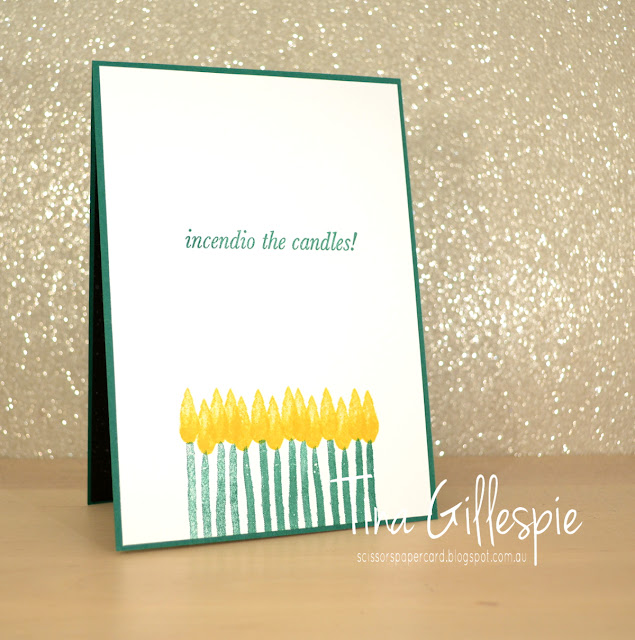
The inside sentiment is from an Ink Road Stamp set called Expecto Stampo. Incendio is another spell to light a fire, so it's perfect for the birthday candles. These were just stamped using the retired Incredible Like You stamp set. Did you notice I stamped 14 candles?
In case you were wondering, Ada loved the card!
Bye for now,
Tina
Tuesday, 16 July 2019
Sunday, 14 July 2019
CTC #237: CASE A Layout
Hi!
It's time for the new CASEing The Catty Sunday Challenge Blog Hop! It's a circle of blogs that you can hop your way around to see what the Design Team have made for this week's task. You may have come from Julia's blog, or you may be starting here. It doesn't matter! To paraphrase Dory - just keep hopping!
This week we are challenging you to CASE a layout of one of the cards on page 151 of the Annual Catalogue. There are four to choose from, or five if you count the tin, which you definitely can! I couldn't choose just one card, I ended up using elements from two - the card at the top left with the boats, and the card at the bottom left with the fish.
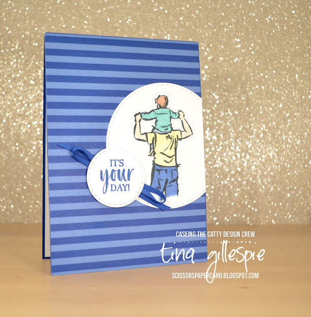
I started with the stripes on the top card. I don't have a striped stamp, so I used some DSP instead. It's a sheet from the retired In Colours DSP pack in Blueberry Bushel. I liked the circle feature from the bottom card, so that's where I went next. Instead of chopping into my DSP layer, I added the circle on top. Truthfully, I'd already adhered my DSP to my card base, so I had no choice but to layer on top!
I coloured my image with my Stampin' Blends, just using one shade of each colour. A tip when colouring this image - don't leave a straight line at the bottom of the image. Make it a bit uneven so it looks less like an amputation, and more like the image has just faded off.
The sentiment circle kind of steals from both cards. I used the same sentiment as on the fish card, but I added some ribbon underneath as is the case on the boat card under the ship's wheel.
I finished the inside by stamping the man again, but in stamped off Balmy Blue and then the sentiment over the top of the man. I love how low-fuss I can be on men's cards, don't you?
That's it from me this week! Have you entered our challenges yet? It's so easy - just make a card based on the challenge and then upload your photo to our Facebook group. Done!
Before you get creating, don't forget to continue the hop! Next up is my friend Rachel, who put her sewing machine to use for her card!
Bye for now,
Tina
Thursday, 11 July 2019
JAI #465: Just Add The Season
Hi!
Hooray for a new Just Add Ink challenge! This week Nikki has decided we should add 'The Season' to our cards. What do we mean by 'The Season'? Well, it can either be your favourite season (summer/autumn/winter/spring) or the current season where you live. For me in Australia, it's the depths of winter, and we are currently having a little cold snap. Not cold enough to snow, but certainly cold enough to just want to stay home snuggled in front of the TV during the school holidays!
I decided I'd make a winter themed card, and then realised I had very little in my stash that was winter themed. Oops! I'm not one to back down from a self imposed challenge, so off I went to look for a winter themed digital stamp. I found this cutie by Graphics Dollar, called Linus Goes Camping. Even better, he was a freebie! I quickly printed him and then got colouring.
I used my Stampin' Blends to colour Linus, the fire and his marshmallow stick. I also coloured the ground with my Light Crumb Cake Blend, and then added some pebbles using my Dark Crumb Cake Blend. This was a technique I saw Paula Dobson use in her brilliant Blends Colouring video.
The trees were stamped using the trees from Waterfront. Stamping them over and over and at different heights hides the trunks of some of the images and makes the trees look a lot taller than the stamps are! I used my sponge brayer to colour the sky (after masking off the moon) so that I could flick water over to create a starry sky.
I had a bit of fun experimenting with my Blends and the Colour Lifter on this card. I used the Lifter to add some cross hatching to the jeans to add a bit of texture. I also added some strokes to the wood on the fire to give more of a rough look. I wasn't thrilled with how the hair turned out, but it was fun trying! I used a Soft Suede Blend to add streaks and then coloured over it with Daffodil Delight and Mango Melody.
I didn't have many options for the inside, as I couldn't print Linus small enough for my liking. I made do with a row of trees, which I quite like!
That's it for me for this week's challenge. Now you can head on over to the Just Add Ink blog, where you can see the rest of this week's Design team cards, and also enter your own. Which season will you choose?
Bye for now,
Tina
Tuesday, 9 July 2019
Blueberry Farewell Booklet
Hi!
LOL, I nearly typed 'Welcome to this week's Colour Creations...' before I remembered that we are finished. I hope you were inspired by our posts each week. I will try to continue to post on Tuesday evenings, as it's a good habit!
Tonight's card uses the new Noble Peacock Specialty DSP. Each of the sheets are heavy weight and have foil accents. The sheet I used is the Blueberry Bushel pattern, and I love that the design looks a bit like a stylised peacock tail.
I paired the Noble Peacock SDSP with some Black Foil cardstock, with some Silver Foil die cuts. The sentiment from Flourishing Phrases is very 'punny' for a musical themed card, don't you think?
When is a card not a card? When it becomes a booklet! This card was made for the members of the band I play in to sign so that we could farewell one of our musicians. Due to poor health, he's unable to continue playing. There's over 40 people in the band, so I needed to make enough pages to allow everyone room to write a message. I also added some ribbon as a belly band so that the booklet can be tied closed. I find that a card like this is preferable to a super sized card, as they are much easier for the recipient to store, and is therefore less likely to be thrown out!
Bye for now,
Tina
Sunday, 7 July 2019
CTC #236: Love, Thanks and Support
Hi!
Welcome! Have you arrived here from Rebecca's blog, or are you just starting here? Either way, please keep hopping and enjoy all the stops on our blog hop this week.
It's the end of the weekend, but for me this means the start of school holidays. Hooray! Hopefully the kids will sleep in a bit so that I can too! Wish me luck 😉
This week we are CASEing any project from the Love, Thanks and Support section of the Annual Catalogue. It's a big section, so there should be plenty to choose from. I flicked through until I got close to the end of the section, and then decided I would CASE the card at the bottom left of page 89.
I think it was the stamped sentiment around the circle layer that caught my eye. I do like a card with an extra level of difficulty! I don't have the Above The Clouds Bundle, so I scanned my shelves and decided upon my Beautiful Bouquet bundle.
I used Blushing Bride, Rococo Rose, Soft Sea Foam, Pear Pizzazz, Very Vanilla and Early Espresso on my card. To stamp the 'Congratulations' in a circle, I adhered the Stitched Shapes circle die to my clear block using washiest tape. I then added a piece of double sided tape to the back of my stamp and adhered it to the block, using the die to shape the stamp. I used tape to hold the stamp in place, as the photopolymer had lost a bit of it's stickiness and I didn't want to wash it and wait for it to dry. I'm too impatient for that! I then temporarily adhered the Very Vanilla circle to my card and used it as a template to stamp in the correct position. I started stamping at the bottom, where I knew the stems were going to sit, so that if the words ended up overlapping (and they did!), it would be hidden by the stems.
I die cut the stems and then adhered them together. I wrapped them with an offcut of the Burlap ribbon and tied a bow using some retired Very Vanilla Baker's Twine. The flowers were then added to the bouquet, making sure some were under the stems.
I had several flowers left over, so naturally I used them on the inside of the card. Nothing goes to waste! I've sort of left the card a little vague - I intend it to be a wedding card, but if push comes to shove it could work for an engagement or anniversary too.
Time for you to be hopping on your way, but first I will remind you of our Facebook group, where you can join in the fun and enter your card in our challenge.
But first, you're off to see what the wonderful Siobhan has created!
Bye for now,
Tina
Thursday, 4 July 2019
JAI #464: Just Add Colour
Hi!
It's that time of the week again - the new Just Add Ink challenge is live, and it's a fun colour challenge suggested by Jackie.
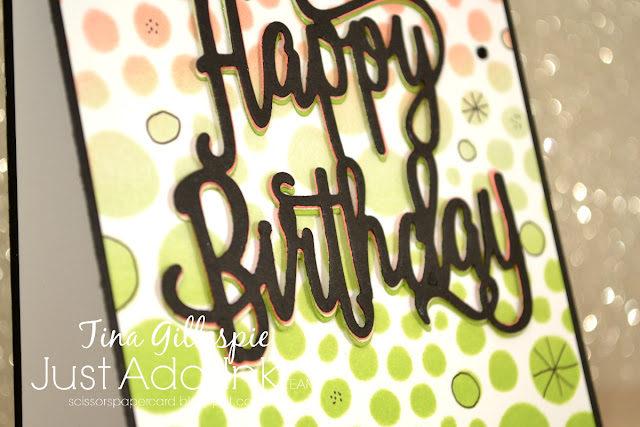
It took me a long time to think about what I cold do with these colours, and in the end I decided to use a new stencil that I purchased recently. It's called Holes Small and is by Ranger.
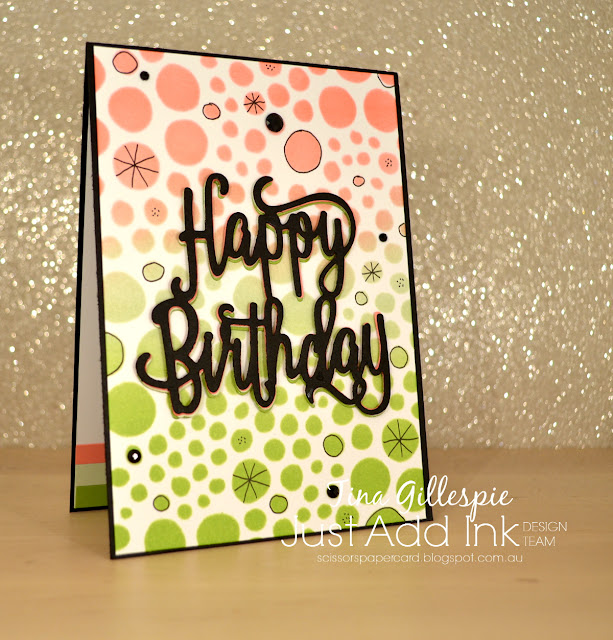
I lightly taped it down over a piece of Whisper White cardstock and then used my sponge brayer to add the ink. There's Granny Apple Green at the bottom, Soft Sea Foam in the middle and Flirty Flamingo on top.
I die cut the now retired Happy Birthday die four times - once each in Granny Apple Green, Soft Sea Foam, Flirty Flamingo and Basic Black and then layered them up in that order. If you look carefully, you can see the different layers under the black. A subtle, but cool effect! I finished the card by doodling in some of the circles and adding some Black Faceted Dots.
Instead of dots I got a bit lazy and went for stripes on the inside - just some offcuts of the cardstock to match the front colours. The stamp is from Genuine Gems, and I coloured it with my Granny Apple Green and Flirty Flamingo Stampin' Blends.
Time to pop on over to the Just Add Ink blog, where you can see the rest of this week's Design Team cards. You can also link up your card to enter the challenge. You'll have fun with these colours!
Bye for now,
Tina
Tuesday, 2 July 2019
A Pocket Full Of Posy
Hi!
Sob! We are finally at the last week of the Colour Creations Blog Share posts. It's been a fun year using each of the colours in Stampin' Up!'s range. I set myself the challenge to participate every week, and I met that challenge! Even when I was overseas I was able to play along, thanks to Catherine allowing me to give her links ahead of time and hoping they would work.
For our final week we are featuring Purple Posy, which is a soft purple that fits well with Highland Heather and Gorgeous Grape. I wanted to go out with a bang, so I have made a super special card for you today.
I had the chance to watch a few crafting videos last week, and one was Jennifer McGuire's Layered Die Cut See-Through Cards. I was immediately keen to give the technique a try, and this was a great opportunity. LOL, it's a great way to use more of that Press'n'Seal that we all got in New Zealand too!
You basically die cut (or punch in my case) a heap of shapes and layer them so that they overlap quite a bit. Press'n'Seal holds it all in place while you trim it to size and then glue matching shapes on the back to keep it all in one piece. You can watch Jennifer's video to see how she completes the cards. I love the lacy look to the card, and how it's quite strong even though it looks delicate.
The inside of the card perfectly mirrors the front of the card, so that you can't see the Purple Posy circle or daisy from the front of the card. This card took several hours to complete, but it was well worth the time. I can't wait to try it again!
For the final time, please head on over to Catherine's blog to see the rest of this week's Purple Posy cards. Keep an eye out though, soon we will be starting the Heart Of Christmas, so there will be weekly Christmas inspiration for you all.
Bye for now,
Tina
Subscribe to:
Posts (Atom)


