Pages

Friday, 20 June 2014

JAI #219: Just Add Inspiration

Hi!

Here we are again at the end of another busy week.  I don't know about you, but I'm hanging out for some time in my crafting space to get inky!  If you are too, why don't you give our latest challenge at Just Add Ink a go?


This week Trish has put together this Inspiration Board as a focus for our challenge.  What do you see in it?  I went with both the colours and the shapes for my card.
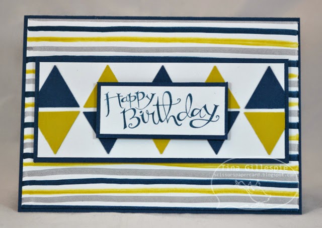

I was asked to make a birthday card for a man turning 25.  I wanted to make something that was a bit edgy and masculine, and I think I've achieved the look.


The base panel was created using my markers.  I just hand drew the lines across the piece of cardstock using my Summer Starfruit, Smokey Slate and Midnight Muse Stampin' Write Markers.  The lines are a bit wobbly and some are thicker than others, but that was exactly the look I was going for.


I also drew a few stripes on the inside and overlaid them with some left over triangles from the front of the card.

What are you going to pull from the Just Add Ink Inspiration Board to inspire your cardmaking?  I can't wait to see!

Bye for now,

Tina

Wednesday, 18 June 2014

Farewell I Am Me DSP

Hi!

I think the I Am Me DSP has well and truly been my favourite DSP in this catalogue.  I really love the combination of colours and patterns in the paper.  I used it to make this mini album, which I made for a Secret Santa gift last Christmas.  I think the recipient was fairly easily able to work out that I'd made it, so I'm safe to post it on my blog.


I made a chipboard cover for the album, which I covered using some of the I Am Me DSP.  I left the front blank so that a photo could be adhered there if desired.


I made a double page for each member of the family, but half of the pages had flaps to lift, so there ended up being 4 pages for each family member.


I also left some space at the front for some family photos.


I die cut each family member's name for their page and added some matts for photos.  All they need to do is trim the photos to size and adhere them in place.  Easy!


Under each flap I designed an "All About Me" page in My Digital Studio for each family member.  You can see the types of questions I had on the page.  I changed them for the adults, things like their workplace instead of school.

I hope the family had fun putting the rest of the album together.  I thought it would be a great memento of this particular point in time that they could look back on in years to come.

Bye for now,

Tina

Monday, 16 June 2014

Farewell Off The Grid

Hi!

Another sad farewell for another fabulous stamp today.  Off The Grid has been one of my absolute favourite stamps for adding a touch of interest to a background.


As well as farewelling Off The Grid I was playing with some new product that I got while at Convention.  We all got the Kinda Eclectic stamp set and I was lucky enough to win the new Sweetheart punch at a Prize Patrol.


I'm really loving the look of collage stamping, where you stamp a heap of different images over the top of each other.  On this card I've used Off The Grid, Gorgeous Grunge and Kinda Eclectic.  I was inspired by the card on page 164 of the new Annual Catalogue.


For all the grunginess on the outside, I went really for a really clean look on the inside.  I think it helps make the sentiment stand out more, which is really important when you are thanking someone for their kindness.

Bye for now,

Tina

Sunday, 15 June 2014

Layouts 40, 41 and 42

Hi!

A little more of  my Paris trip for you today.


Our next stop on this day was the house of the author Victor Hugo.  I am a huge Les Miserables fan, so of course I had to visit one of the places where he lived.


The photo on the top left of the page above shows his writing desk.  I was fascinated to learn that he wrote while standing up.  We also walked a lap of the square his house faces onto - Places des Vosges.  It used to be a Royal Residence and gardens, but the inside is now this gorgeous park that is tucked away from the main road and quite lovely and peaceful.


After we left there we continued down Rue de Rivoli towards the site of the Bastille. I'm also a fan of the works of Alexandre Dumas, who references the Bastille in his Muskateer books.  The Bastile itself is long gone - it was torn down and the bricks reused to build Pont de la Concorde.  At the site is now the Colonne De Juillet, built to mark the July Revolution.


Apparently the bodies of the Revolutionaries are buried under the monument.  The base of the monument is quiet graffitied, mostly with social protest slogans.  The Column is still a site of protest - apparently protest marches follow the Rue es Rivoli and end at the Column.


Our next stop was the famed Berthillon. It's on Ile St-Louis, which is the island beside the one that Notre-Dame sits on.  According to the Lonely Planet Guide Berthillon makes the best icecream in all of Europe.  As we were in the area we decided to give it a go.  Rob was amazed that we had to line up for nearly half an hour to get our icecream, but I insisted.  I thought it was worth the wait, but Rob didn't enjoy his choices as much.  We both had 2 scoops.  I had Lemon and Raspberry gelato.  The server was very clever, putting the raspberry on the bottom and lemon on top.  The lemon was very tart and a big contrast to the sweet raspberry.  Rob ordered Coffee and Ginger and I think he found the ginger a bit too overwhelming.

See you next week with some more of my Paris album.

Bye for now,

Tina

Friday, 13 June 2014

JAI #218: Just Add Colour

Hi!

This month we say goodbye to retiring products from the current Annual Catalogue, so at Just Add Ink we though we'd challenge you to use some of your retiring colours.  Your creation should use three of the retiring In Colours.  Kim is the brains behind this fabulous challenge!


I decided to go with Raspberry Ripple, Primrose Petals and Midnight Muse on my card.


I was really pleased with how the background turned out on this card.  After I made it though I was a bit stumped as to what to put over the top of it.  Hubby suggested I go with a curved shape to offset all of the angles of the hexagons.  I think he was right!


The larger butterfly is from the retiring Beautiful Butterflies Bigz Die, which I will miss a lot.


I think the two pinks look very pretty layered together on the butterflies - what do you think?

I hope you can play along with us this week.  Which are your favourite colours from the retiring In Colours?  See you over at Just Add Ink.

Bye for now,

Tina

Wednesday, 11 June 2014

Simply Stars Card In A Box

Hi!

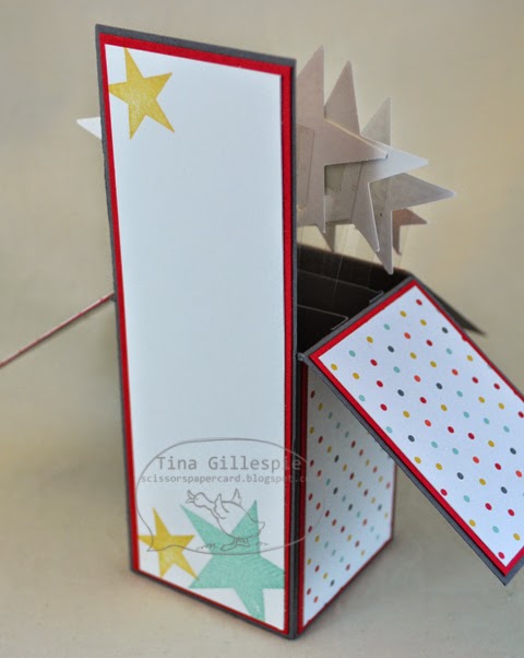
Last month I ran a Card In A Box class and today's card is one of the samples I made to inspire the ladies who attended.  It uses the retiring Simply Stars stamp set and I Am Me DSP.  Both are favourites of mine that I have enjoyed crafting with over the past year.


It's such a cool concept for a card. I love the fact that it folds flat for posting but pops up into this fabulous 3D card to delight the recipient.  Did you notice the sneak peek stamp on the front?  I really like the Dymo label look of this stamp.


You can see that I used thin strips of Window Sheet to support the stars.  They wave around a little, which adds to the cool effect of the card.


Plenty of room on the back for writing your sentiment.


The most difficult part of making this card is to make sure that your stars (or what ever else you use) don't hang out the sides when the card is folded flat, which isn't really difficult at all!

I will be making another one of these sometime this week - my daughter's BFF is having her birthday party this weekend and Ada has put in an order for a butterfly card after seeing this one on my craft desk!

Bye for now,

Tina

Monday, 9 June 2014

Farewell Sweet Essentials and Beautifully Baroque

Hi!

I'm a bit late with my post today - all out of whack with the long weekend!

Today's card farewells two of my favourite stamp sets from the current catalogue.  I especially loved Sweet Essentials, as it was a versatile sentiment set that covered a wide range of occasions.


I love a simple colour scheme for a wedding card - it really adds a touch of class.


This cute little ruffled ribbon is also retiring, even though the Pistachio Pudding colour is still around for another year.  I love the look of it just peeking out from the bottom of the Silver Glimmer paper.


I loved that you could get a smaller image from the Beautifully Baroque stamp, just by selectively colouring the inner segment with a marker.  So easy, but so effective.

Bye for now,

Tina