Hi!
Welcome once again to my blog for the start of the new Just Add Ink challenge. This week it's one that Kelly and I dreamed up - to add a moving element to a card.
What do we mean by this? It's simply something that moves on your card. Some examples may be things like a wobbler spring, a spinner or a slider of some sort - if it moves, it counts! I've always been intrigued by the idea of the Theatre or Stage card, so that's what I decided to make.
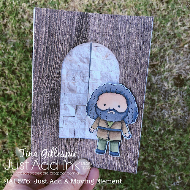
I used a combination of a few different tutorials to make the base of my card. Most Theatre cards are landscape orientation, but for the idea I had I needed a portrait orientation. I used the wooden and brick papers from the In Good Taste DSP, as I was trying to recreate a magical alleyway that opens at the tap of a special umbrella.
Here is the card with the brick panels opened up to reveal the alleyway behind. The gigantic character is from a Kindred Stamps set, called Masters Of Magic. I coloured him with my Stampin' Blends. He's an earthy character, so I stuck with Mossy Meadow, Old Olive and Soft Suede.
I was reasonably happy with my first attempt at a Theatre card, but I think I'll have another go at it soon. What Moving Element do you think you'll add to your card? Will you use the opportunity to try something new, or revisit an old favourite? I can't wait to see. You can link your card for our challenge over on the Just Add Ink Blog, where you will also find the rest of this week's Design Team cards. We had a lot of fun with this challenge!
Bye for now,
Tina


No comments:
Post a Comment
Thanks for taking the time to comment. I really appreciate it.
In line with new Data Protection legislation (GDPR) by commenting you do so in the knowledge that your name & comment are visible to all who visit this blog and thereby consent to the use of that personal information for that specific purpose.