Hi!
Where do you draw the line? It's so much easier to draw the line with Stampin' Up!'s new photopolymer stamp set called Draw The Line! I recently ran a class on border stamps and this was one of the cards we made using the new stamp set.
I really love how easy photopolymer stamps are to line up! We stamped the lines across the bottom in Smoky Slate and then again a second time without reinking. As you can see through the stamps it was easy peasy to make sure that the spacing was even and the lines were straight.
The arrows are also a stamp in the set. I thought they were a great way to add a little feature to the card, and they also tie in nicely with the new What's Up punched arrow. That punch is one of the current Weekly Deals, by the way! I scribbled over the punchie with my Real Red marker to match the punchie to the stamped arrows.
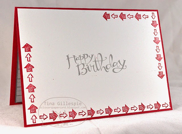
I used the arrows again on the inside to add a border to the card.
Bye for now,
Tina
Monday, 15 September 2014
Sunday, 14 September 2014
Layouts 69 and 70
Hi!
Just squeaking in for my weekend scrapbooking post! Very close to the end of my Paris layouts now.
I had researched before we left and found out that there was a Titanic Exhibition on in Singapore while we were there. I'd missed it when it was on in Australia, so I was determined to go to this one. When we arrived we were given a passenger card each that was based on a real passenger on Titanic. At the end we got to find out the fate of our passenger.

Sadly, Rob's passenger didn't survive, being a 'lower class' male. I got a First Class female passenger, so I was pretty sure I was going to survive.
It was an amazing exhibition that included real artifacts recovered from the ship and the wreck site. There were lots of recreated rooms, including the magnificent staircase, where we had a very dodgy tourist photo taken!
I didn't take any photos of our arrival home to Adelaide. I remember that at the airport Hudson ignored both Rob and I, like he was upset we'd left him for nearly 2 weeks. It didn't take long for him to warm to us again though! I loved the pictures that Alex and Ada had drawn for us, especially as they had "missed our faces". Funny!
Bye for now,
Tina
Just squeaking in for my weekend scrapbooking post! Very close to the end of my Paris layouts now.
I had researched before we left and found out that there was a Titanic Exhibition on in Singapore while we were there. I'd missed it when it was on in Australia, so I was determined to go to this one. When we arrived we were given a passenger card each that was based on a real passenger on Titanic. At the end we got to find out the fate of our passenger.
Sadly, Rob's passenger didn't survive, being a 'lower class' male. I got a First Class female passenger, so I was pretty sure I was going to survive.
It was an amazing exhibition that included real artifacts recovered from the ship and the wreck site. There were lots of recreated rooms, including the magnificent staircase, where we had a very dodgy tourist photo taken!
I didn't take any photos of our arrival home to Adelaide. I remember that at the airport Hudson ignored both Rob and I, like he was upset we'd left him for nearly 2 weeks. It didn't take long for him to warm to us again though! I loved the pictures that Alex and Ada had drawn for us, especially as they had "missed our faces". Funny!
Bye for now,
Tina
Friday, 12 September 2014
JAI #231: Just Add Colour!
Hi!
This week we have a colour combination challenge for you at Just Add Ink. I love doing colour challenges as often the hardest part of a card is choosing the colour combo, but in a challenge the colours are chosen for you. Easy!
This week Mae has chosen these bold colours for us to work with. Usually my first step in doing a colour challenge is to look at the DSP I have to see if I can use any of it. In this case I went straight for the Flowerpot DSP and the bold Crushed Curry Polka Dot paper to use as the base of my card.
Next step is the accessories that I can use. I'd been Project Life-ing the night before and remembered that the Everyday Adventure kit also features Crushed Curry and Basic black. The card I used works well on the card and really ties in to the sentiment I used!
I had to trim the card in half to stretch it for my card. The 'missing bit' is behind the main panel, so no one would ever know it wasn't a whole piece. I created the notecard paper using the Draw The Line photopolymer stamp set and my Spiral Border punch - a great combination!
I really love this little cluster of stars from the Project Life Point & Click stamp set - I've been using them on heaps of cards lately!
What will you do with the colours this week? Can't wait to find out, so make sure you join in with the fun at Just Add Ink this week.
Bye for now,
Tina
This week we have a colour combination challenge for you at Just Add Ink. I love doing colour challenges as often the hardest part of a card is choosing the colour combo, but in a challenge the colours are chosen for you. Easy!
This week Mae has chosen these bold colours for us to work with. Usually my first step in doing a colour challenge is to look at the DSP I have to see if I can use any of it. In this case I went straight for the Flowerpot DSP and the bold Crushed Curry Polka Dot paper to use as the base of my card.
Next step is the accessories that I can use. I'd been Project Life-ing the night before and remembered that the Everyday Adventure kit also features Crushed Curry and Basic black. The card I used works well on the card and really ties in to the sentiment I used!
I had to trim the card in half to stretch it for my card. The 'missing bit' is behind the main panel, so no one would ever know it wasn't a whole piece. I created the notecard paper using the Draw The Line photopolymer stamp set and my Spiral Border punch - a great combination!
I really love this little cluster of stars from the Project Life Point & Click stamp set - I've been using them on heaps of cards lately!
What will you do with the colours this week? Can't wait to find out, so make sure you join in with the fun at Just Add Ink this week.
Bye for now,
Tina
Wednesday, 10 September 2014
I Like You Circle Flip Card
Hi!
I quite like the Circle Card Thinlits, but I often forget to use it! I thought the flower images from the Hostess set I Like You would work beautifully with the shaped card, and I think I was right!
I stamped the Left side of the base card with one of the smaller floral images from I Like You, and then used the happily coordinating Gold Soiree SDSP on the left side. Have I said before how much I love that Stampin' Up! make it so easy to make things match?
The focal floral image was coloured with my Rich Razzleberry and Old Olive Blendabilities Markers. The sentiment comes from Tap Tap Tap and was the perfect size to fill the space left after the flower was stamped.
After I made (and photographed) the back of the card I decided that it would look better with another flower stamped on there. I shifted the sentiment a little and stamped the same flower that I stamped on the left of the card. It looked much better, but silly me forgot to photograph the new back. Oh well!
Bye for now,
Tina
I quite like the Circle Card Thinlits, but I often forget to use it! I thought the flower images from the Hostess set I Like You would work beautifully with the shaped card, and I think I was right!
I stamped the Left side of the base card with one of the smaller floral images from I Like You, and then used the happily coordinating Gold Soiree SDSP on the left side. Have I said before how much I love that Stampin' Up! make it so easy to make things match?
The focal floral image was coloured with my Rich Razzleberry and Old Olive Blendabilities Markers. The sentiment comes from Tap Tap Tap and was the perfect size to fill the space left after the flower was stamped.
After I made (and photographed) the back of the card I decided that it would look better with another flower stamped on there. I shifted the sentiment a little and stamped the same flower that I stamped on the left of the card. It looked much better, but silly me forgot to photograph the new back. Oh well!
Bye for now,
Tina
Monday, 8 September 2014
Dotty Angles With Sequins
Hi!
Today's card uses a new stamp set that we were shown at Convention, way back in May. The name of the stamp set "Dotty Angles" stuck in my head, because Brian Pilling, who demonstrated the set, commented that he thought they stamp set was called "Dotty Angels" and couldn't work out why because there was nothing angelic about it!
I used the Dotty stamp in the set for this card. I really love the confetti look of the dots. They were stamped three times in Pistachio Pudding, Crisp Cantaloupe and So Saffron.
I added some Crisp Cantaloupe and Pistachio Pudding round sequins to the front for a little bling interest to the card.
As you know, I like to do the insides of my cards and match them to the fronts. More dots, this time down the side to leave plenty of room for writing a message to the recipient.
Bye for now,
Tina
Today's card uses a new stamp set that we were shown at Convention, way back in May. The name of the stamp set "Dotty Angles" stuck in my head, because Brian Pilling, who demonstrated the set, commented that he thought they stamp set was called "Dotty Angels" and couldn't work out why because there was nothing angelic about it!
I used the Dotty stamp in the set for this card. I really love the confetti look of the dots. They were stamped three times in Pistachio Pudding, Crisp Cantaloupe and So Saffron.
I added some Crisp Cantaloupe and Pistachio Pudding round sequins to the front for a little bling interest to the card.
As you know, I like to do the insides of my cards and match them to the fronts. More dots, this time down the side to leave plenty of room for writing a message to the recipient.
Bye for now,
Tina
Saturday, 6 September 2014
Layouts 67 and 68
Hi!
I'm nearing the end of my Paris trip layouts - only 2 more weeks to go after this week! I hope you're not sick of them yet.
As exhausted as we were when we flew into Singapore on our way home, we decided that we wanted to get out and see a bit of the city while we were there. It was really tempting to stay at the airport and try to sleep a little more, but I didn't want to regret not going into the city, so off we went!
After discussions with the lady on the help desk we decided to splurge on taxis rather than to attempt the public transport system on the amount of sleep we'd had! In the end it wasn't much of a splurge, as the taxis were quite cheap. Our destination was the Marina Sands Resort and the Art Science Museum as there was a Titanic Exhibition there that we were both keen to see. We wandered around the Resort for a little while and saw the amazing Casino, which looks like it has a boat on top of 3 pillars! We also saw people getting a fish pedicure (yuck!) and some costumes from Wicked!, which was showing there. Sadly, we didn't have enough time to catch the show.
The Museum is an incredible building that is in the shape of a lotus flower. So pretty! There are several ponds surrounding the building that are full of lotus plants. There weren't many flowers in bloom, but the ones that were blooming were beautiful.
Bye for now,
Tina
I'm nearing the end of my Paris trip layouts - only 2 more weeks to go after this week! I hope you're not sick of them yet.
As exhausted as we were when we flew into Singapore on our way home, we decided that we wanted to get out and see a bit of the city while we were there. It was really tempting to stay at the airport and try to sleep a little more, but I didn't want to regret not going into the city, so off we went!
After discussions with the lady on the help desk we decided to splurge on taxis rather than to attempt the public transport system on the amount of sleep we'd had! In the end it wasn't much of a splurge, as the taxis were quite cheap. Our destination was the Marina Sands Resort and the Art Science Museum as there was a Titanic Exhibition there that we were both keen to see. We wandered around the Resort for a little while and saw the amazing Casino, which looks like it has a boat on top of 3 pillars! We also saw people getting a fish pedicure (yuck!) and some costumes from Wicked!, which was showing there. Sadly, we didn't have enough time to catch the show.
The Museum is an incredible building that is in the shape of a lotus flower. So pretty! There are several ponds surrounding the building that are full of lotus plants. There weren't many flowers in bloom, but the ones that were blooming were beautiful.
Bye for now,
Tina
Friday, 5 September 2014
JAI #230: Just Add Dad
Hi!
This week at Just Add Ink we have a bit of an obvious, but still very fun, theme for our challenge this wee. We want you to Just Add Dad! Yes, with Father's Day in a couple of days we want you to show us what you've made. If you don't celebrate Father's Day a male card would be fine too.
I made this card for Rob for Father's Day. His favourite colours are red, white and black because his favourite footy team is the St George Dragons. I went for a few retired items on the card too, including the Real Red Coredinations cardstock and the For My Family stamp set.
I've also used a lot of new stuff, like the Typeset SDSP and the Point & Click photopolymer stamp set. Rob loves maps, so I deliberately chose the map page from the Typeset SDSP pack.
I love this little star cluster and the way it highlights the inside sentiment. The sentiment is from the Just Sayin' stamp set, but I chose to use a different word bubble that the one it was in. I used my Real Red marker to selectively colour the stamp to just use the words and then used the speech bubble from Point & Click to frame it. Love the photopolymer stamps for easy placement!
Can't wait to see what you've all come up with for the males in your life! See you over at Just Add Ink.
Bye for now,
Tina
This week at Just Add Ink we have a bit of an obvious, but still very fun, theme for our challenge this wee. We want you to Just Add Dad! Yes, with Father's Day in a couple of days we want you to show us what you've made. If you don't celebrate Father's Day a male card would be fine too.
I made this card for Rob for Father's Day. His favourite colours are red, white and black because his favourite footy team is the St George Dragons. I went for a few retired items on the card too, including the Real Red Coredinations cardstock and the For My Family stamp set.
I've also used a lot of new stuff, like the Typeset SDSP and the Point & Click photopolymer stamp set. Rob loves maps, so I deliberately chose the map page from the Typeset SDSP pack.
I love this little star cluster and the way it highlights the inside sentiment. The sentiment is from the Just Sayin' stamp set, but I chose to use a different word bubble that the one it was in. I used my Real Red marker to selectively colour the stamp to just use the words and then used the speech bubble from Point & Click to frame it. Love the photopolymer stamps for easy placement!
Can't wait to see what you've all come up with for the males in your life! See you over at Just Add Ink.
Bye for now,
Tina
Subscribe to:
Posts (Atom)
