Welcome to another little blog hop. Today the ladies that are participating all have projects they made using the Big Shot. The blog before mine was Ros Davidson's, but it's all a big loop so it doesn't matter where you start. Just keep hopping 'til you get to where you started!
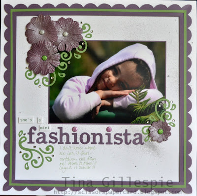
I have a layout for you today that uses several accessories for the Big Shot.
You can see I used the Timeless Type Alphabet Dies, the Scribbles Swirls die and the Tasteful Trims Die. Did you notice the scalloped border around the layout? I'll show you how to make the border in one piece a bit further down, but first a few more closer shots of the layout.
The "she's a mini" part of the title was printed onto Whisper White cardstock and trimmed. I used RGB codes to change the colour of the font to Wild Wasabi to match the rest of the layout.
I used some Glimmer brads in the title and also as the centre of the flowers.
The flowers were brayered with Perfect Plum ink and then spritzed with Frost White Shimmer paint.
OK, so now on to how I made the border piece. Firstly I cut a 1" wide border. To do this you line your cardstock up at the 1" mark, put your blade at 1" and cut down to 11". Turn your cardstock 90 degrees and repeat for all 4 sides. You end up with a shape like this:
Now you need to fold the frame in half diagonally to get this shape:
After each fold burnish with a bone folder. The flatter the folds the easier it is to line up the piece on the die. You need to fold your frame diagonally again to end up with a shape like this:
Now you need to place the cardstock on the die. You shouldn't have any troubles cutting through all layers at once. It's very hard to see in the photo, but I lined the top edge up with the top cutting edge of the die and then centered the piece on the scallops at the bottom. You can see the shape of the corner pieces in the first photo. It's a bit of a flattened scallop. I haven't tried it yet, but I THINK if you want a more rounded scallop at the corners you would have to arrange your cardstock the other way. That is, line up the bottom edge of the cardstock on the scalloped edge so that the points of your cardstock extend the full length of the scallops. Your frame would end up a little narrower than mine. It's all just a matter of playing around with it to see what you like!
When you have cut it and unfolded it, this is what you end up with:
A continuous, scalloped frame! You will probably need to smooth out the folds at the corners with your bone folder. I reckon you could make almost any sized frames using my method, you'd just have to play with the measurements of the frame you cut. The rest of the steps would be the same. If you have any questions, just leave a comment and I will get back to you.
Ink: Perfect Plum
Cardstock: 12 x 12 Textured Whisper White, Perfect Plum, Wild Wasabi, Whisper White
Big Shot: Timeless Type Alphabet Dies, Tasteful Trims Die, Scribbles Swirls Die
Other: Silver Foil Smooch, Frost White Shimmer Paint, Paper Daisies, Basic Jewel Rhinestones, Brayer, Glimmer Brads, Dimensionals, Letter Gothic Standard Font
Thanks for looking at my layout. You're off to Nikki Sadler's blog now, where I'm sure you're in for a real treat!
Catch you later,
Tina
Blogs in the hop:
Ros Davidson
http://www.rosdavidson.typepad.com/
Nikki Sadler
http://www.inkyart.com.au/
Sue Madex
http://www.madexcreations.com/
Kathryn Ruddick
http://www.katlodesigns.com/
Judy May
http://www.judymay.typepad.com/


Tina, your tutorial on making the frame is BRILLIANT!! What a great idea. Love your layout :)
ReplyDeleteLovely layout Tina and the tutorial on how to make the frame is awesome.
ReplyDeleteLovely layout Tina and the tutorial is awesome.
ReplyDeleteWow! What an amazing & awesome idea Tina! Here I thought you used the scallop border punch, now I know your secret. Well done & thanks for sharing! Beautiful scrapbook page too - such a gorgeous layout.
ReplyDeleteGorgeous layout, Tina and lovely colour combo. Super clever idea with the scallop frame.
ReplyDeleteWow Tina this is a fantastic idea and one I will be trying ..thanks for the tutorial!
ReplyDeleteTina, you are amazing! What a great layout and brilliant tutorial. I have just invested in the alphabet dies and am itching to use them...thanks for the inspiration...beautifully done.
ReplyDeleteLovely your layout Tina - that border idea is fabulous. I will definitely be purchasing the scribbles swirls sizzlit too.
ReplyDeleteomg tina, this is beautiful, TFS.
ReplyDelete