Hi!
I hope you are all staying safe and staying home - we certainly are! I thought it might mean more crafting time, but supervising the kids with their school work and being Rob's coffee lady is running me off my feet! I had a quick half hour to throw a card together for this week's Just Add Ink challenge though. Rachael has given us a soft, pretty colour combo to work with.
I'm not quite sure why, but every time I looked at the colours I immediately thought of gingham!
Thankfully each of the colour family DSP packs has this gorgeous gingham paper! I layered some Balmy Blue Gingham DSP under the rectangular die cut from the Nature's Thoughts Dies. I love the pretty stitching effect on the border of the die cut. The two layers were popped up on a Whisper White Notecard, which is smaller than a regular card base. The die cut rectangle fits perfectly!
I used my Balloon Bouquet Punch to create the Easter Eggs. All I had to do was snip off the bottom part of the balloon - the knotted bit - and turn the shapes upside down. Easy! The sentiment is from the new Timeless Tulips stamp set. The whole sentiment is not something I'd ever use, so I took my snips to the stamp and just chopped off the Happy Easter bit.
The Balloon Bouquet Punch crops two balloons each time, so I used the remaining three on the inside of my notecard. I didn't have a sentiment to put on the inside, so I just left it blank - more room for writing!
Please head on over to check out the Just Add Ink blog. You can find the links to the other Design Team cards, and you can also add your card to the challenge gallery. I can't wait to see what you do with these colours!
Bye for now,
Tina
Thursday, 2 April 2020
Tuesday, 31 March 2020
Wiggly Worm Pop Up!
Hi!
I often forget to blog early in the week, but I had a bit of extra time this week and I actually remembered to write a post! Today's card was one that I made using a Jennifer McGuire tutorial. I loved how her card had a cute little pop up element on the inside.
This card was made as a class sample, so that my ladies could try out the technique. I thought the Wiggle Worm bundle was a great choice for this card, as it's great for a younger child.
To create the pop up section, you just create two squares using narrow strips of cardstock. They are just glued together and then glued to the card base, lining up with the fold.
The two little panels on the inside just adhere to the rectangles. They need to be small enough to fit into the card when it is folded. How cute are those bugs? I really should play with this bundle some more!
Bye for now,
Tina
I often forget to blog early in the week, but I had a bit of extra time this week and I actually remembered to write a post! Today's card was one that I made using a Jennifer McGuire tutorial. I loved how her card had a cute little pop up element on the inside.
This card was made as a class sample, so that my ladies could try out the technique. I thought the Wiggle Worm bundle was a great choice for this card, as it's great for a younger child.
To create the pop up section, you just create two squares using narrow strips of cardstock. They are just glued together and then glued to the card base, lining up with the fold.
The two little panels on the inside just adhere to the rectangles. They need to be small enough to fit into the card when it is folded. How cute are those bugs? I really should play with this bundle some more!
Bye for now,
Tina
Sunday, 29 March 2020
CTC #266 Week 1: Easter Cards
Hi!
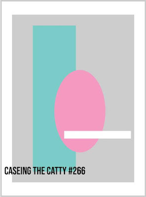
Hello, and welcome back! I hope you're all coping well with the new social restrictions. It might be difficult but it's so important! My household is bunkered down, and so far so good! But anyway, on with the reason why you're here - the new CASEing The Catty Sunday Challenge Blog Hop! We are starting a new challenge this fortnight, just in time for Easter!
All you need to do is create an Easter project using our sketch to guide you! Easy!
I don't usually make Easter cards, so I actually found this one a little difficult!
I started by colouring the flowers from Flowering Foils. I'd fussy cut them a couple of weeks ago, which was very handy! I used Soft Sea Foam, Petal Pink and So Saffron Stampin' Blends, as I wanted a soft colour palette. I just coloured quickly, no blending, but using both Light and Dark markers.
The flowers became my rectangular element, as I cut an oval from the Soft Sea Foam So Very Vellum SDSP pack. It's very subtle, but that's how I wanted it to be. Speaking of subtle, I nearly reached for my Subtle 3DEF for the background, but them I recalled the Country Floral 3DEF, which I haven't used for ages! It fit the floral theme nicely.
I cropped the vellum oval for the front from a larger piece of Vellum, with the intention of using the left over piece on the inside. The writing panel was coped from the largest Stitched So Sweetly die. Do you remember the sentiments I've used? They are from a long retired set, called Well Scripted. I don't have any current Easter sentiments, so I had to reach into my retired stamp sets!
Our challenges are run through our Facebook group, so please pop on over there to join in with the fun. It's easy to join if you aren't already part of the group. When you've made your card, just add your picture to the group.
But now it's time to continue on with the Hop. Next up is the fabulous Judy May with her gorgeous card.
Hello, and welcome back! I hope you're all coping well with the new social restrictions. It might be difficult but it's so important! My household is bunkered down, and so far so good! But anyway, on with the reason why you're here - the new CASEing The Catty Sunday Challenge Blog Hop! We are starting a new challenge this fortnight, just in time for Easter!
All you need to do is create an Easter project using our sketch to guide you! Easy!
I don't usually make Easter cards, so I actually found this one a little difficult!
I started by colouring the flowers from Flowering Foils. I'd fussy cut them a couple of weeks ago, which was very handy! I used Soft Sea Foam, Petal Pink and So Saffron Stampin' Blends, as I wanted a soft colour palette. I just coloured quickly, no blending, but using both Light and Dark markers.
The flowers became my rectangular element, as I cut an oval from the Soft Sea Foam So Very Vellum SDSP pack. It's very subtle, but that's how I wanted it to be. Speaking of subtle, I nearly reached for my Subtle 3DEF for the background, but them I recalled the Country Floral 3DEF, which I haven't used for ages! It fit the floral theme nicely.
I cropped the vellum oval for the front from a larger piece of Vellum, with the intention of using the left over piece on the inside. The writing panel was coped from the largest Stitched So Sweetly die. Do you remember the sentiments I've used? They are from a long retired set, called Well Scripted. I don't have any current Easter sentiments, so I had to reach into my retired stamp sets!
Our challenges are run through our Facebook group, so please pop on over there to join in with the fun. It's easy to join if you aren't already part of the group. When you've made your card, just add your picture to the group.
But now it's time to continue on with the Hop. Next up is the fabulous Judy May with her gorgeous card.
Bye for now,
Tina
Thursday, 26 March 2020
JAI #498: Just Add E
Hi!
Hello, and good to see you here for the new Just Add Ink Challenge. This week it's one of my alphabet challenges, and it's the letter E. What does that mean? It means you create your card using *anything* that starts with E. It could be a technique, a stamp set, a theme, a colour - your imagination is the limit!
Now, with Easter just a couple of weeks away, that would be an obvious theme for this challenge - but I don't like doing the obvious! After a bit of a think, I remembered two stamp sets I'd purchased recently but had yet to use.
How fun is that background? It's from Ink Road Stamps, and is chock full of different movie quotes to do with love. It's called Subway Art: Love. The quote I was after is actually closer to the top, so I chopped up and rearranged the stamped image to bring the quote to the bottom. I stamped the whole image in Balmy Blue using my Stamparatus and then I just inked up the key quote in Night Of Navy and stamped again. Easy!
The quote might give you a big clue as to who the character is - her name starts with E. I know she's not actually the one to say that quote, but it was said to her, and I needed her on the front, so close enough for me! I stamped her using a Kindred Stamps set called Classic Love.
You can't have her without him, so he's on the inside! I hoped you've worked out the story - it's one of my favourite classics.
That's all from me this week. Are you madly thinking about what 'E' element you can add to your card? I hope so! I'd love to see what you make. You can link up to the challenge on the Just Add Ink blog, where you can also see the rest of the Design Team cards.
Bye for now,
Tina
Hello, and good to see you here for the new Just Add Ink Challenge. This week it's one of my alphabet challenges, and it's the letter E. What does that mean? It means you create your card using *anything* that starts with E. It could be a technique, a stamp set, a theme, a colour - your imagination is the limit!
Now, with Easter just a couple of weeks away, that would be an obvious theme for this challenge - but I don't like doing the obvious! After a bit of a think, I remembered two stamp sets I'd purchased recently but had yet to use.
How fun is that background? It's from Ink Road Stamps, and is chock full of different movie quotes to do with love. It's called Subway Art: Love. The quote I was after is actually closer to the top, so I chopped up and rearranged the stamped image to bring the quote to the bottom. I stamped the whole image in Balmy Blue using my Stamparatus and then I just inked up the key quote in Night Of Navy and stamped again. Easy!
The quote might give you a big clue as to who the character is - her name starts with E. I know she's not actually the one to say that quote, but it was said to her, and I needed her on the front, so close enough for me! I stamped her using a Kindred Stamps set called Classic Love.
You can't have her without him, so he's on the inside! I hoped you've worked out the story - it's one of my favourite classics.
That's all from me this week. Are you madly thinking about what 'E' element you can add to your card? I hope so! I'd love to see what you make. You can link up to the challenge on the Just Add Ink blog, where you can also see the rest of the Design Team cards.
Bye for now,
Tina
Sunday, 22 March 2020
CTC #265 Week 2: Second Release Sale-A-Bration
Hi!
Welcome, and thank you for doing us for our new CASEing The Catty Sunday Challenge Blog Hop. We are mid way though our fortnightly challenge to CASE a project from the Second Release Sale-A-Bration Catalogue.
It's a wee little catalogue, but it's certainly packed with inspiration - sometimes in unexpected places! My card was CASEd from the picture of the Flowering Foils DSP on page 3. The way the papers were arranged in peaks, like mountains, caught my eye.
I simplified quite a bit to only have one set of peaks, but I was really pleased with how it turned out. I cropped three of the largest Stitched rectangle dies, one each of Balmy Blue, Blueberry Bushel and Night Of Navy. I imagine this card would look just as great. in other colours too! The Happy Birthday was heat embossed in Silver.
Here's how I started the layers on the Thick Whisper White card base. I glued the first layer down with Tombow, and then flipped the card to trim the excess away from the back. I then repeated the process with the other two layers. I did lay the three layers over the base first without glue so that I didn't glue the top layer too high, which would leave gaps at the bottom. I hope that makes sense!
The inside was decorated using the offcuts from the front! I was left with very little waste, which always makes me happy!
Our challenge is run through our Facebook group. Pop on over there, after you've finished the hop, of course! You can upload your card and see everyone else's cards. Lots of inspiration to be found!
Next up in the Blog Hop is the lovely Bec. I absolutely adore her purple card - you certainly don't want to miss it!
Bye for now,
Tina
Welcome, and thank you for doing us for our new CASEing The Catty Sunday Challenge Blog Hop. We are mid way though our fortnightly challenge to CASE a project from the Second Release Sale-A-Bration Catalogue.
It's a wee little catalogue, but it's certainly packed with inspiration - sometimes in unexpected places! My card was CASEd from the picture of the Flowering Foils DSP on page 3. The way the papers were arranged in peaks, like mountains, caught my eye.
I simplified quite a bit to only have one set of peaks, but I was really pleased with how it turned out. I cropped three of the largest Stitched rectangle dies, one each of Balmy Blue, Blueberry Bushel and Night Of Navy. I imagine this card would look just as great. in other colours too! The Happy Birthday was heat embossed in Silver.
Here's how I started the layers on the Thick Whisper White card base. I glued the first layer down with Tombow, and then flipped the card to trim the excess away from the back. I then repeated the process with the other two layers. I did lay the three layers over the base first without glue so that I didn't glue the top layer too high, which would leave gaps at the bottom. I hope that makes sense!
The inside was decorated using the offcuts from the front! I was left with very little waste, which always makes me happy!
Our challenge is run through our Facebook group. Pop on over there, after you've finished the hop, of course! You can upload your card and see everyone else's cards. Lots of inspiration to be found!
Next up in the Blog Hop is the lovely Bec. I absolutely adore her purple card - you certainly don't want to miss it!
Bye for now,
Tina
Thursday, 19 March 2020
JAI #497: Just Add A Sketch
Hi!
Hooray, it's nearly the weekend! Time for the new Just Add Ink challenge. This week Kim has designed a sketch for us to follow. I love all of the different sized squares/rectangles!
I super-sized the shapes so that I could use the Power Of Hope stamp set.
The shapes are just perfect for the images in the stamp set! I stamped them all in Memento ink and then coloured them with my Stampin' Blends. I used Real Red, Granny Apple Green, Night Of Navy, Balmy Blue, Basic Black, Bronze and Ivory.
I'm not sure if you can see, but I embossed the gorgeous Lily Impressions DP with the Subtle 3D folder, just to enhance the 'paint on canvas' look of the DSP.
The sentiments I used are both from the Hugs From Shelli Paper Pumpkin box. It's nice to use them - I often forget about them!
Time now to head on over to the Just Add Ink blog, where you can find the rest of the Design Team cards, and you can also add your entry to the challenge. We'd love to see what you do with Kim's sketch!
Bye for now,
Tina
Hooray, it's nearly the weekend! Time for the new Just Add Ink challenge. This week Kim has designed a sketch for us to follow. I love all of the different sized squares/rectangles!
I super-sized the shapes so that I could use the Power Of Hope stamp set.
The shapes are just perfect for the images in the stamp set! I stamped them all in Memento ink and then coloured them with my Stampin' Blends. I used Real Red, Granny Apple Green, Night Of Navy, Balmy Blue, Basic Black, Bronze and Ivory.
I'm not sure if you can see, but I embossed the gorgeous Lily Impressions DP with the Subtle 3D folder, just to enhance the 'paint on canvas' look of the DSP.
The sentiments I used are both from the Hugs From Shelli Paper Pumpkin box. It's nice to use them - I often forget about them!
Time now to head on over to the Just Add Ink blog, where you can find the rest of the Design Team cards, and you can also add your entry to the challenge. We'd love to see what you do with Kim's sketch!
Bye for now,
Tina
AWH March Creative Showcase: Monochromatic Cards
Hi!
Welcome to the new Art With Heart Monthly Creative Showcase!
This month the Art With Heart Team are featuring Monochromatic cards, that is cards that only use different shades of the same colour. This is a great opportunity for us to demonstrate the wonderful range of Stampin’ Up! colours across our inks, papers and embellishments that can be combined to produce the amazing monochromatic samples we have to share with you.
I actually found it quite difficult to narrow down which colour I was going to use! There are so many fabulous colours to choose from in Stampin' Up!'s colour families. In the end I went with Bermuda Bay and Pool Party, mostly because of this sheet of DSP in the Lily Impressions pack - why have I not played with this paper sooner??? I love how it looks like paint smeared on a canvas, and best of all, it is free with a qualifying order during Sale-A-Bration!
I stamped the lady and lanterns from Power Of Hope in Memento ink and coloured them with my Bermuda Bay and Pool Party Stampin' Blends. I didn't colour the lanterns or umbrella much - just a quick swipe of Light Pool Part in key places.
I used another Sale-A-Bration freebie to decorate the card - some Bermuda Bay sequins from the Metallic Baker's Twine and Sequins Combo Pack. The sentiment is from Label Me Bold, stamped in Bermuda Bay.
In order to get the white streaks in the DSP in the spot I wanted on my card, I had to crop a wide strip from the DSP first. Waste not, want not, I used it on the inside of my card! It's wider than I'd usually crop the paper, so I chose not to add a sentiment to leave enough room for writing.
That's all from me, now you're off to see what the wonderful Kate Morgan has made. What colour has she chosen? We don't see each other's cards until we do the hop, so it's a surprise for us too!
Welcome to the new Art With Heart Monthly Creative Showcase!
This month the Art With Heart Team are featuring Monochromatic cards, that is cards that only use different shades of the same colour. This is a great opportunity for us to demonstrate the wonderful range of Stampin’ Up! colours across our inks, papers and embellishments that can be combined to produce the amazing monochromatic samples we have to share with you.
I actually found it quite difficult to narrow down which colour I was going to use! There are so many fabulous colours to choose from in Stampin' Up!'s colour families. In the end I went with Bermuda Bay and Pool Party, mostly because of this sheet of DSP in the Lily Impressions pack - why have I not played with this paper sooner??? I love how it looks like paint smeared on a canvas, and best of all, it is free with a qualifying order during Sale-A-Bration!
I stamped the lady and lanterns from Power Of Hope in Memento ink and coloured them with my Bermuda Bay and Pool Party Stampin' Blends. I didn't colour the lanterns or umbrella much - just a quick swipe of Light Pool Part in key places.
I used another Sale-A-Bration freebie to decorate the card - some Bermuda Bay sequins from the Metallic Baker's Twine and Sequins Combo Pack. The sentiment is from Label Me Bold, stamped in Bermuda Bay.
In order to get the white streaks in the DSP in the spot I wanted on my card, I had to crop a wide strip from the DSP first. Waste not, want not, I used it on the inside of my card! It's wider than I'd usually crop the paper, so I chose not to add a sentiment to leave enough room for writing.
That's all from me, now you're off to see what the wonderful Kate Morgan has made. What colour has she chosen? We don't see each other's cards until we do the hop, so it's a surprise for us too!
Bye for now,
Tina
If you have a broken link or have come to this blog hop midway, you can view all the participants below:
Subscribe to:
Posts (Atom)