Hi!
Thanks for joining me again for the latest Just Add Ink challenge. This week Lou has found a beachy Inspiration photo for us to work with. It was good timing, as Adelaide has had a little burst of days over 30C, so it felt right to be playing with a summery image!
I don't have a lot of beachy themed stuff, so I decided to play more with the colours in the photo. I like the mix of the blue(ish!) water and the brown sand.
I started with a Sahara Sand card base, embossed with the Subtle folder. The DSP is from the Woven Threads pack. I love the rustic look of these papers, and thought they worked well as a water substitute.
Normally I'd use either Whisper White or Very Vanilla on a card, but this time I used both! I was hoping they looked a bit like the foamy water at the edge of the ocean, especially with the curly die cut (a sneak peek!!)
To give the card a bit more of a beachy feel I used the seahorse and shell from Seaside Notions on my card. They were stamped in Seaside Spray on Very Vanilla and fussy cut.
What do you see in the Inspiration Photo? The Design Team have taken a whole lot of different ideas and made some amazing cards! You can see the over at the Just Add Ink blog, where you can also link up your card for this week's challenge.
Bye for now,
Tina
Showing posts with label Woven Threads DSP. Show all posts
Thursday, 12 March 2020
Tuesday, 3 December 2019
OnStage Sydney Beautiful Moments Presentation: Avid Samples
Hi!
Here's the third and final part of my OnStage Presentation sample posts. This time I have my Avid Crafter samples for the gorgeous Beautiful Moments stamp set. An Avid Crafter is one who stamps nearly every day and has to have it all! Sound familiar? I am definitely an Avid Crafter!! They definitely want more difficult projects and are willing to spend a lot of time (and money) on one card.
This card, using the Reflection Technique on my Stamparatus, was the card I demonstrated live on the day. It was a little nervewracking, but I did it! The hardest part is getting the water wash over the reflection part of the image to look right. I used Blueberry Bushell ink and an Aqua Painter. The rest of the image was coloured beforehand with my Aqua Painter and ink pads.
Once the Blueberry Bushell was was dry, I flicked my Chalk Marker over the top to give the look of light reflecting off ripples in the water.
I finished the inside with the image again in Crushed Curry Ink.
This image was originally a 'just trying things out' sample that turned out nicely enough to go on a card. I stamped the image on Shimmery White card using a no-line stamping technique and then coloured them with my Watercolour Pencils and an Aquapainter.
I layered two of the Stitched Labels to go behind the image panel.
The girls were stamped in Coastal Cabana to finish off the inside.
I used the Bridge Fold to create this card. All of the colouring was done on Watercolour Paper using my ink pads and Aqua Painter. I stamped using Stazon Ink.
I added a second row of flowers to the middle of the card, between the front layer and the back, to give the card more depth.
The back of the card uses Shimmery White card, as it copes well with watercolouring, but is smooth to write on.
This card is my absolute favourite of all the cards I made. It was the very first idea I had when I saw Jacque's stamp set - how well it would work with A Good Man. 'Perfectly' is the answer!
I used my Stamparatus and stocky notes to stamp and mask the images, starting with the dad/girl, then the mum/girl, and finally the island - which is actually an outline of Rangitoto Island, just off Auckland. A nice homage to Jacque's adopted hometown! I stamped on watercolour paper using Stazon ink and then coloured with my ink pads and Aqua Painter.
Once again, I used Shimmery White cardstock on the inside so that I could watercolcour.
I also made a couple of scrapbook pages for the Presentation, to show how versatile the set is for all paper crafters. I'd recently been in Auckland for April's OnStage event, so I scrapped a photo of the family there, and another of Rangitoto Island. This will be the opening page of my album.
I also made a pocket page of my sisters and I when we were lots younger and entered a sandcastle building competition.
The two little girls on the beach were the perfect image for this page!
Thanks for checking out my samples. You can see my Beginner Samples here, and my Casual Samples here.
Bye for now,
Tina
Here's the third and final part of my OnStage Presentation sample posts. This time I have my Avid Crafter samples for the gorgeous Beautiful Moments stamp set. An Avid Crafter is one who stamps nearly every day and has to have it all! Sound familiar? I am definitely an Avid Crafter!! They definitely want more difficult projects and are willing to spend a lot of time (and money) on one card.
This card, using the Reflection Technique on my Stamparatus, was the card I demonstrated live on the day. It was a little nervewracking, but I did it! The hardest part is getting the water wash over the reflection part of the image to look right. I used Blueberry Bushell ink and an Aqua Painter. The rest of the image was coloured beforehand with my Aqua Painter and ink pads.
Once the Blueberry Bushell was was dry, I flicked my Chalk Marker over the top to give the look of light reflecting off ripples in the water.
I finished the inside with the image again in Crushed Curry Ink.
This image was originally a 'just trying things out' sample that turned out nicely enough to go on a card. I stamped the image on Shimmery White card using a no-line stamping technique and then coloured them with my Watercolour Pencils and an Aquapainter.
I layered two of the Stitched Labels to go behind the image panel.
The girls were stamped in Coastal Cabana to finish off the inside.
I used the Bridge Fold to create this card. All of the colouring was done on Watercolour Paper using my ink pads and Aqua Painter. I stamped using Stazon Ink.
I added a second row of flowers to the middle of the card, between the front layer and the back, to give the card more depth.
The back of the card uses Shimmery White card, as it copes well with watercolouring, but is smooth to write on.
This card is my absolute favourite of all the cards I made. It was the very first idea I had when I saw Jacque's stamp set - how well it would work with A Good Man. 'Perfectly' is the answer!
I used my Stamparatus and stocky notes to stamp and mask the images, starting with the dad/girl, then the mum/girl, and finally the island - which is actually an outline of Rangitoto Island, just off Auckland. A nice homage to Jacque's adopted hometown! I stamped on watercolour paper using Stazon ink and then coloured with my ink pads and Aqua Painter.
Once again, I used Shimmery White cardstock on the inside so that I could watercolcour.
I also made a couple of scrapbook pages for the Presentation, to show how versatile the set is for all paper crafters. I'd recently been in Auckland for April's OnStage event, so I scrapped a photo of the family there, and another of Rangitoto Island. This will be the opening page of my album.
I also made a pocket page of my sisters and I when we were lots younger and entered a sandcastle building competition.
The two little girls on the beach were the perfect image for this page!
Thanks for checking out my samples. You can see my Beginner Samples here, and my Casual Samples here.
Bye for now,
Tina
Thursday, 31 October 2019
JAI #481: Just Add Inspiration
Hi!
Welcome to another Just Add Ink challenge. This week Nikki has found a fabulous Inspiration Photo to guide our creativity.
Oooh, I'd love to get a bunch of flowers like that! So pretty! The flattish brown flowers (I am soooo not a gardener, and have no idea what type they are!) reminded me of the seed pods in Country Home, so that's the stamp set I reached for to make this card.
I totally used the 'wrong' colours for the rest of the flowers, but that didn't worry me, after all, an Inspiration Photo is just a starting point!
I used DSP from the Woven Threads DSP pack, as this linen look paper reminded me of the backdrop on the Inspiration Photo. The paper is gorgeous - it looks so textural!
I stamped the flowers again on the inside, using Sahara Sand ink. The sentiment is from Seaside Notions, as is the one of th front of the card. I so love the mix of fonts in that set!
Time for me to dash, but you can hop on over to the Just Add Ink blog to see the rest of this week's Design team cards. Don't forget to add your card to the challenge gallery before the deadline.
Bye for now,
Tina
Welcome to another Just Add Ink challenge. This week Nikki has found a fabulous Inspiration Photo to guide our creativity.
Oooh, I'd love to get a bunch of flowers like that! So pretty! The flattish brown flowers (I am soooo not a gardener, and have no idea what type they are!) reminded me of the seed pods in Country Home, so that's the stamp set I reached for to make this card.
I totally used the 'wrong' colours for the rest of the flowers, but that didn't worry me, after all, an Inspiration Photo is just a starting point!
I used DSP from the Woven Threads DSP pack, as this linen look paper reminded me of the backdrop on the Inspiration Photo. The paper is gorgeous - it looks so textural!
I stamped the flowers again on the inside, using Sahara Sand ink. The sentiment is from Seaside Notions, as is the one of th front of the card. I so love the mix of fonts in that set!
Time for me to dash, but you can hop on over to the Just Add Ink blog to see the rest of this week's Design team cards. Don't forget to add your card to the challenge gallery before the deadline.
Bye for now,
Tina
Sunday, 20 October 2019
CTC #251: Brightly Gleaming
Hi!
Hello, and welcome to the CASEing The Catty Sunday Challenge Blog Hop. Are you starting here, or have you come from Lauren's blog? It doesn't really matter, as we are all linked in a circle.
This week we are looking at the gorgeous Brightly Gleaming Suite, but particularly the Brightly Gleaming SDSP. It's stunning DSP, which features fabulous copper highlights with the rich colours of the paper.
As part of the challenge, we not only have to CASE the SDSP, but also a layout from page 30, which is the page pictured above. I had about 3 minutes to make my card, as my daughter had dance competitions over the weekend. I ended up going with the card at the top right of the page.
Instead of using the Brightly Gleaming DSP, I chose a more subtle paper from the Woven Threads pack. It's still Pretty Peacock, but it ins't a Christmas pattern. I wanted to make a card for my daughter to let her know how proud we were of her dancing in the competition.
I coloured the dancer using my Blends. I selected Light Pool Party and Light Pretty Peacock for her dress, Ivory for her skin, and the Soft Suede pair for her hair and the shadow under her feet. Ada danced in a similar coloured costume, so that worked nicely for my card! Although her costume had *way* more sequins than my card!
As a different feature, I decided to inset the rectangles in the design rather than layer them on top. I used my Rectangle Stitched dies to crop the opening in the DSP and then to crop a frame in the Copper Foil paper. The whole piece was then popped up over the card base.
To finish the inside I stamped the same dancer, but this time I stamped her off so that the Pretty Peacock was a lighter shade. Ada is forever twirling around the house like this, so it really reminds me of her!
In case you were wondering, her troupe received Highly Commended awards for their Jazz, Tap and Contemporary routines.
That's it for me, but just the start for you! The challenge runs for the next week, and you can upload your card in our Facebook group. Which of the cards will you choose to CASE using the Brightly Gleaming Suite as inspiration?
I'm the last stop on the Blog Hop this week, but if you didn't start at the beginning, you should continue hopping to see the gorgeous cards the DT have created this week. just keep going until you get back to where you started. Siobhan was the starting point this week.
Bye for now,
Tina
Hello, and welcome to the CASEing The Catty Sunday Challenge Blog Hop. Are you starting here, or have you come from Lauren's blog? It doesn't really matter, as we are all linked in a circle.
This week we are looking at the gorgeous Brightly Gleaming Suite, but particularly the Brightly Gleaming SDSP. It's stunning DSP, which features fabulous copper highlights with the rich colours of the paper.
As part of the challenge, we not only have to CASE the SDSP, but also a layout from page 30, which is the page pictured above. I had about 3 minutes to make my card, as my daughter had dance competitions over the weekend. I ended up going with the card at the top right of the page.
Instead of using the Brightly Gleaming DSP, I chose a more subtle paper from the Woven Threads pack. It's still Pretty Peacock, but it ins't a Christmas pattern. I wanted to make a card for my daughter to let her know how proud we were of her dancing in the competition.
I coloured the dancer using my Blends. I selected Light Pool Party and Light Pretty Peacock for her dress, Ivory for her skin, and the Soft Suede pair for her hair and the shadow under her feet. Ada danced in a similar coloured costume, so that worked nicely for my card! Although her costume had *way* more sequins than my card!
As a different feature, I decided to inset the rectangles in the design rather than layer them on top. I used my Rectangle Stitched dies to crop the opening in the DSP and then to crop a frame in the Copper Foil paper. The whole piece was then popped up over the card base.
To finish the inside I stamped the same dancer, but this time I stamped her off so that the Pretty Peacock was a lighter shade. Ada is forever twirling around the house like this, so it really reminds me of her!
In case you were wondering, her troupe received Highly Commended awards for their Jazz, Tap and Contemporary routines.
That's it for me, but just the start for you! The challenge runs for the next week, and you can upload your card in our Facebook group. Which of the cards will you choose to CASE using the Brightly Gleaming Suite as inspiration?
I'm the last stop on the Blog Hop this week, but if you didn't start at the beginning, you should continue hopping to see the gorgeous cards the DT have created this week. just keep going until you get back to where you started. Siobhan was the starting point this week.
Bye for now,
Tina
Thursday, 26 September 2019
AWH September Blog Hop: DSP
Hi!
Tonight the Art With Heart team are sharing amazing projects featuring Stampin’ Up! Designer Series Paper, most of which is in the current promotions where you can buy 3 packs of Designer Series Paper and receive a pack for free! You can select many of the DSP packs from the Annual Catalogue but only until the 30th of September.
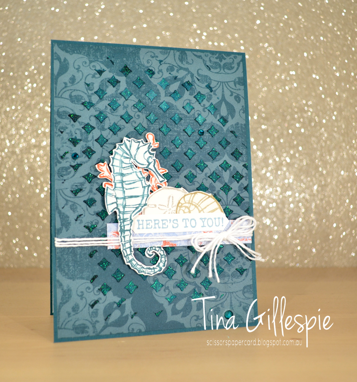
I took advantage of this awesome sale to purchase four packs that I didn't yet own, one of which being the gorgeous Woven Threads DSP. The patterns look like worn rugs that are hundreds of years old. Lots of gorgeous, muted colours and beautiful texture to the paper. I chose a piece of Pretty Peacock DSP that has a fabulous medallion design that's in a lighter shade of the same colour.
I had a plan to add some Shimmery Embossing Paste over the top of the DSP, but otherwise no idea beyond that! To colour the embossing paste, I tapped my Pretty Peacock ink pad over the top of the Pattern Party mask and then scooped out some of the paste. As I spread it over the mask and onto the DSP, it picked up the colour on the mask. I love how this gives uneven colour to the paste - it's lighter through the middle where I first applied the paste, but darker towards the edges, as I'd picked up more ink as I spread the paste.
I decided that the gorgeous blue/green made me think of the ocean, and so I reached for my Seaside Notions stamp set. Each image was stamped on Shimmery White cardstock and then I took an Aquapainter and ran it lightly over each image. It pulls a little colour in from the ink and is a really quick and easy way of adding some subtle colour.
Tonight the Art With Heart team are sharing amazing projects featuring Stampin’ Up! Designer Series Paper, most of which is in the current promotions where you can buy 3 packs of Designer Series Paper and receive a pack for free! You can select many of the DSP packs from the Annual Catalogue but only until the 30th of September.
I took advantage of this awesome sale to purchase four packs that I didn't yet own, one of which being the gorgeous Woven Threads DSP. The patterns look like worn rugs that are hundreds of years old. Lots of gorgeous, muted colours and beautiful texture to the paper. I chose a piece of Pretty Peacock DSP that has a fabulous medallion design that's in a lighter shade of the same colour.
I had a plan to add some Shimmery Embossing Paste over the top of the DSP, but otherwise no idea beyond that! To colour the embossing paste, I tapped my Pretty Peacock ink pad over the top of the Pattern Party mask and then scooped out some of the paste. As I spread it over the mask and onto the DSP, it picked up the colour on the mask. I love how this gives uneven colour to the paste - it's lighter through the middle where I first applied the paste, but darker towards the edges, as I'd picked up more ink as I spread the paste.
I decided that the gorgeous blue/green made me think of the ocean, and so I reached for my Seaside Notions stamp set. Each image was stamped on Shimmery White cardstock and then I took an Aquapainter and ran it lightly over each image. It pulls a little colour in from the ink and is a really quick and easy way of adding some subtle colour.
When I'm stamping things like the shells and coral for the front, I always stamp a couple of extras. This means when I get to the inside I don't have to start stamping all over again, I can just go straight for fussy cutting and gluing. It saves so much time, especially if you're like me and like to clean and put away your stamps as soon as you can.
That's it for me this evening. Now it's time for you to hop on over to the lovely Rachel's blog. I wonder which DSP she's chosen to use?
If you find a broken link or have come to this blog hop from a different entry point, you can view the participants below:
Bye for now,
Tina
Subscribe to:
Posts (Atom)