Pages

Showing posts with label Gorgeous Grunge. Show all posts

Friday, 12 August 2016

JAI #234: Just Add Inspiration

Hi!


Woo Hoo! It's Friday, which means it's nearly the weekend. I'm super excited about this weekend, because I had my new freezer delivered and Rob and I will finally have time to get it unboxed and set up. I've been wanting an upright freezer for ages, and I just can't wait to fill it up.


http://just-add-ink.blogspot.com.au/

Of course, Friday also means it's Just Add Ink's new challenge day, another reason to be excited! This week Trish has chosen a gorgeous Inspiration photo for us to use.


Don't those flowers look beautiful? I feel like running though the grass, trailing my fingers through them as I go. Or maybe lie down among them and look for shapes in the clouds.... Before I get too carried away, I'd best get to my card!


I went fairly literal for the background of my card, with the wood grain and clouds on top, and the line stamp from Gorgeous Grunge to simulate the grass on the bottom. I added the lace ribbon, as it was sitting on my desk and I think it goes with the country theme of the card. Same goes for the Linen Thread over the top.
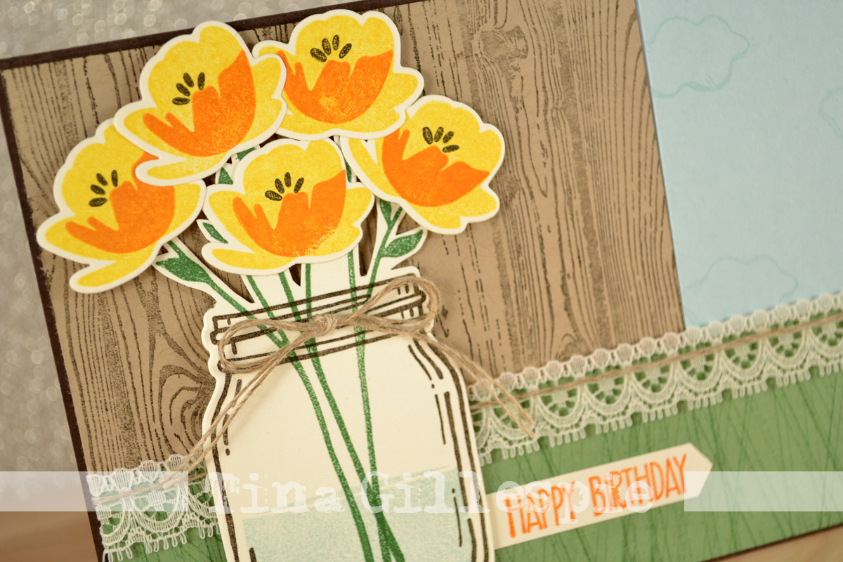


I finally cracked open my Jar Of Love stamps and Framelits. They are so sweet - I really love the look of the flowers. I must have had a little moment and forgot that the flowers in the pic were purple, not yellow. Oh well, I still think they look great!


I stamped and cut a heap of flowers, as I wasn't sure how many I'd use for the front. Lucky I had some left over to use on the inside!


What do you see in the Inspiration photo? You can see how it inspired the rest of the Design Team over on the Just Add Ink Blog, where you can join in the fun with your interpretation.


Bye for now,


Tina

Monday, 25 July 2016

Unexpectedly Grungy

Hi!


Today's card 2was one that was a bit of a surprise for me. Let me explain! My granny upline, Claire Daly, occasionally sets challenges in our team forum - I've probably mentioned this before. This time she gave us a pic of a bed with a geometric style doona and challenged us to use the colours. I loved the colours, but was also inspired by the geometric patterns in the doona. However, when I sat down to create, this is what I came up with.


I think grungy must be nearly the complete opposite in style to geometric! When the mojo's flowing, you just have to go along for the ride. The colours I used are Island Indigo, Pool Party, Blushing Bride and Crumb Cake. The retired Expressions "Thanks" was pushed into my Island Indigo inkpad to colour it, even though it looks nearly black in the pic.


After I'd assembled the card front it looked a little blank, so I ended up adhering a scattering of Gold Metallic Sequins.


So there you have it, my unexpectedly grungy challenge card!


Bye for now,


Tina

Wednesday, 18 May 2016

Going Places With Lost Lagoon

Hi!


I think that today's card is one of my favourite cards that I have even made. I know - it's a big call! There's just some thing about it that really appeals to me.


I started by stamping some Gorgeous Grunge splatters in the opposite corners on the base card, and then built up the layers from there.


I used the retiring Amazing Birthday stamp for the sentiment. You can see that I used my 1 3/4" Circle Punch to crop the image. I wanted the wider border around it so that I could pierce some holes to add a decorative touch. I also pierced the Lost Lagoon circle.


I really, really love the splatter stamp for adding a little something to the inside of a card also. So glad it's not retiring!


Bye for now,


Tina

Monday, 2 May 2016

Lost Lagoon On The Open Sea

Hi!


Today I have a card for you that uses some of my most favourite retiring products. The very top of that list would be the World Map background stamp and the Lost Lagoon In Colour. Sigh. It's always a bittersweet time when favourites retire.


This card was actually a bit of a CASE of one of my own cards from nearly a year ago. You can see the original card here. You can see I've stayed with the World Map/Gorgeous Grunge combo for the background, but this time I've stamped some images from The Open Sea over the top.


I think the sentiment from Butterfly Basics works so well with the card. It reminds me of an old fashioned script, rather like you'd find in a Captain's Log!


I'll be featuring cards with retiring products for the next few weeks - I have plenty in my 'To Blog' folder and I want to show them off before it's too late!


Bye for now,


Tina

Monday, 8 February 2016

MKPLSU Blog Share: Sale-A-Bration

Hi!

Are you ready for some Memory Keeping with Project Life by Stampin' Up! inspiration? I hope so, because it's Blog Share day!


This month the MKPLxSU Design Team are sharing their Project Life pages done with the Memories In The Making Project Life Specialty Card Collection, which is one of the current Sale-A-Bration offerings. It is designed to coordinate with the Memories In The Making Collection featured in the current Occasions Catalogue.


As you can see, I chose to complete a double page of my oldest son's first week at High School. I was originally going to do a single page of his first day, but I ended up with too many photos for one page but not enough for two, so I decided to cover the whole week in the layout.


The MITM Specialty Card Collection consists of two types of cards - acetate and UV resist. In the photo above I've used a printed acetate card to highlight Ada waiting at the bus stop for Alex to come home. I had the wrong lens on my camera with no time to change it, so I couldn't get a closer photo of her waiting. This is a great way to highlight the fact that there is something in this photo to see!


I've use another printed acetate card to highlight Alex in his uniform. Some of the cards, like this one, are silver on one side and gold on the other, making them even more versatile. The journalling card is from the MITM PL Card Collection. Yes, the photo above the card is meant to look funny - Alex was playing around with a photo distorting app on his iPad!


Here I've used another acetate card to frame this selfie Alex took on his iPad on his first day.


The title card is from the MITM PL Specialty Card Collection.  It is one of the UV resist cards. I used my Aqua Painter and Crushed Curry inkpad to very roughly wash the yellow ink over the card. The pattern in the card (in this case stripes) resists the ink. Once it was dry I stamped some of the splatters from Gorgeous Grunge over the card in Basic Black and Tempting Turquoise to match the journalling card in the previous photo. The letter stickers are from the MITM PL Accessory Pack.

I had a lot of fun playing around with the Memories In The Making Project Life Specialty Card Collection.  Have you made a layout using them? You can see the Design team layouts on the links below, or check out our Facebook group.

Julie Kettlewell
Caroline van der Straaten
Linda Higgins
Delys Cram
Constanze Wirtz
Janet Morrow Wakeland

Bye for now,

Tina

Friday, 29 January 2016

JAI #296: Just Add Nature

Hi!

Oh boy, it's hard to believe that it's the last day of school holidays! The last seven weeks have just flown by! My oldest is starting High School this year, so there will be lots of new challenges for us all.  Still, it's an exciting time, and Alex is excited, so I am too.


Speaking of exciting, it's time for the new Just Add Ink challenge! This week Di has challenged us to Just Add Nature to our cards. I've gone for the largest butterfly in the Butterflies Thinlits collection. This was the third card my ladies made last week in class.


I paired the butterfly with the stamp set that rocketed to the top of my 'Must Have' list when I saw the new Occasions Catalogue - Timeless Textures. There's also a little peek of the splatters from Gorgeous Grunge on the card too.


Most of the background stamping has been stamped off first, as I wanted the main focus of the card to be the butterfly. The colours I used were Crumb Cake (edge stamp and splatters), Always Artichoke (grid stamp), Early Espresso (coffee rings) and Rose Red (flourish), all on a Very Vanilla base.  This would have to be one of my favourite colour combinations for girly, grungy cards.


The stamping on the inside is nearly the same as the outside, the exception being I left off the Gorgeous Grunge splatters so that there would be more clean space for writing a message.

What nature themed gorgeousness can you come up with for our challenge?  I'd love to see your work lined over at Just Add Ink.

Bye for now,

Tina

Friday, 21 August 2015

JAI #276: Just Add Male Cards

Hi!

Oh gosh, it's been a hugely busy week!  Thank goodness it's nearly the weekend, which means it's time for the new Just Add Ink Challenge.


As it's zooming ever closer to Father's Day Jan has challenged us to make a male card.  Silly me didn't even twig onto the Father's Day connection, but my card would be super easy to change to be a Father's Day card.


Do you remember me telling you I was in love with the Corrugated Paper/Leaves Framelits combo for male cards? I think that was in my JAI post last week! Such a winning combination for masculine cards. Chuck in a bit of splatter from Gorgeous Grunge and you're getting close to perfection, LOL!


Isn't it just begging you to reach out and run your fingers over the corrugations?


Super easy inside - you could easily whip up one or a few of these cards in no time!

Here's the link to the Just Add Ink blog so you can see the rest of the Design Team's masculine fabulousness this week.

Bye for now,

Tina

Monday, 15 June 2015

World Map and The Open Sea

Hi!

Is it just me, or are the World Map and The Open Sea stamp sets the perfect pairing?  I use them together lots.


This time around I've also paired them up with Gorgeous Grunge (splatters on the map) and Butterfly Basics (sentiments).


The colour combination of Basic Black, Smoky Slate, Real Red and Whisper White is fabulous for a male card.


Do you find making male cards easy or difficult? I must admit that if I have no set card to make I usually tend towards the feminine, but I do enjoy making masculine cards too.

Bye for now,

Tina

Monday, 12 January 2015

Shabby Chic Cards

Hi!

Last year in one of my card classes I had a request for a shabby chic card.  It's not a style I make often, but it is a style I enjoy doing, so I was quite happy to grant the request.


I used the Lullaby DSP pack to provide the background and colour scheme for the card.  I'm a bit of a fan of pink and brown colour schemes - in this case it was Baked Brown Sugar and Crisp Cantaloupe.


We stamped with the two best sets for shabby/grungy cards - Gorgeous Grunge and Work Of Art.  Shabby Chic also requires a feminine touch, hence the butterflies, doily and pearl.


The inside was finished off with a sentiment from Remembering Your Birthday and some more butterflies.


I liked the card so much that I decided to make a second version, this time using the Gold Soiree Specialty DSP as a background.  I'm not sure which one I like best.  What do you think?

Bye for now,

Tina

Monday, 17 November 2014

Layout 83: Hollywood Horrors

Hi!

Another layout for you, and it's another 'spooky' one.  I've done a few lately!


This photo was taken at the Royal Adelaide Show just before Rob and the kids went through the Hollywood Horrors ride. I had to laugh at how frightened Ada looks, even though she insisted she wanted to go on the ride.


I scored around the outside of the layout and then wrote most of my journalling along the score line.  If you'd like to know how I did it you'll need to sign up for my newsletter.  There's a sign up box over to the right on my sidebar.

Bye for now,

Tina

Saturday, 8 November 2014

Layout 82: Halloween 2014

Hi!

I've had a little burst of scrapping lately, mostly back to the more traditional 12x12 instead of Project Life.  It's been a while since I've done any 12x12 and I'm really enjoying it.


Rob took the kids Trick or Treating last week.  They really enjoy the dressing up part of it.  Ada plans her outfit for weeks, while Alex just throws something together at the last minute!  Lucky he and Rob had built a 'Steve' head (from Minecraft) for a birthday party earlier in the year, so it wasn't too difficult for him to put together his outfit.


The house is from the Set Holiday Homes.  You can purchase it as a Photopolymer set out of the current Holiday Catalogue, or you can do as I did and purchase the MDS download.  I opted for the download as I wanted the flexibility of being able to resize the images.  In this case I printed the house at approximately 3 1/2 inches by 4 1/2 inches, printed it and then coloured it with my Blendabilities.


I did a lot of soft collage stamping in the background of my layout.  I deliberately used softer colours so that I didn't take too much focus away from the photos and the house.  A bit different from more traditional Halloween colours, but I love the effect.  I used Soft Sky, Crumb Cake and Daffodil Delight and Pumpkin Pie.

Bye for now,

Tina

Monday, 16 June 2014

Farewell Off The Grid

Hi!

Another sad farewell for another fabulous stamp today.  Off The Grid has been one of my absolute favourite stamps for adding a touch of interest to a background.


As well as farewelling Off The Grid I was playing with some new product that I got while at Convention.  We all got the Kinda Eclectic stamp set and I was lucky enough to win the new Sweetheart punch at a Prize Patrol.


I'm really loving the look of collage stamping, where you stamp a heap of different images over the top of each other.  On this card I've used Off The Grid, Gorgeous Grunge and Kinda Eclectic.  I was inspired by the card on page 164 of the new Annual Catalogue.


For all the grunginess on the outside, I went really for a really clean look on the inside.  I think it helps make the sentiment stand out more, which is really important when you are thanking someone for their kindness.

Bye for now,

Tina

Wednesday, 4 June 2014

My Convention Swap

Hi!

I thought I'd sow you the card I made as a swap at Convention.  I didn't end up making many of them as there were quite involved and heavy on the layers.  I was really pleased with how they turned out though.


I tried to stick to products that were carrying over into the next Annual Catalogue as I wanted to be able to use the card as a display card in the future.


I really loved the touch of drama that the black matts add to the card.


As usual I decorated the inside too - which is unusual in a swap, but I wanted to do it anyway.  A card doesn't feel finished anymore unless I decorate the inside too.

Stamps: World Map, Dictionary, Gorgeous Grunge, Memorable Moments, Sassy Salutations
Ink: Jet Black Stazon, Pacific Point, Garden Green, Sahara Sand
Cardstock: Basic Black, Sahara Sand, Very Vanilla, Watercolour Paper
Other: Big Shot, Circles Framelits, 1 3/8" Circle Punch, Banner Punch, Cotton Ribbon, Aqua Painter, Silver Mini Brads, Sponge Daubers, Dimensionals

Bye for now,

Tina

Wednesday, 28 May 2014

Quick and Easy Happy Birthday with Simply Stars

Hi!

Today I have a quick and easy Birthday card for you featuring the Simply Stars stamp set and Retro Fresh Washi Tape.  The two in combination are fabulous for bright, cheerful cards.


I stamped on the base card first using the small splatter stamp from Gorgeous Grunge.  I love the way it adds some extra interest tot he card without being too out there.


I kept the inside fairly simple, but I think I added a few stamped stars before I mailed it for a bit of extra oomph.


Bye for now,

Tina

Saturday, 3 May 2014

JAI 213: Just Add Inspiration!

Hi!

Here we are with another gorgeous Just Add Ink Challenge to sink your teeth into.  This week Nikki has put together this beautiful set of images to inspire you to create.


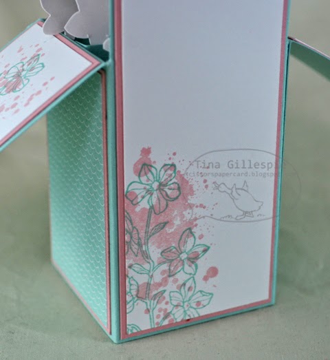
Isn't it lovely?  The colour palette is so pretty!  I decided to use the colours to create my very first card in a box.  It was lots of fun to create, and very easy too.


It was quite difficult to get a lovely picture of the card, especially of all the flowers in the top.  Being a gloomy day didn't help either!


I was a bit lazy creative in colouring the flowers.  I stamped the flower in Pool Party and then stamped one of the splodge stamps from Gorgeous Grunge over the top in Blushing Bride.


I'm not really a gold person, but I wanted to include some on my card.  I stamped the sentiment in gold and then clear embossed over the top of it.  I also used some of the thick gold Baker's Twine.


The back of the card in a box is where you write your sentiment, so of course it had to be stamped too!

What will you pull out of the inspiration photos to inspire your creativity?  The design team have a wide variety of cards to inspire you too.  Why don't you pop on over to Just Add Ink to check them all out?

Bye for now,

Tina