Hi!
Welcome to the new Just Add Ink challenge. This week Jo has found this gorgeous Inspiration photo for us to use to spark our creativity. Wouldn't your heart sigh when you met a friend at this cafe? It's so pretty!
I was particularly taken by the colours in the photo, so I pulled out my Petal Pink, Call Me Clover, Melon Mambo and Whisper White cardstock and off I went!
I started with the Beautifully Detailed Laser Cut panel. It's so pretty, and the opening in the middle made me think of a window like the one in the Inspiration Photo. I popped it up over a panel of Petal Pink and then set all that over lots of Call Me Clover layers.
I was very excited to realise that the Everyday Label punch is the perfect match for the opening in the laser cut paper. I don't know why I was surprised, as coordination is one of Stampin' Up!'s hallmarks! The Whisper White label on it's own wasn't enough, so I cropped an extra two from Call Me Clover card and layered them underneath to give a narrow border.
I used the Sprig punch on both the front and inside to provide a base for the flowers. Did you know that the punch had carried over from the Holiday Catalogue? Not long now 'til we know if it will appear in the new Annual Catalogue!
Why not pop on over to the Just Add Ink to see the rest of the Design Team's cards, and to link up yours? Can't wait to see how your creativity is sparked by the Inspiration photo.
Bye for now,
Tina
Showing posts with label Dragonfly Dreams. Show all posts
Thursday, 4 April 2019
Wednesday, 5 December 2018
CASEing Colour Combinations
Hi!
Papercrafters often talk about CASEing, but usually it refers to copying the design of a card and maybe changing a few things to make it a little more unique. Sometimes though, it's the colour combination that grabs you and begs to be made into something totally different. That's the challenge this week for CASEing The Catty - take a colour combo from a card in the Holiday Catalogue and use the colour combo to make a new card.
I flicked through the catalogue for inspiration and stopped on page 42 when I got to the Country Lane suite of products. I don't actually own any of it, apart from the Chicken Wire Elements, but the Blackberry Bliss, Mint Macaron, Crumb Cake and Whisper White combo on the first card was one I loved.
In the end the only things the same were the Chicken Wire Element and the use of a circle, but otherwise I went in a completely different direction with my card.
I hope this gets you thinking about looking at cards in a whole new way now. Another great reason to flip through the catalogue - colour inspiration!
Bye for now,
Tina
Papercrafters often talk about CASEing, but usually it refers to copying the design of a card and maybe changing a few things to make it a little more unique. Sometimes though, it's the colour combination that grabs you and begs to be made into something totally different. That's the challenge this week for CASEing The Catty - take a colour combo from a card in the Holiday Catalogue and use the colour combo to make a new card.
I flicked through the catalogue for inspiration and stopped on page 42 when I got to the Country Lane suite of products. I don't actually own any of it, apart from the Chicken Wire Elements, but the Blackberry Bliss, Mint Macaron, Crumb Cake and Whisper White combo on the first card was one I loved.
In the end the only things the same were the Chicken Wire Element and the use of a circle, but otherwise I went in a completely different direction with my card.
I hope this gets you thinking about looking at cards in a whole new way now. Another great reason to flip through the catalogue - colour inspiration!
Bye for now,
Tina
Tuesday, 28 August 2018
A Crumb Cake CASE
Hi!
Here we are with another Colour Creations Blog Share. I've lost track of the week number, but I've managed to play along every week now - Im happy with that! This week we are focussed on one of my very favourite neutrals - Crumb Cake. Is it a colour that you use lots?
I can't remember why I was flicking through the catalogue, but a card on page 139 caught my eye. I'm sure you will work out which one when you have a look. I don't have the Eastern Beauty suite, so I decided to substitute with other stuff from my stash. I was a bit stumped on what to use for the window part until I came across the piece of Crumb Cake I used on my card. I'd cut it ages ago and not used it. Once I trimmed it for the front it was perfect!
I went for some lovely bright colours for the flower and leaves - Highland Heather, Gorgeous Grape and Crumb Cake for the flower and Lemon Line Twist with Granny Apple Green for the leaves. The epoxy dots I used on the front are retired, but you'll soon be able to purchase something similar from the Holiday Catalogue 😉
The flower on the inside was my first attempt. I used Early Espresso on the centre, but thought it turned out too dark. Instead of wasting the effort, I popped it on the inside!
Why not pop on over to Catherine's blog, where you can see the rest of this week's Crumb Cake cards? You can bet I will!
Bye for now,
Tina
Here we are with another Colour Creations Blog Share. I've lost track of the week number, but I've managed to play along every week now - Im happy with that! This week we are focussed on one of my very favourite neutrals - Crumb Cake. Is it a colour that you use lots?
I can't remember why I was flicking through the catalogue, but a card on page 139 caught my eye. I'm sure you will work out which one when you have a look. I don't have the Eastern Beauty suite, so I decided to substitute with other stuff from my stash. I was a bit stumped on what to use for the window part until I came across the piece of Crumb Cake I used on my card. I'd cut it ages ago and not used it. Once I trimmed it for the front it was perfect!
I went for some lovely bright colours for the flower and leaves - Highland Heather, Gorgeous Grape and Crumb Cake for the flower and Lemon Line Twist with Granny Apple Green for the leaves. The epoxy dots I used on the front are retired, but you'll soon be able to purchase something similar from the Holiday Catalogue 😉
The flower on the inside was my first attempt. I used Early Espresso on the centre, but thought it turned out too dark. Instead of wasting the effort, I popped it on the inside!
Why not pop on over to Catherine's blog, where you can see the rest of this week's Crumb Cake cards? You can bet I will!
Bye for now,
Tina
Monday, 13 August 2018
It's Good To Be Green
Hi!
Is that a Kermit quote? I can't remember, it just popped into my head when I was thinking about a title for this post. Anyway... on to toady's card! This week I have a card that I CASEd from the Annual Catalogue. I recently purchased Swirly Frames and this was my first time using it. I liked the green card on page 137, so away I went!
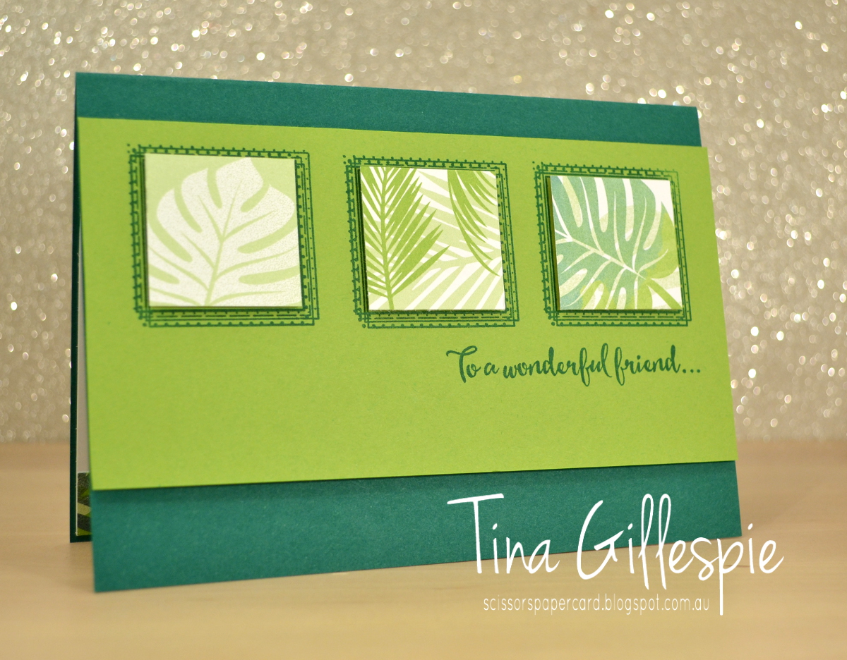
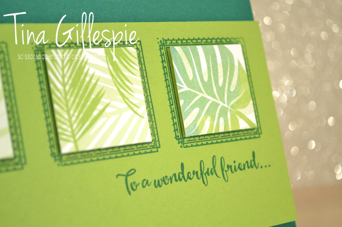
I made a slightly simpler version of the card. While I own both the Tropical Escape DSP and Tropical Thinlits, I do not own the Tropical Chic stamps. I am still in two minds about them - do I really need the stamps? The Concept Artist used the stamps on the squares in the catalogue card, but I just chopped some of the DSP. Easy substitution!
I also used a pair of sentiments from Dragonfly Dreams on my card. That's what CASEing is all about - taking the bits of a card that work for you, and finding something in your stash for the bits that don't.
I used some more of the Tropical Escape DSP for the inside. This card is a great way to use up all those tiny scraps that seem to accumulate. The squares on the front were about 1 1/4 inches, and the strip on the inside could be as narrow or as wide as you wish. If your scraps are too narrow, just add a second or third. Too easy!
Bye for now,
Tina
Is that a Kermit quote? I can't remember, it just popped into my head when I was thinking about a title for this post. Anyway... on to toady's card! This week I have a card that I CASEd from the Annual Catalogue. I recently purchased Swirly Frames and this was my first time using it. I liked the green card on page 137, so away I went!
I made a slightly simpler version of the card. While I own both the Tropical Escape DSP and Tropical Thinlits, I do not own the Tropical Chic stamps. I am still in two minds about them - do I really need the stamps? The Concept Artist used the stamps on the squares in the catalogue card, but I just chopped some of the DSP. Easy substitution!
I also used a pair of sentiments from Dragonfly Dreams on my card. That's what CASEing is all about - taking the bits of a card that work for you, and finding something in your stash for the bits that don't.
I used some more of the Tropical Escape DSP for the inside. This card is a great way to use up all those tiny scraps that seem to accumulate. The squares on the front were about 1 1/4 inches, and the strip on the inside could be as narrow or as wide as you wish. If your scraps are too narrow, just add a second or third. Too easy!
Bye for now,
Tina
Monday, 30 July 2018
Polished Stone Dragonflies
Hi!
Remember a little while ago I was playing around with the Polished Stone technique? Well, I found one more card in my 'To Blog' folder using the technique that I hadn't shown you yet. Here it is!
I used Night Of Navy and Mint Macaron ink to create the Polished Stone panel. Isn't it pretty?
Speaking of pretty - how's that Subtle 3D Dynamic Textured Impressions Embossing Folder? I've been using it so much, as it adds that little something extra on so many cards.
That's the last of my Polished Stone cards for now - hopefully I'll get back to the technique some more soon, as it's a fun one!
Bye for now,
Tina
Remember a little while ago I was playing around with the Polished Stone technique? Well, I found one more card in my 'To Blog' folder using the technique that I hadn't shown you yet. Here it is!
I used Night Of Navy and Mint Macaron ink to create the Polished Stone panel. Isn't it pretty?
Speaking of pretty - how's that Subtle 3D Dynamic Textured Impressions Embossing Folder? I've been using it so much, as it adds that little something extra on so many cards.
That's the last of my Polished Stone cards for now - hopefully I'll get back to the technique some more soon, as it's a fun one!
Bye for now,
Tina
Monday, 2 July 2018
Springtime in Colour
Hi!
Today's card is not one I've CASEd from anyone in particular, but it's similar to a lot of cards that others have made. I've used the new Springtime Impressions Thinlits. I first loved them for the butterfly, but at second glance the other two dies, which I've used on this card, are pretty lovely too.
This card was fairly quick and easy to put together. I cut the large flower image with my Big Shot and then used my Stampin' Sponges to add colour to the flowers and leaves. The colours I used were Berry Burst, Calypso Coral, Crushed Curry, Garden Green and Lemon Lime Twist. There's no trick to adding the colour - it's literally jut sponged over the top.
Underneath where the die cut was going to lie I also sponged some Pool Party ink. It helps to make the colours in the flowers pop. A few pearls, a sentiment and a die cut flower (the third die in the set) and the card front was done!
The little flower die is so sweet that I couldn't help add a couple more to the inside of the card. So now, in the cold depths of winter, I am dreaming about Spring and new flowers!
Bye for now,
Tina
Today's card is not one I've CASEd from anyone in particular, but it's similar to a lot of cards that others have made. I've used the new Springtime Impressions Thinlits. I first loved them for the butterfly, but at second glance the other two dies, which I've used on this card, are pretty lovely too.
This card was fairly quick and easy to put together. I cut the large flower image with my Big Shot and then used my Stampin' Sponges to add colour to the flowers and leaves. The colours I used were Berry Burst, Calypso Coral, Crushed Curry, Garden Green and Lemon Lime Twist. There's no trick to adding the colour - it's literally jut sponged over the top.
Underneath where the die cut was going to lie I also sponged some Pool Party ink. It helps to make the colours in the flowers pop. A few pearls, a sentiment and a die cut flower (the third die in the set) and the card front was done!
The little flower die is so sweet that I couldn't help add a couple more to the inside of the card. So now, in the cold depths of winter, I am dreaming about Spring and new flowers!
Bye for now,
Tina
Monday, 25 June 2018
Polished Stone in Pink
Hi!
I mentioned a couple of weeks ago that I'd been playing around with the Polished Stone technique for my June classes. Today I have the first card I made using the technique.
I used Melon Mambo and Basic Black as the main colours on my card. I wanted to keep the colours dramatic but simple so that the focus would be on the Polished Stone panel.
Speaking of which, how lovely does that Polished Stone panel look? I used Melon Mambo, Pumpkin Pie and Daffodil Delight reinkers on Glossy Cardstock to achieve the effect. It's important to choose colours that are beside each other on the Colour Wheel, or you risk ending up with brown blobs instead of lovely colours. I went with a little more PP and DD, as I knew MM would dominate the combination.
I used the dotty stamp from Dragonfly Dreams on the inside, trying to recreate the Polished Stone in a small way.
Have you tried the technique yet? It's a fun one, so well worth trying!
Bye for now,
Tina
I mentioned a couple of weeks ago that I'd been playing around with the Polished Stone technique for my June classes. Today I have the first card I made using the technique.
I used Melon Mambo and Basic Black as the main colours on my card. I wanted to keep the colours dramatic but simple so that the focus would be on the Polished Stone panel.
Speaking of which, how lovely does that Polished Stone panel look? I used Melon Mambo, Pumpkin Pie and Daffodil Delight reinkers on Glossy Cardstock to achieve the effect. It's important to choose colours that are beside each other on the Colour Wheel, or you risk ending up with brown blobs instead of lovely colours. I went with a little more PP and DD, as I knew MM would dominate the combination.
I used the dotty stamp from Dragonfly Dreams on the inside, trying to recreate the Polished Stone in a small way.
Have you tried the technique yet? It's a fun one, so well worth trying!
Bye for now,
Tina
Monday, 28 May 2018
Saying Goodbye to Wisteria Wonder
Hi!
Wisteria Wonder is one of the colours that has been cut from the range of Stampin' Up! colours starting next month. It's been a purple I've liked using, as it's a lovely, soft colour. Having said this, I'm pretty excited about the new purples, as are the purple lovers that have been begging for a 'true' purple for many years!
The first card today is a CASE of a tag in the soon to be finished Annual Catalogue. You can see it on page 76, smack bang in the centre of the page. It's the tag on the Foil frenzy gift box.
I kept the tag essentially the same. I had to use an oval as the base as I didn't own the Lots Of Labels Framelits set at the time that I made this card. I also used the flowers and leaves from Happy Birthday Gorgeous. They frame the Happy Birthday diecut so well!
Hmm, thinking back, I don't use the flowers in this set anywhere as much as I should!
My second card pairs Wisteria Wonder with the Delightful Daisy DSP and the Cat punch. I haven't used the punch much, but it has carried over to the new Annual Catalogue, so I've got another yer at least to remedy that!
Teeny Tiny Sentiments is another retiring set that I didn't use much, but it was very handy to have on hand. It contains a HUGE range of sentiments that cover nearly every occasion you could think of, and because they are so small you can fit them anywhere on a card.
I gave this card to my Mother-In-Law for Mother's Day. She loves cats, so it was very fitting for her.
Bye for now,
Tina
Wisteria Wonder is one of the colours that has been cut from the range of Stampin' Up! colours starting next month. It's been a purple I've liked using, as it's a lovely, soft colour. Having said this, I'm pretty excited about the new purples, as are the purple lovers that have been begging for a 'true' purple for many years!
The first card today is a CASE of a tag in the soon to be finished Annual Catalogue. You can see it on page 76, smack bang in the centre of the page. It's the tag on the Foil frenzy gift box.
I kept the tag essentially the same. I had to use an oval as the base as I didn't own the Lots Of Labels Framelits set at the time that I made this card. I also used the flowers and leaves from Happy Birthday Gorgeous. They frame the Happy Birthday diecut so well!
Hmm, thinking back, I don't use the flowers in this set anywhere as much as I should!
My second card pairs Wisteria Wonder with the Delightful Daisy DSP and the Cat punch. I haven't used the punch much, but it has carried over to the new Annual Catalogue, so I've got another yer at least to remedy that!
Teeny Tiny Sentiments is another retiring set that I didn't use much, but it was very handy to have on hand. It contains a HUGE range of sentiments that cover nearly every occasion you could think of, and because they are so small you can fit them anywhere on a card.
I gave this card to my Mother-In-Law for Mother's Day. She loves cats, so it was very fitting for her.
Bye for now,
Tina
Thursday, 8 February 2018
JAI #395: Just Add Inspiration
Hi!
Are you ready for a new Just Add Ink challenge? I am! This week Kelly found this gorgeous Inspiration photo for us to base our cards on.
Isn't it stunning? It made me think of two very special places - my hometown, where the cherry blossoms in Spring made the streets come alive with gorgeous pink colour. It also reminded me of my time with Rob in Paris, where we strolled through parks and gardens that were so lush with foliage and so immaculately maintained. Two sets of very happy memories!
The picture is very romantic to me, so I decided it was best to make a wedding card. The sentiment suits the picture so well!
Here's how I made it: first, I masked the top two thirds of the card and sponged Crumb Cake ink on the bottom third using my Sponge Brayer, trying to get the colour darker along the edge of the path. I then stamped the splatter from Swirly Bird over the top. Next, I masked off the middle section of the card. I used my sponge brayer to add Tranquil Tide ink, again trying to make it darker along the edges. I then removed the bottom mask and stamped the dotty stamp from Dragonfly Dreams along the edge of the colour, making sure that some of the stamping fell in the Crumb Cake section. I was trying to blur the hard lines created by the masking.
I then repeated the process with the top section of the card, this time with Flirty Flamingo ink. I used the largest floral stamp in Beautiful Bouquet over the top, and also the dotty stamp from Dragonfly Dreams to soften the edge. I then stitched around the vellum sentiment and the edge of the card. It still needed more, so I ended up adhering some clear heart shaped sequins to the front. You may just be able to see them to the bottom left and top right of the sentiment panel.
I was a bit sponge brayered out by the time I got to the inside, so a few of the dotty stamps had to do!
I've been astounded at the variety of ways the Design Team have interpreted this image, and I'm sure you will be too! Pop on over to the Just Add Ink blog to check it all out, and to link up your card.
Bye for now,
Tina.
Are you ready for a new Just Add Ink challenge? I am! This week Kelly found this gorgeous Inspiration photo for us to base our cards on.
Isn't it stunning? It made me think of two very special places - my hometown, where the cherry blossoms in Spring made the streets come alive with gorgeous pink colour. It also reminded me of my time with Rob in Paris, where we strolled through parks and gardens that were so lush with foliage and so immaculately maintained. Two sets of very happy memories!
The picture is very romantic to me, so I decided it was best to make a wedding card. The sentiment suits the picture so well!
Here's how I made it: first, I masked the top two thirds of the card and sponged Crumb Cake ink on the bottom third using my Sponge Brayer, trying to get the colour darker along the edge of the path. I then stamped the splatter from Swirly Bird over the top. Next, I masked off the middle section of the card. I used my sponge brayer to add Tranquil Tide ink, again trying to make it darker along the edges. I then removed the bottom mask and stamped the dotty stamp from Dragonfly Dreams along the edge of the colour, making sure that some of the stamping fell in the Crumb Cake section. I was trying to blur the hard lines created by the masking.
I then repeated the process with the top section of the card, this time with Flirty Flamingo ink. I used the largest floral stamp in Beautiful Bouquet over the top, and also the dotty stamp from Dragonfly Dreams to soften the edge. I then stitched around the vellum sentiment and the edge of the card. It still needed more, so I ended up adhering some clear heart shaped sequins to the front. You may just be able to see them to the bottom left and top right of the sentiment panel.
I was a bit sponge brayered out by the time I got to the inside, so a few of the dotty stamps had to do!
I've been astounded at the variety of ways the Design Team have interpreted this image, and I'm sure you will be too! Pop on over to the Just Add Ink blog to check it all out, and to link up your card.
Bye for now,
Tina.
Monday, 5 February 2018
CTC #164: Occasions Catalogue Kits
Hi!
EDIT: I was so excited to be a Crew Pick for this card!
I'm pretty happy to be 4 for 4 with the CASEing The Catty Challenges this year. They are announced each Sunday evening, and I've been mostly able to get straight into the challenge and get a card made pretty quickly. This week the challenge is the kit cards from pages 14-17 of the Occasions Catalogue. I don't have either kit, so I had to improvise. My card is a CASE of one of the trio at the bottom of page 17.
The card in the catalogue is square, but I decided to make a full sized card. I used exactly the same colours and ribbon, but I had to use different stamps. I remembered that the Soft Sayings kit had a similar flower stamp, and so I decided to use it.
I stamped the swoosh from Work Of Art, the flower and the leaves from Soft Sayings, and then I spritzed the cardstock lightly with some water. Once it dried I stamped the sentiment from Bunch Of Blossoms. I finished it off with the Berry Burst ribbon and some retired Pearls for the centre of the flower. The dotty stamp from Dragonfly Dreams provides a nice background for the main panel.
I used a few of the same stamps on the inside to finish off the card. It's always so much nicer to have a finished inside, don't you think?
Bye for now,
Tina
EDIT: I was so excited to be a Crew Pick for this card!
I'm pretty happy to be 4 for 4 with the CASEing The Catty Challenges this year. They are announced each Sunday evening, and I've been mostly able to get straight into the challenge and get a card made pretty quickly. This week the challenge is the kit cards from pages 14-17 of the Occasions Catalogue. I don't have either kit, so I had to improvise. My card is a CASE of one of the trio at the bottom of page 17.
The card in the catalogue is square, but I decided to make a full sized card. I used exactly the same colours and ribbon, but I had to use different stamps. I remembered that the Soft Sayings kit had a similar flower stamp, and so I decided to use it.
I stamped the swoosh from Work Of Art, the flower and the leaves from Soft Sayings, and then I spritzed the cardstock lightly with some water. Once it dried I stamped the sentiment from Bunch Of Blossoms. I finished it off with the Berry Burst ribbon and some retired Pearls for the centre of the flower. The dotty stamp from Dragonfly Dreams provides a nice background for the main panel.
I used a few of the same stamps on the inside to finish off the card. It's always so much nicer to have a finished inside, don't you think?
Bye for now,
Tina
Monday, 5 June 2017
Tranquil Tulips in Watermelon
Hi!
Today I have a card for you that uses a lot of new product from the new Annual Catalogue. It's always such an exciting time of year when you get to see all of the new stamps and papers.
Today's card features a new Hostess set called Tranquil Tulips. I think it's going to be a favourite! I've paired it with the new Delightful Daisy DSP.
Tranquil Tulips is a photopolymer set, so lining up the layers is a breeze. There are 5 layers in this main panel: The stems, leaves, two different layers to the tulips, and finally the stamens.
Today I have a card for you that uses a lot of new product from the new Annual Catalogue. It's always such an exciting time of year when you get to see all of the new stamps and papers.
Today's card features a new Hostess set called Tranquil Tulips. I think it's going to be a favourite! I've paired it with the new Delightful Daisy DSP.
Tranquil Tulips is a photopolymer set, so lining up the layers is a breeze. There are 5 layers in this main panel: The stems, leaves, two different layers to the tulips, and finally the stamens.
I can really see myself having fun with this set!
Bye for now,
Tina
Wednesday, 24 May 2017
Dragonfly Dreams CASE
Hi!
Today's card was one I CASEd from Pam Scales. You can see her blog here, but I couldn't find her gorgeous card on her blog, so I can't link directly to it.
I changed a few things, but essentially the card is the same. Pam used a banner across the top of her DSP for the sentiment, instead of the ribbon I used. She also used a different DSP. I used Blooms and Bliss on my version.
The layers on the Dragonfly are so pretty. The top layer was cut from more of the Blooms and Bliss DSP, and was adhered onto a solid Rich Razzleberry Layer.
I love the dotty stamp in the set for creating little borders on my cards. It can either be bold or subtle, or anywhere in between.
Bye for now,
Tina
Today's card was one I CASEd from Pam Scales. You can see her blog here, but I couldn't find her gorgeous card on her blog, so I can't link directly to it.
I changed a few things, but essentially the card is the same. Pam used a banner across the top of her DSP for the sentiment, instead of the ribbon I used. She also used a different DSP. I used Blooms and Bliss on my version.
The layers on the Dragonfly are so pretty. The top layer was cut from more of the Blooms and Bliss DSP, and was adhered onto a solid Rich Razzleberry Layer.
I love the dotty stamp in the set for creating little borders on my cards. It can either be bold or subtle, or anywhere in between.
Bye for now,
Tina
Monday, 3 April 2017
Dragonflies in Ombre
Hi!
I may have mentioned once or twice that I have been playing a lot with the sponge brayers. Today's card is another of my creations. It's one of my favourite cards I've made using the brayer ombre backgrounds.
This card was given to my sister for her 40th Birthday. Her favourite colour is purple, so that's naturally the colour I used. I first tried Perfect Plum, but it turned a brownish, dusky purple - lovely, but not the look I was going for. I tried Rich Razzleberry next, and it was perfect.
After I'd brayered the background, I clear heat embossed a few dragonflies over the front. The main dragonfly was heat embossed in Silver and watercoloured with Rich Razzleberry ink. So pretty!
A special birthday like a 40th deserves a special card - and I think this one fills the brief. What do you think?
Bye for now,
Tina
I may have mentioned once or twice that I have been playing a lot with the sponge brayers. Today's card is another of my creations. It's one of my favourite cards I've made using the brayer ombre backgrounds.
This card was given to my sister for her 40th Birthday. Her favourite colour is purple, so that's naturally the colour I used. I first tried Perfect Plum, but it turned a brownish, dusky purple - lovely, but not the look I was going for. I tried Rich Razzleberry next, and it was perfect.
After I'd brayered the background, I clear heat embossed a few dragonflies over the front. The main dragonfly was heat embossed in Silver and watercoloured with Rich Razzleberry ink. So pretty!
A special birthday like a 40th deserves a special card - and I think this one fills the brief. What do you think?
Bye for now,
Tina
Monday, 6 February 2017
Dragonfly Dreams in Bermuda Bay
Hi!
Do you ever CASE someone else's card? I do! Typically I CASE when I have a new stamp set that I love, but I'm a bit intimidated by the set because I've already seen soooo much great stuff that I'm sure I'll never be able to make anything as good. Sound familiar? CASEing is a great way to get the set inky and build up some confidence.
Today's card is a CASE of this card by Carolyn King. I didn't change very much at all, because I loved her card so much.
While Carolyn used Enamel Dots on her card, I used clear sequins. I really liked the subtle touch they added.
Carolyn also mentioned that she coloured her wings using the rock 'n' roll method. I chose to colour mine with the new Watercolour Pencils and then blend them using my Clear Wink Of Stella pen. I stamped the dragonfly in Momento ink so I didn't smudge it using the Wink Of Stella. Using the pencils allowed me to use Pacific Point, Old Olive and Bermuda Bay to colour the wings.
Carolyn didn't show the inside of her card on her blog, so I was on my own for my inside. I didn't stamp a sentiment, so that the card is versatile enough for several different occasions.
Bye for now,
Tina
Do you ever CASE someone else's card? I do! Typically I CASE when I have a new stamp set that I love, but I'm a bit intimidated by the set because I've already seen soooo much great stuff that I'm sure I'll never be able to make anything as good. Sound familiar? CASEing is a great way to get the set inky and build up some confidence.
Today's card is a CASE of this card by Carolyn King. I didn't change very much at all, because I loved her card so much.
While Carolyn used Enamel Dots on her card, I used clear sequins. I really liked the subtle touch they added.
Carolyn also mentioned that she coloured her wings using the rock 'n' roll method. I chose to colour mine with the new Watercolour Pencils and then blend them using my Clear Wink Of Stella pen. I stamped the dragonfly in Momento ink so I didn't smudge it using the Wink Of Stella. Using the pencils allowed me to use Pacific Point, Old Olive and Bermuda Bay to colour the wings.
Carolyn didn't show the inside of her card on her blog, so I was on my own for my inside. I didn't stamp a sentiment, so that the card is versatile enough for several different occasions.
Bye for now,
Tina
Subscribe to:
Posts (Atom)