Hi!
Today I have tow very different cards for you that feature the gorgeous Springtime Foils SDSP from the recent Sale-A-Bration promotion. I took a little longer than everyone else falling in love with these papers, so I didn't really use them much until they'd already retired.
This first card I made as a class sample to demonstrate the technique that was all the rage earlier this year. I can't recall what it was called, but you basically cut a slot in the front of the card so that the butterfly (which was adhered to the inside of the card) could pop through the slot. I teamed the Foils DSO with Berry Burst and some plain Gold Foil. Such a luxe combo!
After the class, I remade this card and gave it to my mum for her recent milestone birthday. I wish I'd taken a photo before I mailed it! I added a half circle under the 'celebrate' punchie and added the appropriate numbers. I won't reveal her age, but she looks young for it!
Here's a look at the side of the card so you can see how the butterfly pops through the card.
And the inside. I love how the butterfly does most of the work for both the inside and outside of the card!
My second card also uses the Springtime Foils SDSP. Funnily enough, I used the same sheet of paper but got a very different look!
My sister was invited to a wedding and asked me to make a card for her that wasn't 'girly'. She sent me through a pic of the invite, which was black with metallic leaves on it. Straight away I thought of this DSP. I coloured it black by rubbing my Memento ink pad over the paper and then buffing it with some paper towel to remove the ink from the foil part of the design. I repeated this process about 4 times until I was happy with the black. It looked too grey to start with! Just a tip - you can't use a permanent ink like Archival Black for this technique, as it won't buff off of the foil.
I matted the piece on Gold Foil to add some extra luxe to the card. I used Vellum to go under the sentiment so that I didn't lose too much of the gorgeous black foil pattern underneath.
Isn't this sentiment great for a wedding card? I combined two stamps from Beautiful Bouquet and added some tiny gold hearts to help tie in the front of the card. They were punched from the Cookie Cutter punch.
So there you go, two different cards using the gorgeous Springtime Foils DSP. Even though it's retired, I hope I've given you some new inspiration for using it.
Bye for now,
Tina
Showing posts with label Bold Butterfly Framelits. Show all posts
Monday, 21 May 2018
Thursday, 28 September 2017
JAI #379: Just Add Inspiration
Hi!
I hope you're ready for Friday and the new challenge!
This week at Just Add Ink Kelly has provided a beautiful Inspiration Photo for the challenge. I love it, as it makes me think of summer. I am soooo over winter and ready for summer to roll around, so I was excited to create using this photo as my guide.
I decided that rather than my usual literal approach to Inspiration Photos, this time I was going to find inspiration in another way. After a bit of consideration, I decided to use the colours as the basis for my card.
I mostly went with the pink and the green from the photo, with touches of brown, black and white. The pitcher reminded me of a strawberry champagne cocktail I particularly enjoy over summer, so I decided to include some 'bubbles' in my card as an extra little tribute.
I used the Lemon Lime Twist Foil Frenzy SDSP to represent the bubbles. The foil finish adds a touch of glam to the card without being overwhelming. Sometimes a little bit of the Foil Frenzy SDSP goes a long way!
I used a spotty stamp from No Bones About It to carry the bubbly look through to the inside of the card. It seemed a bit funny to use a dinosaur stamp on a girly, butterfly card - but it works!
What do you see in the Inspiration Photo? You can link your card over at Just Add Ink, where you can also see the cards that the rest of the Design team have created. It's a fabulous lot, as usual!
Bye for now,
Tina
I hope you're ready for Friday and the new challenge!
This week at Just Add Ink Kelly has provided a beautiful Inspiration Photo for the challenge. I love it, as it makes me think of summer. I am soooo over winter and ready for summer to roll around, so I was excited to create using this photo as my guide.
I decided that rather than my usual literal approach to Inspiration Photos, this time I was going to find inspiration in another way. After a bit of consideration, I decided to use the colours as the basis for my card.
I mostly went with the pink and the green from the photo, with touches of brown, black and white. The pitcher reminded me of a strawberry champagne cocktail I particularly enjoy over summer, so I decided to include some 'bubbles' in my card as an extra little tribute.
I used the Lemon Lime Twist Foil Frenzy SDSP to represent the bubbles. The foil finish adds a touch of glam to the card without being overwhelming. Sometimes a little bit of the Foil Frenzy SDSP goes a long way!
I used a spotty stamp from No Bones About It to carry the bubbly look through to the inside of the card. It seemed a bit funny to use a dinosaur stamp on a girly, butterfly card - but it works!
What do you see in the Inspiration Photo? You can link your card over at Just Add Ink, where you can also see the cards that the rest of the Design team have created. It's a fabulous lot, as usual!
Bye for now,
Tina
Thursday, 8 June 2017
JAI #363: Just Add An Anniversary
Hi!
Are you ready for a new Just Add Ink challenge? I am!
This week Chantell has challenged us to Just Add Anniversary. It could be the anniversary of anything you like, as long as it celebrates an Anniversary.
I recently hosted an ATC swap, and I had a stamped and cut butterfly left over, as well as a 'love' die cut from vellum. I decided to put them to good use for this challenge while they were still floating on the surface of my desk. If I left them too long, they may have been lost forever!
The butterfly was stamped using the solid stamp from Watercolour Wishes in Powder Pink ink. I then inked the flourish from Timeless Textures in Berry Burst ink and 'kissed' the two stamps together. I then repeated on the other wing before stamping the butterfly image on my cardstock. It's such a pretty look, isn't it?
Do you have an upcoming Anniversary to celebrate? I've only just celebrated mine, so this card will go into my stash until such time as I require an anniversary card. They are always handy to have on hand. Why don't you pop on over to the Just Add Ink blog so that you can join in the fun?
Bye for now,
Tina
Are you ready for a new Just Add Ink challenge? I am!
This week Chantell has challenged us to Just Add Anniversary. It could be the anniversary of anything you like, as long as it celebrates an Anniversary.
I recently hosted an ATC swap, and I had a stamped and cut butterfly left over, as well as a 'love' die cut from vellum. I decided to put them to good use for this challenge while they were still floating on the surface of my desk. If I left them too long, they may have been lost forever!
The butterfly was stamped using the solid stamp from Watercolour Wishes in Powder Pink ink. I then inked the flourish from Timeless Textures in Berry Burst ink and 'kissed' the two stamps together. I then repeated on the other wing before stamping the butterfly image on my cardstock. It's such a pretty look, isn't it?
Do you have an upcoming Anniversary to celebrate? I've only just celebrated mine, so this card will go into my stash until such time as I require an anniversary card. They are always handy to have on hand. Why don't you pop on over to the Just Add Ink blog so that you can join in the fun?
Bye for now,
Tina
Monday, 22 May 2017
Perth OnStage Swap
Hi!
I just realised that I haven't showed you the card I made as my swap while I was at OnStage in Perth last month. If you follow me on Fabebook, you probably would have seen a photo of me making them, but not the finished product. Well, here it is!
Yes, my love affair with the Sponge Brayers lives on! I used Sweet Sugarplum ink to create the ombre background, which went a lovely, deep, dusky pink. I loved the sentiment for this card, as I made it as a swap for my friends that were going to OnStage.
The Basic Black butterfly had a layer of Gold Foil paper behind it. I think it looks a little like a Monarch butterfly. The gold certainly added a bit of luxe to the card.
Most people only make a card front for swaps, but as I was only making 12 I decided to make a whole card.
Bye for now,
Tina
I just realised that I haven't showed you the card I made as my swap while I was at OnStage in Perth last month. If you follow me on Fabebook, you probably would have seen a photo of me making them, but not the finished product. Well, here it is!
Yes, my love affair with the Sponge Brayers lives on! I used Sweet Sugarplum ink to create the ombre background, which went a lovely, deep, dusky pink. I loved the sentiment for this card, as I made it as a swap for my friends that were going to OnStage.
The Basic Black butterfly had a layer of Gold Foil paper behind it. I think it looks a little like a Monarch butterfly. The gold certainly added a bit of luxe to the card.
Most people only make a card front for swaps, but as I was only making 12 I decided to make a whole card.
Bye for now,
Tina
Monday, 15 May 2017
Decorated Photo Frame
Hi!
Today I have a project for you that was my sample for two different classes. The ladies in the groups were all pretty much non-crafters. I was asked to design a decorated photo frame for them to make, so I had to design something WOW, but that was easy for beginners to make.
When I first showed the ladies they were all a little freaked out. They thought it was going to be hard, but thankfully they trusted me that it wasn't, and gave it a go. They were all so happy with the end result. The kits had a variety of colours, and I had a huge selection of dies for them to choose from, so all the frames looked very different.
Most of the flowers were 'punch, brad and scrunch'. We punched 6-8 layers of cardstock or tissue paper, pierced them and added a brad. The layers were then scrunched up, and flattened out a little to give a dimensional look.
Sitting underneath the flowers were diecuts from the Flourish Thinlits. The word love is from the Sunshine Wishes Thinlits.
I was so pleased that everyone had a fabulous time making the frames, and came away with a great sense of accomplishment. Mine is now hanging proudly on the wall between my dining room and craft room where I can see it all day long.
Bye for now,
Tina
Today I have a project for you that was my sample for two different classes. The ladies in the groups were all pretty much non-crafters. I was asked to design a decorated photo frame for them to make, so I had to design something WOW, but that was easy for beginners to make.
When I first showed the ladies they were all a little freaked out. They thought it was going to be hard, but thankfully they trusted me that it wasn't, and gave it a go. They were all so happy with the end result. The kits had a variety of colours, and I had a huge selection of dies for them to choose from, so all the frames looked very different.
Most of the flowers were 'punch, brad and scrunch'. We punched 6-8 layers of cardstock or tissue paper, pierced them and added a brad. The layers were then scrunched up, and flattened out a little to give a dimensional look.
Sitting underneath the flowers were diecuts from the Flourish Thinlits. The word love is from the Sunshine Wishes Thinlits.
I was so pleased that everyone had a fabulous time making the frames, and came away with a great sense of accomplishment. Mine is now hanging proudly on the wall between my dining room and craft room where I can see it all day long.
Bye for now,
Tina
Tuesday, 23 August 2016
Circle Of Spring Butterflies
Hi!
Do you sometimes forget about your old favourites in the rush of new products? I know I do! It's often worth Getting them out and looking at them with new eyes. In this case, I pulled out my Fringing Scissors.
The colour combo is Dapper Denim, Peekaboo Peach and Whisper White. Don't they look great together? I love the way the fringing adds a fun, flirty touch to the front of the card.
The Thick Baker's Twine is a great way to finish a card, and is very cost effective. Bonus!
Do you sometimes forget about your old favourites in the rush of new products? I know I do! It's often worth Getting them out and looking at them with new eyes. In this case, I pulled out my Fringing Scissors.
The colour combo is Dapper Denim, Peekaboo Peach and Whisper White. Don't they look great together? I love the way the fringing adds a fun, flirty touch to the front of the card.
The Thick Baker's Twine is a great way to finish a card, and is very cost effective. Bonus!
I quite like this colour combo - I think it would make a great masculine card too. What do you think?
Bye for now,
Tina
Wednesday, 10 August 2016
Some Fancy Folding
Hi!
Today I have a Fancy Fold card for you. I'm not sure what it's called - triangle pocket card maybe? Whatever it's called, it's a very easy fold that looks fabulous.
Doesn't it look great? The most difficult part was working out how to cut the DSP, but even that was relatively easy. You simply cut a sheet of A4 cardstock in half longways and then score diagonally. Fold along the score, and then fold the whole lot in half, so that the on the bottom of both the front and inside you end up with a triangular pocket. Decorate, and you're done!
I found it better to make two cards at once, as the DSP panels are rectangles cut in half. I don't tend to use triangle shaped DSP on my cards, so by making two I wasn't wasting any DSP. I used the Blooms and Bliss DSP on this card.
The inside of the card has a little pocket, which is the perfect spot to pop a gift card for the recipient. Why don't you give this Fancy Fold a go - it really is very easy!
Bye for now,
Tina
Today I have a Fancy Fold card for you. I'm not sure what it's called - triangle pocket card maybe? Whatever it's called, it's a very easy fold that looks fabulous.
Doesn't it look great? The most difficult part was working out how to cut the DSP, but even that was relatively easy. You simply cut a sheet of A4 cardstock in half longways and then score diagonally. Fold along the score, and then fold the whole lot in half, so that the on the bottom of both the front and inside you end up with a triangular pocket. Decorate, and you're done!
I found it better to make two cards at once, as the DSP panels are rectangles cut in half. I don't tend to use triangle shaped DSP on my cards, so by making two I wasn't wasting any DSP. I used the Blooms and Bliss DSP on this card.
The inside of the card has a little pocket, which is the perfect spot to pop a gift card for the recipient. Why don't you give this Fancy Fold a go - it really is very easy!
Bye for now,
Tina
Monday, 25 July 2016
Unexpectedly Grungy
Hi!
Today's card 2was one that was a bit of a surprise for me. Let me explain! My granny upline, Claire Daly, occasionally sets challenges in our team forum - I've probably mentioned this before. This time she gave us a pic of a bed with a geometric style doona and challenged us to use the colours. I loved the colours, but was also inspired by the geometric patterns in the doona. However, when I sat down to create, this is what I came up with.
I think grungy must be nearly the complete opposite in style to geometric! When the mojo's flowing, you just have to go along for the ride. The colours I used are Island Indigo, Pool Party, Blushing Bride and Crumb Cake. The retired Expressions "Thanks" was pushed into my Island Indigo inkpad to colour it, even though it looks nearly black in the pic.
After I'd assembled the card front it looked a little blank, so I ended up adhering a scattering of Gold Metallic Sequins.
So there you have it, my unexpectedly grungy challenge card!
Bye for now,
Tina
Today's card 2was one that was a bit of a surprise for me. Let me explain! My granny upline, Claire Daly, occasionally sets challenges in our team forum - I've probably mentioned this before. This time she gave us a pic of a bed with a geometric style doona and challenged us to use the colours. I loved the colours, but was also inspired by the geometric patterns in the doona. However, when I sat down to create, this is what I came up with.
I think grungy must be nearly the complete opposite in style to geometric! When the mojo's flowing, you just have to go along for the ride. The colours I used are Island Indigo, Pool Party, Blushing Bride and Crumb Cake. The retired Expressions "Thanks" was pushed into my Island Indigo inkpad to colour it, even though it looks nearly black in the pic.
After I'd assembled the card front it looked a little blank, so I ended up adhering a scattering of Gold Metallic Sequins.
So there you have it, my unexpectedly grungy challenge card!
Bye for now,
Tina
Friday, 20 May 2016
JAI #312: Just Add Colour
Hi!
It's that time of the week again - challenge time at Just Add Ink!
It's been a bit of a long week for me - two out of three kids were home sick for Monday and Tuesday. Needless to say, not much got done around here and I've spent the rest of the week chasing my tail and trying to catch up on my jobs. It was nice to be able to sit and craft for Just Add Ink. This week we have a lovely colour combination selected by Patrice.
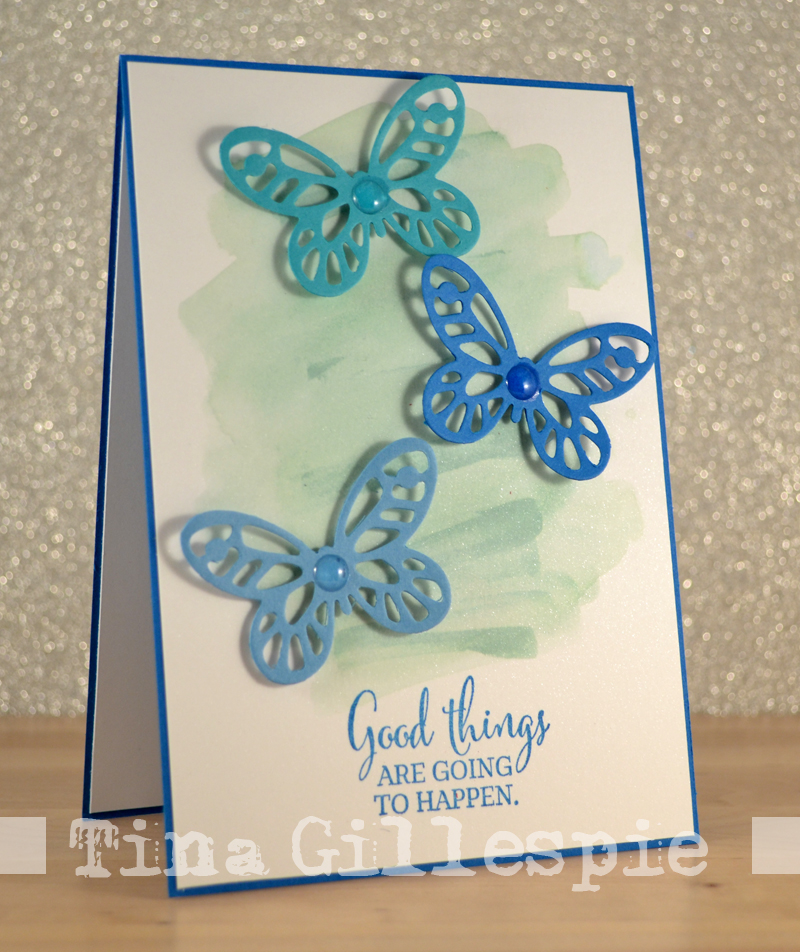
I'm a bit of a blue person, so I really loved this combo! My first thought was a masculine card, but when I sat to craft I somehow found myself adding butterflies to the card. Not very masculine at all!
I used the Shimmer White cardstock as a base and used my Aqua Painter and Mint Macaron ink pad to create a colour wash background. The shimmer is difficult to photograph, hopefully you can see it in the next photo.
The butterflies were originally meant to have a white dot on their bodies, courtesy of the White Perfect Accents. However, when I went to peel them off I accidentally got my thumb nail between the clear top and the white base. Ooops! I'm too stingy to waste them, so I just stuck them to the butterflies using my Fine Tip Glue Pen. In the end, I think I prefer them this way!
I used Pacific Point as my card base colour, so I stuck with it for the inside of the card. I love that sentiment - I'm here for you - it's so meaningful.
Pop on over to the Just Add Ink blog so that you can see what the rest of the Design Team have created this week using these colours. Why don't you join in the fun while you're there?
Bye for now,
Tina
It's that time of the week again - challenge time at Just Add Ink!
It's been a bit of a long week for me - two out of three kids were home sick for Monday and Tuesday. Needless to say, not much got done around here and I've spent the rest of the week chasing my tail and trying to catch up on my jobs. It was nice to be able to sit and craft for Just Add Ink. This week we have a lovely colour combination selected by Patrice.
I'm a bit of a blue person, so I really loved this combo! My first thought was a masculine card, but when I sat to craft I somehow found myself adding butterflies to the card. Not very masculine at all!
I used the Shimmer White cardstock as a base and used my Aqua Painter and Mint Macaron ink pad to create a colour wash background. The shimmer is difficult to photograph, hopefully you can see it in the next photo.
The butterflies were originally meant to have a white dot on their bodies, courtesy of the White Perfect Accents. However, when I went to peel them off I accidentally got my thumb nail between the clear top and the white base. Ooops! I'm too stingy to waste them, so I just stuck them to the butterflies using my Fine Tip Glue Pen. In the end, I think I prefer them this way!
I used Pacific Point as my card base colour, so I stuck with it for the inside of the card. I love that sentiment - I'm here for you - it's so meaningful.
Pop on over to the Just Add Ink blog so that you can see what the rest of the Design Team have created this week using these colours. Why don't you join in the fun while you're there?
Bye for now,
Tina
Friday, 8 April 2016
JAI #306: Just Add Sympathy
Hi!
Here we are again - it's Friday, so time for another Just Add Ink challenge.
This week Jan has challenged us to Just Add Sympathy. I don't know about you, but I find these some of the most difficult to make, especially at the times they are needed. This was a good chance to get one made when I wasn't too sad and not feeling creative.
I went for a subdued colour scheme of Early Espresso, Sahara Sand, Rose Red, Garden Green and Very Vanilla. I quite like that mix of colours.
The Hardwood background was stamped with Early Espresso ink on Sahara Sand cardstock. I love the old, weathered look it creates for the background.
I used my Thoughts And Prayers stamp set for the inside. It's an oldie, but a goodie, for sympathy cards.
As usual, the rest of the Design Team have come up with some fabulous creations for your inspiration. You can see them over at the Just Add Ink blog. I hope you can play along with us this week.
Bye for now,
Tina
Here we are again - it's Friday, so time for another Just Add Ink challenge.
This week Jan has challenged us to Just Add Sympathy. I don't know about you, but I find these some of the most difficult to make, especially at the times they are needed. This was a good chance to get one made when I wasn't too sad and not feeling creative.
I went for a subdued colour scheme of Early Espresso, Sahara Sand, Rose Red, Garden Green and Very Vanilla. I quite like that mix of colours.
The Hardwood background was stamped with Early Espresso ink on Sahara Sand cardstock. I love the old, weathered look it creates for the background.
I used my Thoughts And Prayers stamp set for the inside. It's an oldie, but a goodie, for sympathy cards.
As usual, the rest of the Design Team have come up with some fabulous creations for your inspiration. You can see them over at the Just Add Ink blog. I hope you can play along with us this week.
Bye for now,
Tina
Wednesday, 2 March 2016
A Pretty Birthday Bouquet
Hi!
One of me favourite DSPs in the Occasions Catalogue is the very pretty Birthday Bouquet DSP. Today's card features on of the gorgeous floral designs.
I also used some of the new Blushing Bride Glimmer Paper to cut the butterfly. It's such a pretty, dusky pink and looks great in Glimmer Paper.
I think I stamped my sentiment a little high on this card. I may go back and add something underneath it so it doesn't look so high. Maybe some sequins - what do you think?
I love finding a little scrap of DSP to use on my inside. I often end up with these in my DSP, so it's great to find a use for them rather than waste the pieces.
Bye for now,
Tina
One of me favourite DSPs in the Occasions Catalogue is the very pretty Birthday Bouquet DSP. Today's card features on of the gorgeous floral designs.
I also used some of the new Blushing Bride Glimmer Paper to cut the butterfly. It's such a pretty, dusky pink and looks great in Glimmer Paper.
I think I stamped my sentiment a little high on this card. I may go back and add something underneath it so it doesn't look so high. Maybe some sequins - what do you think?
I love finding a little scrap of DSP to use on my inside. I often end up with these in my DSP, so it's great to find a use for them rather than waste the pieces.
Bye for now,
Tina
Monday, 22 February 2016
Watercolour Wings On A Brick Wall
Hi!
Today's card is an older one that's been sitting patiently in my "To Blog" file on my computer waiting for it's own blog post. I've been doing a fair bit of Project Life scrapbooking lately and haven't made many cards, so this card is getting it's turn today.
I'm pretty sure this card was a CASE of some sort. I don't think I copied directly, more made this using another card as inspiration, but I really can't recall. Do you think I can find the card I CASEd though? Sigh. If you think it's yours, please let me know so I can give credit.
The Crumb Cake background was embossed with the Brick Wall TIEF and then lightly sponged in Crumb Cake ink to give the bricks a bit of definition. The ferns were then stamped over the top. The smaller butterfly was cut from Silver Foil paper - so pretty!
The inside, as usual, got a similar treatment as the outside. I think it's so important to 'do' the inside as well as the outside - it really is a lovely finishing touch to a card.
Bye for now,
Tina
Today's card is an older one that's been sitting patiently in my "To Blog" file on my computer waiting for it's own blog post. I've been doing a fair bit of Project Life scrapbooking lately and haven't made many cards, so this card is getting it's turn today.
I'm pretty sure this card was a CASE of some sort. I don't think I copied directly, more made this using another card as inspiration, but I really can't recall. Do you think I can find the card I CASEd though? Sigh. If you think it's yours, please let me know so I can give credit.
The Crumb Cake background was embossed with the Brick Wall TIEF and then lightly sponged in Crumb Cake ink to give the bricks a bit of definition. The ferns were then stamped over the top. The smaller butterfly was cut from Silver Foil paper - so pretty!
The inside, as usual, got a similar treatment as the outside. I think it's so important to 'do' the inside as well as the outside - it really is a lovely finishing touch to a card.
Bye for now,
Tina
Wednesday, 20 January 2016
A Beautiful Butterfly CASE
Hi!
I think it's something I say a lot, but I'm going to say it again - I love school holidays! The kids played quite happily together this afternoon so I was able to get a decent chunk of time at my craft desk. I managed to get a few cards made, but as they are for a class on Friday, you will just have to wait to see them. Instead I will show you a card I made for a class late last year.
You could sponge in any colours you wanted - it really doesn't matter!
Here is the card I CASEd for mine. I can't link to a blog as I took the photo at the last Convention on the Gold Coast.
If you know who made this gorgeous card, please let me know as I'd love to credit them.
Bye for now,
Tina
I think it's something I say a lot, but I'm going to say it again - I love school holidays! The kids played quite happily together this afternoon so I was able to get a decent chunk of time at my craft desk. I managed to get a few cards made, but as they are for a class on Friday, you will just have to wait to see them. Instead I will show you a card I made for a class late last year.
Isn't that butterfly gorgeous? It was so easy to do. Simply cut one of each of the Butterfly dies and snip them in half, making sure that the body stays intact and on the right wing if you want it to face the same way as mine. Keep it on the left wing if you'd like your butterfly to face the other way. The solid butterfly was then sponged with Daffodil Delight, Pumpkin Pie and Garden Green ink. Adhere the outline butterfly pieces to the matching solid butterfly pieces and then adhere the two halves together as desired. Done!
You could sponge in any colours you wanted - it really doesn't matter!
Here is the card I CASEd for mine. I can't link to a blog as I took the photo at the last Convention on the Gold Coast.
If you know who made this gorgeous card, please let me know as I'd love to credit them.
Bye for now,
Tina
Subscribe to:
Posts (Atom)


