Pages

Monday, 7 July 2014

Kinda Eclectic for Twins

Hi!

Today I have a pair of cards to show you that I made for my twin nieces.  I usually make them the same cards with different colours, and this year was no exception.


Their favourite colours are pink and yellow, so that was the obvious place to start!  The background panel was made by colouring the Positively Chevron stamp with my Daffodil Delight and Melon Mambo Stampin' Write Markers.  I made the one wider panel and cut it in half - much quicker and easier than making two!


I preferred the way the large pink/small yellow butterfly combination looked against the yellow starburst, so I decided to make the main panels the same.  I just changed the colour of the matt to contrast with the card base.


Here they are side by side so you can see how they are the same, but different - just like my gorgeous nieces.


I forgot to take photos of the cards before they were written on, and I was too lazy to edit the photos to blur the writing, so you'll just have to imagine how the insides might look!

Bye for now,

Tina

Saturday, 5 July 2014

Layouts 49 and 50

Bonjour!

I'm a little late today, but here's a little more of my Parisian trip.


The Invalides, as the name suggests, was built as a hospital for those who were injured at war to recuperate.  It's now a museum dedicated to war related stuff, but I believe there's still a small part of it still used for it's original purpose. The war stuff didn't greatly interest me, but Rob was keen to see it, so we spent some time here.


I must admit though, that I was fascinated by the Relief Map part of the museum.  It housed these incredibly vast small scale 3D maps of areas that related to battles.  It was astounding to think that they were transported to the battle sites to aid the Generals to plot their moves, especially in the digital age!  Most of the maps would have required a cart all to themselves.


We also visited the chapels at the Invalides.  One side was for the soldiers and the other was for Royalty, separated by a giant window.  The difference between the two chapels was incredible. The top left picture shows a stained glass window in the soldier's side - pretty, but very plain.  The Royalty side was very opulent.  It also contains Napolean's Tomb, which was very grand.


The tomb is located under this huge gold dome - there's 12kg of gold just in the decoration!  It really was an incredible place to visit.

Bye for now,

Tina

Friday, 4 July 2014

JAI 221: Just Add A Shaker

Hi!

We've rolled around the calendar again, back to Friday and another Just Add Ink Challenge.  This week Paula had challenged us to add a shaker to our project.  I've never made a shaker card before, and even after this challenge, I still haven't!  I decided to add a shaker segment to a Project Life page instead!


My daughter Ada started going to dance lessons about 2 years ago.  It's always been in the back of my mind to make her a dance album, and with the introduction of PL, now is the perfect time! I've used the 6x8 pocket page we got as a Make and Take at Convention, and added the shaker section to the bottom half of one of the 3x4 sections.  I then cut a 3x4 card down to 3x3 to fit in the top of the pocket.


All I did was add a heap of sequins that I pulled off the Sequin Trim, pop them into the pocket and then sew them in using my sewing machine.  Easy!  I love this size page for my daughter's dance album as it's the same size as the programs I have kept from her concerts and competitions.  It will be super easy to slip them into a full sized page to keep all her dance things together.  I can't wait to get my hands on more pages and the album so I can really get going with it.  I can see lots more sequin shaker sections coming up on future pages!

There are a lot of fabulous cards made by the Design Team this week.  Why don't you pop on over to the Just Add Ink blog to check them out and get some inspiration for the challenge?

Bye for now,

Tina

Wednesday, 2 July 2014

Hello New Annual Catalogue!

Hi!

How exciting - Stampin' Up!'s new 2014-15 Annual Catalogue went live today.  One of the perks of being a Demonstrator is that we get access to some of the new stuff a month early.  One of my favourite new products is the Blendabilities Markers.


This was my first attempt at colouring. We were given the Calypso Coral Markers and Blended Bloom stamp at Convention and I couldn't wait to get home and get colouring.  My only trouble was that I didn't have the required Momento Ink pad.  No worries - I heat embossed the image in black embossing powder and I was set!


I paired the flower with the leaves from Kinda Eclectic and the now-retired Modern Medley DSP.  A great combination, I think!


I've been doing lots more colouring with the Blendabilities - now I just need to make some cards to put the gorgeous blooms on!

Bye for now,

Tina

Monday, 30 June 2014

Farewell I Am Me DSP

Hi!

Today is the final day of the 2013-14 Annual Catalogue, so it's my final "farewell" post.  The I Am Me DSP was one of my favourites from the catalogue.  I loved the colour combinations and patterns in the paper.


This card was a CASE of one I saw at the recent Stampin' Up! Convention in Melbourne.  I really loved it, especially as we were shown a few different versions that showed how the same design could be male, female, baby, whatever you want!  I just can't remember who the card was demonstrated by.


The hexagon that outlines the sentiment was punched from the cardstock, and then a few of the hexagons surrounding it are popped up on Dimensionals.


Nice and simple on the inside, following the hexagon theme.

I'll be back soon with some new stuff from the 2014-15 Annual Catalogue!

Bye for now,

Tina

Saturday, 28 June 2014

Layouts 46, 47 and 48

Hi!

It's been a really miserable week in Adelaide.  Perfect weather for staying inside and scrapping.  I was hoping to finish my Paris album this weekend, but we have a very busy weekend so it looks like it probably won't happen.  Oh well, there's only one more school week until the holidays, so hopefully I can get it finished then.  In the meantime, here's a few more pages.


The Grand and Petit Palaces are opposite each other on the banks of the Seine.  We had planned to tour both, but after lining up for a short time at the Grand Palais we realised that the line was for a fashion photography exhibition.  We were unable to tour the building itself, so we left and headed across the Rue to the Petit Palais where we were able to tour the building.  It houses an art museum that focuses on the Fine Arts.


It was a gorgeous building, with many beautiful works of art. For me though, the highlight was the courtyard in the middle.  Paris was emerging from Winter into Spring and so the trees were just starting to blossom.  So pretty!


Our next destination was the Invalides and to get there we had to cross the Seine.  We crossed le Pont Alexandre III several times, and each time we were impressed with the beauty of the bridge.  I just had to devote a whole page to it!  The photos were taken on different days, hence the sunny and cloudy skies in the photos!

I hope you find some time to do something creative this weekend.

Bye for now,

Tina

Friday, 27 June 2014

JAI #220: Just Add A Sketch

Hi!

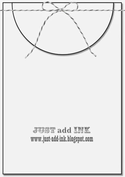
Here we are at the end of another week.  They are flying past so quickly!  This week for our Just Add Ink challenge Kim has designed a sketch. It's really great - open to interpretation in so many fabulous ways.


The sketch stumped me for a while, but then I was looking through my new Everyday Adventure Project Life Card Collection and found the perfect card!


It works so well with the sketch! I matted it on Basic Black and then created a background for the card using the sentiment stamp from Just Sayin'.


I was pretty pleased with how it turned out, and I love that the cards from the Project Life sets can be used for more than just PL scrapbooking.


I hope you can find time to play along with us the week at Just Add Ink - it's a fabulous sketch!

Bye for now,

Tina