Hi!
Thanks for joining me for the final Colour Creations Blog Hop for 2022. Don't worry, we'll be back in 2023 with the rest of the colours! This week we are focusing on Old Olive - a longtime staple of the colour range. As the name suggests, it's an olive green that's quite versatile.
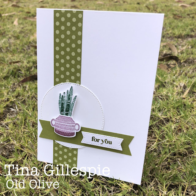
I was intrigued by this colour combo from Brian King. I don't usually put two greens together, especially two that are as different as Old Olive and Shaded Spruce, but I was keen to give it a go!
Shaded Spruce is a great colour for succulents, so I pulled out my Plentiful Plants bundle and stamped some of the images. I think this plant is a mother-in-law's tongue? It sits perfectly in the two-handled pot, which I stamped in Rich Razzleberry.
I used my Simply Fabulous stamp set for the sentiment, cropped using a Simply Stylish Die. I had initially planned to heat emboss a sentiment on the Old Olive banner underneath, but I ran out of time. This was a great alternative.
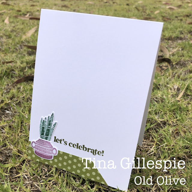
Here's a tip for you - it you have an offcut of DSP to use, but it's not quite wide enough, snip off one end at an angle and make it look like a feature!
Thanks for hopping along with us in 2022, we hope that you continue to do so in 2023. For now though, please do continue on your way with tonight's hop, starting with my lovely friend Di Furniss. Di's favourite colour is green, so I'm sure she's had a wonderful time creating with Old Olive.
The place to go for help if you run into any problems with links is the wonderful Cathy Proctor's blog. She does a fabulous job of keeping us all organised. She has a list of all of tonight's participants on her blog to help get you back on track.
Bye for now,
Tina


Wow, this is a colour combination I have never tried but it looks fabulous, Tina. As usual, the inside of your card is a lovely as the front.
ReplyDeleteThis is a great layout, Tina. I love all the white space and the strips of designer paper drawing the eyes down to the circle with you potted succulents. An unusual colour combination, but it really does work!!! Great tip for the inside too.
ReplyDeleteThere is no way I'd have thought of those colours as an accompaniment to Old Olive! It surprisingly works well. I find your arrangement of labels on labels fascinating too.
ReplyDeleteGreat crisp card Tina - inside and out. Terrific tip about the DSP too. Hadn’t thought of that. Really like it. May use it even if I DO have enough DSP 😃
ReplyDeleteGreat colour combo Tina - it works so well, especially with the potted Mother-in-laws Tongue. Love your use of DSP. Gorgeous card. Xxx
ReplyDeleteWhat a lovely clean card that says it all. Love it Tina.
ReplyDeleteThe white space on your card really makes the colours pop, Tina. Love the little pots, especially, and your tip for creating a feature with DSP offcuts!
ReplyDelete