Hi!
Welcome to Shaded Spruce week of the Colour Creations Blog Hops. Are you a fan? I am, even though I don't use Shaded Spruce much. I guess that I don't use green a lot, but Shaded Spruce is a favourite shade when I do.
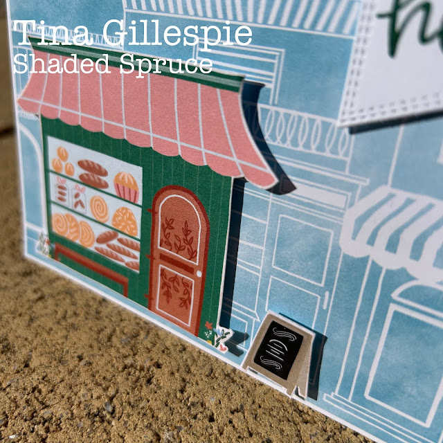
I don't have a lot of Shaded Spruce products, but I do have the Les Shoppes DSP, which has this fabulous Shaded Spruce bakery. Yum! I used the coordinating ink and my Biggest Wish stamp set for my sentiment. I cropped it with my Nested Shapes banner die. I actually cropped it twice - once to get the banner end, and then a second time across the top to reduce the length.
I popped the shop and the sandwich board up over the top of a layer of the blueprint type DSP from the pack. I wanted to give the look of a group of shops, but still keep the focus on the Shaded Spruce shop. I love the effect!
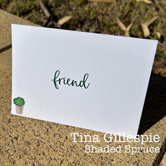
A little Shaded Spruce coloured pot of flowers was a great way to finish off the inside of the card.
Next you're off to see something marvellous from the craft desk of Kate Morgan. I always love seeing what she's created, and I'm sure that you will too.
Week after week, the lovely Cathy Proctor does a wonderful job of keeping us all on track. If you find yourself off track, just pop on over to her blog. You'll find a list of all of tonight's participants to help get you back on track.
Bye for now,
Tina


The Shaded Spruce bakery looks great against the blueprint-patterned paper, Tina. I also like that you used Shaded Spruce ink for the sentiments; nice touch!
ReplyDeleteGreat idea to feature the Shaded Spruce Bakery over the Balmy Blue background. The greeting you used works really well on your altered banner die cut
ReplyDeleteLove your Shaded Spruce bakery card, Tina! You've used this DSP perfectly to created a delicious scene and I love your altered banner die cut too.
ReplyDeleteThe shop in shaded Spruce stands out beautifully against the blue. You really do think up some clever cards Tina.
ReplyDeleteA delicious card Tina. I adore the dimension of the Shaded Spruce Bakery over the blue print shops. Gorgeous xxx
ReplyDeleteI agree Tina that the paler monochrome background DSP allows the colourful store to stand out. Love the pavement board at the front.
ReplyDeleteOh wow, I saw a card the other day like this, where they popped the coloured shop up over the top of the single colour background DSP. I love that you have done a similiar thing, and who couldn't walk past a glorious bakery! The sentiment on the banner is a cute idea too!
ReplyDeleteSuch an effective use of the papers Tina. The Shaded Spruce looks great on the Balmy Blue.
ReplyDelete