Hi!
Thanks for joining me for the new Colour Creations Blog Hop. This week it's Rich Razzleberry's turn - a former In Colour that became a core colour during a past colour refresh. Given that we are about to have another refresh, it's fun speculating on which colours might get the chop, and which retired In Colours might make a comeback. We all have our favourites!
Brian King has a lovely, bright colour combo to go with Rich Razzleberry. I wasn't a fan of Flirty Flamingo to start with, but it's grown on me over the years. Knowing my luck, that means it's a colour that may retire soon. Sigh! RR and FF have been matched with Daffodil Delight, for a fun combo.
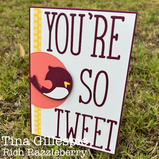
I recently received the Songbird Builder punch as a Sale-A-Bration reward, so I decided to use it on tonight's card. I don't have much other bird stuff, so I decided to use my Alphabet A La Mode dies to create a punny sentiment for my card. Because the letters are so skinny, you can fit a lot on!
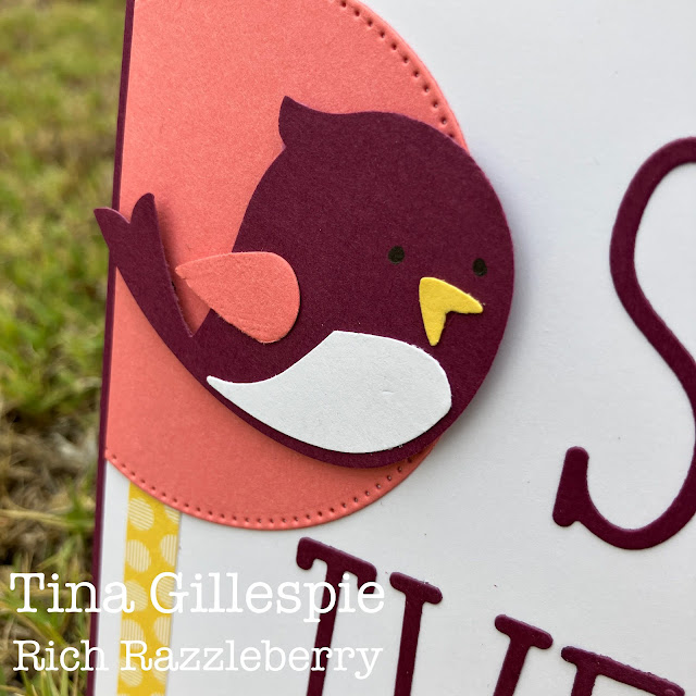
Here's my songbird. I used a Basic Black marker to draw the eyes on, as I don't have the coordinating stamp set. They are a bit tricky to see in black, but I think that white would look a bit weird, so black they will stay.
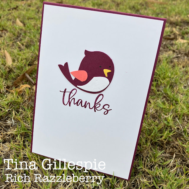
Her mate is on the inside of the card. I think they make a fun thank you card. Do you agree?
The next stop in tonight's blog hop is the lovely Amie McIlroy. You won't want to miss her card, I'm sure it's going to be wonderful.
As always, we are kept in line and on track by the fabulous Cathy Proctor. It can be a lot of work some weeks behind the scenes, as blog platforms don't always do what they are told to do. She's a real gem!
Bye for now,
Tina


What a fun fifties-style graphic style card, Tina! It's amazing how a colour combination can totally change the look of a colour - your Rich Razzleberry looks more like Merry Merlot when paired with Flirty Flamingo!
ReplyDeleteSuch a sweet card Tina, and I love the colours you’ve chosen to go with Rich Razzleberry
ReplyDeleteSuch a cute fun card Tina. A happy colour combo and cute little birds - both on front cover and inside. Love it.
ReplyDeleteHaha love the pun Tina! Who would have thought such a bold colour combo would work so well together. Theresa
ReplyDeleteSweet card, Tina. I like the addition of a second bird to the inside of the card (and I think the black eyes look great!).
ReplyDeleteTina, I love your punny sentiment it is so fun, especially in this bright colour combo. Great use of those letter dies too.
ReplyDeleteWell there’s a colour combo I’d have never thought of, but you’ve used it very well. Love how you used only the punch to create your birdies, they look great with the hand-drawn eyes.
ReplyDeleteSorry, that was me - Rachel P
ReplyDelete