Hi!
Thanks for joining me again for the new Colour Creations Creative Showcase. This week it's the turn of Garden Green. It's a Goldilocks green - not too dark, not too light, but just right! I don't use green a lot, but when I do Garden Green is one of the greens I tend to consider first.

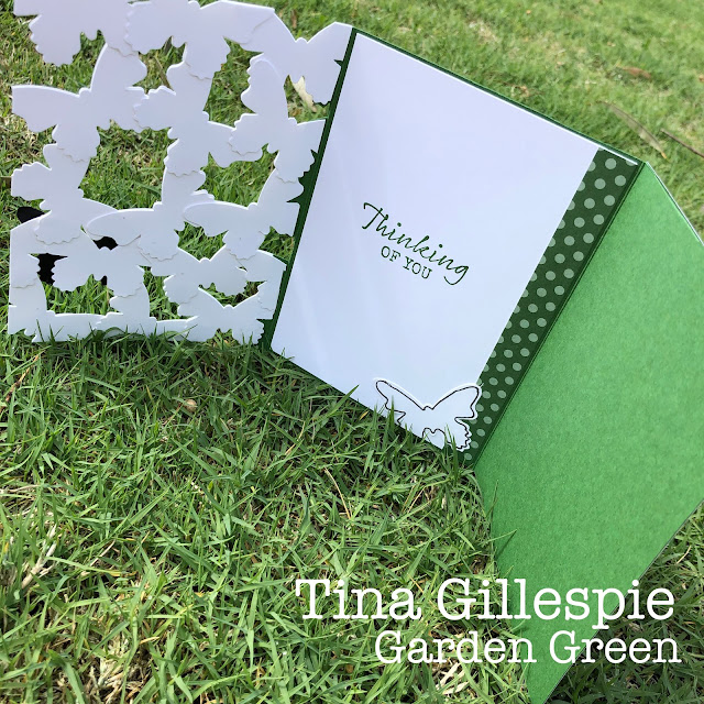
This week I revisited a technique that I'd tried a while ago. It's one by Jennifer MacGuire, where she used die cuts to create a layer card front. Last time I used daisies, this time it is butterflies. I just punched a heaps from Thick Whisper White and layered them until they were large enough to be a card front. I adhered them together at the points of overlap.

They didn't quite have enough definition, so I used a fine tip marker to hand-draw around the edges of each butterfly. I then added a few of the little butterflies and a large black butterfly, each given a coat of Clear Wink Of Stella. I heat embossed the sentiment from Free As A Bird onto Garden Green cardstock and double punched it with my Classic Label Punch.

The card is a tri-fold, so that I could add a plain background behind the butterflies. It then opens up again for the writing panel. I added another hand-outlined butterfly, a piece of left over DSP and the sentiment from Seaside Notions.
That's all from me tonight. As always, please head on over to Catherine's Blog, where you'll find the rest of this week's Garden Green cards.
Bye for now,
Tina


Very creative, Tina! How interesting that Garden Green is the one you reach for when you need a green ... it's my least used green! :)
ReplyDeleteYour tri-fold card is so cool and so creative Tina. Love it!!!
ReplyDeleteThis is lovely Tina, I love that the floating front is completely separate from the layers underneath - really delightful card with that surprise element of the tri-fold.
ReplyDeleteVery cool Tina - you always think outside the box!
ReplyDeleteLovely card Tina - very crafty!!
ReplyDeleteWow what an interesting and fun way to do a card front! I will have to give it a go sometime. I love the way it gives your Goldilocks Garden Green a way to shine through!. I think Garden green was one of my most used greens before Mossy Meadow now I us it more! Love your card!
ReplyDeleteThat looks so modern and fab. I love this. The butterflies look great with that pen outline.
ReplyDeleteWow Tina - you just blow me away every week with the ideas and techniques you come up with and this card is no exception! Thank you so much for joining the Colour Creations Showcase this week and inspiring us all with your creations xx
ReplyDeleteAnother wow card Tina. Your pieced card front is delightful, especially with the hand-drawn line around the butterflies and the addition of some little butterflies. The tri-fold design makes it extra special. xxx
ReplyDeleteVery clever card, Tina and your Goldilocks reference (too funny). I had forgotten about this technique, but it looks fab with those butterflies!
ReplyDeleteWow Tina, such a creative and effective card! I'd never seen this style before. I love the tri-fold design too.
ReplyDeleteWow Tina, what a clever and effective card. I love it!
ReplyDelete