It's time for the new CASEing The Catty Sunday Challenge Blog Hop! It's a circle of blogs that you can hop your way around to see what the Design Team have made for this week's task. You may have come from Julia's blog, or you may be starting here. It doesn't matter! To paraphrase Dory - just keep hopping!
This week we are challenging you to CASE a layout of one of the cards on page 151 of the Annual Catalogue. There are four to choose from, or five if you count the tin, which you definitely can! I couldn't choose just one card, I ended up using elements from two - the card at the top left with the boats, and the card at the bottom left with the fish.
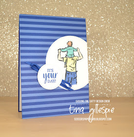
I started with the stripes on the top card. I don't have a striped stamp, so I used some DSP instead. It's a sheet from the retired In Colours DSP pack in Blueberry Bushel. I liked the circle feature from the bottom card, so that's where I went next. Instead of chopping into my DSP layer, I added the circle on top. Truthfully, I'd already adhered my DSP to my card base, so I had no choice but to layer on top!
I coloured my image with my Stampin' Blends, just using one shade of each colour. A tip when colouring this image - don't leave a straight line at the bottom of the image. Make it a bit uneven so it looks less like an amputation, and more like the image has just faded off.
The sentiment circle kind of steals from both cards. I used the same sentiment as on the fish card, but I added some ribbon underneath as is the case on the boat card under the ship's wheel.
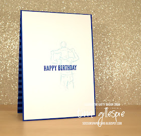
I finished the inside by stamping the man again, but in stamped off Balmy Blue and then the sentiment over the top of the man. I love how low-fuss I can be on men's cards, don't you?
That's it from me this week! Have you entered our challenges yet? It's so easy - just make a card based on the challenge and then upload your photo to our Facebook group. Done!
Before you get creating, don't forget to continue the hop! Next up is my friend Rachel, who put her sewing machine to use for her card!
Bye for now,
Tina


oooh I love the inside with the stamped off image under the greeting. And thank you for the colouring hint - that's so true!! Awesome card, great case.
ReplyDeleteGreat masculine card. The colours and layout work so well together!
ReplyDeleteFabulous CASE Tina, I like the way you included bits from two cards. Especially like the stamped off image on the inside.
ReplyDeleteThis is a great card Tina - I love that the whole background is DSP. So striking! Kelly x
ReplyDeleteAwesome card, Tina. Love the bright colours. This might be a "low-fuss" masculine card but it certainly isn't boring! As always I love the way you've embellished the inside, a feint stamping of the main image is a great idea for this.
ReplyDeleteLovely card Tina and very clever to incorporate elements from two different cards. Great tip about colouring the pants too.
ReplyDeleteLove your take on this card! It's perfect for a male card.
ReplyDelete