Hi!
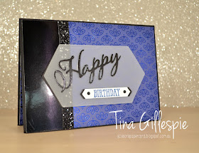
Do you ever buy a craft product just for one part of a pack? Maybe it's a set of dies that you purchased for one die, or a stamp set? This time, for me, it was one pattern in the Noble Peacock SDSP. I really loved the Blueberry Bushel paper in the pack, and bought it just for that! Although, I think once I get into Christmas card making, the Pretty Peacock sheets will be just as appealing!
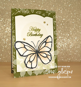
I made this card as a class sample to show off the gorgeous foil DSP. I paired it with plain Black Foil, with some Black Glittered Organdy Ribbon for a touch of glitz. After I'd glued it all down I looked at it and wished I'd embossed the plain black foil with the Subtle Embossing Folder. My class ladies all went for this option, and it looked fabulous.
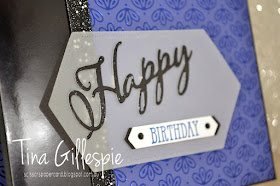
I cut the 'Happy' from Black Foil using the Merry Christmas Dies. I love that the 'Happy' works equally well on a birthday card as it does on a Christmas card. I layered it over some vellum that I'd cropped using a Stitched Nested Labels Die. The Classic Label Punch was the perfect choice for the 'Birthday' part of the sentiment, as it mirrors the Labels Die shape.
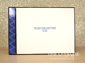
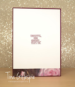
A little strip of the DSP finishes off the inside. I like occasionally doing a vertical strip rather than horizontal, just for something different. In this case it ties the inside layout with the front layout, so I think it was a good decision.
Bye for now,
Tina
Pages
▼
Tuesday, 30 July 2019
Sunday, 28 July 2019
CTC #239: CASE A Layout
Hi!
Welcome back to a new CASEing The Catty Sunday Challenge Blog Hop. It's been another busy week in my household, so I just squeaked into the end of the list for the blog hop, after Monique.
This week we are choosing a card from page 103 of the Annual Catalogue to CASE, but with an extra twist - we need to change the theme. So if the card you choose is a thank you card, you need to make anything but a thank you card. Easy!
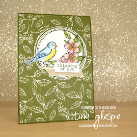
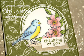
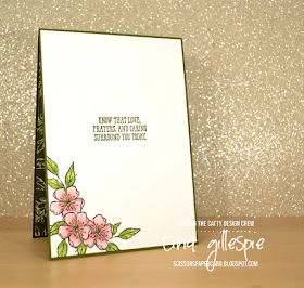
I was in a bit of a rush to get my card done, so I went for the Crumb Cake card at the top of this photo. In my rush I assumed it was a new baby card, as it's in the Kid's and Babies section. What's the opposite of a new baby card? A sympathy card. I always seem to need them for my stash.
It's funny how 'I need to get a card made in a hurry' morphed into 'I'll just do some colouring with my Blends', which I can never do in a hurry! I stamped the flower from Best Birds three times, masking each one as I went. Once all three were masked I stamped the leaves over the top. They were coloured with my Flirty Flamingo, Granny Apple Green and Daffodil Delight Blends.
The bird was then stamped and coloured using Daffodil Delight, Balmy Blue and Light Night Of Navy Blends, with Light Crumb Cake for the ground. The sentiment is from a Paper Pumpkin set I got while I was in the USA. I think it's Birds Of A Feather.
When I cut the card for the inside I was kidding myself that I'd only stamp one flower and leaf combo. As soon as I stamped the first flower I knew I had to do the whole trio - it wouldn't look right with just one. Sigh. Luckily I'm quicker at the photo editing and blog post writing than I am at making a quick card! LOL!
That's it for me for this week. Don't forget to join our Facebook group so that you can play along with our challenges each week.
In the meantime though, you're hopping off to see what Julia has made this week.
Bye for now,
Tina
Thursday, 25 July 2019
JAI #467: Just Add A Sketch
Hi!
Welcome to the new Just Add Ink challenge. This week Lou has designed a fantastic sketch for us to use. I love a good sketch challenge!
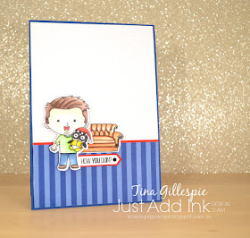
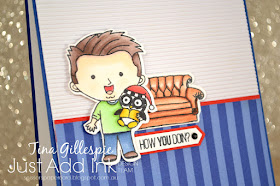
I had a hankering to pull out some of my pop culture stamps to have a play with this sketch. After a flick through, I settled on two stamp sets that coordinate perfectly that are from two of my favourite pop culture companies, Kindred Stamps and The Ink Road Stamps.
Do you recognise the character? He spent a lot of time sipping coffee in New York with his 5 friends. The sentiment, 'how you doin'?' was a pretty iconic pick up line of his! The character is from "The One With The Friend' from Kindred, and the couch and sentiment are from "The One With All The Stamps" from The Ink Road.
I coloured the character and the couch with my Copic markers. I've been playing around a bit with darker shadow lines, and this was a great opportunity to try them out again.
The inside sentiment is also from Kindred. It's a play on the episode titles of the TV show - every single episode name started with "The One Where...", which is also why both the stamp sets have similar names! It's one of my favourite TV shows that I watched every week when it was on TV. I have the boxed set so that I can watch it all again, I just lack the time! Oh well, one day 😊
That's it from me, not it's time to hop on over to the Just Add Ink blog, where you can see the rest of this week's Design team cards. You can also link up your card and play along in our challenge. If you don't have a blog you can always email us your card and we can link it up for you.
Bye for now,
Tina
AWH July Blog Hop: Simple Stamping
Hi!
Tonight the Art With Heart team are sharing creative projects featuring Simple Stamping, which means our projects feature only paper, stamps and ink. It’s a great way to create a quick and easy card for new stampers or for when you need a card at short notice. These projects highlight how Stampin’ Up! ink, paper and card stock coordinates perfectly.
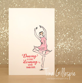
To keep this card super simple, I used one of our note cards and envelopes. They come in a pack of 20, and are pre cut and scored for convenience. I stamped the twirling dancer in Memento ink so that I could blend my Watercolour Pencils with Wink Of Stella. Don't all dancers need a bit of glitz? LOL
Silly me coloured the section between her legs before I realised that it wasn't meant to be a part of her dress. Oops! Thankfully, a quick line from her right leg out to the side of the dress meant that I could cover up my mistake. Phew!
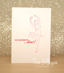
I stamped the dancer again on the inside in Melon Mambo, but stamped off once first. Ada's dance studio's colours are hot pink, black and silver, so Melon Mambo is the closest colour match for the pink.
I also stamped the envelope, this time without stamping off. It just fit! You can see the difference between the two images, where I fixed up my mistake on the card. I don't think it matters at all!
That's it from me, now you're off to visit the blog of the very arty Kathryn Ruddick.
Tina Gillespie
Bye for now,
Tina
Tonight the Art With Heart team are sharing creative projects featuring Simple Stamping, which means our projects feature only paper, stamps and ink. It’s a great way to create a quick and easy card for new stampers or for when you need a card at short notice. These projects highlight how Stampin’ Up! ink, paper and card stock coordinates perfectly.
If you would like a copy of the 2019 - 2020 Annual Catalogue, contact any of the girls on the blog hop and we will get in touch with you.
Thanks for joining me! You may have arrived from Catherine Proctor's blog, or you may be starting here - it doesn't matter. Grab a cuppa and just keep hopping until you've got back to where you started.
When the topic of this blog hop was announced, I had just received the new stamp set, Born To Shine. It's a great line art/sentiment set that features a pair of ballerinas and some encouraging sentiments. My daughter, Ada, is a dancer and I thought this set would be great for little notes of support when she has performances.
To keep this card super simple, I used one of our note cards and envelopes. They come in a pack of 20, and are pre cut and scored for convenience. I stamped the twirling dancer in Memento ink so that I could blend my Watercolour Pencils with Wink Of Stella. Don't all dancers need a bit of glitz? LOL
Silly me coloured the section between her legs before I realised that it wasn't meant to be a part of her dress. Oops! Thankfully, a quick line from her right leg out to the side of the dress meant that I could cover up my mistake. Phew!
I stamped the dancer again on the inside in Melon Mambo, but stamped off once first. Ada's dance studio's colours are hot pink, black and silver, so Melon Mambo is the closest colour match for the pink.
I also stamped the envelope, this time without stamping off. It just fit! You can see the difference between the two images, where I fixed up my mistake on the card. I don't think it matters at all!
That's it from me, now you're off to visit the blog of the very arty Kathryn Ruddick.
If you find a broken link or have come to this blog hop from a different entry point, you can view the participants below:
Tina Gillespie
Bye for now,
Tina
Tuesday, 23 July 2019
Diagonal Folded Perennial Essence
Hi!
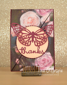
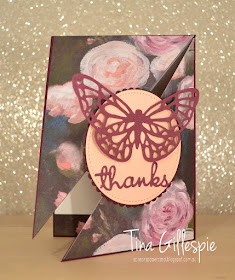
Today I have a fancy fold card for you. I made it as a class sample. Every now and then I get a hankering to make a fancy fold, and the Diagonal Fold card was one I hadn't tried yet.
It's a fairly simple fold to make. You score a piece of A4 card in half in both directions and then cut it in half diagonally. Done! This gives you two card bases to decorate. The hardest part was the cutting, only because it didn't fit in my trimmer, so I had to use a ruler and craft blade to cut the card.
I took a piece of Perennial Essence DSP and cut it to card front size and then chopped it down the middle on the same diagonal as my card base. The butterfly and 'thanks' had a coat of Wink Of Stella for a little added glimmer.
Nice and simple on the inside, just a piece of matching DSP and a lovely sentiment. Have you tried a Diagonal Fold card? It not, do give it a go - it's a fun and easy card (or two) to make.
Bye for now,
Tina
Sunday, 21 July 2019
CTC #238: Garden Lane
Hi!
Thanks for joining me for the new CASEing The Catty Sunday Challenge Blog Hop. Did you join me from Rebecca's blog, or are you starting here? It doesn't matter, just keep moving around the blog hop until you get back to where you started.
This week we are not only CASEing the colours of the Garden Lane DSP, we are also CASEing cards from the Annual Catalogue that feature the suite. I had a look, and my eye was caught by the Memories and More card in this photo from page 39:
I don't have much of the two 'Lane' suites, apart from the Magnolia DSP, so I had to improvise a little! Instead of using a magnolia bloom, I switched it out for a butterfly.
I kept the layout of the M&M card, I just made it full card size. The butterfly was stamped and coloured in the same way as the magnolia on the card. I just used my Petal Pink Blends to colour the very inner bit of each section of the wings. It gives it such a soft, pretty look.
The bottom of the card looked too square and harsh, even after I'd added the butterfly. To soften it, I used my Leaf punch to crop some leaves from Vellum. I then coloured each one using my Dark Soft Sea Foam Blend and tucked them under the butterfly.
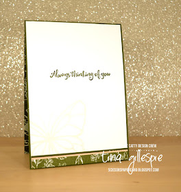
As the butterfly was a huge feature of the front of the card, I used it again on the inside. This time I just stamped it in second generation Petal Pink ink to keep it nice and soft.
The Design team have made a fabulous range of cards this week for our challenge. What will you make? You can add your card to our Facebook group. I ca't wait to see it!
In the meantime though, don't forget to finish the hop! Next on the list is the lovely Michelle.
Bye for now,
Tina
Thursday, 18 July 2019
JAI #466: Just Add Inspiration
Hi!
It's time for the newest Just Add Ink challenge, and this week Kelly has given us our challenge. Just in time for Christmas in July, she's given us a festive Inspiration photo to work from.
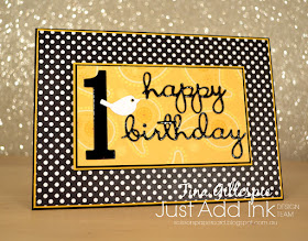
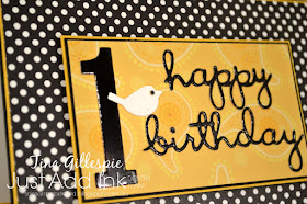
Aww, how lovely is that? It's the kind of display I'd love in my house, but can never quite pull off! My eye was caught by that gorgeous black and white polka dot ribbon. I can't quite bring myself to start making Christmas cards just yet, so I ran with the polka dots for a card for my littlest great nephew's birthday.
These papers are actually old Creative Memories paper from my stash. I came across them while searching for something else, and I'm glad I did, because the polka dots are perfect for this challenge!
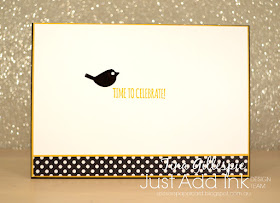
The paisley paper is from the same pack. I love how it's quite subtle. The best match for Stampin' Up! cardstock was Crushed Curry, which frames all of the Basic Black quite nicely. I used Black Foil for the sentiment and number die cuts.
I couldn't resist adding a second little birdie to the inside of the card, using a scrap of left over Black Foil. I like how it adds a little bit of whimsy to the card.
That's it from me this week - time to pop on over to the Just Add Ink blog to see the rest of this week's Design team cards.
Bye for now,
Tina
Tuesday, 16 July 2019
Happy Birthday Ada!
Hi!
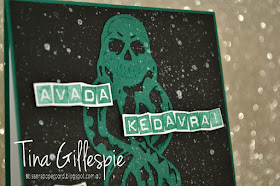
Last week my daughter had a birthday, turning 14. Ada's a mad Harry Potter fan, and so I usually make her a Harry Potter themed card. She's been talking lately about getting a Dark Mark tattoo when she's old enough (gulp!), so I decided to go with that theme for her card. For those not in the know, the Dark Mark is a magical tattoo on the 'baddies' (Death Eater's) arm that they use to summon each other.
The Dark Mark is a skull with a snake coming out of the mouth. I certainly don't have any stamps for that! In the end I purchased a cut file from an Etsy store and cut it from some Shaded Spruce cardstock. The Basic Black cardstock was a little to stark, so after I adhered the Dark Mark I misted it with some old Smooch shimmer mist that I found on my desk.
I can't take credit for the sentiment on the card. -I googled 'Death Eater Birthday Cards' and found one that I liked. Avada Kedavdra is an Unforgivable Curse that kills the person it's aimed at, hence the second part of the sentiment!
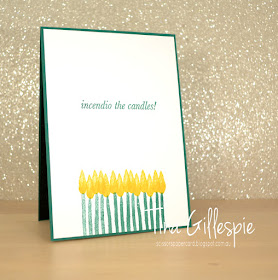
The inside sentiment is from an Ink Road Stamp set called Expecto Stampo. Incendio is another spell to light a fire, so it's perfect for the birthday candles. These were just stamped using the retired Incredible Like You stamp set. Did you notice I stamped 14 candles?
In case you were wondering, Ada loved the card!
Bye for now,
Tina
Sunday, 14 July 2019
CTC #237: CASE A Layout
Hi!
It's time for the new CASEing The Catty Sunday Challenge Blog Hop! It's a circle of blogs that you can hop your way around to see what the Design Team have made for this week's task. You may have come from Julia's blog, or you may be starting here. It doesn't matter! To paraphrase Dory - just keep hopping!
This week we are challenging you to CASE a layout of one of the cards on page 151 of the Annual Catalogue. There are four to choose from, or five if you count the tin, which you definitely can! I couldn't choose just one card, I ended up using elements from two - the card at the top left with the boats, and the card at the bottom left with the fish.
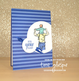
I started with the stripes on the top card. I don't have a striped stamp, so I used some DSP instead. It's a sheet from the retired In Colours DSP pack in Blueberry Bushel. I liked the circle feature from the bottom card, so that's where I went next. Instead of chopping into my DSP layer, I added the circle on top. Truthfully, I'd already adhered my DSP to my card base, so I had no choice but to layer on top!
I coloured my image with my Stampin' Blends, just using one shade of each colour. A tip when colouring this image - don't leave a straight line at the bottom of the image. Make it a bit uneven so it looks less like an amputation, and more like the image has just faded off.
The sentiment circle kind of steals from both cards. I used the same sentiment as on the fish card, but I added some ribbon underneath as is the case on the boat card under the ship's wheel.
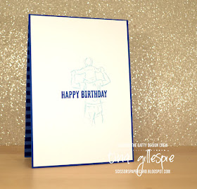
I finished the inside by stamping the man again, but in stamped off Balmy Blue and then the sentiment over the top of the man. I love how low-fuss I can be on men's cards, don't you?
That's it from me this week! Have you entered our challenges yet? It's so easy - just make a card based on the challenge and then upload your photo to our Facebook group. Done!
Before you get creating, don't forget to continue the hop! Next up is my friend Rachel, who put her sewing machine to use for her card!
Bye for now,
Tina
Thursday, 11 July 2019
JAI #465: Just Add The Season
Hi!
Hooray for a new Just Add Ink challenge! This week Nikki has decided we should add 'The Season' to our cards. What do we mean by 'The Season'? Well, it can either be your favourite season (summer/autumn/winter/spring) or the current season where you live. For me in Australia, it's the depths of winter, and we are currently having a little cold snap. Not cold enough to snow, but certainly cold enough to just want to stay home snuggled in front of the TV during the school holidays!
I decided I'd make a winter themed card, and then realised I had very little in my stash that was winter themed. Oops! I'm not one to back down from a self imposed challenge, so off I went to look for a winter themed digital stamp. I found this cutie by Graphics Dollar, called Linus Goes Camping. Even better, he was a freebie! I quickly printed him and then got colouring.
I used my Stampin' Blends to colour Linus, the fire and his marshmallow stick. I also coloured the ground with my Light Crumb Cake Blend, and then added some pebbles using my Dark Crumb Cake Blend. This was a technique I saw Paula Dobson use in her brilliant Blends Colouring video.
The trees were stamped using the trees from Waterfront. Stamping them over and over and at different heights hides the trunks of some of the images and makes the trees look a lot taller than the stamps are! I used my sponge brayer to colour the sky (after masking off the moon) so that I could flick water over to create a starry sky.
I had a bit of fun experimenting with my Blends and the Colour Lifter on this card. I used the Lifter to add some cross hatching to the jeans to add a bit of texture. I also added some strokes to the wood on the fire to give more of a rough look. I wasn't thrilled with how the hair turned out, but it was fun trying! I used a Soft Suede Blend to add streaks and then coloured over it with Daffodil Delight and Mango Melody.
I didn't have many options for the inside, as I couldn't print Linus small enough for my liking. I made do with a row of trees, which I quite like!
That's it for me for this week's challenge. Now you can head on over to the Just Add Ink blog, where you can see the rest of this week's Design team cards, and also enter your own. Which season will you choose?
Bye for now,
Tina

