Hi!
It's Friday - time for the new Just Add Ink challenge! This week we have a sketch deigned for us by Narelle, which is funny because as I was making my card I was thinking how very 'Narelle' this sketch is, not realising it was one of hers!
I straight away knew I wanted to use my Tropical Escape suite of products.
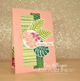
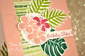
My first pick was the striped DSP from the Tropical Escape DSP pack. I then chose the darker colour DSP to help anchor the two papers. The circle that the flowers sit on is the reverse of the striped paper. I stamped the palm leaves and flowers in ink that coordinates with the DSP, except fo the pop of Berry Burst.
You can't see it in the picture, but the Blushing Bride layer (not the card base) is embossed with the Subtle 3DTIEF. Have you got this yet? It's such an awesome embossing folder.
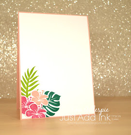
I'd stamped and die cut some extra leaves and flowers for the front - there's nothing worse than cleaning your stamp or putting away your dies only to realised you need just one more! They never go to waste, as I just use the extras on the inside.
Why not pop on over to the Just Add Ink blog, where you can find the rest of this week's cards made by the Design Team? You can also link up your card - who could resist this awesome sketch?
Bye for now,
Tina
Pages
▼
Thursday, 29 November 2018
Tuesday, 27 November 2018
Humming Along In Lipstick
Hi!
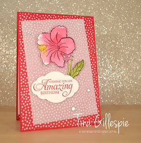
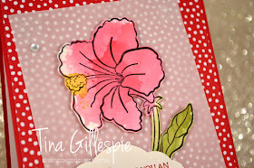
Its time once again for this week's Colour Creations Blog Share. This week we are looking at Lovely Lipstick. It's a colour I haven't used much as it intimidates me a bit! I can't decide if it's a red or a pink! What do you think? Today's card definitely leans towards pink. What ever you think, it's bold colour, and so I toned it down a little with a layer of vellum.
I have used a stamp set that was an All Attendee gift at OnStage, called Humming Along. It will be available from January when the Occasions Catalogue goes live. Isn't the flower gorgeous? It's a lovely big bloom, just right for colouring. Does anyone know the type of flower? I'm a bit horticulturally challenged! EDIT: My friend Rachel tells me it's a hibiscus!
When we are at OnStage we get to see a lot of different stamping presentations. One which really stuck with me was Dale Hampshire's presentation on colouring for people who have problems with holding markers - maybe they have shaky hands, as Dale does. I've been thinking off and on about other ways to colour.
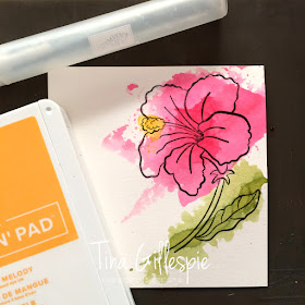
I decided to give smooshing as a method of colouring a go, and I was quite pleased with the results. Do you remember how to smoosh? You basically just transfer some ink to a clear block, spritz with some water, pick up the watery ink with a bendable plastic sheet and then smoosh the sheet onto your cardstock.
This time I stamped first in Stazon ink so that my outline wouldn't run. I was then able to be a bit more selective about where on my Shimmery White cardstock I smooshed each colour (Lovely Lipstick, Old Olive and Mango Melody). It looks quite messy like this, doesn't it? Look closer though - the water and the way you bend the plastic help to create colour variations in the different parts of the flower and leaves. It's not a perfect way of colouring, but it's not meant to be! Take a look at how it ends up once it's fussy cut (BTW: there's a gorgeous set of dies to match the stamp set, but I don't have them yet!):
I was so pleased with the results, and I can't wait to try it with my class ladies! It really is a cheat's watercolouring.
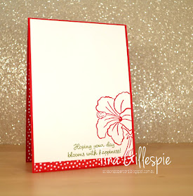
I finished off the inside with another of the blooms and a strip of DSP left from the front. The sentiment comes from the Varied Vases set. You may be interested to know that there's a new stamp set to match the lunch in the Occasions Catalogue too!
Why not pop on over to Catherine's blog, where you'll find the rest of this week's Lovely Lipstick cards? It's a bold colour, and I can't wait to see what the other girls have done with it.
Bye for now,
Tina
Sunday, 25 November 2018
CASEing The Catty #205
Hi!
EDIT: Oh, wow, I was a winner at CASEing The Catty with this card!
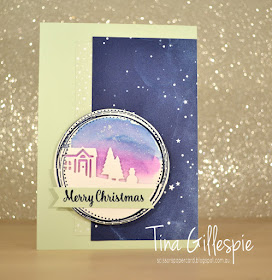
It's been a long while since I've managed to play along with the CASEing The Catty challenge, but after a busy weekend with Rob and the kids, I decided I'd make sure I made the time to give the challenge a go. For challenge #205, the CTC have asked us to choose a birthday card from the catalogue and give it a Christmas twist. What fun! I made a cuppa and settled in with my Annual Catalogue and eventually decided I'd CASE the Mint Macaron/Gorgeous Grape card at the top right of page 136.
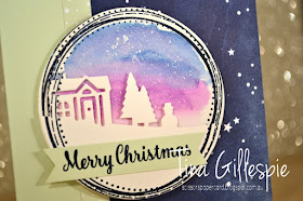
I kept the layout pretty much the same, and I also used Swirly Frames on my focal panel, but to give it the Christmas twist, I went with the Hometown Greetings Edgelits.
I started by stamping and cutting two of the large Swirly Frames circles in Night Of Navy and using my Layering Circles dies. I then took my Aquapainter and Night of Navy and Gorgeous Grape ink to create the evening sky on one of the circles. I was so thrilled with how that turned out! I also flicked over some Frost White Shimmer Paint to represent the stars. I cut the second circle with the edgelit, trimming off the second house as it didn't look quite right to me. I then used Dimensionals to pop it up on top of the first circle.
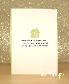
The inside was kept fairly simple so that I'll have plenty of room to write a Christmas message when I send the card. Thanks to the CTC team for a fun challenge!
Bye for now,
Tina
Thursday, 22 November 2018
JAI #435: Just Add Inspiration
Hi!
Welcome to the new Just Add Ink challenge!
This week we have a gorgeous, wintery picture that Kim found to inspire us. Funnily enough, it's been very cold here in Adelaide, even though Summer is nearly upon us!
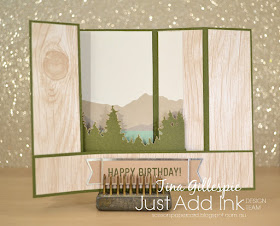
On my recent trip to the USA, I was excited to be able to tour Stampin' Up!'s Home Office. It was fascinating to see where it all happens! At the end of the tour, the four of us were gifted a Paper Pumpkin kit, which we were all very excited to receive. Mine just happened to be perfect for this week's challenge!
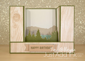
The kit was called Manly Moments, and featured a card with a mountain/forrest scene. I didn't make the card as designed in the kit, instead I used the components to make a bridge card. I had to add a piece of Mossy Meadow cardstock to make the card base, but otherwise, everything is from the kit.
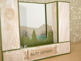
The original card was wider than the back of the bridge card, so I chopped the card base and wrapped it around the sides of the card. The woodgrain paper is actually the inside of the matching envelope! I added a strip of Mossy Meadow across the middle of the box part of the card and attached the forrest part of the kit. I like how it gives the card an extra bit of dimension.
I love this style of card, because even though it's very dimensional, it folds flat and is the correct size for a standard envelope. Winning!
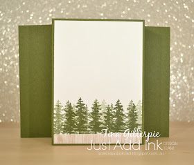
I didn't want to use more stickers on the back, as I'd have to 'steal' them from another card to allow it. Instead, I stamped the trees from Waterfront and added a spare strip of paper from the envelope. I was so happy with how this card turned out!
The rest of the Design team have done an amazing job with Kim's Inspiration Challenge this week. You can see their cards, and link up your own, over at the Just Add Ink blog.
Bye for now,
Tina
AWH November Blog Hop: Sketch This
Hi!
Tonight the Art With Heart team are sharing creative projects featuring a card sketch. We hope you like how we have each put our own spin on the sketch and that it inspires you to get creative and make some fabulous cards. If you are inspired by the sketch, please share with us!
Can you see how I used the photos and postcard to replicate the main part of the sketch? I pretty much ignored the rest of the sketch as it didn't work with my page, but the most important part is included. I purchased the post card on my trip. I often do, as they photos are usually better than any I can hope to take! In this case though, the rustic flag appealed. Can you see that it's the flag painted onto some boards?
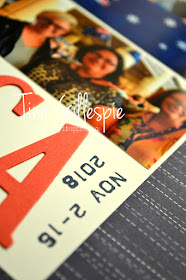
I then picked two photos that were the highlights from the two main parts of my trip. I had such a wonderful time travelling with Judy May, Kathryn Mangelsdorf and Rachel Palmieri, so I wanted to include them in this layout. The photo with the Aussie flag is from our visit to Stampin' Up!'s Home Office in Riverton, Utah, and the bottom photo is on the registration day of OnStage in Orlando, Florida, where we met Sara Douglass, the CEO of SU. You can see that I've cropped the photos to fit the sketch. How fabulous that the two photos I wanted to use worked perfectly!
I üst had to include a kangaroo to go with the American feel of the page. The kangaroo featured heavily in my swaps and gifts, so it will also feature heavily in this album. I coloured is with my watercolour pencils and blended with my Wink Of Stella pen. I tossed up between my Blends and pencils, but in the end went with the pencils as I felt it worked better with the rustic look of the flag postcard.
I love the Labeler Alphabet set! It's fabulous and versatile and will also feature heavily in the album, as it did on my swaps and gifts. And, yes, I did wear that flag headband for most of OnStage! It was a great way for people to find me, so I only took it off during the sessions so that I didn't annoy people sitting behind me.
Thats it for me for this month. You're now off to see what treasures Rachel Woollard has for you!
If you get lost along the way, here's the list of blogs participating in today's hop:
Rebecca Jacovou
Caroline Manwaring
Sharon Davern
Monika O’Neill
Sue Madex
Ros Davidson
Kate Morgan
Andrea Roberts
Tina Gillespie
Rachel Woollard
Bye for now,
Tina
Tonight the Art With Heart team are sharing creative projects featuring a card sketch. We hope you like how we have each put our own spin on the sketch and that it inspires you to get creative and make some fabulous cards. If you are inspired by the sketch, please share with us!
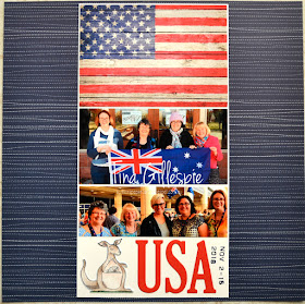
Just like last month, I decided to scrap a layout rather than make a card. I'm keen to get stuck into scrapping my USA trip, so this was just the starting point I needed. This page will be the opening page to my album.
Can you see how I used the photos and postcard to replicate the main part of the sketch? I pretty much ignored the rest of the sketch as it didn't work with my page, but the most important part is included. I purchased the post card on my trip. I often do, as they photos are usually better than any I can hope to take! In this case though, the rustic flag appealed. Can you see that it's the flag painted onto some boards?
I then picked two photos that were the highlights from the two main parts of my trip. I had such a wonderful time travelling with Judy May, Kathryn Mangelsdorf and Rachel Palmieri, so I wanted to include them in this layout. The photo with the Aussie flag is from our visit to Stampin' Up!'s Home Office in Riverton, Utah, and the bottom photo is on the registration day of OnStage in Orlando, Florida, where we met Sara Douglass, the CEO of SU. You can see that I've cropped the photos to fit the sketch. How fabulous that the two photos I wanted to use worked perfectly!
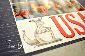
I üst had to include a kangaroo to go with the American feel of the page. The kangaroo featured heavily in my swaps and gifts, so it will also feature heavily in this album. I coloured is with my watercolour pencils and blended with my Wink Of Stella pen. I tossed up between my Blends and pencils, but in the end went with the pencils as I felt it worked better with the rustic look of the flag postcard.
I love the Labeler Alphabet set! It's fabulous and versatile and will also feature heavily in the album, as it did on my swaps and gifts. And, yes, I did wear that flag headband for most of OnStage! It was a great way for people to find me, so I only took it off during the sessions so that I didn't annoy people sitting behind me.
Thats it for me for this month. You're now off to see what treasures Rachel Woollard has for you!
If you get lost along the way, here's the list of blogs participating in today's hop:
Rebecca Jacovou
Caroline Manwaring
Sharon Davern
Monika O’Neill
Sue Madex
Ros Davidson
Kate Morgan
Andrea Roberts
Tina Gillespie
Rachel Woollard
Bye for now,
Tina
Wednesday, 21 November 2018
A Foxy Deer
Hi!
Today is the last Heart Of Christmas Blog Share for 2018. Have you enjoyed seeing all of the Christmas inspiration? Has it inspired you to start on your Christmas cards? I hope so!
The card I have made for this week's Blog Share has been one I've had on my mind for the entire 15 weeks of Heart Of Christmas. I just always kept putting off making it, as other ideas and new products took priority. As today's is the last, it was time to put ink to cardstock!
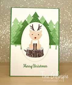
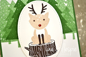
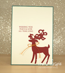
How cute is the reindeer? Can you see why I've been wanting to make this card? LOL
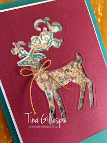
I couldn't resist adding a Red Rhinestone to turn him into Rudolph!
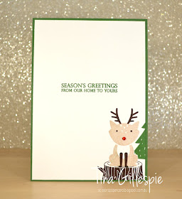
Here he is again on the inside. I hadn't intended to add the rhinestone to this deer's nose, but it just didn't look quite right without it after doing the one on the front.
You can see the rest of this final week's cards over at Claire's blog. I'm sure you'll love what you see.
Bye for now,
Tina
Tuesday, 20 November 2018
Lemon Lime, But No Twist
Hi!
Welcome to the new Colour Creations Blog Share for this week.
This week we are looking at Lemon Lime Twist - a colour that I originally thought 'OMG, what are they thinking???', but have since come to love! It's such a bright, fresh colour.
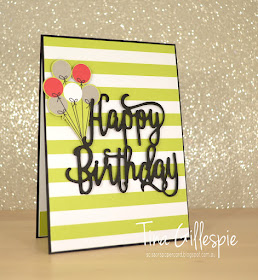
I've been pondering over this card for the past 2 weeks or so. It's my first 'post Orlando trip' card, but I've been thinking about it on and off while I was away. I knew I'd be jet lagged, so I wanted a simple card that wouldn't take too much brain power to put together, but still looked fabulous. Hence, the 'Lemon Lime, but no Twist' title of my post, LOL.
The basic design was set pretty much from the start - the LLT stripes on a Basic Black card with the BB die cut. I liked the boldness of the colours and simplicity of the design.
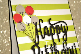
I worried that it was a little too simple though, so I added the fussy cut balloons from the Broadway Bound SDSP pack (which is also where the striped DSP came from). Overall, I was pleased!
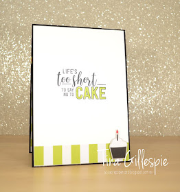
Oooh, did you notice that the inside contains a little sneak peek? The cupcake was also fussy cut from the Broadway Bound SDSP, but the sentiment is from a stamp set from the upcoming Occasions Catalogue called Amazing Life. It's a really fun birthday set.
As always, you can find the rest of this week's cards over at Catherine's blog. I can't wait to see what everyone has made!
Bye for now,
Tina
Monday, 19 November 2018
Orlando Roomie Gifts
Hi!
I'm back now from Orlando, and I had a wonderful time!
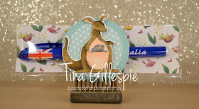
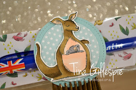
Today I have for you the gifts I made and had made for the ladies I shared a house with in Orlando. While on the hunt for Australian flag pencils for my swaps, I found these pens. Perfect!
I started with the same backing paper as I used for the pencils, but the only pieces I had left went sideways, not longways. I couldn't do a bag topper as I did for the pencils, so I went with a belly band instead.
I only had 6 to make, so I decided to stamp the kangaroos and colour them with my Blends. It was an extra special touch for some special people. I layered the kangaroos over a pair of Pool Party circles. I love the starry paper from the Twinkle Twinkle DSP pack, a bit of a nod to the American flag.
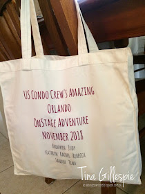
I wanted to make the gift extra special, and a little more personal, so I had some tote bags made up by Vistaprint to commemorate the trip.
Here's the tote. It's the perfect size for 12x12 papers, so I can see myself using it a lot - yes, I did have one made for me too. Hopefully the others find it just as useful!
Bye for now,
Tina
Thursday, 15 November 2018
JAI #434: Just Add A Big Bold Sentiment
Hi!
Welcome to the new Just Add Ink challenge!
After a two week challenge last time, we are back to the usual one week timeframe with the new challenge. This week Nikki has challenged us to add a big, bold sentiment to our cards.
So, as you know, I've been in the USA for Stampin' Up!'s 30th Birthday Onstage celebration. My kids were pretty upset I was going without them, so I decided that I'd make them a card each that I'd post from the airport so that they'd get them in the mail. All kids love getting mail! Hopefully it will ease the sting of not getting to come too.
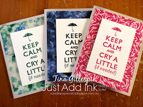
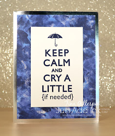
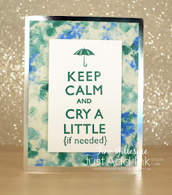
The stamp set is an old hostess set called Keep Calm. I love the different take on the classic English poster, and I thought it was perfect for these cards.
I used paper from the Garden Impressions DSP pack on each of the cards, choosing a different colour and design for each child. It's great that I was able to find two patterns more suited to boys in a very floral pack!
The card bases are the Silver Foil Edged Cards and Envelopes Pack. I've been using them quite a bit. Despite them being US sized, they are a great addition to our range, and an easy way to add a bit of pizzazz to a card. All I did was add the DSP and pop up the sentiment panel. Done!
My kids aren't really the kind to cry over me being away, in fact they'll probably have a fabulous time with Rob, as he tends to let them get away with more than I do!
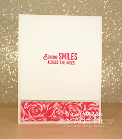
All of the cards are the same on the inside too, just different colours and papers to match the front. I added a small strip of Silver Foil paper over the DSP just to help tie in with the front of the card. I really hope they love getting them I'm the mail!
You can see the rest of the Design Team's cards over at the Just Add Ink blog. Everyone had fun with this challenge, and I'm sure you will too.
Bye for now,
Tina
Wednesday, 14 November 2018
Copper For Christmas
Hi!
Hello, and welcome to the new Heart Of Christmas Blog Share. Have you been checking out the teams cards each week? You should if you haven't already. Plenty of gorgeous Christmas inspiration for you to see.
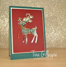
This week I went back to the Detailed Deer Thinlits. They are so beautiful! I had some copper ribbon left from the Notes Of Kindness card kit that I've been itching to use, so I decided to use it on this card. I hadn't yet decided to make it a shaker card, but as I had no other copper elements to add to the card except for the copper sequins, a shaker card it became! I think the copper works so beautifully with the rich tones of Tranquil Tide and Fresh Fig.
I used the putty end of my Take Your Pick tool to lift most of the copper sequins out of my Metallics Assortment pack of sequins. The putty tip makes the job so much easier!
I used the left over die cut from the front to complete the inside. I couldn't resist adding another copper bow!
That's it once again from me, but you can pop on over to Kate's Blog where you can see the rest of this week's cards.
Bye for now,
Tina
Tuesday, 13 November 2018
A Bike Ride Through The Highland Heather
Hi!
Time for the new Colour Creations Blog Share!
This week it's Highland Heather's turn. It's another new purple in the range. It's lighter than Gorgeous Grape, which we featured a few weeks ago, and they work wonderfully together.
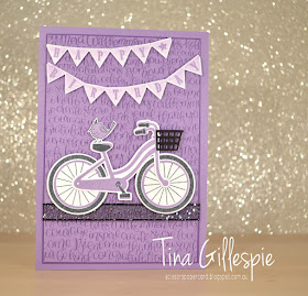
My first thought was to use the purple to stamp a bike. I haven't used my Bike Ride stamp set much, so this was a good excuse. While I was stamping with a set I hadn't used much, I decided to use a few more from that same category - Handwritten and Pick A Pennant.
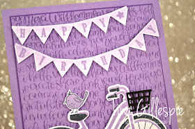
To make the pennant I first stamped the banner, stamping it off on some scrap paper first. I then stamped the letters over the top. I hand cut the banner because I haven't got the coordinating framelits. I found I had to snip right up between the sections on the 'birthday' banner so that I could bend it enough to fit on my card.
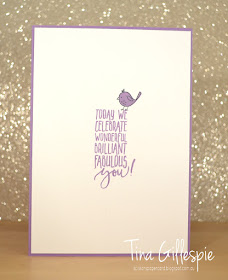
How cute is that little birdie? He's from the Pick A Pennant stamp set too. I couldn't resist adding him onto both the front and inside of the card.
Catherine is hosting this week's Colour Creations Blog Share as usual. You can pop on over to her blog to see the rest of this week's cards.
Bye for now,
Tina


