Hi!
Welcome to the new Colour Creations Blog Share.
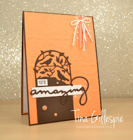
This week we are all using Early Espresso on our cards. It's a rich brown that works fabulously as an alternative to Basic Black when you're wanting a dark neutral colour. It took me a little while to warm to Early Espresso when it first came out - I was a Chocolate Chip girl - but now it's a colour I use a lot.
For my card today I've paired it with Grapefruit Grove and Very Vanilla. I recently purchased the Botanical Tags Thinlits, and thought that they'd look great as a silhouette effect on my card.
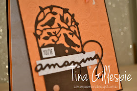
It might be a little difficult to see, but I've painted the two birds and the word 'amazing' with a layer of Wink Of Stella. Can you see the new Tin Tile Dynamic Textured Impressions Embossing Folder on my card? It's so pretty!
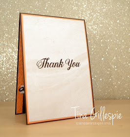
Again, it's difficult to see in the photo, but instead of using Very Vanilla cardstock on my card I've actually used a sheet of DSP from the Petal Promenade DSP pack. It's got a very subtle pattern that's perfect for stamping on. Can you see the swirls through the paper on the inside of my card? I also used it under the sentiments on the front of the card. It's a quick and easy way of creating a subtle effect on a card.
You can see the rest of this week's cards over at Catherine's Blog. Now I'm off to get stuck into making next week's card.
Bye for now,
Tina


Tina these colours look amazing together and how gorgeous is the tin tile embossing folder? Thanks for joining the Art With Heart Colour Creations blog tonight.
ReplyDeleteThe early espresso silhouette does look stunning on the card front. Certainly draws your attention in.
ReplyDeleteGreat card Tina. How gorgeous does Grapefruit Grove look with Early Espresso! I love the inside layer of DSP, it is perfect for stamping on. Love it!
ReplyDeleteThis is what I love about these challenges. I never would have put these two colours together, but it really works. Reminds me of Jaffa ice-cream :) Love those Botanical Bird Thinlits too.
ReplyDeleteNice Card Tina, I haven't used Grapefruit Grove myself yet but it looks so good with the Early Espresso and the tin tile Embossing folder.
ReplyDeleteThat looks so good with the Grapefruit - wouldn't have thought of that combo and it is so effective. Love this card.
ReplyDeleteWhat a wonderful colour combination, so pretty. I love the use of that DSP on the inside too, perfect!
ReplyDelete