Hi!
Woo hoo for Friday - one more week until the school holidays, and I can't wait!
This week for our challenge at Just Add Ink Rachael has given us an Inspiration photo to guide us.
Isn't it pretty? It makes me think of being in Europe....
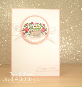
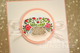
Even though I've just purchased the Bike Ride bundle, I didn't want to add a bike to my card. That meant I really had to think about what I wanted to do instead. In the end, I decided to go with the white wall, the basket and the flowers.
The basket and flower stamps are both from the Bike Ride stamp set. I used my Stamparatus to create the mirror image of the flowers so that I could have a bunch hanging over each side of the basket. It's such a cool technique - you should give it a go!
It's hard to see in this photo, but I used the new Subtle embossing folder to emboss the front of the card. Have you noticed it in the catalogue? It turns the cardstock from plain to textured in a few turns of the Big Shot handle. So easy!
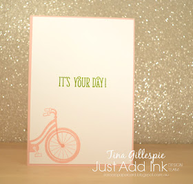
LOL, in the end I decided to sneak the bike onto the card! It was a bit hard to resist.
What inspires you in the picture we've used for this week's challenge? You can see what the rest of the Design Team have done over at the Just Add Ink. Once you've made your card, link it up so we can all enjoy your creativity!
Bye for now,
Tina
Pages
▼
Thursday, 28 June 2018
AWH Blog Hop: CASEing The Catalogue
Hi!
Welcome to June's Art With Heart Blog Hop!
This month, Ros has asked us to CASE a card from the new Annual Catalogue. Do you ever CASE? It's a great way to kick start your creativity when you feel like you've lost your mojo. I also sometimes CASE when I have a new stamp set and I'm a bit stumped on how to use it.
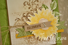
So what is a CASE? It can mean Copy And Share Everything, or Copy And Selectively Edit. Doesn't matter which you pick - it just means you've made a card that was directly inspired by another. Of course, you should always give credit to the original! I've chosen the card at the bottom left of the picture on page 157 to CASE today, and I've made two versions.
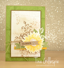
If you have your Annual Catalogue handy and have flicked to page 157, you can see that my first card is a pretty direct CASE of the card I chose. I've used all of the same stamp sets, inks and colours - there isn't a lot that I've changed.
In this picture, you can see my two changes - I've used staples instead of stitching (I was feeling a bit too lazy to get out my sewing machine!), and I've used a stamped Pear Pizzazz flag instead of Pear Pizzazz DSP. That was simply because I don't have any current Pear Pizzazz DSP. Otherwise, the card is as close of a CASE as I could make it.
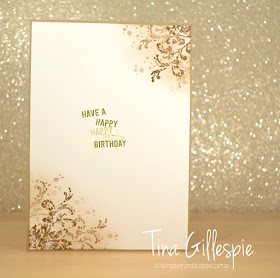
I had to imagine what the inside would look like, as it's rare that the insides are shown in the Catalogue. I just went with similar stamping to the background on the front.
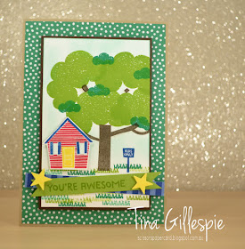
Next, I decided to CASE the same card, but to make it completely different. I started by selecting a different stamp set. I recently got Treehouse Adventure, so I pulled it out for a play. My first effort went in the bin, but I was much happier with the second!
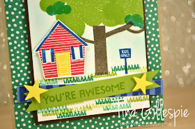
Like the first card, I've used a Crumb Cake card base. I've kept the green background, but this time I've used some Call Me Clover DSP. As I was making a kid's card, I elected to go with bright colours. Once again, my main panel is matted in a dark brown, but this time I've used Early Espresso rather than Soft Suede. The tree and grass replaces the grungy stamping on the first card, but I've used different shades of the one colour (green/brown) on each card, stamping off at times both.
You can easily see on this card, I've flipped some of the elements. The treehouse replaces the sunflower, but now it's on the opposite side of the card. I had no intention to do so, but in stamping the grass I managed to get an ink smudge in a bad spot, so the house had to hide it. I've not used twine on this card, and the banner elements are different, but still in a similar position.
I couldn't resist adding the house in again on the inside!
So there you have it - two cards that CASE the one card, but both are very different!
That's it from me, now you're hopping back to the start, as I'm last on the list. Top of this list this month is the fabulous Catherine Proctor.
If you find a broken link or have come to this blog hop from a different entry point, you can view the participants below:
Bye for now,
Tina
Tuesday, 26 June 2018
Smooshed Berry
Hi!
Hooray for a Colour Creations Blog Share with one of my favourite colours!
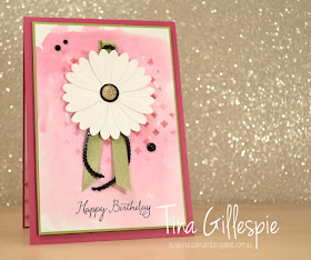
This week we are featuring Berry Burst. It's such a luscious, rich pink - very aptly named! I needed to make a card for one of my nieces, so I decided to make it a little special.
Have you tried the smooshing technique? That's how I created my background. I used an Aqua Painter to spread some water over my 'F' clear block (that's the background stamp sized one), and then picked up some Berry Burst ink and mixed it around in the water. I kept going until I was happy with the pink colour, and then I took my cardstock and smooshed it onto the block. I love the variations in colour you get, and the little runs where some water has pooled.
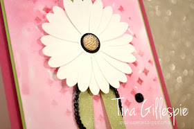
Once it dried, I roughly sponged some more Berry Burst through the diamond mask in the Pattern Party set. I then finished with some Pear Pizzazz Shimmer ribbon, Black sequin trim, and some Basic Black Faceted Gems. With all that colour, I left the daisy crisp Whisper White on top. I layered three of the punched daisies to give a very full look, probably more of a gerbera.
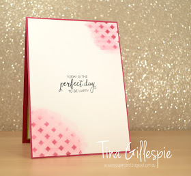
To finish the inside, I sponged with the mask again and then dragged my wet Aqua Painter over the sponged area to spread the colour.
As usual, you can find the links to the other blogs over at Catherine's blog. Berry Burst is a popular colour, so there's bound to be plenty of inspiration to be found!
Bye for now,
Tina
Monday, 25 June 2018
Polished Stone in Pink
Hi!
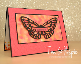
I mentioned a couple of weeks ago that I'd been playing around with the Polished Stone technique for my June classes. Today I have the first card I made using the technique.
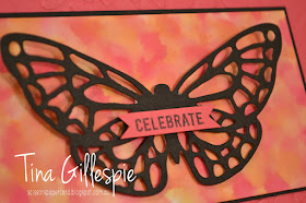
I used Melon Mambo and Basic Black as the main colours on my card. I wanted to keep the colours dramatic but simple so that the focus would be on the Polished Stone panel.
Speaking of which, how lovely does that Polished Stone panel look? I used Melon Mambo, Pumpkin Pie and Daffodil Delight reinkers on Glossy Cardstock to achieve the effect. It's important to choose colours that are beside each other on the Colour Wheel, or you risk ending up with brown blobs instead of lovely colours. I went with a little more PP and DD, as I knew MM would dominate the combination.
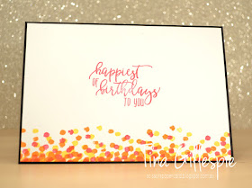
I used the dotty stamp from Dragonfly Dreams on the inside, trying to recreate the Polished Stone in a small way.
Have you tried the technique yet? It's a fun one, so well worth trying!
Bye for now,
Tina
Thursday, 21 June 2018
JAI #414: Just Add A Window
Hi!
Whoops! I'm running a bit late with my Just Add Ink post today! This week Nikki has challenged us to add a window or a frame to our cards.
I wasn't sure which one I wanted to do, so I just added both!
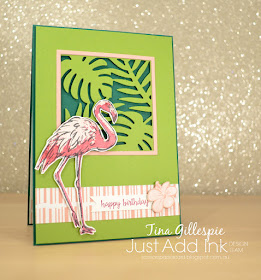
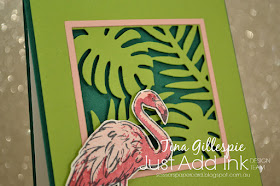
I recently received the new Tropical Thinlits and the coordinating Tropical Escape DSP. Quite conveniently for this challenge, the thinlit set has a window die that I was very eager to use. I cut the window into my Granny Apple Green front panel, and then used some Blushing Bride with my Layering Squares Thinlits to cut a narrow frame to go around it. The colours really pop with the Shaded Spruce card base peeking out. I tried Whisper White, but it didn't pop in quite the same way.
I didn't buy the Tropical Chic stamp set to match the dies and DSP, and I'm sort of regretting that now! Instead I used the flamingo from Fabulous Flamingo, stamped in Early Espresso, Berry Burst (stamped off) and Blushing Bride.
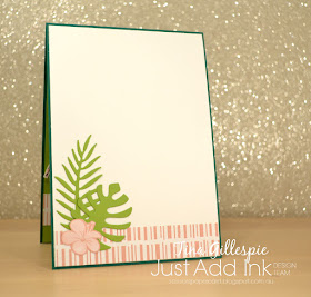
The hibiscus flowers on the front and inside were fussy cut from the DSP. I had hoped that they could be cut by the die, but they are a bit smaller. Looks like that stamp set will be on my next order - you'd think I'd know this by now, always get the bundle!
The Design Team have had a fun time with Nikki's challenge. You can see their cards over at the Just Add Ink blog, where you can also link up your card. See you there!
Bye for now,
Tina
Tuesday, 19 June 2018
On The Waterfront At Bermuda Bay
Hi!
Have you been enjoying our weekly Colour Creations Blog Shares? I have! It's been fun using colours that I may not have used for a while. Which is a little funny, as this week is Bermuda Bay, a colour that I featured heavily on last week's Basic Grey card!
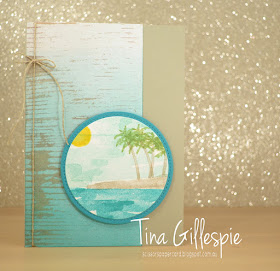
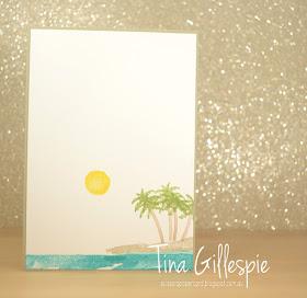
This week's card started off with a 'I wonder what it would look like if I tried...' thought. In this case, I was thinking about brayering some colour onto the pale Wood Textures DSP.
What do you think? I loved how it turned out! It was exactly the beachy look I was going for. I layered it on a Sahara Sand card base - which is another colour I don't use a lot of, but is a great alternative to Crumb Cake, which was a bit dark for this look.
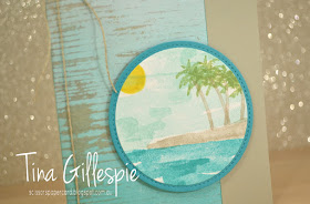
I used Bermuda Bay (ocean), Sahara Sand (beach), Crumb Cake (trunks), Old Olive (palm leaves), Pool Party stamped off (sky) and Daffodil Delight (sun) to create the scene on the front. I then created a matching scene on the inside.
Once again - no sentiment! I don't particularly have a purpose for this card yet, so I will wait to stamp something else when I know what Im doing with it.
You can find the rest of the group's blog links over at Catherine's blog again this week. It really is amazing how differently we all use the same colour.
Bye for now,
Tina
Thursday, 14 June 2018
JAI #413: Just Add Colour
Hi!
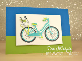
Welcome to the new Just Add Ink challenge. This week Di has given us this very cool Colour Combo to work with.
I think this one is lots of fun! It includes the new core colour, Granny Apple Green. Don't have it yet? Easy - substitute a different green. Maybe Old Olive or Pear Pizzazz? As long as it's a similar colour, it's still OK.
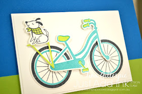
I purchased the Bike Ride bundle just before the end of the last Annual Catalogue. I'd been on the fence about the bundle all year, and when it carried over I decided to take the plunge. It's such a fun set, that was perfect for these fun colours.
How cute is that dog, popped up on the back of the bike, looking very happy with himself?
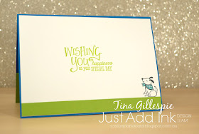
So cute that I decided to pop another dog on the inside!
You can head on over to the Just Add Ink blog to see the gorgeous cards that the rest of the Design Team have created. You can also link up your creation - can't wait to see it!
Bye for now,
Tina
Tuesday, 12 June 2018
Up & Away With Basic Grey
Hi!
Time for another feature colour Blog Share!
This week we are featuring Basic Grey. I must admit that it's a colour I don't used very much, so it was a bit of a struggle this week for me. My card classes this month have been trying the Polished Stone technique, so I decided to give the technique a whirl using Basic Grey.
To make the Polished Stone panel I took a piece of Glossy White cardstock and a cotton ball. I squirted some Isocol (rubbing alcohol) on the cotton ball and then dripped some drops of Basic Grey, Smokey Slate and Bermuda Bay ink from my reinkers onto the soaked part of the cotton ball. I then just dabbed the cotton ball all over the Glossy cardstock until I was happy with the look. I had to use my old Archival Basic Grey reinker, and I don't think it worked quite as well as the Classic reinkers do, as it reacted differently with the Isocol. Good enough, though!
I adhered the panel flat to the base and then popped up the Whisper White panels on either side. It's a fun, different way to add a bit of interest to a card. How do you like the sentiment feature? Using a rectangle under a flag is a little quirky, but fun touch to the card.
I used another Polished Stone panel on the inside. I actually made this piece first using a Glossy offcut as a test piece for the larger panel on the front. I suspected the Archival Basic Grey might not work, so I made a smaller piece first rather than waste a larger piece. Thankfully, it worked well enough that I was happy to keep going.
As usual, Catherine is hosting the Blog Share, so you can find the links to the other blogs there. Enjoy - there's always some amazing projects to see!
Bye for now,
Tina
Monday, 11 June 2018
Old & New Are Better Together
Hi!
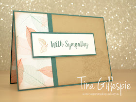
Today's card is one that features some old favourite Stampin' Up! stamps with some new product. It's Lovely As A Tree and Nature's Poem DSP. Although the DSP is a part of the new Nature's Poem suite of products, it was also designed to compliment the everlasting Lovely As A Tree stamp set.
I love this pattern from the DSP pack. The veiny, translucent leaves are just gorgeous! I thought the softer, muted colours (there's also the same pattern, but in a richer colour palette in the pack) were very suitable for a more masculine sympathy card.
All that Crumb Cake looked a little stark on it's own, so I stamped the tree from LAAT in the corner. Although it doesn't stand out much, it really adds some interest to the card. Any how gorgeous does Crumb Cake look teamed with Tranquil Tide?
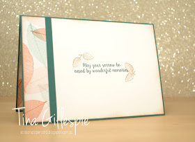
I let the inside mirror the outside by using a smaller strip of the Nature's Poem DSP. It's definitely a pack to add to your DSP stash - or should I say DSP hoard? LOL!
Bye for now,
Tina
Thursday, 7 June 2018
JAI #412: Just Choose Two
Hi!
Yay for Friday, and double yay for a Long Weekend! Do you have plans? I need to sort out my youngest's wardrobe, but otherwise I'm hoping to craft as much as possible. I have a sewing project or two planned also.
This week for our Just Add Ink challenge, Lou has tasked us to choose two on our cards.
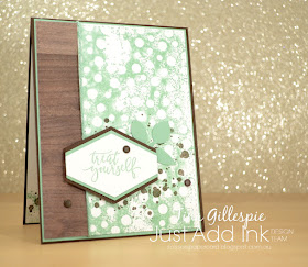
Hmm, which two will you choose? I went with spots and splatters for my card.
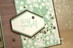
I decided to try a new to me technique on this card. I can't recall what it's called, but you basically ink up a mask and then press the cardstock to the mask. In this way, you get the reverse of the pattern you'd get by sponging ink onto the cardstock through the mask. I chose this spotty design from the now retired Seasonal Decorative Masks, inked it up with Mint Macaron ink, spritzed it with a tiny bit of water, and then pressed the card to the mask. I love how it turned out - the splotchy, grungy kind of look.
To finish the front, I stamped some splatters in Early Espresso ink to layer under my sentiment. I really, really, really wanted to add some bling, but I was trying hard to keep this card more on the masculine side, so I ended up using a few retired Enamel Dots in Early Espresso to jazz it up a little.
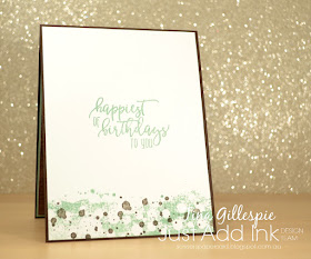
The bottom of the inside was created the same way as the front, but instead of inking the whole piece of cardstock, I gently bent the card so that only the bottom touched the mask. I pressed with my fingers to ink up the small section. Doing it this way gives a random, messy edge rather than a straight one, which would look a little odd.
As usual, the Design Team have risen to the challenge and produced some wonderful cards. You can see them over at the Just Add Ink blog, where you can also link up your cards. Which two will you choose?
Bye for now,
Tina
Tuesday, 5 June 2018
Hello, Balmy Blue!
Hi!
Some of the Art With Heart team have decided to do a weekly Blog Share that highlights a different colour in our range each week. Today marks the first of the Blog Shares, and we are featuring the new colour, Balmy Blue.
Blue is one of my favourite colours, so I was very happy to kick off this new weekly event with a shade of blue. Balmy Blue is a mid-blue, but leans more towards being a softer blue. It's part of the new Subtles collection and it's a gorgeous colour.
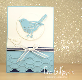
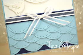
I don't actually have anything in Balmy Blue, apart from the cardstock. I decided to make the cardstock a feature of the card by creating this layered scalloped section. It's my favourite part of the whole card!
I simply cut a heap of the smallest Stitched Shapes Circle, chopped each one in half and then layered them in alternating rows on a piece of Night Of Navy cardstock. I was surprised by how quickly and easily it came together!
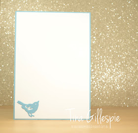
You may have noticed that there's no stamping on this card - yet! It's partly because I'm waiting for my Balmy Blue inkpad to arrive, but also because I haven't decided what occasion to use this card for. It may well end up as more of a letter than a card, not requiring a sentiment at all. Who knows? LOL
Why don't you pop on over to Catherine's blog? She'll be hosting the Blog Share each week, so that's where you'll find the links to all of the people participating each time.
Bye for now,
Tina


