Hi!
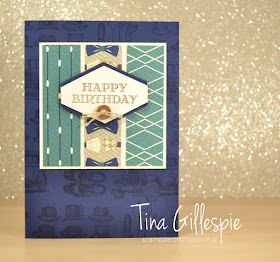
Today I have a card for you that I made using a couple of retiring products. One I will certainly miss is the Guy Greetings stamp set. I particularly like the font - it's a little but fancy, but not too fussy for a masculine card. For this card, I've made the Happy Birthday sentiment the focus, aided by the Tailored Tag punch, a True Gentleman button, and some Linen Thread. All three of those are carrying over. Yay!
I used some of the image stamps in Guy Greetings to create a background for my card. I simply put 4 stamps on one block to allow me to stamp them all in one step. I then just repeated until I covered the card front.
I love the mix of colours in the True Gentleman DSP. For this card I selected patterns that were mostly Night Of Navy, Tranquil Tide and Very Vanilla. Three colours make it easy to get a harmonious colour scheme.
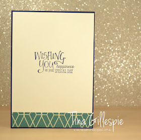
I couldn't resist adding another strip of the DSP to the inside. It's such a cool geometric pattern, and I really like the way it looked as an incomplete section of the pattern.
Bye f or now,
Tina
Pages
▼
Monday, 30 April 2018
Thursday, 26 April 2018
JAI #406: Just Add A Sketch
Hi!
Hooray for Friday, although boo that it's nearly the end of school holidays. The kids go back to school on Monday and I will miss our lazy days home together.
But Friday means it's a new Just Add Ink challenge, and this week it's a sketch designed by me!
I thought this was a nice easy one, only slightly tricky with the diagonal panel. What do you think?
I pulled out my Myths & Magic SDSP for another play before it retires.
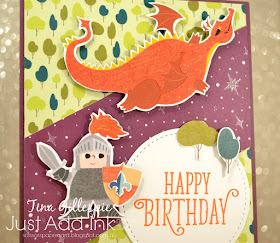
I've made a few mermaid cards, so this time I went for the knights and dragons. They were a little time consuming to fussy cut, but it's a job I don't mind too much. I even fussy cut a tiny fleur-de-lis to go on his shield!
My main tip is to position the characters so that they are looking at each other as much as possible. Don't yo just love the smirk on the dragon's face as he eyes off the knight? Too funny! It's hard to see in the photos, but the dragon body, and knight's plume and chest are all glittery. It really adds a fun element to the card.
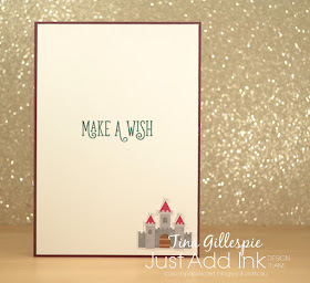
There were also little castles on the same sheet of DSP, so I fussy cut one to go on the inside.
That's it for me for this sketch. Pop on over to the Just Add Ink blog to see what the Design Team have done with the sketch. I hope you have as much fn with it as I did. Don't forget to link up your card.
Bye for now,
Tina
AWH April Blog Hop: Retiring Products
Hi!
Tonight the Art with Heart team are sharing creative projects featuring products from the Last Chance Products list. There are lots of products to choose from with retiring stamp sets, inkpads and ink refills guaranteed to be available until 7 May (and all other products while supplies last). Contact anyone on the blog hop to place your last chance order today.
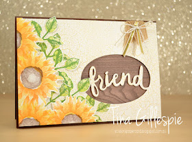
I've chosen to make a card using several retiring products.
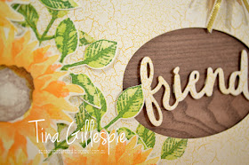
The first retiring product are the Lovely Words Thinlits. They coordinate with the also retiring Lovely Inside & Out stamp set, which I haven't used today. I selected the 'friend' thinlit for my card, as it paired nicely with the inside sentiment. One of the ribbons I have used in the top corner is also retiring - the 1/8" Gold Ribbon. It's Silver twin is also retiring.
The front of the card uses a subtle crackle paper from the Colour Theory DSP Stack. Some of the leaves from the Painted Harvest stamp set were stamped directly to the DSP. Do you ever stamp on DSP? It's a great technique that often gets forgotten. I've backed the word 'friend' with some of the Wood Textures DSP, which is carrying over to the next Annual Catalogue. Yay!
The final retiring products are two of the retiring colours. I've used Chocolate Chip (sob!) as my card base, and also for the centre of the sunflowers. Peekaboo Peach is also retiring. I used it as the top, darker layer of my sunflowers, with Crushed Curry underneath.
There's always some mixed feelings at this time of year - sadness at some retiring favourites, but also excitement over the new stuff about to hit my craft desk. I think this year I'm mostly excited, as there's lots of great stuff on the way.
Now it’s time to hop on over to our next participant, the very talented, Kimberly Hern.
If you find a broken link or have come to this blog hop from a different entry point, you can view the participants below:
Monday, 23 April 2018
A Magical Mermaid
Hi!
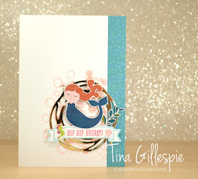
I love the whimsy of the Magic and Myths SDSP. Have you seen it in the Occasions Catalogue? It's retiring at the end of the Catalogue, so you need to get it before it's gone.
For this card, I have fussy cut one of the mermaids. How serene does she look? I've layered her on top of a Swirly Scribbles die cut, the was in turn layered over some stamped bubbles from the Playful Backgrounds stamp set.
I also fussy cut a few more elements from the SDSP - the seaweed, seahorse and the seashell. They were so cute, and I didn't want to waste them.
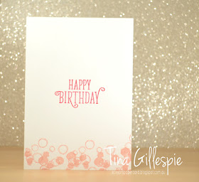
I carried over the bubbles to the inside. Playful Backgrounds is one of my favourite background sets, so I was very pleased to see that it's carrying over to the new Annual Catalogue.
Bye for now,
Tina
Thursday, 19 April 2018
JAI #405: Just Add Inspiration
Hi!
Yay for Friday!
It's time for the newJust Add Ink challenge, and it's an Inspiration Photo provided by Kelly.
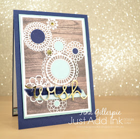
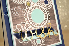
Could you imagine waking up in that bedroom? I imagine it to be out in the country somewhere, and that you'd wake up to the sounds of nature all around. The natural place to start with my card was the Wood Textures DSP. How exciting to know that it will be carrying over to the upcoming Annual Catalogue. I'm so happy about this, as I felt I hadn't used enough this catalogue.
One of the things I came home from On Stage with was a pack of the new Delightfully Detailed Laser Cut Specialty Paper. It's absolutely stunning - a real must have from the new catalogue. One sheet has card front sized designs, and I used one of them on this card to soften all of the wood.
I wanted to add some more colour to the card, so I took my collection of circle punches and added some circles in Pool Party, Night Of Navy and Gold to match the colours used elsewhere.
I stamped Stylised Birthday on the inside, and finished it off with another strip of the Delightfully Detailed paper. Stylised Birthday is retiring at the end of May. Do you have yours? It's a great stamp that works well for any type of birthday card.
The team at Just Add Ink have outdone themselves with their cards for this challenge. Pop on over to the blog to check them all out, and to link up your entry.
Bye for now,
Tina
Wednesday, 18 April 2018
SIP #146
Hi!
I'm back with another challenge card. This challenge site is a new one to me, I hadn't heard of it before I saw a card on FB that mentioned the site, so off I went to have a look. They just started a new challenge last night, which suited me perfectly. The team at Stamp, Ink, Paper are challenging us to make a card with a food or drink theme.
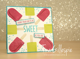
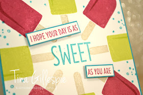
Once again, I went digging through my pile of retiring stamp sets for inspiration. I was tossing up between Cool Treats and Mixed Drinks, but I really wanted to try a 'wreath' card on my Stamparatus, so Cool Treats won the contest.
It's kind of hard to explain, and there are plenty of videos out there to watch, but you draw a template with two squares of equal sizes, overlapping with one turned 90 degrees, so you get an 8 pointed star. You then lay a piece of cardstock, cut to the same size as the square, over the template. I started stamping with the icy pole stick. I set it down so that it lined up with an imaginary line that ran from the centre of the cardstock to the corner of the cardstock. As you stamp, you then turn the cardstock so that the corner shifts to the next point in the star. LOL, you really should watch a video!
I used Berry Burst, Lemon Lime Twist, Crumb Cake and Bermuda Bay on my card. My first attempt at the wreath card was a little rough ( I won't point out my mistakes!), but overall I was happy with it. I'll certainly be trying it again!
Bye for now,
Tina
Tuesday, 17 April 2018
GDP #134
Hi!
Wow, I'm really on a roll this week with my card making! I'm having a lot of fun creating for some new to me challenges. I've known about Global Design Project for a while, but I haven't yet played along. Way past time to change that!
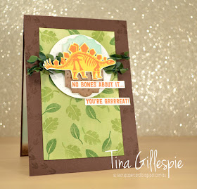
This is the fun sketch the team gave us to work with this week. I pulled out the retiring No Bones About It to make my card.
I started with the Pear Pizzazz panel. It's actually a smooshed panel, but I used far too much water, so I didn't get much variation in colour. Oh well! Rather than start again, I decided just to go with it. I used Shimmery White paper, so it still adds something more that just plain Pear Pizzazz cardstock to the card.
The dinosaur stamps have been well loved by me, as I have 4 great nephews (soon to be 5!) all under the age of 4. Having said that, I will happily wave them goodbye in just over a month, as there's a really cool set coming up in the new Annual Catalogue that will suit young boys (and girls for that matter!).
LOL, I always love stamping a dino walking off the page on the insides of my cards. There's just something about it that tickles my funny bone.
Bye for now,
Tina
Monday, 16 April 2018
CTC #174
Hi!
One of the things I love most about the school holidays is the lack of places to be! The kids and I like keeping the holidays fairly low key to allow the batteries to recharge. All this means that I usually get a lot more time to stamp during the day, allowing me to take part in some challenges.
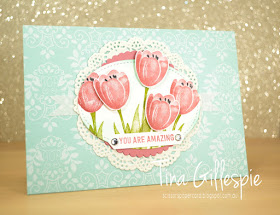
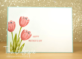
Today I'm joining in with the CASEing The Catty Challenge. This week they are challenging us to recreate a card from either the Memories & More or Hostess sections of either the Annual or Occasions catalogues. After a quick flick through both catalogues, the card that most caught my eye was the Feathery Friends card on page 220 of the Annual. I don't have the Feathery Friends stamp set, so I decided to substitute with another of the Hostess sets, Tranquil Tulips.
The DSP background is from the Petal Garden DSP stack. This is one of my favourite designs from the pack, which pretty much means I've hoarded it until that end of catalogue must use it up panic sets in. LOL!
The tulips are stamped in Sweet Sugarplum. I wish you could see the card yourself, because it's much nicer than it looks on screen. My photo editing program and I just couldn't get the colour any truer.
I stamped the tulips again on the inside. It's really hard to see, but I also sponged around them in Pool Party ink, just like I did on the front panel. It's a lovely sky effect, and finishes off the card nicely.
Bye for now,
Tina
Playing With Brushos
Hi!
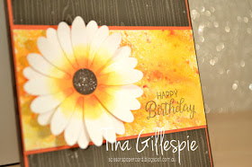
Have you had a chance to play with the new Brushos powders yet? They are a lot of fun!
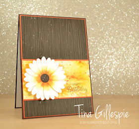
I was playing around with the Gamboge and Yellow powders to create this panel. I sprinkled the powders on Watercolour Paper, using mostly Yellow. A few spritzes of water and it's done! I didn't use too much water, as I wanted a speckled look.
The rest of the card was built around the Brusho panel. I quite like pairing orange with brown, so I chose Tangerine Tango and Early Espresso. Did you know that Tangerine Tango is one of our retiring colours? I think it's a colour I will miss! The woodgrain paper is from the Coffee Break DSP pack.
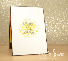
I love this sentiment! It's fabulous for so many occasions. It's from the Beautiful Bouquet stamp set, which is carrying over to the new Annual Catalogue. Yay!
Bye for now,
Tina
Thursday, 12 April 2018
JAI #404: Just Add A Shaker
Hi!
Have you missed me? I felt a bit sorry for my poor, neglected blog, but my building work has finally been completed. I wasn't able to get into my craft space the whole 4 weeks of the work, so it's great to be back creating again. Last weekend's On Stage event was the perfect timing to reboot the ole mojo.
This week at Just Add Ink Di set the challenge, and it's to Just Add A Shaker. What an awesome challenge!
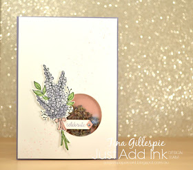
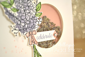
The best part about making a shaker card for me is choosing what will go inside the shaker. Sequins and glitter are fun, but sometimes you just need to think outside the box! While I was pondering, my eye fell upon a bag of dried lavender that a lovely friend had given to me, and that kick started my card.
I actually made this card before the renovations started and during the middle of Sale-A-Bration. I used two SAB stamp sets, that are now no longer current. The lavender image is from Lots Of Lavender. It's such a pretty set! It was stamped on scrap card and then fussy cut to layer over the top of the shaker window.
You may be able to see the second SAB set in this picture. I used one of the 'sprinkles' stamps from Eclectic Expressions to create a subtle feature across the front of the card. How lovely does the dried lavender look in the shaker window? It smells great too!
The Lots Of Lavender stamp set coordinates with the Lots Of Happy Card kit, so I used a sentiment stamp from the kit to complete the inside.
That's it from me for now - my first Just Add Ink card in little while. It's great to be back into the swing of things again! See you over at the JAI blog.
Bye for now,
Tina

