Hi!
Welcome to the new CASEing The Catty Sunday Challenge Blog Hop! Have you started here with me, or come from Shannon's blog? It really doesn't matter, but please do continue hopping until you get back to where you started.
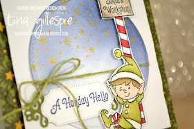
This week we are choosing a card from the Annual Catalogue and CASEing it using our Holiday Catalogue supplies. That sounds easy, until you realise that there's over 200 pages of projects to choose from! I ended up starting at the back, and soon came across this cute little card on page 206.
I loved the subtle DSP behind the main panel, and the way the image overhangs the circle panel. Too cute!
I started with a 4 1/4" square Old Olive card base, which I covered with a piece of DSP from the Night Before Christmas pack.
The next layer was Whisper White cardstock, cropped to 3 1/2" square. I ran it though my Big Shot in my Subtle folder. I actually placed the cardstock in the folder on a diagonal, so that the pattern runs diagonally. I wish the camera had picked it up! The Whisper White Stitched Shapes Circle was sponged with Night Of Navy ink, fading out at the bottom of the circle. I stamped a scattering of stars in Golden Glitz Delicata ink.
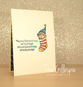
My cute little elf was stamped in Memento ink and colours with my Blends - Ivory, Old Olive, Cherry Cobbler, Soft Suede, Daffodil Delight and Crumb Cake. I then used my Shimmery Crystal Effects to coat the edge of his hat, collar, buttons and bottom of his jacket. An Old Olive linen twine bow and a few shapes from the Ornate Frames Dies finishes off the front of the card.
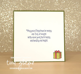
Being a smaller card, there wasn't really enough room to stamp the elf again, so I contented myself with stamping and colouring the present and then stamping the sentiment from Elfie.
Phew, that's it from me. Do you know we have a Facebook group for our challenges? You don't need a blog to enter, just snap a photo of your card and upload it to the group. Done!
Now you're off on the next stop of this Blog Hop, which is my lovely friend and SU travel buddy, Judy!
Bye for now,
Tina
Pages
▼
Sunday, 29 September 2019
Thursday, 26 September 2019
JAI #476: Just Add Inspiration
Hi!
Welcome once again to the new challenge at Just Add Ink. This week Jo has found a cool picture for our inspiration. It reminds me so much of visiting Floriade when I lived in Canberra. Have you ever been? It's well worth the trip if you haven't! I love that after the event, the flowers are cut and delivered to hospitals and nursing homes.
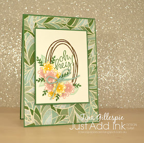
Anyway, on to my card! I was mostly inspired by the colours and the floral theme. What grabs your attention?
I started with the DSP from Mosaic Mood SDSP pack. It's one of the textured pieces, so the design looks and feels like glossy tiles. Rather than the boded colours of the Inspiration Photo, I decided to go with the colours in the DSP for my flowers.
I used my Sweetly Swirled stamp set for the main panel of the card. I'd hoped that my Delicata Golden Glitz ink pad might have arrived so that I could use it to stamp the oval, but sadly it didn't. I had to make do with Soft Suede instead. I stamped a few flowers in Blushing Bride and Crushed Curry on the same card as the oval, and then a few more on some scrap Very Vanilla card, to be fussy cut and adhered over the oval. The two different leaves were also stamped in Mint Macaron and Garden Green. I finished it off with a bow in Mint Macaron twine.
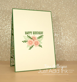
I stamped in a similar manner on the inside, just omitting the oval. The sentiment is from the ever versatile Itty Bitty Birthdays.
That's all from me for tonight. You can pop on over to the Just Add Ink blog to see the rest of the Design Team's cards and to link up your own. I can't wait to see what you create with this photo as your inspiration.
Bye for now,
Tina
AWH September Blog Hop: DSP
Hi!
Tonight the Art With Heart team are sharing amazing projects featuring Stampin’ Up! Designer Series Paper, most of which is in the current promotions where you can buy 3 packs of Designer Series Paper and receive a pack for free! You can select many of the DSP packs from the Annual Catalogue but only until the 30th of September.
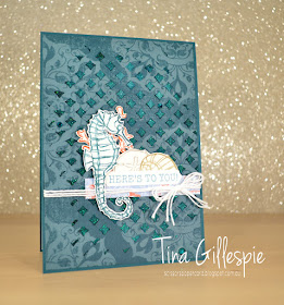
I took advantage of this awesome sale to purchase four packs that I didn't yet own, one of which being the gorgeous Woven Threads DSP. The patterns look like worn rugs that are hundreds of years old. Lots of gorgeous, muted colours and beautiful texture to the paper. I chose a piece of Pretty Peacock DSP that has a fabulous medallion design that's in a lighter shade of the same colour.
I had a plan to add some Shimmery Embossing Paste over the top of the DSP, but otherwise no idea beyond that! To colour the embossing paste, I tapped my Pretty Peacock ink pad over the top of the Pattern Party mask and then scooped out some of the paste. As I spread it over the mask and onto the DSP, it picked up the colour on the mask. I love how this gives uneven colour to the paste - it's lighter through the middle where I first applied the paste, but darker towards the edges, as I'd picked up more ink as I spread the paste.
I decided that the gorgeous blue/green made me think of the ocean, and so I reached for my Seaside Notions stamp set. Each image was stamped on Shimmery White cardstock and then I took an Aquapainter and ran it lightly over each image. It pulls a little colour in from the ink and is a really quick and easy way of adding some subtle colour.
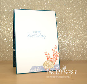
When I'm stamping things like the shells and coral for the front, I always stamp a couple of extras. This means when I get to the inside I don't have to start stamping all over again, I can just go straight for fussy cutting and gluing. It saves so much time, especially if you're like me and like to clean and put away your stamps as soon as you can.
That's it for me this evening. Now it's time for you to hop on over to the lovely Rachel's blog. I wonder which DSP she's chosen to use?
If you find a broken link or have come to this blog hop from a different entry point, you can view the participants below:
Bye for now,
Tina
Wednesday, 25 September 2019
AWH HOC Week 6
Hi!
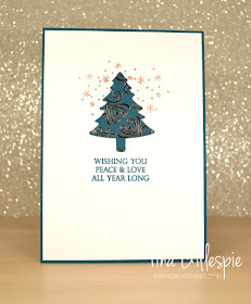
Welcome to Week 6 of the Art With Heart team Heart Of Christmas Blog Share. Can you believe it's week 6 already??? This week I received my new Pine Tree punch. I love the classic tree shape, don't you?
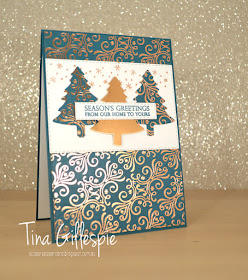
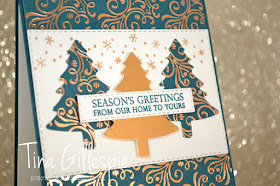
Once again I pulled out my Brightly Gleaming SDSP, for the card. I used my Stitched Rectangles to crop the paper for the front of the card. I chose the rectangle that was about four inches wide and cropped one in Whisper White and one in the Pretty Peacock DSP. I then sliced the DSP rectangle into two pieces. The gap is covered by the WW panel.
I used the punch to crop three trees, two from the DSP and one from Copper Foil. The WW panel looked a little plain with just the trees, so I used my new Celestial Copper Delicata Ink to stamp some of the 'sprinkles' from Elfie across the top of the panel. Another Stitched Rectangle was used to crop and sentiment from Merry Christmas To All.
I replicated the tree and sprinkles on the inside of the card. I quite like the sprinkles behind the tree!
This week my lovely friend, Judy is hosting the Heart Of Christmas blog share, so please do pop on over to her blog to check out the rest of this week's cards.
Bye for now,
Tina
Sunday, 22 September 2019
CTC #247: Holiday Catalogue Punch Project
Hi!
I don't actually own any of the Holiday Catalogue punches, so my choices were a little limited! This pair of tags caught my eye, especially the repeated sentiment on the punched shapes, and so that's what I CASEd.
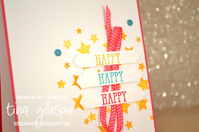
I started with a happy, bright colour combination of Melon Mambo, Bermuda Bay and Mango Melody. The stars are from the Family Party stamp set, and the Happy is from Well Said. I stamped it in each of my colours and then cropped it with my Classic Label punch.
The punched shapes were popped up over the top of some retired Melon Mambo ribbon. I also used some retired Bermuda Bay Enamel Dots to finish off the front of the card.
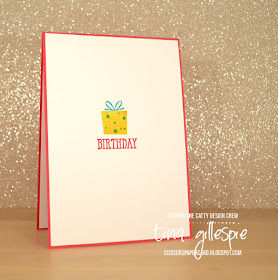
The present on the inside is from the Family Party set too. I love that it's photopolymer so that the two layers are easy to line up.
That's it from me! Do you have any of the punches from the Holiday Catalogue yet? I have my eye on the tree punch, so keep on the lookout for that on my blog in the future. In the meantime, you can head on over to the CASEing The Catty Facebook group to add your card to the challenge.
Before you go, don't forget to finish the hop. Next you're off to see what the lovely Rebecca has made. She's got the tree punch that I am coveting!
Bye for now,
Tina
Welcome to this week's CASEing The Catty Sunday Challenge Blog Hop. This week we are asking you to choose a punch project from the Holiday Catalogue to CASE. Did you see Michelle's gorgeous butterflies on her blog, which is before mine in the hop?
I don't actually own any of the Holiday Catalogue punches, so my choices were a little limited! This pair of tags caught my eye, especially the repeated sentiment on the punched shapes, and so that's what I CASEd.
I started with a happy, bright colour combination of Melon Mambo, Bermuda Bay and Mango Melody. The stars are from the Family Party stamp set, and the Happy is from Well Said. I stamped it in each of my colours and then cropped it with my Classic Label punch.
The punched shapes were popped up over the top of some retired Melon Mambo ribbon. I also used some retired Bermuda Bay Enamel Dots to finish off the front of the card.
The present on the inside is from the Family Party set too. I love that it's photopolymer so that the two layers are easy to line up.
That's it from me! Do you have any of the punches from the Holiday Catalogue yet? I have my eye on the tree punch, so keep on the lookout for that on my blog in the future. In the meantime, you can head on over to the CASEing The Catty Facebook group to add your card to the challenge.
Before you go, don't forget to finish the hop. Next you're off to see what the lovely Rebecca has made. She's got the tree punch that I am coveting!
Bye for now,
Tina
Thursday, 19 September 2019
JAI #475: Just Add Food
Hi!
Welcome back for the new Just Add Ink challenge. This week Kelly has asked us to add food to our cards - not real food, just the paper and ink kind! Although, you could probably get away with including a lollipop on your card. Hmm, now why didn't I think of that sooner?
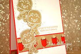
I was a bit stumped by this for a while, until I remembered this cute Kindred Stamps set that I purchased about a year ago. It celebrates National Gingerbread Day - I didn't even know there was any such day!
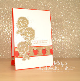
How funny is that gingerbread man/beast? LOL! I heat embossed the image four times on Crumb Cake cardstock using white embossing powder. I also cut a strip of DSP from the Night Before Christmas pack. I think a hot chocolate is the perfect combo with gingerbread, don't you agree?
The card base was stamped with the splatters from Waterfront using Crumb Cake ink. I was hoping it looked like gingerbread crumbs under the cookies. I then used my Subtle folder to emboss the cardstock. I totally agree with the sentiment - gingerbread tastes way better chewy (which is also a hint to the identity of the gingerbread character!).
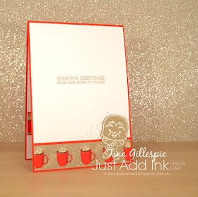
I used my fourth gingerbread man on the inside, along wth some more hot chocolate. My kids think this card is hilarious - they don't want me to use it at Christmas. I will have to compromise by sending it to someone who will really appreciate the humour!
As we have arrived at the end of my post, it's time to pop on over to the Just Add Ink blog to see the rest of this week's Design Team cards. In the meantime, are you thinking about what food related stuff you have that you could use on a card? Can't wait to see it!
Bye for now,
Tina
Wednesday, 18 September 2019
AWH HOC Week 5
Hi!
Wow, I can't believe it's Week 5 of the Heart Of Christmas Blog Shares already! My goodness, how the weeks are flying by!
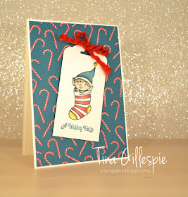
As you can see, I have returned to Elfie - I can't resist the cute set for very long. I hadn't coloured the stocking image before this card, so it was well overdue! I select colours based on the Night Before Christmas DSP, which forms the background of my card.
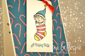
Once again, I used the new Shimmery Crystal Effects to add some subtle dimension and shimmer to the card by applying a coat to the bands on both the hat and the stocking. It looks so much better in real life!
I used the same elf on the inside, coloured in exactly the same colours. I didn't use the Shimmery Crystal Effects, mostly because I was to impatient putting my card together and I couldn't wait for it to dry!
Now it's time to pop on over to Claire's blog, where you can find the rest of this week's Heart Of Christmas links.
Bye for now,
Tina
Sunday, 15 September 2019
CTC #246: Feels Like Frost
Hi!
Woo hoo, time for the new CASEing The Catty Sunday Challenge Blog Hop! It's been a glorious weekend here in Adelaide, so I'm glad I got my card done early in the week, as I've been out enjoying the sunshine. How does lunch at a McLaren Vale winery with friends sound, followed by a night with the Adelaide Symphony Orchestra watching Harry Potter? It was as perfect as you can imagine! On a more mum note, it's also been perfect clothes washing weather. Can't escape that chore!
Anyway, on to this week's challenge! We are CASEing the cards and colours in the Feels Like Frost suite of products. The blues, greens and purples are so pretty together! I'm a real blue girl though, and this card at the bottom of the page caught my eye.
The Pretty Peacock and Silver look stunning together! I've made quite a few Pretty Peacock cards lately though, so I decided to switch it our for some blues. Here's what I came up with.
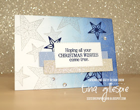
I started by using my sponge brayer to add some Seaside Spray ink to the right 2/3rds of the card, and then some Night Of Navy over the right third. I didn't add a heap of ink, and I didn't want really dark navy, just a hint of it. I then stamped the stars all over using my Silvery Shimmer Delicata ink.
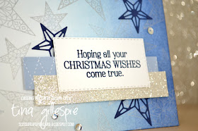
I don't have any snowflakes in my collection of dies, so I used my new stars instead. I think they work just as well! A strip of Seaside Spray In Colour DSP and some Silver Glimmer Paper finish off the front of the card nicely. Oh, and I can't forget the sequins!
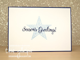
Isn't that big star stamp gorgeous? It also comes with a filler stamp, but I didn't want to make it too heavy, or the sentiment would have got lost.
Don't forget to join us in our Facebook group. You can see the cards for each week's challenge and enter your own card - no blog necessary!
Time to hop on over to the lovely Rebecca's blog to continue on with the hop.
Bye for now,
Tina
Friday, 13 September 2019
Blog Hopping With Kelly's Paper Adventures Team
Hi!
I'm very excited to join you tonight as a Guest Designer on the lovely Kelly Kent's team blog hop. Thanks so much to Kelly and the rest of the Paper Adventures team for the invitation, which I was thrilled to accept.
Kelly gave me a theme of 'S' for the hop. I love these types of challenges, as it's so wide open for interpretation. I always challenge myself to see how many S elements I can fit into my card. Let's see!
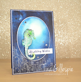
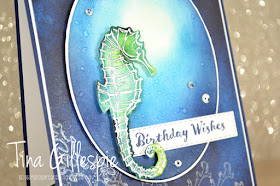
The most obvious is the stamp set, Seaside Notions. I'm not usually a fan of sea themed sets, but I really love this one! My background is a piece of See A Silhouette DSP, over which I've stamped the coral image with Silvery Shimmer Delicata ink. The oval cropped from Shimmery White cardstock and then sponged using several inks. I stared with Pool Party at my focal point, followed by Pacific Point a little around the point, then Blueberry Bushell further out, and finally Night Of Navy around the very edges. Hopefully it looks like looking up into the sun from underwater! I finished that panel by flicking some water over the top to give a bubbly effect.
The seahorse was coloured using my Bermuda Bay and Granny Apple Green Pigment Sprinkles. I then heat embossed with Silver embossing powder and used the Bleached Watercolour Technique to remove some of the colour. It gives that lovely translucent look that seahorses have. I then finished off with a sentiment and some sequins. Lots of 'S' elements there!
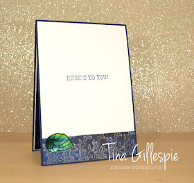
The DSP I used on the inside was my test piece for the front - I wanted to see how the Delicata ink would look on the DSP before I committed to stamping the big piece. I loved it, so I decided to use the test on the inside. I also had a scrap of the Pigment Sprinkles piece big enough for the shell, so that got used too.
So I will say thank you to Kelly and her team once again, and then direct you to Siobhan's blog so that you can continue the Hop.
Bye for now,
Tina


