Hi!
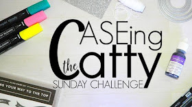
Hooray, time for the new CASEing The Catty Sunday Challenge Blog Hop! Hopefully you've arrived here from Liz's blog, as ever, just keep hopping until you get back to where you started.
This week we are trying a slightly new challenge. Instead of a whole section to CASE, we are giving you one card to CASE. That sounds a bit easy, but it's not really - don't just copy the card, put your thinking cap on and get inventive!
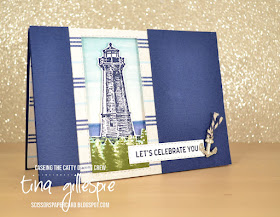
You can find the card to CASE on page 159. It's a fairly simple layout, with a couple of layers, the nice bow and a decorative edge. I decided I'd reverse the layers on my card, by using a window to a scene.
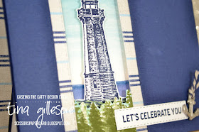
I started by watercolouring the ocean and sky on a piece of Shimmery White cardstock. The lighthouse was from my Make and Take pack in Auckland, as was the DSP, twine and the metal anchor. The lighthouse was floating a bit in space, so I added the row of trees from Waterfront as a way of grounding it. The background was adhered to my card base with the lighthouse popped up over it.
I used my Stitched rectangles to cut a window in the Come Sail Away DSP. The trees were adhered to the back of the window, and then the whole lot was affixed to the base using Foam Adhesive Strips. The top Night Of Navy layer was cut in half using another Stitched Rectangle so that I had stitched lines on both halves. I then embossed it with my Subtle folder and adhered it to the card base with more Adhesive Strips. The card was finished with the sentiment and the anchor.
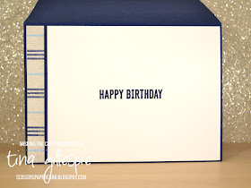
I had a small strip of the DSP and the Subtle embossed cardstock left, so they were used to decorate the inside. I'm still on the fence over the Come Sail Away suite. What do you think of it?
Once you've finished the hop, you can add your card to the challenge over in our Facebook group. It's fabulous to see how everyone interprets the challenge each week!
That's it from me, now you're off to see what my friend Judy has done with this card.
Bye for now,
Tina
Pages
▼
Sunday, 30 June 2019
Thursday, 27 June 2019
JAI #463: Just Choose Two
Hi!
This week at Just Add Ink, Jan has challenged us to choose two to add to our projects. Which two? Any two of:
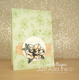
That's right - foil, ribbon or sequins. Hmmm, which two will you choose? I sort of chose mine by accident, as I noticed that this card that I made for a class fit the bill for this weeks challenge! Lucky me!
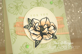
You may look at my magnolias and think they don't look much like the magnolia set in the Annual Catalogue, and you'd be right! They are Stampin' Up! stamps, but you can find the set in a new, smaller brochure aimed at new stampers. Not that experienced stampers can't buy them though. I liked them as I found the other set too big. The set is called Magnolia Blooms, and it coordinates perfectly with the rest of the Magnolia Lane suite of products.
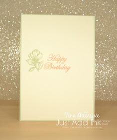
It's hard to see in the photo, but I embossed the background layer with the Subtle EF after stamping the smaller magnolia. This is the Faux Fabric look, and it certainly looks like fabric. A few green Iridescent sequins and a swish of Petal Pink ribbon and my card was done!
That's all from me - now it's time to pop on over to the Just Add Ink blog, where you can find the rest of this week's gorgeous Design team cards. You can also link up your card when you've decided if you'll add two of foil, ribbon or sequins!
Bye for now,
Tina
AWH Blog Hop: In Colours
Hi!
Tonight the Art With Heart team are sharing creative projects featuring the current In Colours. There are 10 to choose from, including the new 2019 - 2021 In Colours and the carrying over 2018 - 2020 In Colours. If you would like a copy of the 2019 - 2020 Annual Catalogue, contact any of the girls on the blog hop and we will get in touch with you.
For my card I selected three of the new In Colours - can you work out which ones?
Hopefully you worked out that they were Pretty Peacock, Seaside Spray and Rococo Rose.
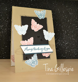
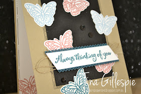
Last weekend I was invited to attend my friend Kathryn's team stamping day. We like to share ideas and projects, and the lovely Caroline shared some samples she'd made using the Block Fill technique. My card is a bit of a cross between it and the Inlaid Dies technique. Instead of stamping the butterflies and colouring the rest of the rectangle black, I cut a black rectangle and then cut the butterfly shapes from it before replacing the cut bits with stamped and cut butterflies. Hopefully that makes sense!
I finished it off by using a fine tipped marker to add a couple of lines around the rectangle. I added some dots to the inner line, just for a bit of added interest. I quite like this technique, and I think I'll be giving it a go again.
I also used some of the new Pretty Peacock Scalloped Linen Ribbon to back my sentiment. I had to chop it down the middle and adhere it to the back of the sentiment, but it was very easy to do. A bit of Linen Thread and a few black sequins, and the front was done!
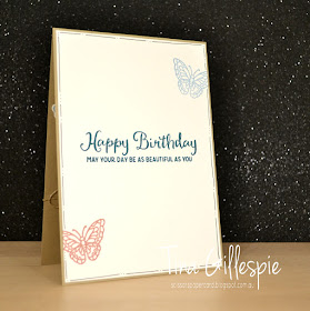
I repeated the same elements on the inside - the three colours, the butterflies and the hand drawn border. Thanks for showing me such a fun technique, Caroline!
That's it for me, next you are off to visit the lovely Vicki Boucher at her blog to see what wonderful In Colour deliciousness she has whipped up!
If you find a broken link or have come to this blog hop from a different entry point, you can view the participants below:
Tuesday, 25 June 2019
Beside The Seaside
Hi!
Here we are at the second last Colour Creations Blog Share - we've nearly run out of colours to feature! This week it's the new In Colour, Seaside Spray. It's a fabulous dusky light blue that I can see becoming a favourite of mine!
I've been on a bit of a sponge brayer kick again, so this week's card features the technique. It's totally different to the card I had in my head all week, but sometimes you've just got to go where the muse takes you!
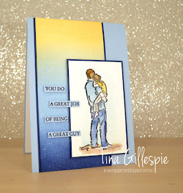
I started with the sponge brayered panel and Seaside Spray ink. I brayered about 2/3 of the panel with Seaside Spray, tapering it off towards the top. I then flipped the panel and used So Saffron to brayer down from the top, blending with the Seaside Spray. I had intended to stop there, but the Saffron turned out darker than I expected. I balance out the panel, I brayered a little Night Of Navy at the bottom of the panel. I finished it off by flicking over a little water.
I stamped the main image onto some of the new watercolour paper using Stazon ink. The new paper is fabulous - so smooth and takes the water so well. Definitely worth a look if you enjoy watercoloring. The sentiment was stamped in Navy ink on Seaside cardstock and chopped up to add to the front.
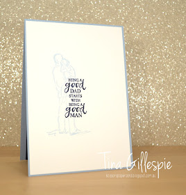
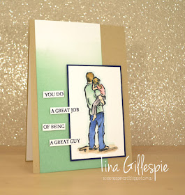
I stamped the main image again on the inside in Seaside Spray ink, stamped off once. The image and sentiments are all from A Good Man, which is fast becoming my favourite set from the Annual Catalogue.
This card was actually a CASE of myself! I attended a stamping day hosted by Kathryn Mangelsdorf on the weekend, and I made a card with the group to demonstrate sponge brayering. Here's my slightly simpler card.
It's pretty much an identical card, just easier brayering and coloured with Blends rather than watercoloured.
Now it's time to hop on over to Catherine's blog, where you'll find the rest of this week's cards.
Bye for now,
Tina
Sunday, 23 June 2019
CTC #234: Pressed Petals DSP
Hi!
Hello, and welcome to the new CASEing The Catty Sunday Challenge. As always, we are CASEing projects from the Stampin' Up! Catalogue, but this year we are trying some new twists on our challenges. Did you see Sandra's gorgeous project? If not, you will eventually, just keep hopping!
So the twist this week is to CASE the colours in the Pressed Petals DSP. There are a heap of colours to choose from, so it should be an easy task. The hardest part will be choosing which colours to use! If you don't have your catalogue handy, you can see them listed in the graphic above. I chose Mossy Meadow, Night Of Navy and the new Rococo Rose for my card.
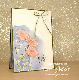
I was in the mood for some watercolouring, so after stamping my stems in Mossy Meadow on some Shimmery White cardstock, I used my Aqua Painter and some fairly diluted Night Of Navy to create a background for the flowers. I am very much a rough watercolourer, so I'm not too fussy about getting the colour exactly around the stems. In fact, I deliberately stayed away so that I didn't accidentally pull some of the Mossy Meadow into the Night Of Navy.
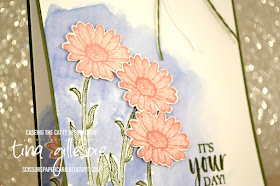
The daisies were stamped in Rococo Rose and fussy cut before being popped up over the top using Dimensionals. I quite like this sweet little flower from the Daisy Lane set - it's a bit overlooked in the excitement of a the smaller daisy flower that coordinates with the new punch, I think!
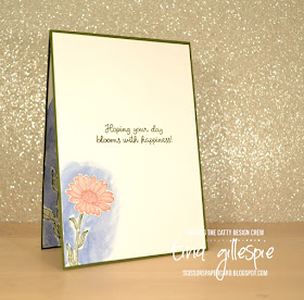
I repeated the design on a smaller scale for the inside. Shimmery White is the perfect cardstock for this type of watercolouring, as it doesn't pill with the application of water. It's also a bit more cost effective than watercolour paper!
That's it for me this week. Don't forget to check out our Facebook group, where you can see what others have made for the challenges and add your own project to the mix. What colours do you like from this week's list?
As ever, don't forget to finish the hop first - there's lots of inspiration to be found. Next up is Rose.
Bye for now,
Tina
Thursday, 20 June 2019
JAI #462: Just Add A Sketch
Hi!
Sorry for the late post - I don't know if I'm coming or going this week! Anyway, on with the show! This week at Just Add Ink we have a sketch challenge, designed by Kim. It's a fun one, and the Design Team have made a lot of wonderful cards using it.
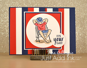
I decided to make a fancy fold card, but to do so I needed to rotate the sketch sideways. Totally fine, as long as we can still see the basis of the sketch in your card.
I'm not sure what the fold is called, I basically just chopped off half of the front of the card and overlapped the main image panel. I've been staring a lot with A Good Man, and the guy on the deck chair was the perfect image for this card. Some of my class ladies thought it was a bit American with the stripes, but I was going for a more nautical look. Either way it doesn't matter!
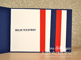
To create the stripes, I cut strips of cardstock 1/2" wide in Poppy Parade and Night Of Navy. I also cut one in Whisper White to use as a spacer. I started with the Navy stripe and then used the spacer to lay the Poppy stripe next, and so on until I'd covered half of the inside. This shows up on the front when the card is closed.
What do you see in the sketch? Why not pop on over to the Just Add Ink blog, where you can see what the rest of the Design Team have created? You can also link up your card for the challenge. See you there!
Bye for now,
Tina
Sorry for the late post - I don't know if I'm coming or going this week! Anyway, on with the show! This week at Just Add Ink we have a sketch challenge, designed by Kim. It's a fun one, and the Design Team have made a lot of wonderful cards using it.
I decided to make a fancy fold card, but to do so I needed to rotate the sketch sideways. Totally fine, as long as we can still see the basis of the sketch in your card.
I'm not sure what the fold is called, I basically just chopped off half of the front of the card and overlapped the main image panel. I've been staring a lot with A Good Man, and the guy on the deck chair was the perfect image for this card. Some of my class ladies thought it was a bit American with the stripes, but I was going for a more nautical look. Either way it doesn't matter!
He was coloured using my Blends in Poppy Parade, Night Of Navy, Ivory, Smokey Slate and Crumb Cake.
To create the stripes, I cut strips of cardstock 1/2" wide in Poppy Parade and Night Of Navy. I also cut one in Whisper White to use as a spacer. I started with the Navy stripe and then used the spacer to lay the Poppy stripe next, and so on until I'd covered half of the inside. This shows up on the front when the card is closed.
What do you see in the sketch? Why not pop on over to the Just Add Ink blog, where you can see what the rest of the Design Team have created? You can also link up your card for the challenge. See you there!
Bye for now,
Tina
Tuesday, 18 June 2019
Getting Shirty With Terracotta
Hi!
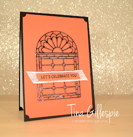
Hello and welcome back for the new Colour Creations Blog Share. It's time for Terracotta Tile this week, which as the name suggests, is a lovely reddish brown. As much as I like it, I struggled for inspiration this week, until I was folding the washing. While we were in New Zealand, Rob purchased a t-shirt for himself, and as I was folding it I realised it was pretty close to Terracotta Tile in colour.
I loved how the Maori design at the bottom looks hand drawn, and fades out as it gets higher up the t-shirt. I ran out of time to attempt to recreate the look using stamps, so in the end I went with dies.
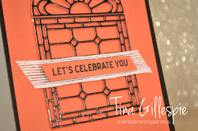
I die cut the Stained Glass dies out of Black Foil, and then a couple of more times out of Terracotta Tile. Layered together they give the window some extra dimension, without the need for cutting Dimensionals into teeny tiny pieces!
I'm not completely thrilled with how I translated the t-shirt to a card, so I will probably revisit sometime in the two years that Terracotta Tile will be in our range. I love the look of the thin black lines on the earthy colour, so I think it will look great, I just have to think bit harder!
Thanks for looking at my Terracotta Tile card. Don't forget to pop on over to Catherine's blog, where you can find the links for the rest of this week's cards.
Bye for now,
Tina
Sunday, 16 June 2019
CTC #233: CASE A Layout
Hi!
Gosh, what a busy weekend I've had - I can't believe it's nearly over! The best part about the end of the weekend is that it's CASEing The Catty Sunday Challenge Blog Hop time. Hooray! The blog before mine is Peta's, but as always, it doesn't matter where you start, just keep hopping until you get back to where you started.
This week we are selecting a card from page 36 and CASEing the layout. There are 7 different cards to choose from, so plenty of inspiration to be had. The Mossy Meadow card a the top left caught my eye - the cluster of elements on the card looked fun to play with.
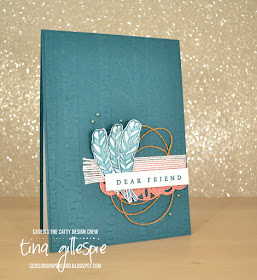
I went with the new In Colour, Pretty Peacock, for my card base, and used the Woodland Embossing Folder simply because I hadn't used it for a while!
I followed the basic layout of the cluster fairly closely, but substituted for different items. The scallop layer is a partial die cut of a Stitched Label using Rococo Rose that was left over from another card. The feathers and sentiment are from the Hugs From Shelli Paper Pumpkin Kit. I stamped the feathers in Pretty Peacock and then used a slightly damp Aqua Painter over the top to colour them. It has the added advantage of curling the feathers a bit, giving the card a little dimension. The Copper Thread is from the Notes Of Kindness kit, and the pearls are from the retired Share What You Love Artisan Pearl pack.
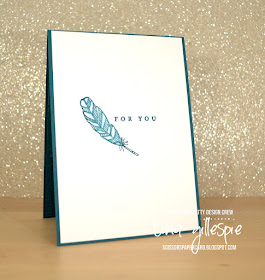
Another feather completes the inside. It was coloured in the same manner as the feathers on the front.
That's it for me! Which card appeals to you from page 36? Don't forget to share your CASEd card with us in our Facebook group.
Before you do though, don't forget to finish the hop. Next up is Julia's blog, with her gorgeous floral card.
Bye for now,
Tina
Thursday, 13 June 2019
JAI #461: Just Add Inspiration
Hi!
It's time for the new Just Add Ink challenge! This week Rachael has found a stunning Inspiration Photo to kick start our creativity. Just look at those colours!
I have no idea what those trees are, but the yellow foliage is gorgeous. I'm not sure I'd want to park my car under one of them though!
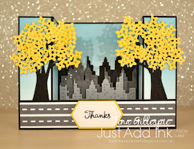
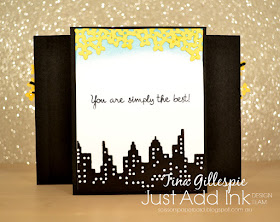
When I see a photo like this, my first instinct is to try to recreate it. I struggled for along time with the perspective, and in the end I gave up on recreating it exactly. Plan B was a 3D card of some sort, either a Bridge fold or a Bendy card. Ultimately, the Bridge fold won.
I started by sponge brayering some Balmy Blue ink onto Whisper White cardstock for the background of the card, fading it out as I got towards the bottom. To make the trees I used the Bouquet Bunch dies. I cut the large bunch of stems from Basic Black and then to make it more trunk like, I adhered the bottom of the stems to a scrap of Basic Black and then hand trimmed around the edges. I then used the cluster of four pointed flowers for the foliage, cut from Daffodil Delight cardstock.
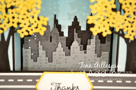
The buildings and roads are a Mama Elephant Die that I've had for ages but never used. I cut three of the buildings in Basic Black, Basic Grey and Smokey Slate and layered them on the background using Dimensionals between each layer. I didn't pop out any of the windows, but those that fell out were backed with Whisper White cardstock.
I used some left over flower clusters and another row of buildings to finish the back of the card. This time I popped out all the windows, and I must say that I think it looks fantastic!
The Design Team have used the Inspiration Photo in so many ways for their cards. You can see their cards over on the Just Add Ink blog, where you can also link up your card for the challenge. What inspires you in the photo?
Bye for now,
Tina

