Hi!
Here we are again with the new Just Add Ink challenge. This week Rochelle has put together this gorgeous colour combo.
I must admit, when I first saw it I wondered what Rochelle was thinking when she put pink and red together! I also struggle big time with 4 colour combos - I find it difficult to balance out the colours. I was pleasantly surprised with how well this one came together in the end - it's not such a tricky combo after all!
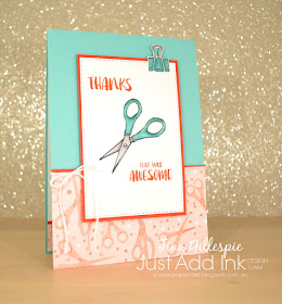
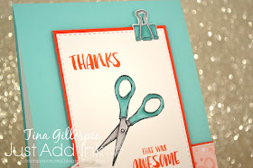
I've used a mix of old and new products on this card. The DSP is from a new suite called 'Follow Your Art', and is a great one for all the crafters out there - paper, paint and fabric. A lot of the DSP has bright, bold designs, but for this card I selected a piece that was softer Blushing Bride. I add some pop to the card I used Poppy Parade to add borders.
The Follow Your Art suite works really well with the existing Crafting Forever stamp set, which is carrying over to the new Annual Catalogue. The scissors are stamped from this set and coloured with my Blends. The bulldog clip is from the It Starts With Art stamp set and is also coloured with Blends. The retiring Fabulous Flamingo stamp set is the source of the sentiments. I wanted a thank you card for a friend who is helping me with a label for my first quilt, and I think this card will fit the bill perfectly!
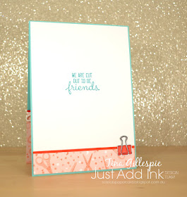
The inside sentiment is from Crafting Forever, and goes so well with the scissor theme of the front of the card, don't you think?
Do you have an idea of how you can use this colour combo? You can pop on over to the Just Add Ink blog, where you can see the rest of this week's Design Team cards for more inspiration. Don't forget to come back and link up your card too!
Bye for now,
Tina
Pages
▼
Thursday, 30 May 2019
Tuesday, 28 May 2019
Tranquil Dreams
Hi!
Sob! It's officially the last Colour Creations Blog Share! I think we've managed to convince Catherine to keep going for the 5 new In Colours, so you may well see us back next Tuesday night though! In the meantime, this week we are stamping with Tranquil Tide. It's a lovely, deep earthy green that I've come to love.
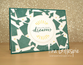
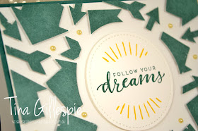
Once again, I made a pair of cards using punched shapes and the Floating Frames technique. I used a sheet of Tranquil Tide DSP from the Classic Garage DSP pack and a retired arrow punch for my shapes. Apologies for using a retired punch, but it was just so perfect for the theme of my card that I couldn't resist!
The dreams sentiment is from the Follow Your Dreams stamp set, and the rays are from a soon to retire Hostess set called Here Comes The Sun. I think they work pretty well together, along with the arrows.
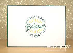
Here Comes The Sun also had the perfect sentiment for the inside of the card too! I think I'll give this card to Ada, as she's dancing in a charity performance on Saturday night.
Now, I know I said a pair of cards, and I've only shown you one. Silly me grabbed Shaded Spruce cardstock instead of Tranquil Tide for the other card, and I was too far gone with it before I realised. Oops! I will have to show you that one another time.
Catherine's blog is where you'll find the rest of this week's cards, which are always well worth the look! Hopefully I'll see you next week with a new In Colour.
Bye for now,
Tina
Sunday, 26 May 2019
CTC #230: Favourite Big Shot Project
Hi!
Gosh, these Sunday's seem to be rolling around quickly! That's good, though, as that means it's time for the CASEing The Catty Sunday Challenge Blog Hop. This week we are CASEing our Favourite Retiring Big Shot Project. Whether you came from Julia's blog, or are starting here, just keep hopping until you get back to where you started.
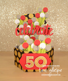
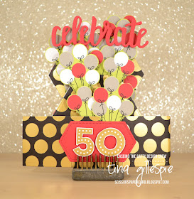
Once again, I have far too many favourites to pick just one, so I decided to go with a die set that I thought hadn't seen enough love from me - the Window Box Frameilts. They are a fun set that is designed to make a sweet octagonal box, but I mostly got the set so that I could make a pop up card with it. Sadly, I didn't ever make one, so this was my chance to do so.
I have a friend trying 50 next month, so I decided that this would be an extra special card for him. I know his party colours are black and red, so the Broadway Bound SDSP was the perfect choice! I followed this tutorial to make the card base. It was very easy to follow, but she doesn't tell you which flaps to chop off, so do look at the pictures closely!
The word 'celebrate' is held up with two thin strips of Window Sheet. I cut two of the words and sandwiched the ends of the acetate between them. I then adhered the bottom the strips to the flap in the middle of the card.
I decided to add 50 balloons to the card - that's a lot of fussy cutting! I adhered some flat, but a lot of them were adhered using Dimensionals to give added dimension. Some even had two layers of Dimensionals to pop them out even further!
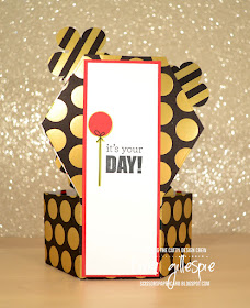
Here's a look at the back of the card - the only place to write a message! The writing panel also adds some strength to the back to keep it standing straight.
The beauty of this card is that it folds flat to allow it to be mailed. Well, flatish after all the Dimensionals I used! This card will be given in person, though, so I didn't mind that it got a bit bulky.
That's it for me! Will you join or challenge this week? What's your favourite retiring Big Shot item? Is it a die set, or maybe an embossing folder? Your can enter our challenge over in our Facebook group.
Before you do, don't forget to finish the blog hop. There's lots of lovely projects to see, including Michelle's Medallion card, which is up next!
Bye for now,
Tina
Thursday, 23 May 2019
JAI #458: Just Add Q, X, Y Or Z
Hi!
Yay for Friday and a new Just Add Ink challenge. This week it's one of my alphabet challenges, and we are doing what I called the 'nasty letters' while I was trying to think of what to do!
I had a brilliant idea and went full tilt on the card, only to realised I'd lumped 'V' in with the letters and made completely the wrong card! Oops. In the end I made a similar card, based on the same pop culture universe (you may be able to guess what my V card was if you're familiar with the universe).
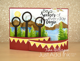
I ended up going with the letter Q to create a card based on a game that's played in the skies on broomsticks. The aim of the game is to get large balls through one of the hoops, while avoiding other balls that are thrown at you by the opposition, all the while trying to catch the tiny golden ball that has wings. LOL! If you're really confused, that's ok! I showed Ada the card (she's a big fan) and he thought it was pretty awesome, so I must have got it right.
This was my first ever Bendy Card, so called because the two flaps at the side create curves where they slot into the card base. There are heaps of tutorials on the web, just google 'bendy card'. The style allowes you to add dimension to a scene, but still fold the card flat for mailing.
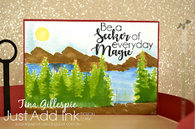
The scene I created for the background was a mix of stamping, stencilling and watercoloring. The trees were stencilled using a Kindred stencil, and then I stamped over the top with the trees from Waterfront. The mountains, sun and ground were all stamped and then the lake and sky were watercoloured. Would you believe I didn't base it around the sentiment? It came last, and just happened to perfectly fit the space. Phew!
You can see that the goal posts are attached to the back of the left flap, and the golden ball is attached to the right flap. I used a sliver of Window Sheet so that it looked like it was floating through the sky.
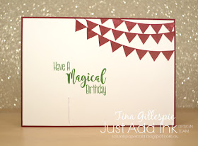
I carried over the banners from the front of the card to the back - there is no 'inside' on this card. You can see where I used a craft knife to slice through the card to allow one of the flaps to slot into place.
Well, that's my card for challenge - I hope you like it! You can see what the rest of the team have created by visiting the Just Add Ink blog. Which letter will you choose to create with?
Bye for now,
Tina
AWH Blog Hop: New Catalogue
Hi!
Tonight the Art With Heart team are sharing creative products using supplies from the upcoming 2019 - 2020 Annual Catalogue. If you would like a copy of the brand new Annual Catalogue, contact any of the girls on the blog hop and we will get in touch with you.
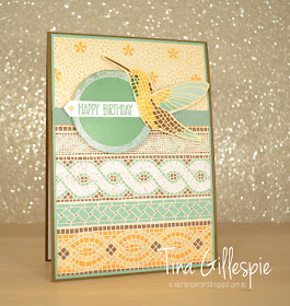
New catalogue time is always an exciting time for devotees of Stampin' Up!, and this year's catalogue is no exception. I found it very difficult to narrow down what I was going to play with, and in the end went for one of the very first products I got my hands on - Mosaic Mood SDSP.
I used two different sheets from the pack to create my background. It's a fairly classic layout - top third on one pattern, bottom tow thirds in another, with a solid strip between them to break them up. In this case I've used some Mint Macaron ribbon. I love the patterns in this paper, and can't wait to play some more with them.
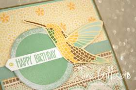
The humming bird was fussy cut from a third sheet of DSP. What you can't see in the photo is what makes this pack a Specialty pack. The catalogue calls it 'shiny accents', but it's like an actual mosaic. The design is raised and very textural. So pretty - just like running your fingers over real tiles.
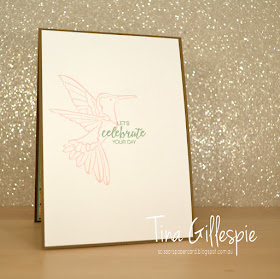
I stamped the inside with the humming bird from the retiring stamp set, Humming Along. It's a great tie in with the DSP, so if you love the paper, I'd grab the stamp set before it's too late!
Now it’s time to hop on over to our next participant, the very talented, Ros Davidson.
If you find a broken link or have come to this blog hop from a different entry point, you can view the participants below:
Christina Barnes
Rachel Woollard
Tina Gillespie
Ros Davidson
Vicki Boucher
Rebecca Jacovou
Claire Daly
Catherine Proctor
Rachel Palmieri
Kimberly Hern
Kate Morgan
Bye for now,
Tina
Monday, 20 May 2019
Going Softly With Suede
Hi!
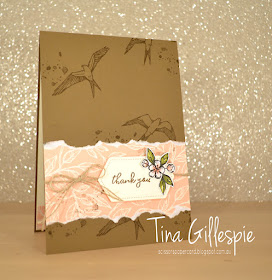
Welcome to the new Colour Creations Blog Share. This week it's Soft Suede's turn to shine! Is it a colour you use often? It's a bit of a strange brown, but I think it works well with vintage themes, so that's sort of where I went with tonight's card.
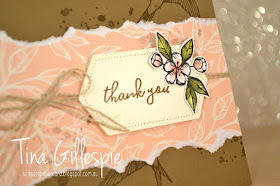
I received my Hugs From Shelli Paper Pumpkin kit today, and so I ripped straight into it! The birds, splatter and the pink leafy paper are all from the kit. The paper is actually an envelope that I chopped up and then tore the edges of before adhering to my base.
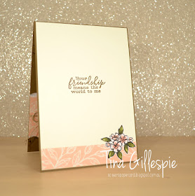
I used products from the coordinating Bird Ballad Suite to complete the card. The sentiment (inside and outside) are from the Free As A Bird stamp set, the Stitched Nested Label Die is the bundled die set, and the fussy cut flower is from the Bird Ballad DSP. I used twine I had in my stash, but there is also twine in the Paper Pumkpin kit.
Isn't this the best sentiment? This card is going to a friend who gave up a lot of her week to help me strip wallpaper and then paint the horrid purple and yellow walls and ceilings in Hudson's room. She deserves way more, but a card is a start!
As always, pop on over to Catherine's blog where you can find the links to the rest of the cards this week. I can't wait to see wheat everyone's made!
Bye for now,
Tina
Sunday, 19 May 2019
CTC #229: Favourite Retiring Punch
Hi!
Welcome to Sunday night and the new CASEing The Catty Sunday Challenge Blog Hop! You may have arrived here from Rebecca's blog, or you may be starting here. Either way, just keep on hopping until you get back to where you started. This week the CTC Crew are using their favourite retiring punch. There's a few to choose from!
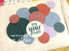
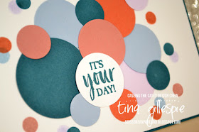
Some of my most used punches are my circle punches, and a whopping four (!) are retiring at the end of the current Annual Catalogue. I've used the largest three on my card: 1 3/4", 1 1/4" and 3/4" punches.
I started by punching out a heap of different sized circles from the new In Colour cardstock. I only did one in the new Pretty Peacock cardstock in the largest circle, to keep it as a subtle focal point. I originally intended to do the sentiment on a strip, but I couldn't make that work, so I ended up going with another circle.
After I'd laid out all the circles, I had a little moment of panic about gluing them all down. Do you ever have that - once you lift them to glue, you can never get them quite the same way again? Luckily I had a brain wave - Press & Seal to the rescue! I cut a small piece and laid it over the top of my circles. I could then flip the whole piece over, add adhesive to the back and then flip it again to adhere it to my card front. Problem solved!
Of course, this really only works if you want your card to be flat. Or maybe you could only put a tiny bit of tape on the back of the piece you want to pop up, so that you could lift them easily? I will have to experiment!
I finished off the front by stamping some circles around the outside of the punched circles to add to the confetti feel. I used a little round stamp from Jar Of Love. I snuck in another new stamp set for the sentiment - it's from A Good Man.
I had a few punched circles left from the front, so along with some extra stamping, they went down the side of the inside. Done! I think the whole card took under an hour - perfect for those cards you need in a hurry!
You can enter our challenge each week by posing your card over on our Facebook group.
Before you go, don't forget to finish the hop. The Crew have done a great job with their punches, so you wouldn't want to miss anyone! Next up is the lovely Elizabeth.
Bye for now,
Tina
Tuesday, 14 May 2019
Softly With Sea Foam
Hi!
Sigh, we are getting close to the end now! This week we are using Soft Sea Foam on our Colour Creations Blog Share cards. It's a new colour, nearly a year old, but not a colour I've used a lot. It's a softer green and not yet a colour I automatically think of when I think about soft greens.
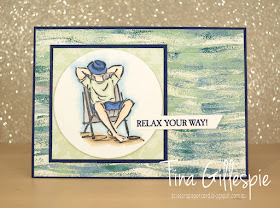
I decided to ink up my new stamp set, A Good Man, for the first time. It's a set that went straight to the top of my 'must have' list when I first saw it. I love that it's a masculine set that's not cars, fishing, hunting or tools. My hubby is more of a gamer, so those types of sets just aren't him. He's a great dad, so this set was just perfect. Having said that, I haven't used either of the 'dad' images on my card!
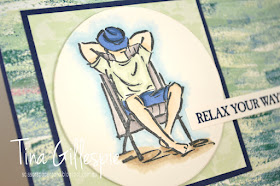
LOL, Rob would quite like relaxing like this though! I coloured the image with my Blends and then layered it on some Tranquil Textures DSP. The sentiments I've used on the card are a bit of a generic, have a great day, type. I love that this means the card would work for either a birthday or Father's Day.
The man's shirt was coloured with my Soft Sea Foam Blends. I used Night Of Navy on his shorts and Smokey Slate on the chair. His legs were a mix of Ivory and Petal Pink, while the ground was Crumb Cake. The 'sky' was created by colouring around the image with the light Balmy Blue marker and then going over it with the Colour Lifter marker to soften the colour and blur the edge. It's such a cool effect!
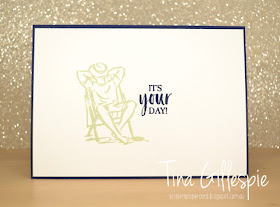
I stamped the same image inside, this time just using Soft Sea Foam ink and leaving it as just the outline. I don't think the inside needs more.
As always, you can pop on over to Catherine's blog to see the rest of this week's Soft Sea Foam cards. Do you like the colour? I do - I just have to remember to use it more!
Bye for now,
Tina
A Birthday Blog Hop For Kelly
Hi!
Welcome to my first post of the night - there'll be another one a bit later! For now though, I am hopping with my demonstrator friend, Kelly Kent. It's her birthday (hip hip hooray!) and she's celebrating by doing a blog hop. what a fun way to celebrate! The blog before mine was Shannon's, but we are all linked in a circle, so start wherever and end where you start! Confused? LOL!
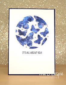
Tonight's cards are the first I made using the technique that's going totally viral, especially after all us demo's went to New Zealand and cleared them out of Press & Seal! Yes, it's the Floating Frames technique. I hope you're not too sick of it yet!
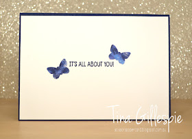
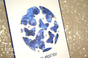
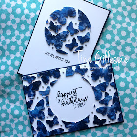
I made this card as a class sample and decided that it's far too hard for everyone to stamp, colour and cut a heap of flowers in a class, so we'd use punches with DSP instead. It really cuts down on the time involved but still makes a pretty awesome card! I used a sheet of 6x6 DSP from the Garden Impressions DSP pack combined with the Butterfly Duo punch for my card. One sheet of 6x6 gives plenty of butterflies for the front, with some left over to decorate the insides.
I'm not going to explain the technique, there are plenty of videos and tutorials out there. I will give you a few tips though. I didn't take a photo, but before I laid out my punched shapes on the copy paper, I traced the shape of the circle die onto the paper. This allowed me to see where I would cut and hopefully I could avoid teeny tiny pieces of butterfly to try to stick a dimensional to!
As it turned out, choosing a slightly mottled DSP worked well, as sometimes the Press & Seal sticks too well to the paper. If a little bit peels away, it's less obvious on a paper that already looks distressed!
Can you tell where the paper peeled away a little? Didn't think so! LOL
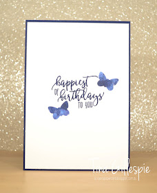
I kept the stamping simple by using the same sentiments on both cards, just switching the inside for outside to suit each one.
Slightly dodgy photo, but here's both cards together. I've made a few more Floating Frames cards since these, including a pair using the Balloon Duo punch. It's a bit addictive!
That's it for me, now you're hopping off to visit Monique's blog to see what gorgeous card she's made for Kelly's Birthday Hop.
Bye for now,
Tina


