Hi!
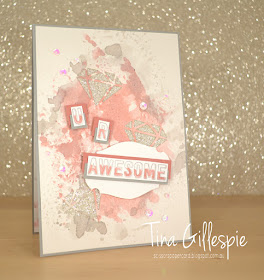
Time for a new Colour Creations Blog Share. This week it's Smokey Slate, which I surprisingly found to be a hard colour toward with! I asked Rob for inspiration and he straight away said to make a Game Of Thrones card. Umm, no! In the end, I decided to go with a classic pink and grey combo.
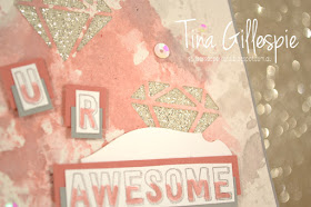
My new Rococo Rose ink pad was on my desk, so I did a bit of smooshing with it. I then added some Smokey Slate smooshing around the edges. Once it dried I used my retiring Eclectic Layers dies to cut a few diamonds into the cardstock.
The stamp set is a new one from the upcoming Annual Catalogue, called Genuine Gems. The pieces on my card are actually chopped from a larger sentiment that says 'I told the universe to send some awesome your way'. I half coloured the open letters and then matted them in halves on Smokey Slate and Rococo Rose cardstock. I was going for a card for an older teen girl, so I was trying a few funky things out.
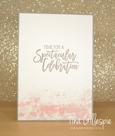
I did a little more smooshing on the inside. It's hard to see, but there is some Smokey Slate in there amongst the Rococo Rose!
Tina to pop on over to Catherine's blog, where you can find the rest of this week's Smokey Slate cards.
Bye for now,
Tina
Pages
▼
Tuesday, 30 April 2019
Sunday, 28 April 2019
CTC #226: CASE A Layout
Hi!
Sob! it's Sunday, which means the school holidays are over, but ti also means it's time for this week's CASEing The Catty Sunday Challenge Blog Hop. Yay! You may have arrived here from Siobhan's blog, or just starting here. It really doesn't matter, just keep hopping 'til you get back to where you started.
This week we are CASEing layouts from the Occasions Catalogue. What does this mean? Simply take a card you like and make a new one based on the placement of all of the elements on the card. Easy!
I decided to CASE the front of the catalogue, treating it like a big card.
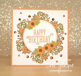
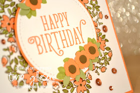
I started by using my Stamparatus to create the wreath of flowers on the base. It was a little tricky, as I stamped the Bike Ride image six times (because there are 6 cards on the cover!), but I got it first go! I only used the Stamparatus to stamp the outline, and then the flowers and leaves were stamped by hand.
The punched flowers were created using the Bitty Blooms Punch pack, but I also threw in a few leaves stamped with a leaf from Happy Birthday Gorgeous. After I'd assembled the card I added a scattering of copper sequins to represent the butterflies on the cover.
It wasn't until I was editing these photos that I realised how vintage the colour scheme is. I used Grapefruit Grove, Pear Pizzazz and Soft Suede. I think nearly every kitchen had crockery or bakeware in these colours in the 70's!
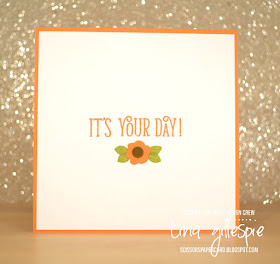
I couldn't resist adding another little flower on the inside!
Hopefully I'll see you over in our Facebook group, where you can add your CASEd Layout card to the challenge.
Before you go, though, don't forget to complete the hop! Next up is the lovely Julia.
Thursday, 25 April 2019
JAI #454: Just Add Colour
Hi!
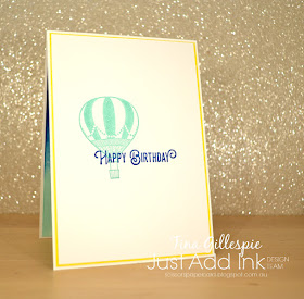
Welcome back to the newJust Add Ink challenge. This week Lou has put together this fun colour combo for us to use.
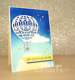
My initial background was meant to look like the sun at the bottom with the sky and upper atmosphere above. My daughter thought the balloon was floating over a beach! Whatever works for you, I guess!
I was OK with the Pineapple Punch sun and Coastal Cabana sky, but the Blueberry Bushel atmosphere part just didn't work - I couldn't get the blue intense enough. I nearly binned the whole piece. I hate wasting the effort though, so I pulled out my trusty sponge brayer and went over the Blueberry Bushel part. Yay! Finally the depth I was after!
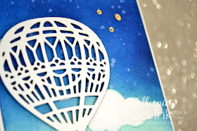
I then used my Aquapainter to flick some water over the piece to add some visual interest to the background. I initially cut a Basic Black balloon to go on the card, but it didn't look right. The Whisper White was much better. Don't you agree? Did you know that the Up & Away bundle is retiring with the end of the current Annual Catalogue? It's one I will miss!
I used each of the colours again on the inside of the card. I hadn't intended the Pineapple Punch layer, but I'd forgotten that I could have just stamped on the WW base rather than the insert piece. It looked strange just white on white on the inside, so I just trimmed the layer and matted it with the Pineapple cardstock.
So, all in all, it really is a fun colour combo! What do you think? You can see the rest of this week's Design Team cards over at the Just Add Ink blog, where you can also link up your card. See you there!
Bye for now,
Tina
Welcome back to the newJust Add Ink challenge. This week Lou has put together this fun colour combo for us to use.
I must admit that when I first saw this combo, fun was not the word I had in mind! It's very bright and I was stumped for a long time. Then I saw a technique using glycerine with ink and sponges to create a background and I thought I'd give it a go with these colours. You basically pick up a bit of glycerine with your sponge before picking up the ink. It helps the ink to go onto the cardstock a lot smoother.
My initial background was meant to look like the sun at the bottom with the sky and upper atmosphere above. My daughter thought the balloon was floating over a beach! Whatever works for you, I guess!
I was OK with the Pineapple Punch sun and Coastal Cabana sky, but the Blueberry Bushel atmosphere part just didn't work - I couldn't get the blue intense enough. I nearly binned the whole piece. I hate wasting the effort though, so I pulled out my trusty sponge brayer and went over the Blueberry Bushel part. Yay! Finally the depth I was after!
I then used my Aquapainter to flick some water over the piece to add some visual interest to the background. I initially cut a Basic Black balloon to go on the card, but it didn't look right. The Whisper White was much better. Don't you agree? Did you know that the Up & Away bundle is retiring with the end of the current Annual Catalogue? It's one I will miss!
I used each of the colours again on the inside of the card. I hadn't intended the Pineapple Punch layer, but I'd forgotten that I could have just stamped on the WW base rather than the insert piece. It looked strange just white on white on the inside, so I just trimmed the layer and matted it with the Pineapple cardstock.
So, all in all, it really is a fun colour combo! What do you think? You can see the rest of this week's Design Team cards over at the Just Add Ink blog, where you can also link up your card. See you there!
Bye for now,
Tina
Tuesday, 23 April 2019
Spruced Up Flamingo
Hi!
Gosh, we are getting to the end of our Colour Creations Blog Shares now. I will miss them! Hmmm, I wonder if I can convince everyone to continue for a further 5 weeks with the new In Colours? Maybe!
Anyway, this week we are up to Shaded Spruce. It's a fabulous deep green, new to the range this year as a part of the Regals colour family.
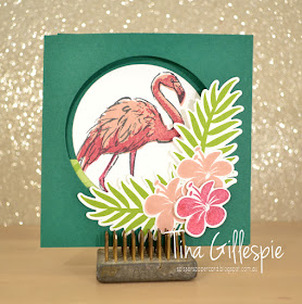
I recently saw this card by my JAI friend Lou, and thought it was a simple, but very effective fancy fold. Before I explain, let me show you how it folds out. You can see that there's a round window in the front of the card. I used my Tropical Chic stamp set to create a little frame for the window. It's carrying over to the new Annual Catalogue - yay!
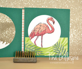
The first flap opens to show the image from Fabulous Flamingo. I used my Stamparatus to line up all of the layers, making it so much easier to stamp. Sadly, the flamingo is retiring at the end of May. I used a piece of Tropical Escape DSP to anchor the flamingo panel. I will miss that DSP! You can see another little strip of it down the left side of the card....
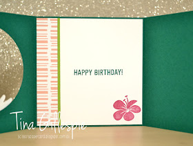
...which is actually on the inside of the card. I like how it adds interest to both the middle layer and the inside layer - much like the flamingo for the front and middle.
So how do you make this card? Just take a piece of A4 card and cut it in half longways. Score at 4 inches and 8 inches and you're done! Oh, cut your window in the first 4 inch section so that it becomes the front of the card. This way the shorter panel becomes the middle flap, showing that little strip of DSP from the inside. It also folds much more nicely this way.
Time to pop on over to Catherine's blog for the rest of this week's Shaded Spruce cards. Don't forget that if you right click on each link you can open the link in a new tab or window to avoid having to jump back and forwards from Catherine's blog.
Bye for now,
Tina
Sunday, 21 April 2019
CTC #225: Easter
Hi!
Welcome to the new CASEing The Catty Sunday Challenge Blog Hop. I'm the start of the hop this week, which surprises me, as I'm usually not that organised!
It's from page 22 of the Occasions Catalogue, which shows how some products from the Occasions Catalogue tie back to some from the Annual Catalogue. That wasn't what intrigued me though, it was the stitched lines at the top and bottom of the card - can you see them? I decided to run with that, but also step it up a little.
I used the largest circle in the Stitched Shapes die set to cut the background. I started by lightly drawing some guidelines on the Highland Heather card and then cutting the middle circle. I left the circle in place and then cropped the two either side. I then adhered everything piece by piece onto a piece of Gorgeous Grape cardstock and mounted it on my Gorgeous Grape base.
How sweet are these daisies? They are from a new set from the upcoming Annual Catalogue called Daisy Lane. These are smaller than our current daisies and will have a punch to match. Sadly for me, I don't have the punch yet, as I had to fussy cut the six daisies I stamped and coloured with Blends. The leaves are also from the same stamp set.
I'd originally planned to make the daisies on the front with three layers, but I quite liked the look of just two. As I's already stamped and coloured six, it meant that I had two spare for the inside. Yay! was very happy to discover that the new colour family DSP stacks have a gingham print, so very soon we will have gingham in all of our colours. Double yay!
That's it for me now, don't forget to join in the fun in our Facebook group.
Before you go, though, don't forget to finish the hop! Next up is the lovely Sandra.
Bye for now,
Tina
Welcome to the new CASEing The Catty Sunday Challenge Blog Hop. I'm the start of the hop this week, which surprises me, as I'm usually not that organised!
This week we are celebrating Easter by CASEing our favourite Easter projects from either of the current catalogues, or you could take a non-Easter card and make an Easter version. Whatever you like! When flicking through for inspiration, this cute bunny card caught my eye.
It's from page 22 of the Occasions Catalogue, which shows how some products from the Occasions Catalogue tie back to some from the Annual Catalogue. That wasn't what intrigued me though, it was the stitched lines at the top and bottom of the card - can you see them? I decided to run with that, but also step it up a little.
I used the largest circle in the Stitched Shapes die set to cut the background. I started by lightly drawing some guidelines on the Highland Heather card and then cutting the middle circle. I left the circle in place and then cropped the two either side. I then adhered everything piece by piece onto a piece of Gorgeous Grape cardstock and mounted it on my Gorgeous Grape base.
How sweet are these daisies? They are from a new set from the upcoming Annual Catalogue called Daisy Lane. These are smaller than our current daisies and will have a punch to match. Sadly for me, I don't have the punch yet, as I had to fussy cut the six daisies I stamped and coloured with Blends. The leaves are also from the same stamp set.
I'd originally planned to make the daisies on the front with three layers, but I quite liked the look of just two. As I's already stamped and coloured six, it meant that I had two spare for the inside. Yay! was very happy to discover that the new colour family DSP stacks have a gingham print, so very soon we will have gingham in all of our colours. Double yay!
That's it for me now, don't forget to join in the fun in our Facebook group.
Before you go, though, don't forget to finish the hop! Next up is the lovely Sandra.
Bye for now,
Tina
Thursday, 18 April 2019
JAI #453: Just Choose Two
Hi!
Can you believe it's Friday again? I'm back from New Zealand and ready to get stuck back into all things Stampin' Up! I just need to get over the jet lag first! LOL. In the meantime, the new Just Add Ink challenge is ready to kick off. This week Jan has challenged us to Choose Two to add to our cards.
I have to admit that I groaned when I saw this challenge, as it's naturally geared towards Easter, and I don't usually make Easter cards. I decided by choosing bunnies and flowers I could make a card that could be used as a baby card instead. Hooray!
I ended up absolutely loving this card! I pulled out my retired Garden Girl stamp set for the images, and my Stamparatus to make the wreath part of the card. I was so thrilled with how it turned out. The gingham was a late addition to the card, but Im so glad I thought to add it - perfect for either a baby or Easter card.
The images were all stamped on Shimmery White cardstock in Memento ink and then coloured with my Watercolour pencils. While you wouldn't usually use Memento with water, my blending medium was Wink Of Stella, which is alcohol based. This means the ink won't run when I blend the pencils. Hopefully you can see how super glittery the image ends up when you use WOS on Glimmer Paper!
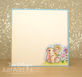
Another cute little bunny graces the inside. I masked him off and stamped some flowers behind and coloured them the same was as the ones on the front, using Wink Of Stella to blend the pencil. Did you notice there are no sentiments at all on the card? I will add them later when I decide what to do with the card.
Don't forget to pop on over to the Just Add Ink blog, where you can link your card up for this week's challenge. You can also see the rest of the Design Team cards.
Bye for now,
Tina
Tuesday, 16 April 2019
Springtime In Sahara
Hi!
Welcome once again to the new Colour Creations Blog Hop. I'm joining in even though I'm still in New Zealand, so hopefully nothing technical goes wrong!
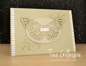
This week we are featuring a neutral that I don't use very much. - Sahara Sand. I was so lacking for inspiration that I went googling and I found this card by Teneale Williams that I decided to CASE. There are lots of products on her card that are long retired, so I had to make do with similar current products.
As the current butterfly is wider than the old style one, I flipped the card to be landscape orientation. I kept the strips of DSP at each end of the card, as I quite liked that feature.
I promise that I used some Sahara Sand DSP from the Neutrals pack on my card, the photo is just showing it as more like Crumb Cake! I pulled out an old favourite stamp set, Timeless Textures to add some detail under the butterfly. There are actually two butterflies layered - another feature I loved from Teneale's card.
Similar inside stamping, and I also repeated the DSP under the panel trick for the strip along the bottom of the inside. I will have to remember that one!
Time once more to pop on over to Catherine's blog to see the rest of this week's Sahara Sand cards. You'll be glad you did.
Bye for now,
Tina
Sunday, 14 April 2019
CTC #224: Favourite Occasions Big Shot Project
Hi!
Hooray for a new CASEing The Catty Sunday Challenge Blog Hop! This week we are choosing our favourite Big Shot project from the Occasions Catalogue to CASE. You've arrived here from Siobhan's blog, or you may have started here. Doesn't matter, grab a cuppa and hop, hop, hop away!
A quick flick through the catalogue, and my eye caught on the card on the bottom left of page 27.
Part of the reason I selected this card to CASE was that I wanted to make a thank you card for my CTC teammate and New Zealand travel buddy, Judy May. She's a pink girl, and the splashes of Berry Burst in this card really appealed.
As I mentioned, Judy loves pink, so I switched out the Pool Party panel for a Blushing Bride panel. I also added a couple of layers so that I could use a Berry Burst card base. All the stamping is the same as the catalogue sample, although I used Very Vanilla card to match the Tea Room ribbon.
I also changed the sentiment on the front. It was my first cut into my Copper Foil paper - isn't it gorgeous? Why, oh why, did I take so long to use it? LOL!
I repeated the same style of stamping on the inside. Still not a fan of the big flower, but I do like how it sits over the stamping. What do you think?
While that's it for me this week, it's not it for you! Continue on with the Blog Hop by hopping on over to Julia's blog!
Don't forget to stop by the Facebook group to join I the fun there too!
Bye for now,
Tina
Thursday, 11 April 2019
JAI #452: Just Add A Sketch
Hi!
Welcome to the new Just Add Ink challenge. This week it's a sketch challenged designed by me! This was a fun sketch to design, and I think it can be interpreted so many ways - don't just stick to circles, any shape is fine!
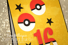
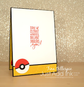
I think I designed this before Christmas and I had snowflakes in my head instead of circles. In the end, I used a mix of Pokeballs and stars.
I made this card for my oldest child, Alex, who is turning 16 (gulp!) in a few days. He's mad on Pokemon Go, and the Pokeballs are a big part of the game. The Crushed Curry DSP is from the Classic Garage DSP Pack, I loved the subtle grungy pattern in it.
To make the Pokeballs I punched 1 1/4 inch circles in Whisper White and Real Red, then snipped the red ones in half. I added a thin strip of Basic Black to the back of the red and then adhered the whole lot to the white. To get the little circles, I used a 1/4 inch circle punch and then punched a 1/2 inch circle over the opening to create a black 'donut'. I then adhered it over the top of a 1/2 inch white circle and then glued that to the larger circle. Done!
The numbers 16 were done in a similar way to the larger part of the Pokeball. The hardest part was lining up the black strip!
I made a fourth Pokeball for the inside of the card too - why not when I'm already making three? LOL. I hope Alex loves his card, I know I had fun making it.
Time to head on over to the Just Add Ink blog, where you can find the rest of the Design Team's cards and add your own to the challenge.
Bye for now,
Tina


