Hi!
It's time for the new Just Add Ink challenge! This week Kim has designed a sketch to kick of our creativity!
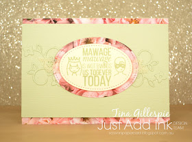
I really love this sketch, and the Design Team have done some fabulous things with it, so clearly they love it too! What comes to your mind when you see it? The elegant curls to the side made me think of a wedding card, so that's what I decided to make.
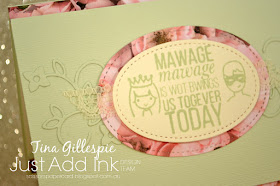
I wanted to go really subtle with the curls, so I cut them from Soft Sea Foam Cardstock, which is the same as the layer underneath, which was embossed with the Subtle 3DTIEF. The little flourishes were from the new Well Written Framelits dies. Aren't they pretty? I wanted to add a little splash of colour, so I used some of the Petal Promenade DSP on the card. The gorgeous rose paper is perfect for a wedding card, as it looks just like a bouquet of roses.
How much fun I this stamp set? It's a new purchase from Ink Road Stamps, and it's called 'As You Wish' and is full of quotes and fun images inspired by the movie The Princess Bride. In case you're not familiar, the priest doing the wedding ceremony in the movie has a speech impediment and can't pronounce the letter r. Now I just need to find a bride and groom who love the movie so I can give them this card!
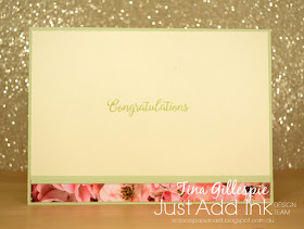
On the inside I used one of my favourite sets for sentiments - Beautiful Bouquet. There wasn't another quote in the As You Wish set that would work on the inside, so I thought a simple congratulations would be best. Oh, and more of that gorgeous DSP!
The Just Add Ink team have had a lot of fun with this week's sketch. You can see all the cards, and then link up your own over at the blog. See you there!
Bye for now,
Tina
Pages
▼
Thursday, 31 January 2019
Tuesday, 29 January 2019
Glad Wrapped Olive
Hi!
Welcome to the new Colour Creations Blog Share. But first - how did back to school day go? Or have your kids got another day off? My oldest two went back today, high school for the first time for Ada. They had a great day. Unfortunately we are still waiting on paperwork to allow Hudson to return to school, but I'm hopeful it will be later this week.
On to today's card. I used an old, but new to me, technique on this card. I host a monthly ATC swap and wanted to try out the technique before I used it, just in case it turned out to be trickier than I thought. Thankfully, it was very easy!
The technique is called the Glad Wrap Technique, or if you're in the US it might be the Saran Wrap Technique. You basically take a scrunched up piece of soft plastic, ink it up and pounce it all over your cardstock to create a textured look. You can use just one colour, as I have, or several different colours. It's very retro - it reminds me of the finish people used to apply to painted walls. I can't recall what it was called! For my card I used Old Olive ink on a piece of Soft Sea Foam cardstock.
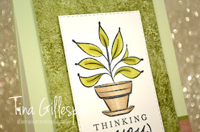
Here's a closer look - doesn't it look soooo textured? I still feel surprised when I run my fingers over it and it's smooth!
The stamped image is a new Hostess set from the Occasions Catalogue called Just Because. It's grout some great floral images that are fabulous for colouring. I used my Old Olive and Crumb Cake Blends to colour this image.
I made a small test piece of my Glad Wrap technique and so rather than waste it, I used it on the inside of the card. I also used a small strip of the same Wood Textures DSP that I used on the front. No inside sentiment yet - I'll stamp something when I know what I'm going to use this card for.
As ever, this week's cards can be found over on Catherine's blog. There's always such a wonderful variety of cards made using the focus colour. I love checking out the cards each week.
Bye for now,
Tina
Sunday, 27 January 2019
CTC #213: Floral Romance
Hi!
Welcome back to CASEing The Catty Sunday Challenge and Blog Hop.
Being a blog hop, all the blogs are linked in a loop, so you just keep hopping until you get back to where you started. The blog before mine was the lovely Elizabeth Gross. You may have started here, there, or anywhere on the hop - it really doesn't matter - but do make sure you see everyone's creations as they are always fabulous.
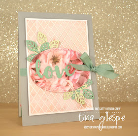
This week we are CASEing the Floral Romance section of the Occasions Catalogue. I'd sort of skipped over that section when I first looked at the catalogue, as I'm not big on Valentines and I don't make a lot of wedding cards. I realised what I was missing when I was made to look for this challenge. So many gorgeous things!
For the challenge, I settled on this pretty gift box. I don't have any of the product, but that's not really the point of CASEing. You don't have to copy exactly! Having said that, I did copy fairly closely, but I used alternate products.
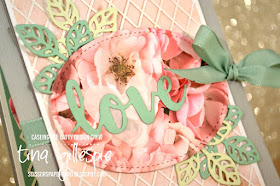
My first thought when looking at this box was that I don't have the die used on the background. A quick flick through my Annual Catalogue reminded me that there was a similar piece in the Delightfully Detailed SDSP. I layered it over the top of some of the soft pink paper in the Petal Promenade DSP and then mounted it on some Smokey Slate cardstock that I'd run through the Big Shot with the Subtle 3DTIEF.
The main floral panel is also from the Petal Promenade DSP, cropped with a Stitched Oval Framelit. The leaves were cut using the Flourish Thinlits leaf from Mint Macaron and Soft Sea Foam cardstock. I love how the soft grey, pink and green work together!
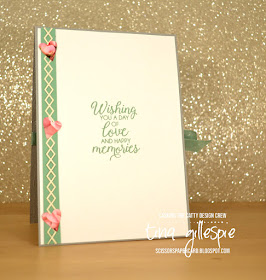
I used a second piece of the Delightfully Detailed SDSP to create the border piece along the side of the inside. Silly me used the Very Vanilla side rather than the Whisper White side. Oh well, most people wouldn't even notice that! The hearts, like the vellum heart on the front, are cropped using the Support Ribbon dies.
Now you're off to Peta Stephen's blog so that you can continue your way around the Blog Hop.
Don't forget to join us in our Facebook group. It's where you can see what everyone has made for the challenge, and you can add your card to the group to join in the challenge too.
Bye for now,
Tina
Thursday, 24 January 2019
JAI #441: Just Add Inspiration
Hi!
Yay for a new Just Add Ink challenge! This week Jo has found this gorgeous Inspiration Photo for our challenge. I'm hungry just looking at it!
Those cupcakes look very yummy, but I think I'd have to scrape half of the icing off! My kids would be more than happy to eat it for me, I think.
I've looked past the colours this week, and decided to give my new Birthday Cheer bundle a run.
As soon as I saw the Edgelits in the Occasions Catalogue, I knew I wanted to try an Easel card using them. I love how they pop off of the top of the page as an outline, but when you close the card they are filled in.
The Broadway Bound SDSP is a great pair for the bundle. I really love this metallic confetti paper.
The little heart on the inside has come from the cupcake on the right. It is just the right size to keep the easel card open, and is a cute addition to the inside of the card, don't you think?
The rest of this week's yummy cards can be found over at the Just Add Ink blog, where you can also link up your card for the challenge. Can't wait to see what you whip up (LOL!) using the picture as inspiration.
Bye for now,
Tina
AWH January Blog Hop: Occasions Catalogue
Hi!
Tonight the Art With Heart team are sharing creative projects using product from the Occasions Catalogue. The Occasions Catalogue is current now until June 3rd. Be sure to request your copy of the catalogue today (along with the Sale-A-Bration brochure).Did you know that Sale-A-Bration is also a great time to join our fabulous team? Ask anyone on the blog hop if you’d like more details.
I decided to use one of the smaller items in the Occasions Catalogue for tonight's projects. It may even be one you've overlooked - the Sweet Pins and Tags, on page 15 of the catalogue. They are part of the How Sweet It Is suite of products. I'm not a big fan of that suite, and I'm not really even sure why I ordered the tags. Maybe to bump up an order so that I reached a SAB threshold for a freebie? Sound familiar? LOL
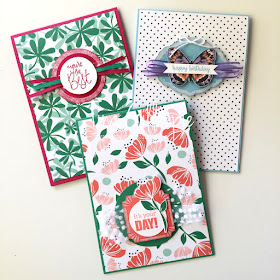
As I sat to craft, I looked at page 14 of the Occasions Catalogue and noticed that the samples had coloured tags. I was so excited by this - it makes the tags so much more interesting! The basic tags are white with iridescent foil edges - pretty, but a bit ho-hum. How much nicer does it look in Calypso Coral? The iridescent border stands out soooo much more, and you really get to see the features like the stripes on the corners.
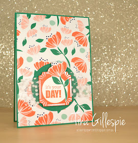
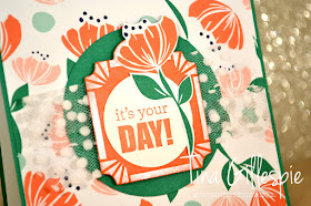
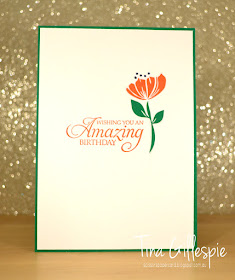
To colour the tag, I simply used my sponge brayer, but you could probably just apply the ink with a spritzer, dauber or sponge. I completed the card with two more Occasions Catalogue products - Happiness Blooms DSP and Itty Bitty Birthdays stamp set. The flower on the tag was fussy cut from the DSP, as is the flower on the inside.
Now, once I'd coloured one tag, I couldn't stop there. The pack has three different shaped tags, and you get 8 of each, plus some cute little pins that you could use to attach them to ribbon, etc. I chose not to use the pins as they don't really make sense on a card.
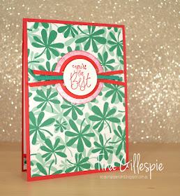
This card features the round tag, brayered with Lovely Lipstick ink. Once again, the DSP is from the Happiness Blooms DSP pack. I love the bold colours and patterns in the papers!
The stamp set I used on the inside is also a new set from the Occasions Catalogue, called Incredible Like You. I really love the cursive font - what do you think?
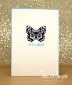
I've cheated a little on this last card, as apart from the tag, it's mostly SAB products. As soon as I saw the tag I decided it would make a great resting spot for a butterfly from the Botanical Butterfly DSP. I was right!
This tag was brayered with Balmy Blue ink to match the colours in the DSP. Even though it's a softer colour it really makes the tag pop.
I returned to Itty Bitty Birthdays for the inside sentiment.
Here are all three cards together. Are you rethinking the tags now? At only $8.95 for a pack of 24, they are a value buy, and definitely worth another look, especially as they can be changed to any colour you desire. Just doing a spot of enabling there!
Phew! That's finally it from me, now you're off to visit Ros Davidson, who always creates something pretty amazing!
Here's the list of links in case you get lost or find a broken link along the way.
Bye for now,
Tina
Tuesday, 22 January 2019
Incredible Night Of Navy
Hi!
Time for this week's Colour Creations Blog Share. This week it's Night Of Navy, which recently got shifted to the Neutrals colour family. It makes sense if you think about things like clothing - navy items are often used as a neutral with other items.
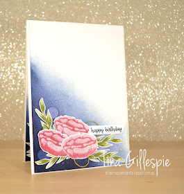
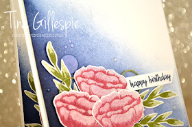
I started my card by using my sponge brayer to colour the bottom corner of the card. I then used my Aqua Painter to drip and then flick some water over the coloured area. You can see the difference - the drips are big and round, while the flicks are much smaller. It's a fun way to add interest to a block of colour.
The flowers from Incredible Like You are stamped in Berry Burst. I didn't stamp off the colour - the more solid stamp in the two stamp pair is designed to transfer less ink to the card, giving a lighter shade. So clever! The leaf stamps are the same design as the flower. I stamped them in Old Olive, which incidentally, is next week's colour.
I recreated a mini version of the front on the inside. I realised after I'd stuck everything down that I'd forgotten to do the water flicks over the Night Of Navy. Oops!
Why not head on over to Catherine's blog, where you can see the rest of this week's Night Of Navy cards?
Bye for now,
Tina
Sunday, 20 January 2019
CTC# 212: Sale-A-Bration
Hi!
It's the end of another busy week, which makes it time for the CASEing The Catty Sunday Challenge Blog Hop!
I do love a good blog hop! The blog before mine belongs to the talented Judy May. You may have started there, or anywhere on the hop - it doesn't matter. Just keep on hopping until you get back to where you started. Hopefully by the end you'll be inspired to enter out challenge.
This week we are back to CASEing the Sale-A-Bration Catalogue. It's got heaps of great cards, so it was hard to narrow it down to just one. I CASEd a card from the front cover last time, so I decided to head for the back of the catalogue for inspiration this time. I decided I's CASE this card, from the bottom of page 18.
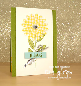
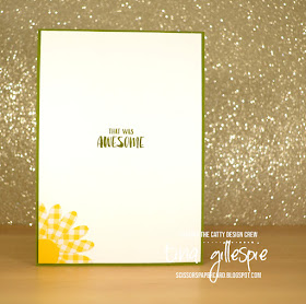
I don't have the Lasting Lily stamp set, but a few days ago I saw a card on the FB, where a demonstrator had punched some daisies from the Gingham Gala DSP. I was keen to give it a go, so this card seemed like a great way to do it.
I used the coordinating Daisy Delight stamp set to create the stem of the daisy. I don't like the tiny little leaves on the stem, so I just used a marker to ink the stem part. I then used the larger leaf stamp and the filler stamp to add the leaves. Much better proportions!
The daisy centre needed a little something, so I added this huge (retired) Iced Rhinestone. I think it finishes off the card quite nicely! How cute does the gingham daisy look? I just can't get enough of this DSP!
I often use 3 layers on my daisies, but this time it didn't look right. I'd already punched the third daisy, so I decided to use it on the inside rather than waste it. I just snipped it in half, layered it, and glued to it to corner of the cardstock, trimming it to fit.
That's it for me, now you're off to visit Siobhan's blog to see what fun she's had with the SAB Catalogue.
Don't forget to also pop by our Facebook group, where you can add your card to this week's challenge. See you there!
Bye for now,
Tina
Thursday, 17 January 2019
JAI #440: Just Add Something New Blog Hop
Hi!
Yay for the return of Just Add Ink for another year! As always, we are kicking off the new year with a Blog Hop to start our challenges. Blog hops are a circle, start where you like and just keep on hopping until you get back to where you started. You may want to grab a cuppa first! The very lovely Jo's blog is the one before mine, and you'll find the link to the next blog at the end of the post.
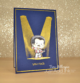
Just before Christmas I treated myself to some new stamps from Kindred Stamps. My daughter, Ada is a huge fan of a superstar band that has just had a movie released about the lead singer. Hopefully you get the hint - I'm not allowed to say the names! When Kindred release a stamp set inspired by some iconic rockers, and it included Ada's favourite, I just had to get it. This was the first time it saw ink.
Ada is starting High School this year (I nearly typed next year!!) and so I wanted to make a card for her to let her know I think she's going to have an amazing year, and this set fit the bill. I started by using some Vegas Gold Shimmer Paint to create the spotlights. I just masked horizontally across the top and bottom and then, one at a time, I masked the diagonal lines to create the spots. I wanted the lights to fade out towards the bottom, so I let the sponging taper out. To get the pool of light on the ground, I cut a very thin oval into a post it note and sponged through the opening. The trickiest part was lining it up with the spotlights. I repeated, on a smaller scale, for the tops of the spotlights. I tried using cardstock to make the top of the lights, but it ended up looking like the aliens were trying to beam him up, so I abandoned that idea!
I coloured the singer with my Copic markers and then fussy cut and popped him up using Dimensionals. I definitely need more practice with hair/highlights, but overall I'm pretty happy with how he turned out. I should also mention that I used the same Shimmer Paint to edge the piece of cardstock under the main panel. I like my golds to match, so this was the best way to get the look.
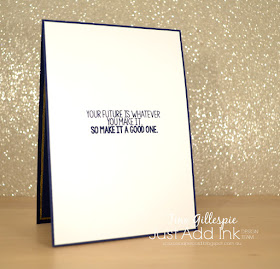
The sentiment on the inside is also from a Kindred Stamps set, but a different set to the one on the front. I thought it was very apt though!
Now you're off to see what the incredible Lou has made with her 'something new'.
What new crafting things have you purchased recently? Don't forget to link your card over at the Just Add Ink blog.
Bye for now,
Tina


