Hi!
Are you ready for another week of Christmas inspiration? I think we are up to week 12, which means I have an extra 12 cards in may stash that I wouldn't usually have at this time of year.
I made this week's card last week while I was watching the movie 'Sully' on TV. Have you seen it? The movie tells the story of the plane that landed in the Hudson River and everyone survived. It was quite interesting and exciting, so I think my colouring suffered at times. Luckily I wasn't trying to work on a trickier card!
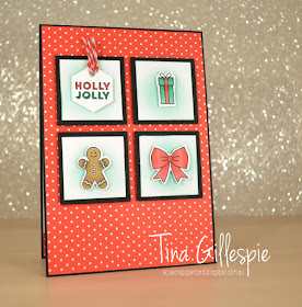
I used the Tags and Tidings bundle on this card. It's a cute little stamp and die set that makes a ton of sweet little tags. It's one large stamp and one large die, so you can stamp and cut 16 different tags in two quick steps. Nice!
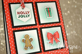
I trimmed the tag loops off of the three picture images, as I didn't need them to be tags on this card. The Holly Jolly one I left, as I liked the shape and timing it would have looked strange to say the least. I coloured the images with my Poppy Parade, Shaded Spruce and Soft Suede Blends Markers. I then sponged some Pool Party ink onto the Whisper White squares behind them. I helps the tags to pop from the background.
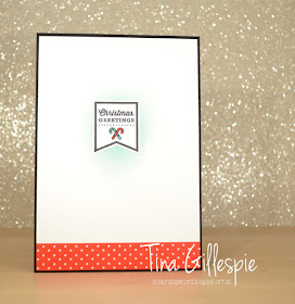
It's tricky to see in the photo, but I also sponged the Pool Party ink on the inside before adhering the tag to the cardstock.
You can find the links for the rest of this week's Heart Of Christmas cards over at Claire's blog. I'm loving seeing what everyone makes each week, and I'm sure you are too.
Bye for now,
Tina
Pages
▼
Wednesday, 31 October 2018
Tuesday, 30 October 2018
Double Folded Grapefruit
Hi!
Thanks for joining me for another Colour Creations Blog Share.
This week we are looking at Grapefruit Grove. At the risk of becoming an outcast, this isn't a colour I've yet warmed to. I like that it's a very different colour to anything else in our range, and I will acknowledge that it's a useful colour, but it's just not one that I find myself reaching for unless I have to. I'll duck for cover now!!
I often start my Colour Creations process by looking at which DSP has the colour of the week. In this case it was the Petal Promenade DSP. As soon as I realised and saw the pieces with the frames, I knew exactly what I was going to make.
I can't recall what this fold is called, but it's super easy to make. It's just two top fold cards, one slightly smaller than the other that is adhered upside down to the front of the larger base, and then folded to create the extra little bit at the front. The floral frames are actually quite small, so I started with them and built my card up from there.
I had to use one and a half of the frames to make the card, and the trickiest part was cutting the half piece so that it lined up exactly with the full frame behind it. The photo doesn't show it very well, but I managed to get it pretty spot on. I was quite chuffed!
The DSP piece along the bottom was from the same sheet of paper as the frames on the front. The flowers reminded me of a wedding bouquet, so that's where I went with the inside of the card.
Why not pop on over to Catherine's blog so that you can see the rest of this week's Grapefruit Grove cards? Maybe the colour will warm on me by the end of the Blog Share!
Bye for now,
Tina
Monday, 29 October 2018
Great Scott!
Hi!
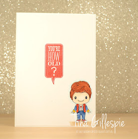
Today's card is one that I made for a very good friend. She's a mad fan of a certain trilogy of movies that involved a funny looking car and some time travel. My family are also big fans of this trilogy, so when I had the opportunity to buy some stamps that were a parody of the movies, I just had to buy them.
The stamps are from my favourite pop culture company, Kindred Stamps, and are called Back In Time. I think they have retired now, so I'm very glad I got them when I did. Have you guessed the trilogy of movies?
This image was a great way of practicing 'colouring white'. Clearly, you can't actually colour white, so it's about adding some shadows in a light grey to make the image come to life with a bit of shape. I was pretty pleased with my first attempt.
Hehehe, I couldn't resist adding this retired Stampin' Up! stamp to the inside. My friend is a little older than me and sometimes I like to rub it in a little. She gives as good as she gets though!
Bye for now,
Tina
Thursday, 25 October 2018
JAI #432: Just Choose Two
Hi!
Hooray for Friday and the new Just Add Ink challenge.
This week Patrice has challenged us to Choose Two to add to our cards this week.
Which two will you choose of Buttons, Bows or Bling? I chose Bows and Bling.
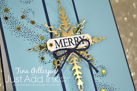
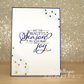
I'm not sure if this card is a bit too footy jumper looking or not. What do you think? I think it's the stripe down the middle. I stamped over it with the starry swirl in Balmy Blue in to match the cardstock. The same stamp was also stamped in Night Of Navy on the larger layer.
My bling is these cute little stars that I found in my stash - I think they were a free gift with a purchase. I glued them over where the larger stars are in the swirl. A bit fiddly, but my Take Your Pick tool made the job much easier.
I repeated the swirls and stars on the inside. If you're going to bling something up, you may as well go big!
You can see the rest of the Design Team cards over at the Just Add Ink blog, where you can also link up your card. Which two will you choose?
Bye for now,
Tina
AWH October Blog Hop: Pink
Hi!
Tonight the Art With Heart team are sharing creative projects featuring the colour pink. We hope our Blog Hop inspires you to get creative with the various shades of pink that Stampin’ Up! offer in our collection of 53 colours.
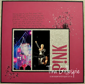
Now, I must admit that when Ros first gave us the pink theme, my mind jumped straight to the entertainer, P!NK. I went to one of her concerts back in July and hadn't scrapped the experience yet, so I thought why not?
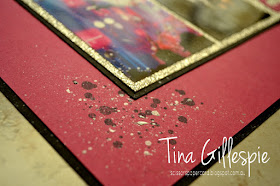
I chose Berry Burst for my colour pink, and complimented it with Basic Black and Silver Glimmer Paper. It's such a fun combo, and what else for an awesome entertainer such as P!NK? To create the title I cut each letter with my Large Letters dies and then simply trimmed of the serifs on each letter. The serifs are the little 'flicks' at the ends of the letters. It changes the look of the font quite a lot! Here's a tip: to adhere the photos and letters over the Glimmer paper, it is best to use a liquid glue as it grips better to the uneven surface of the glitter.
I had fun making the splatters on the page. I started by stamping the splatters from Swirly Bird in Memento ink. It was good, but not quite the right look. I got out my Silver Embossing Paste, and using my Aqua Painter, I flicked it over the top. Much better!
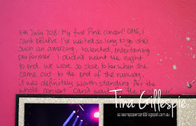
To get the spacing right on my text, I wrote it out on a piece of scrap paper, but starting at the bottom of the page and going up. By doing this, I knew where to start my top line so that my writing was perfectly spaced.
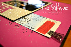
Did you notice the Black Glittered Organdy Ribbon at the top of the photo section? I couldn't resist adding a piece of my favourite ribbon, especially when it has the important purpose of hiding my ticket and a piece of the confetti that fluttered down during the concert. I made a little pocket for them under the panel so I could keep the photos and ticket together, but keep the ticket hidden.
Well, that's it from me, you're now off to the next participant, the very talented Ros Davidson.
If you find a broken link or have come to this blog hop from a different entry point, you can view the participants below:
Sharon DavernKate MorganAndrea RobertsTina GillespieRos DavidsonCatherine ProctorCaroline ManwaringRachel PalmieriSue MadexRebecca JacovouAlisha WatsonClaire DalyRachel WoollardMonika O’NeillJune Kempster
Bye for now,
Tina
Wednesday, 24 October 2018
A CASE For Christmas
Hi!
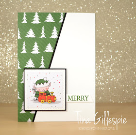
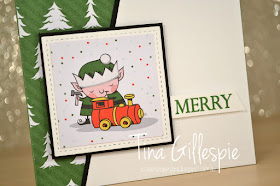
Welcome to a new week's Heart Of Christmas Blog Share. Today's cards was actually a layout that I CASEd from this card by Chris Smith. The layout immediately appealed to me, so with a few tweaks I made my own version.
I didn't have any of the stamps or dies that Chris used, so I grabbed my trusty Santa's Workshop SDSP and my Merry Christmas To All stamp set and away I went. You probably can't see in the photo, but the white part of the card front is embossed using the Subtle DTIEF.
I love this sweet little elf - most of the others have a cheeky look, so this little guy stands out from the crowd. There wasn't a lot of room for a sentiment so I just went with the single word, Merry.
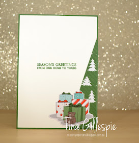
I trimmed a smaller triangle from the tree paper to finish off the inside, along with a group of gifts, fussy cut from the Santa's Workshop SDSP. I'm going to have to think hard about how to use the left over piece of the tree paper, as it's a wide, diagonal stripe. Could be interesting!
As always, you can find the rest of this week's cards over at Claire's blog. I find it easy to view each page by right clicking on the link and selecting to open the link in a new tab. That way I'm not jumping back and forth between each page.
Bye for now,
Tina
Tuesday, 23 October 2018
A Balloon Celebration For Granny
Hi!
Are you enjoying seeing the different colours each week in the Colour Creations Blog Share? I am!
This week we are looking at Granny Apple Green, one of the new greens in our colour range. It's a lovely, bright green that is true to the Granny Apple Green name. It's a softer bright green, if that makes sense to you!
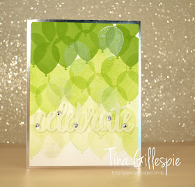
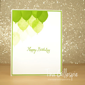
I had a lot of fun with the colour this week, seeing how many shades I could get from the colour. I've seen this style of card with the ombre balloons around the Internet a bit and I've been wanting to try it. This seemed like the perfect time. I started with the colour full strength at the top, and slowly worked my way down the cardstock each time I stamped it, so that it got lighter as it got closer to the bottom. Here's a hint if you want to try this: if you stamp a balloon half way off the cardstock, don't stamp the second generation balloon completely on the cardstock - you'll end up with a balloon that is part ark and part light. Not a good look! To get around it, I either stamped off on scrap paper or made sure that when I stamped second or third generation I stamped less of the balloon, so that the darker areas were always off the cardstock.
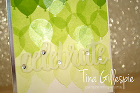
To give the card a bit more zing to go with the Silver Foil edges, I also stamped some balloons over the top using Frost White Shimmer Paint on my stamp. I've darkened the photo a little so that you can see it better. The 'celebrate' die cut was cut from vellum, and I hid chopped up Mini Dimensionals behind the sequins. I didn't want to go to all that effort with the balloons and then hide them behind a big sentiment!
Some more balloon-y fun on the inside. Once I got going on the balloons, I really couldn't stop!
As always, you can find the rest of this week's cards over at Catherine's blog. I can't wait to see what fun everyone has had with Granny Apple Green!
Bye for now,
Tina
Monday, 22 October 2018
A Whole Llama Fun
Hi!
I mentioned last week in this post that I'd been asked to make a llama card for a friend to give to her daughter for there birthday. I actually made two cards, and today I have the second one for you.
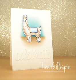
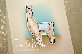
Isn't it different? It's very cool how two vastly different cards can be made using the same stamp set. I used Shimmer paper for the front of the card, as I love the way the ink blends on it. I cut the 'celebrate' from Shimmer paper too so that it sort of disappeared into the front of the card, leaving the llama as the focus.
The background behind the llama was inspired by this card with a much cuter llama than mine, but beggars can't be choosers! My brief was a blue llama card, so I kept the sky to just Balmy Blue. Once again the llama was coloured with my watercolour pencils and blended with Clear Wink Of Stella.
I used a small strip of DSP on the inside to bring blue into the colour scheme again.
So what do you think? Which card would you have chosen? My friend loved both so much that she couldn't decide and took both of them! Now she's set for her daughter's next birthday too.
Bye for now,
Tina


