Hi!
Hooray for a new Just Add Ink challenge! This week Di has challenged us to add texture to our cards. I toyed with the idea of using the Faux Silk technique on my card, but then a new stamp set arrived in the mail and I just had to use it!
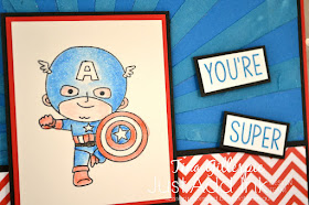
I was lucky enough to be able to purchase a limited edition super themed box from Kindred Stamps that included a stamp set called You're Super. It arrived in the post just before Rob's birthday. He's mad on these super heroes, so it was a no brainer to use them on his card!
To add the texture on my card, I used my Pacific Point reinker to dye some Embossing Paste. I then used a retired mask to apply it to the front of my card. I was worried when I dyed the paste that I'd made it too dark, but it's actually dried lighter! The red zig zag paper was in the super pack from Kindred Stamps.
I stamped this patriotic Super Hero on Shimmery White cardstock using Memento ink and then coloured him using my Watercolour Pencils. Of course, I blended with my Wink Of Stella pen. It's a bit redundant using it on Shimmery White, but I love the way it blends the pencil so much that I just have to use it. I used my Pacific Point, Real Red, Calypso Coral, Basic Black and Basic Grey pencils to colour him in.
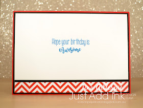
This inside sentiment is from another Kindred Stamps set called Building Blocks. The You're Super set had a sentiment that said 'Have a super birthday', but as I'd used super on the front it felt weird to add it to the inside too.
The Just Add Ink blog is where you'll find the rest of the textural cards made by the Design Team. I wonder what they'll think of to add texture? What are you thinking of? I can't wait to see!
Bye for now,
Tina
Pages
▼
Thursday, 30 August 2018
Wednesday, 29 August 2018
A Twinkly Christmas
Hi!
Here we are again with a new week of Heart Of Christmas. This is the third week of our Christmas themed Blog Share.
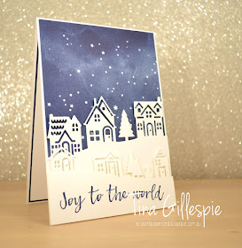
A month or so ago I CASEd a card from the Annual Catalogue. You can see it here. For this week's Heart Of Christmas I decided to remake the card, but as a much faster and easier version.
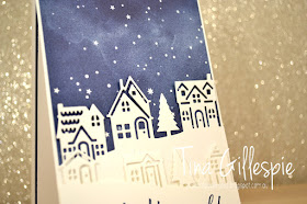
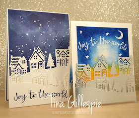
I decided to use plain Whisper White for the rows of houses instead of the Silver Foil on the original card. It's a great substitute, and helps to keep costs down if you are mass producing cards like this.
Instead of water colouring and heat embossing the night sky I decided to use some paper from the Twinkle Twinkle DSP pack. Isn't it perfect for this card? Just another way to keep the costs a little lower.
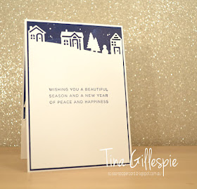
I used an offcut of the DSP to finish the inside. I had originally planned to have the houses along the bottom, but it looked a little strange with the abrupt edge of the DSP along the top. Shifting the houses to the top solved this problem nicely!
Here are my two cards side by side so that you can see the differences.
Why not pop on over to Claire's blog to see the rest of the cards in the Heart Of Christmas Blog Share this week? They are always fantastic!
Bye for now,
Tina
Tuesday, 28 August 2018
A Crumb Cake CASE
Hi!
Here we are with another Colour Creations Blog Share. I've lost track of the week number, but I've managed to play along every week now - Im happy with that! This week we are focussed on one of my very favourite neutrals - Crumb Cake. Is it a colour that you use lots?
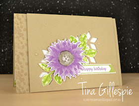
I can't remember why I was flicking through the catalogue, but a card on page 139 caught my eye. I'm sure you will work out which one when you have a look. I don't have the Eastern Beauty suite, so I decided to substitute with other stuff from my stash. I was a bit stumped on what to use for the window part until I came across the piece of Crumb Cake I used on my card. I'd cut it ages ago and not used it. Once I trimmed it for the front it was perfect!
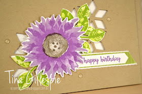
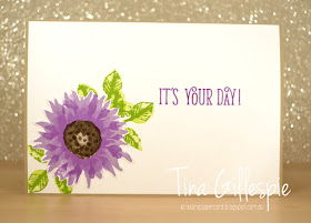
I went for some lovely bright colours for the flower and leaves - Highland Heather, Gorgeous Grape and Crumb Cake for the flower and Lemon Line Twist with Granny Apple Green for the leaves. The epoxy dots I used on the front are retired, but you'll soon be able to purchase something similar from the Holiday Catalogue 😉
The flower on the inside was my first attempt. I used Early Espresso on the centre, but thought it turned out too dark. Instead of wasting the effort, I popped it on the inside!
Why not pop on over to Catherine's blog, where you can see the rest of this week's Crumb Cake cards? You can bet I will!
Bye for now,
Tina
Monday, 27 August 2018
Nature's Poem Doubled
Hi!
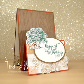
Today's card features a new fold that is trending at the moment. I can't recall what it's called - double easel maybe? - but it's a fun one, so I thought I'd give it a go.
Have you seen it around? Think it looks to tricky to try? It's not at all tricky! Start with a standard card base (Soft Suede) and then cut another card base in a contrasting colour (Cajun Craze), but slightly smaller all around. Adhere the smaller card base to the front of the first card base, but upside down. Then just fold the part of the smaller base that isn't stick down in half, so that it forms the zig saggy bit that sits at the front. Decorate, and you're done! I haven't given measurements, because it varies according to the size of your A4 card, but it would be easy enough to google a tutorial for your country.
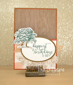
I used Nature's Open DSP to decorate my card. I don't own the coordinating stamps and dies, so I used ole favourite Lovely As A tree and Picture Perfect Birthday instead. This is what the card looks like closed flat. You could decorate the back section of the front if you desired, but I thought the wodgrain paper didn't need anything else.
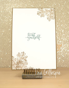
I used the same two stamp sets to finish off the inside.
Are you keen to try this card fold yet? It really isn't tricky, but it's WOW enough that the recipient will probably think you spent hours and hours making it. It will be our secret 😜
Bye for now,
Tina
Thursday, 23 August 2018
JAI #423: Just Add Colour
Hi!
This week at Just Add Ink we have a colour challenge for you. Kim has given us the following colours to work with.
Just a note that our Colour Challenge rules have changed slightly. Where previously we allowed the addition of any of the Neutrals to the challenge colours, with the Colour Revamp at Stampin' Up! we are now only allowing the addition of any of the Basics or Metallics.
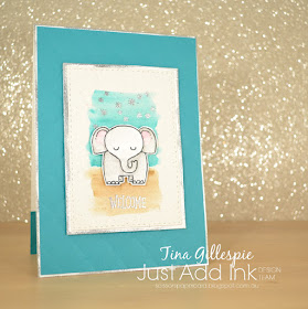
I loved this colour combo, but I found Soft Suede the hardest to include. In the end, I decided to use it to make some earth for my sweet little elephant to stand on. Once I go my head around that, the rest came together easily! I used my Basic Grey Watercolour Pencil to colour the elephant and then blended (as usual!) with my Wink Of Stella pen. I think I've forgotten how to use the pencils with water!
To bring some silver into the mix, I heat embossed some stars and the sentiment. I didn't feel like it was enough silver, so I decided to add some to the edges of the main panel and the card base. To do this I swiped my Versamark inkpad over the edges of the cardstock and then tipped the embossing powder over the edges. I then heat set the powder as usual. It's such a cool effect, as it's not uniform all the way around the edge. It was my first time trying this technique, but certainly not the last!
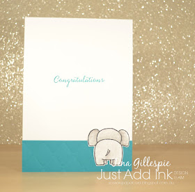
I just had to include the back side of the elephant on the inside. It's hard to see in the photos, but I used my new Tufted DTIEF to emboss the Bermuda Bay cardstock on the front. I also embossed the smaller strip for the inside to tie them together.
That's ti for me today - you can see the gorgeous cards the rest of the team have created with Kim's colours over at the Just Add Ink blog. Don't forget our rules have changed slightly when you are making your masterpiece!
Bye for now,
Tina
AWH August Blog Hop: Coloured Images
Hi!
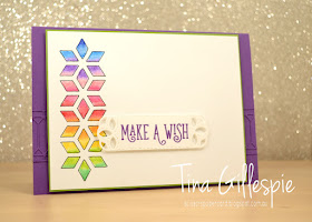
For this month's Blog Hop I decided to stretch the rules a little. The theme is Coloured Images, but instead of stamping and colouring an image I created a mask which I used to draw my own image to colour.
Do you recognise it? It's a die from the Eclectic Layers Thinlits set. I cut it from scrap cardstock, trimmed it to the size I was after, used washi to adhere it to my cardstock and then traced through the design with a pen.
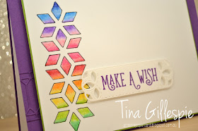
I then used my watercolour pencils to colour the rainbow of colours in the design. I use a Wink Of Stella pen to blend the colours together. LOL, I don't think I've ever used the pencils with my Aqua Painter! Each of the little sections was coloured with two colours, leaving a little white in the middle. The WOS pen is then used to smooth the colour and to pull it into the white section until the two colours blend nicely.
Just in case you were wondering, here's the colours I used. It was a mix of the old and new packs to get the perfect spectrum. The new collection of Watercolour Pencils are available this month, however Stampin' Up! have said that they may be in an upcoming catalogue.
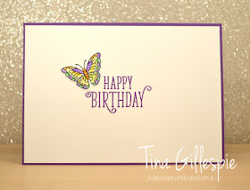
I used some of the same colours to colour the butterfly on the inside.
Are you a colourer? What's your preferred medium? Are you keen on pencils, markers or Blends? I love all three!
That' sit for me, so now it’s time for you to hop on over to Ros Davidson's blog. She makes awesome cards, and she's also the one that organises us to do our hops. Thanks, Ros!
Here's a list of all of the hoppers tonight in case you come across a broken link:
Tonight the Art With Heart team are sharing creative projects featuring cards with images that you can colour in. We hope our Blog Hop inspires you to pick up some Stampin’ Write markers, Watercolour pencils, Stampin' Blends or another form of colouring medium and colour in with your stamps.
Don’t forget to contact any of the ladies on the blog hop to order any products, especially the limited edition Colour Your Season products.
For this month's Blog Hop I decided to stretch the rules a little. The theme is Coloured Images, but instead of stamping and colouring an image I created a mask which I used to draw my own image to colour.
Do you recognise it? It's a die from the Eclectic Layers Thinlits set. I cut it from scrap cardstock, trimmed it to the size I was after, used washi to adhere it to my cardstock and then traced through the design with a pen.
I then used my watercolour pencils to colour the rainbow of colours in the design. I use a Wink Of Stella pen to blend the colours together. LOL, I don't think I've ever used the pencils with my Aqua Painter! Each of the little sections was coloured with two colours, leaving a little white in the middle. The WOS pen is then used to smooth the colour and to pull it into the white section until the two colours blend nicely.
Just in case you were wondering, here's the colours I used. It was a mix of the old and new packs to get the perfect spectrum. The new collection of Watercolour Pencils are available this month, however Stampin' Up! have said that they may be in an upcoming catalogue.
I used some of the same colours to colour the butterfly on the inside.
Are you a colourer? What's your preferred medium? Are you keen on pencils, markers or Blends? I love all three!
That' sit for me, so now it’s time for you to hop on over to Ros Davidson's blog. She makes awesome cards, and she's also the one that organises us to do our hops. Thanks, Ros!
Here's a list of all of the hoppers tonight in case you come across a broken link:
Bye for now,
Tina
Wednesday, 22 August 2018
Elves On Parade
Hi!
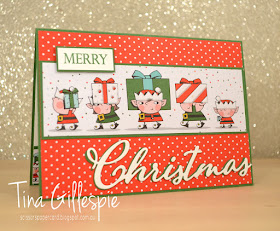
Welcome back to the second week of the Heart Of Christmas Blog Share. I've gone super cute this week with some paper from the Santa's Workshop SDSP pack. It's such fun paper!
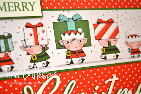
See what I mean? How cute is that parade of elves? They are so funny with their gifts. The best part about this DSP? It's got flocked bits!
Can you see the flocking on the presents and the hats? I can't stop running my fingers over it! I used my Wink Of Stella pen to add some glitter to the Garden Green parts of the design, it's just hard to see in the photo.
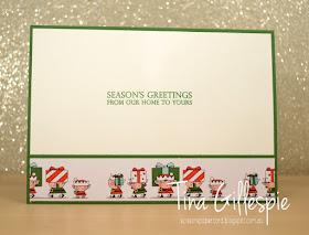
Another sheet of the DSP has the same design only smaller, so I used a strip of it on the inside of the card.
Have you started your Christmas cards yet? Maybe our Blog Share will inspire you to get started. You can see the rest of this week's cards over on Claire's blog.
Bye for now,
Tina
Tuesday, 21 August 2018
A Coastal Christmas
Hi!
Welcome back to another Colour Creations Blog Share. We are featuring a returning colour this week - the lovely Coastal Cabana.
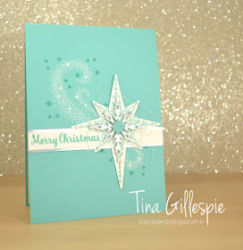
I was glad to see the return of Coastal Cabana to the Brights Collection. It's such a pretty greenish blue. I love how crisp it looks when paired with white, so that's what I went with this week.
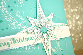
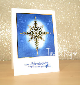
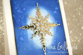
Can you see in this picture that the star and sentiment are on one piece of cardstock? I've used the die to cut the star out above and below the sentiment strip, but not cut the bits in between. I was so pleased with how it turned out, and I will certainly be trying it again. I continued to layer on top of the large star, using Silver thread, a Silver foil die cut star and a tiny Coastal Cabana star that I enhanced with Wink Of Stella. I also used some of the bits popped out from the foil star to decorate the ends of the large star. Fiddly, but a fun finishing touch for the star.
LOL, it's been a long time since I've used a single stamp set to make a card, but Star of Light had everything I needed in one convenient set.
Now you're off to Catherine's blog where you can find the rest of this week's Coastal Cabana cards.
Bye for now,
Tina
Welcome back to another Colour Creations Blog Share. We are featuring a returning colour this week - the lovely Coastal Cabana.
I was glad to see the return of Coastal Cabana to the Brights Collection. It's such a pretty greenish blue. I love how crisp it looks when paired with white, so that's what I went with this week.
I also love a Christmas card in non-traditional colours. I stared by heat embossing the starry flourish stamp with white embossing powder and then stamping some more stars around it. The sentiment and large star use a technique I've been wanting to try for ages - partial die cutting.
Can you see in this picture that the star and sentiment are on one piece of cardstock? I've used the die to cut the star out above and below the sentiment strip, but not cut the bits in between. I was so pleased with how it turned out, and I will certainly be trying it again. I continued to layer on top of the large star, using Silver thread, a Silver foil die cut star and a tiny Coastal Cabana star that I enhanced with Wink Of Stella. I also used some of the bits popped out from the foil star to decorate the ends of the large star. Fiddly, but a fun finishing touch for the star.
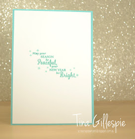
LOL, it's been a long time since I've used a single stamp set to make a card, but Star of Light had everything I needed in one convenient set.
Now you're off to Catherine's blog where you can find the rest of this week's Coastal Cabana cards.
Bye for now,
Tina
Monday, 20 August 2018
A Sunburst In Winter
Hi!
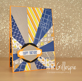
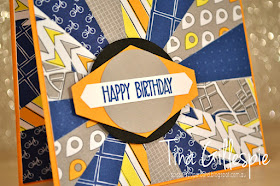
It's been a dreary few weeks of winter here in Adelaide, so I decided to give a Sunburst card a go as a way of trying to bring some summer into my heart. I went looking for some instructions on how to make the card and found an awesome tutorial on my friend, Di Barnes' blog. You can view her instructions here. She's such a clever cookie for working out the correct way to cut the DSP, and a sweetheart for sharing.
After reading Di's tips on the selection of paper and patterns for this type of card, I decided to go with DSP from the Best Route pack. It's great for this, as there aren't too many pieces where the direction in the pattern matters too much - only the bikes really.
It took me a long time to work out the mix of colours and shapes for the sentiment panel. Nothing worked to make it pop from the background until I added the Basic Black circle at the back.
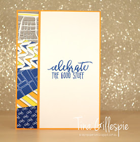
As Di did, I used some of the left over pieces to create the panel for the inside of the card. I still have a lot of offcuts left over, so I think I will make a larger version of this panel to go on the front of a card - stay tuned for that!
Bye for now,
Tina
Thursday, 16 August 2018
JAI #422: Just Choose Two
Hi!
Time for the new Just Add Ink challenge! This week Rochelle has set the challenge to Just Choose Two.
It's an embossing week! Powder, Folder or Paste - which two will you choose? I went with the Folder and Paste combo.
I made this card for Ada to give to her school Performing Arts teacher. A few weeks ago she organised a day of concerts to show off all that the kids have been learning with her. It was amazing day and a half of rehearsals and three performances, and the teacher did such a wonderful job of organising. The rapport she has with the kids is an incredible thing to see - they all adore her. I wanted to make the card as special as she is, so I went all out.
I used a retired SU mask to add some Shimmer Embossing Paste to the card. When it dried, I sponged Berry Burst and Powder Pink ink over the top. It makes me think of a tulle tutu - can you see it?
The stamps I used are from The Ink Road set called Pitch, Please. Can you tell which series of movies it's themed on? LOL - the perfect set for this card! Before I move on, I'll point out that I used the Subtle Embossing Folder on the Berry Burst layer - it's just hard to photograph!
The stamps on the inside are from a Kindred Stamps set called Building Blocks. If you think of a movie from a few years back that had a very catchy song with the word 'awesome' featuring heavily, you will work out the theme of the stamp set. LOL.
That's it from me for this week. You can, as usual, see the rest of the team's cards and link up your own acrd over at the Just Add Ink blog. See you there!
Bye for now,
Tina
Splattered Stars
Hi!
Once again Claire Daly is running a weekly Blog Share with a Christmas theme. She did this for the first time last year, and it was so much fun and inspiration that she's decided to do it again this year. It's called Heart Of Christmas, and will be on Thursday mornings between now and Christmas.
Today's card was one I made for a class. I'd had a request to do the splatter technique that you can see on the main panel. It's such a fun and easy technique that I was happy to comply.
I started by using my sponge brayer to ink the Shimmery White panel with Blueberry Bushel ink. I then spritzed some water into my cupped palm, dipped my fingers into the water and then flicked the water over the panel. Where the water lands it pushes away some of the ink, leaving lovely splatter marks behind. If you blot the water before it dries the effect is even more pronounced. The gorgeous gold foil star and matt finished off the front.
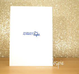
I toyed with the idea of using the little bits out of the star on the front to decorate the inside, but they were just too fiddly. I probably should go back and stamp a pale star over the sentiment - what do you think?
You can see the rest of this week's Christmas cards over at Claire Daly's blog. It's always worth a look.
Bye for now,
Tina
Tuesday, 14 August 2018
A Beautiful Day For Cherry Cobbler
Hi!
Are you excited for a new week of Colour Creations? This week's it's an old favourite - Cherry Cobbler.
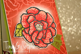
I always try to do something a little different on my Colour Creations cards. It could be a new technique or stamping style, or just a new way to use my stash. I actually used two techniques for the first time on today's card.
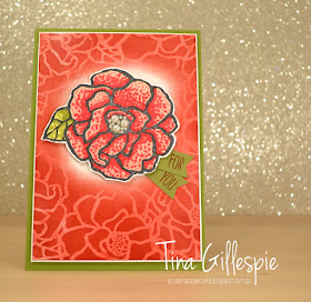
The first technique is called Ghosting - and it's why I had to photograph my card at a weird angle! I cut some Glossy White cardstock for the card background and then stamped the large flower all over using Versamark ink. I then used a sponge brayer to go over the top with Cherry Cobbler ink. The versa mark resists the ink, leaving a soft outline. It's just like Emboss Resist without the heat embossing.
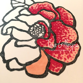
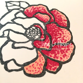
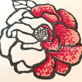
The second technique is called Pointilism, and it's how I coloured my focal flower. I used my Blends markers on Whisper White Cardstock, after stamping with Memento. Here's a little breakdown of how to do it
I worked one petal at a time. First, I coloured all over with my Light Calypso Coral Blend.
Next, I took my Light Cherry Cobbler Blend and used the pen nib end to gently add some dots onto the petal. I kept them fairly spaced and more towards the outer edge of the petal.
Lastly, I used my Dark Cherry Cobbler Blend to add more dots over the top. These were a little closer together, especially towards the bottom of the petal where I wanted the shading effect to be darker. I used the same technique on the leaf using the Dark Pineapple Punch and both Old Olive Blends.
I mimicked the front of the card on the inside, but in reverse.
Are you inspired to try Pointilism with your Blends? I think I need to practice a little more to perfect my technique, but I certainly had a lot of fun with it.
You can see what the other ladies participating have done with Cherry Cobbler by following their links on Catherine's blog. Don't forget that you can right click on each link to give you the option of opening the link in a new tab or window.
Bye for now,
Tina


