Hi!
Welcome to the new Colour Creations Blog Share.
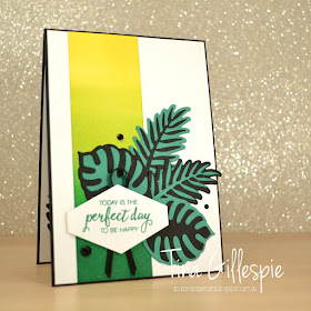
This week it's Call Me Clover's turn. The lush green made me think of the Tropical Chic suite.
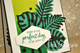
I started by using my sponge brayers to create the ombre panel. I used Call Me Clover, Lemon Lime Twist and Pineapple Punch on Shimmery White paper.
I used the dies to cut the leaves in both Basic Black and Call Me Clover, and then layered them in pairs. Isn't it a dramatic look?
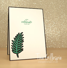
On the inside I used the larger die to create a window and the smaller die to add the Call Me Clover accent.
Short and sweet for me tonight! You can find everyone's links at Catherine's blog.
Bye for now,
Tina
Pages
▼
Tuesday, 31 July 2018
Monday, 30 July 2018
Polished Stone Dragonflies
Hi!
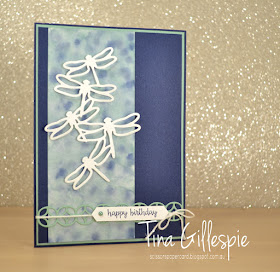
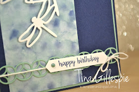
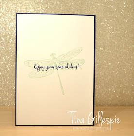
Remember a little while ago I was playing around with the Polished Stone technique? Well, I found one more card in my 'To Blog' folder using the technique that I hadn't shown you yet. Here it is!
I used Night Of Navy and Mint Macaron ink to create the Polished Stone panel. Isn't it pretty?
Speaking of pretty - how's that Subtle 3D Dynamic Textured Impressions Embossing Folder? I've been using it so much, as it adds that little something extra on so many cards.
That's the last of my Polished Stone cards for now - hopefully I'll get back to the technique some more soon, as it's a fun one!
Bye for now,
Tina
Thursday, 26 July 2018
JAI #419: Just Add A Twist
Hi!
I've survived the first week back at school, but barely! They kids are always a little cranky in the first week - I think it's the shock of having to get up early again. No more lazy sleep ins every day!
Luckily, I have the new Just Add Ink challenge to look forward to every Friday! This week Kelly has challenged us to Just Add A Twist by using a product in a way that it's not usually intended to be used. Hmmm, thinking caps on for this one!
Really, it's not that tricky when you think about it. At the most basic level you could apply some ink to any non-stamp surface and stamp with it. See, not so hard! I'm sure you can think of something vastly more exciting than that though!
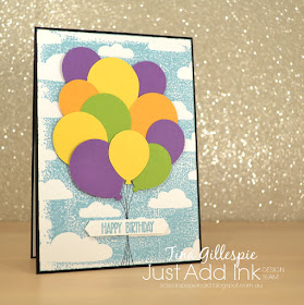
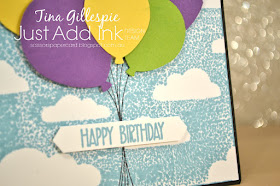
I decided to complete this challenge by using one of my masks as a stamp. I took the cloud mask from the Pattern Party Decorative Masks pack, repeatedly pressed my Balmy Blue inkpad onto the mask and then pressed a piece of Whisper White cardstock to the inked mask. As you can see, it leaves behind a blue sky and white clouds rather than blue could on a white sky if I'd used the mask as intended. Isn't it a cool effect?
Don't you love the textured look this technique gives? If you wanted a smoother look you could spritz the mask a little after adding the ink and before pressing the cardstock to it. Or maybe brayering the ink on would smooth it? Time to experiment!
All it took to finish the card was some stamped strings and punched balloons in Granny Apple Green, Gorgeous Grape, Mango Melody and Daffodil Delight. Such a happy card!
No blue skies on the inside - just a lone balloon carried over from the front.
So do you have your thinking cap on? You're bound to find plenty of inspiration when you check out the rest of the Design team cards at the Just Add Ink blog. These ladies know how to think out of the square!
Bye for now,
Tina
AWH Blog Hop: Designer Series Paper
Hi!
Tonight the Art With Heart team are sharing creative projects featuring Designer Series Paper. This month, Stampin’ Up! have a special on selected Designer Series Paper packs that allows you to get one free pack when you purchase 3 packs. That's 4 packs for the price of 3! We hope our blog hop inspires you to get crafting with your DSP.
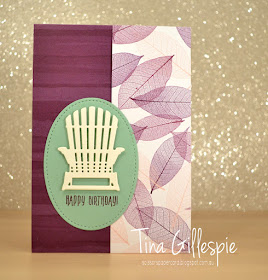
When I was thinking about what to make for this blog hop, I did a google search that was something like "fun things to make with designer series paper". One of the things that came up with this fun No-Cut Patterned Paper Folder by my good friend Di Barnes. Bingo! Di's tutorial is awesome (and free!), and has lots of info, especially on which types of papers work best. Having read all the info, I went for a piece in the Nature's Poem DSP, which is one of the packs on sale this month. It's one of the popular designs from this year's Annual Catalogue.
I kept the front of my card fairly basic, as the inside is where the magic is! The contrast between the two patterns in the DSP is so lovely.
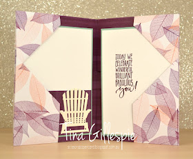
The paper is folded (no cutting!) in such a way that it forms two pockets on the inside - how cool is that? I've cut an insert for each pocket, but Di's instructions also include an adaptation so that you can fit a few cards/envelopes in each pocket.
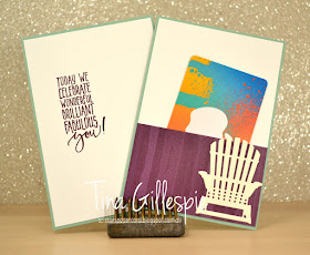
Here's the two inserts. You can see that I've used another small piece of the DSP to create a place for a gift card. You could probably just tuck the gift card into the the pocket on the card base, but this way it's not going to accidentally slip out of the card. I left the back of the inserts plain, but it would be great as a group card, as there's lots of room for many people to sign. You could even add a photo or two to the back. Lots of ideas!
Now it’s time to hop on over to our next participant, my friend and fellow South Aussie, card maker extraordinaire Kathryn Mangelsdorf.
If you find a broken link or have come to this blog hop from a different entry point, you can view the participants below:
Bye for now,
Tina
Tuesday, 24 July 2018
Crazy for Cajun
Hi!
Welcome to this week's Colour Creations Blog Share, where we are looking at Cajun Craze.
When SU announced the new colour revamp, there were a few moans about why Cajun Craze was carried over and not retired. I'm thrilled it stayed a part of the range, as it's a colour like no other in the line up. It's a gorgeous orangey-brown that is so rich. Have I talked it up enough? Let's move onto my card!
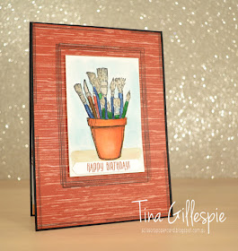
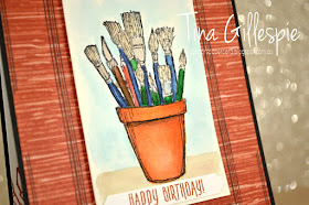
I've been having a lot of fun lately playing with water and ink, and this card is no exception. Other techniques I've used have been quite messy, but this time I decided to watercolour an image. I purchased Crafting Forever a little while ago, but hadn't yet played with it. Cajun Craze makes the best terracotta pots, so that's where I started. I stamped my image on Watercolour paper as opposed to Shimmery White, as I wanted to do some serious colouring, rather than my usual 'slap it on' method of watercolouring.
I started with the pot and Cajun Craze. I learned quickly that I needed to let one layer of colour dry before adding the next. I also learned to use a darker colour to create more depth. In this case, I used my Early Espresso marker to draw lines under the rim of the pot and down the right side. I blended a little with my Aquapainter, just enough to create a subtle shadow effect. I used the same technique on the handles of the paintbrushes. They were coloured in Blueberry Bushel and Call Me Clover before having some Night Of Navy and Garden Green added for effect. Again - it's so important to let one colour dry before adding the next. If something happens like one colour bleeding over to the next, you can quickly sop up the water and it will usually stop the colour bleeding into the wrong area. This small panel took me quite a number of hours to colour, but the results were well worth it. While I love my slap it on style, there's a lot to be gained from taking time to colour correctly!
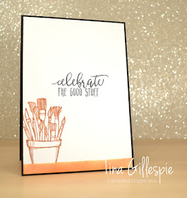
The Cajun Craze piece along the bottom of the inside was a test piece before I started colouring the main image. I really liked it, so I kept it for the inside. Waste not, want not!
I'e rambled on enough for now, so why not pop on over to Catherine's blog where you can find the rest of the links for this week's Blog Share?
Sunday, 22 July 2018
CTC #188
Hi!
Sadly, the school holidays are drawing to a close. They always go so quickly! Ada and I went to see the new Mamma Mia movie tonight, and we both loved it. There may have been a few tears shed! I resisted the urge to sing along - I'll save that for the DVD! - but I came home in a great mood, so I decided to take advantage by making a card for the latest CASEing the Catty challenge. This week it's the Holiday section of the Annual Catalogue. I have yet to start my Christmas cards, so this was a great opportunity.
The card I CASEd is on page 101 of the catalogue. It's one of those eye catching, WOW! cards that I've been dying to try since I first laid eyes on it. I'm hoping I did it justice, as it really is an amazing card.
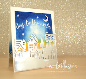
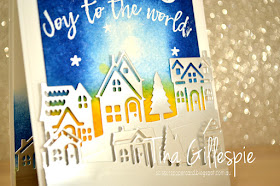
I started by sponging Pumpkin Pie, Crushed Curry and Blueberry Bushel ink on water colour paper and then spritzing with water. You can see the green layer where the colours ran together, but it's also on the catalogue card, so I didn't try to 'fix' it. After it dried I stamped and heat embossed the sentiment, moon and stars. I had to curve the sentiment on the block a little, as it was a tight squeeze when it was straight.
The houses were cut from Silver Foil paper - it's the devil to photograph without any reflections, but it looks amazing on any card. I couldn't quite work out how the SU Concept Artist had cut their front layer, as it didn't match any of the dies in the set. It must have been some fancy Big Shot trick, but far to tricky for me to work out at 9PM on a Sunday! The row of houses works well enough. It's popped up on Dimensionals to give the card some depth.
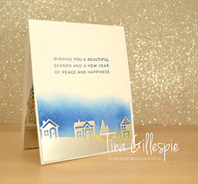
The piece I'd originally cut from the front didn't have enough length on the bottom, so I put it to work on the inside. I sponged the same colours on some Whisper White card stock, spritzed and dried the piece. The technique doesn't work as well as it does on watercolour paper, but it's good enough for my purposes.
So now I can say I've started my 2018 Christmas cards. Who knows when I'll make more, but at least I have one in my stash now!!
Bye for now,
Tina
Thursday, 19 July 2018
JAI #418: Just Add Colour
Hi!
Yes, it's Just Add Ink challenge day! This week Jo has given us a very pretty colour combination to work with.
What a coincidence for me to have two projects requiring Blushing Bride in one week! Tuesday I showed you some brayering I'd done with Blushing Bride ink and the Delightfully Detailed SDSP. You can see that post here. Today I'm using the other piece of cardstock that I produced.
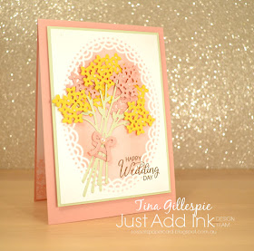
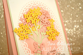
There's something about white lace that says wedding to me, so that's where I went with the card. It was pretty quick and easy to cut and assemble the bouquet. Unfortunately my photo doesn't show the Daffodil Delight blooms very well - they are much softer than the photo makes them look.
This was my first time playing with the new Soft Sea Foam colour. It's such a lovely green, and a perfect accompaniment to Blushing Bride. I can see myself using it lots!
On the inside I stamped one of the flower stamps from Beautiful Bouquet multiple times across the bottom using Blushing Bride ink and then brayered some Blushing Bride ink over the top to soften the look. I love how it turned out!
Pop on over to the Just Add Ink blog to see the other gorgeous creations the Design Team have made this week. They always stun me with how beautiful they are!
Bye for now,
Tina
Tuesday, 17 July 2018
A Delightful Blushing Bride
Hi!
It's Tuesday evening, which means it's time for the new Colour Creations Blog Share. Are you enjoying our trip through the Stampin' Up! colour collection? I am!
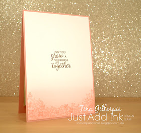
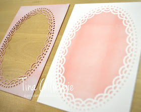
This week the focus colour is Blushing Bride. It's such a lovely, dusky soft pink. A soft colour needs a soft paper, so I decided to use some of my Delightfully Detailed SDSP. The oval piece was perfect for my plans. I wanted the main panel of my card to be Blushing Bride, so I decided to brayer some ink over the paper. To stretch the paper even further, I cut a piece of Whisper White the same size as the oval panel and layered the two pieces before I brayered. The result was two pieces with an oval feature in Blushing Bride. You can see what I do with the second piece on Friday.
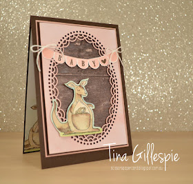
For today's card I used the DSP piece. I love Blushing Bride paired with Early Espresso, don't you? And even better with a piece of the dark Wood Textures DSP!
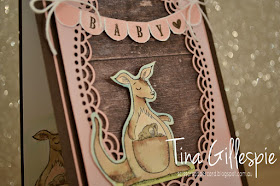
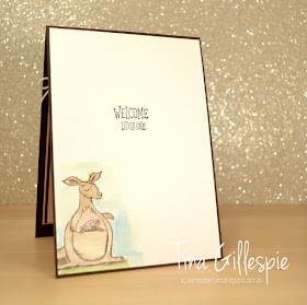
I pulled out my Animal Outing Stamp set and stamped the Kangaroo on some Watercolour paper. I coloured her with my Aqua Painter using the following inks: Crumb Cake (Kangaroo), Early Espresso (Kangaroo shading), Grey Granite (Koala), Blushing Bride (Kangaroo chest, ears and nose, and koala nose), Pear Pizzazz (grass) and Balmy Blue (sky).
How adorable is that banner? I used my Pick A Pennant stamp set to make it. I don't have the matching dies, but it was easy enough to trim around the banner. I snipped up between each section of the banner so that I could curve it a little more across my card. Don't you love the rustic texture the wood paper adds to the background? It's such a sweet contrast against the lacy paper.
I added and coloured another Kangaroo on the inside using my Aquapainter and inkpads. It's just on Whisper White this time, so it's never as good a result as when I used Watercolour paper, but it's good enough. And look - I managed to stamp the 'Little One' stamp correctly first time! LOL
You can see what the rest of the ladies have created over at Catherine's blog. Just a little tip - when you get to the list of links you can right click on the link instead of left clicking. A little box should pop up and you can choose to open the link in a new window or new tab. This little trick saves you from jumping back and forth between each blog and Catherine's. You can just click on each window/tab in turn and close it when you're done looking and hopefully commenting!
Bye for now,
Tina
Monday, 16 July 2018
CTC #187
Hi!
It's been a while since I've played along at CASEing The Catty, but I found time last night to make a card that suits this week's challenge. The DT are CASEing cards from the Kids and Babies section of the Annual Catalogue, which covers pages 80-91. I chose the card at the top left of page 91.
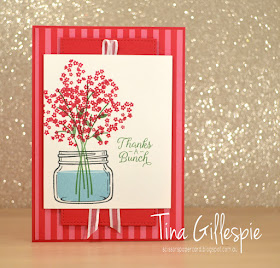
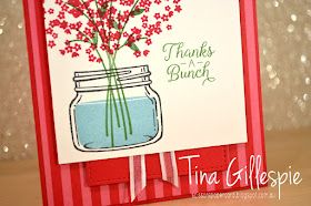
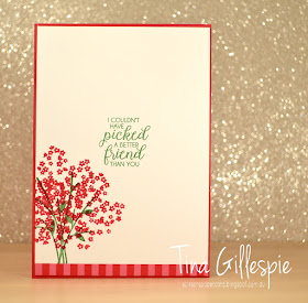
I kept the same basic layout of the card, but I changed the colours, stamps and purpose of the card. I don't really have many baby sets, and I've made a few baby cards lately, so it was time for a change! It was nice to stamp with two old favourite sets - Jar Of Love and Beautiful Bouquet. They combine rather nicely, don't you think?
The DSP I used is from the 2018-2020 In Colour DSP Stack. It's a cute little 6 inch stack that's the perfect size for card fronts. I used Lovely Lipstick - a colour I haven't used much of at all yet. I can't quite decide if it's a red or a pink! I love the addition of the Stitched Shapes square under the main panel. One of those subtle little details that can make a big difference to a card.
Isn't that sentiment lovely? I can just imagine the smile it will bring to the face of the recipient!
Bye for now,
Tina
Thursday, 12 July 2018
JAI #417: Just Add T
Hi!
Hooray for Friday - it's challenge time!
This week at Just Add Ink it's one of my alphabet challenges, and the letter T has been chosen.
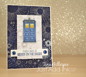
I actually made this card a few months ago when I received a new Kindred stamp set called Time Traveller. My husband and kids are big fans of this show, so I just had to buy the stamp set. I'm not such a huge fan, but it is a show I enjoy watching when Rob puts it on. I certainly loved watching it as a kid!
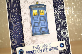
How cool is the background on this card? I love how, if you squint a little, it could represent the phone box flying through time and space. I used some retired Year Of Cheer SDSP, which I found on my desk while tidying up. It was the perfect size for the card. After trimming the piece to go under the phone box, I took the remaining piece and rubbed my Night Of Navy ink pad all over it. I used a tissue to wipe the ink from the embossed areas and then repeated until I got the depth of colour I was after. I love that some bits are still a bit splotchy - it adds to the time/space feel.
The colouring on the blue phone box was inspired by this stunning card. I loved the dimension she achieved, so I hoped to emulate it, and I was pleased with my efforts. I used the following Blends: Night Of Navy (Light and Dark), Daffodil Delight (Light and Dark) and Pumpkin Pie (Light). I still need practice on the smaller sections, but overall not too bad!
I made the claim on the outside that the card was bigger on the inside, so I had to follow through! I made it bigger by adding a pop up element. I simply cut an extra strip to add to the back of the center robot so that it pops up when the card is opened. The other two were adhered flat to the card base. The three were coloured with the following Blends: Smoky Slate (Light and Dark), Bronze and Ivory.
So, there you have it - my Telephone box card for our Just Add T challenge. You can find out what T elements the rest of the team have used over at the Just Add Ink blog. It's a fun week to get involved!
Bye for now,
Tina
Tuesday, 10 July 2018
Why, Hello, Blueberry Bushel!
Hi!
Welcome to the new Colour Creations Blog Share!
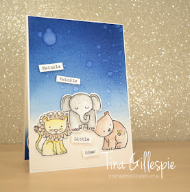
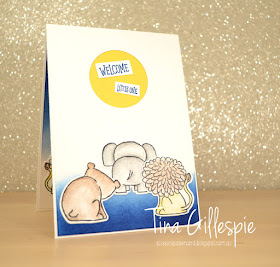
This week we are focussing on Blueberry Bushel, one of the new In Colours. Blue is one of my favourite colours, so I decided to have a bit of fun this week.
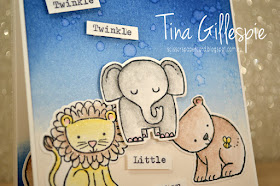
I started with the background of my card, brayering Blueberry Bushel ink over the top of some Shimmery White cardstock. Once I was happy with the depth of colour I flicked some water over the cardstock with my fingers. I need to practice more, as some of my splatters were a little large!
The animals from A Little Wild were coloured using my Watercolour pencils and then blended using my Wink Of Stella pen - my favourite way to use the pencils. The sentiment was typed on some card using my old type writer then trimmed and popped up on Dimensionals.
Have you ever made a whoopsie on a card? This was my doozie!
Uh Oh! The 'Little One' was the very last thing I had to stamp on the inside, and I managed to stuff it up. Luckily, I had a brainwave on how to fix it - I turned it into the sun!
I simply punched a circle over where the sentiment was, trimmed the sentiment bits, adhered some Daffodil Delight card behind the circle and adhered the sentiment pieces over the top. Done! The rest of the inside was a mirror of the outside - so cute how they include the back side of the animals in the stamp set.
You can find the rest of this week's blogs over at Catherine's blog.
Bye for now,
Tina
Monday, 9 July 2018
An Old CASE
Hi!
I'm a bit late with today's post. -sorry! I spent the weekend at a Band Camp with the concert band I play in, and came back so tired I didn't have the energy to do much more than crawl into bed with a book. I fell asleep with the book clutched in my hand and my glasses still on after only a handful of pages. Oh well - on with the card!
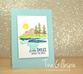
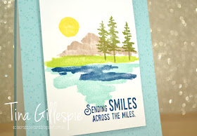
This card was a CASE of a card that appeared in the last Occasions Catalogue, when Waterfront made it's debut. Often when I have a new stamp set that I am a bit overwhelmed with I start by CASEing a card from somewhere, usually the catalogue. I find that by doing that, I sort of 'break the barrier' and it sparks off my creativity with the set.
I changed a few things, like shifting the tiny splatters from the main panel of the card to the base of the card, and also using a different sentiment. I thought this sentiment from Lift Me Up worked so nicely with the scene. The layout and scene were kept the same as the sample in the catalogue.
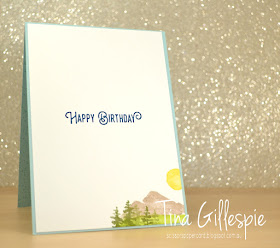
As ever with this set, I simply recreated a small part of the scene on the front on the inside. Too easy!
Well, I'm off to catch up on my washing and housework for now. I can't believe how much it builds up after not quite two days away!
Bye for now,
Tina


